Ollie Norris
Documentation

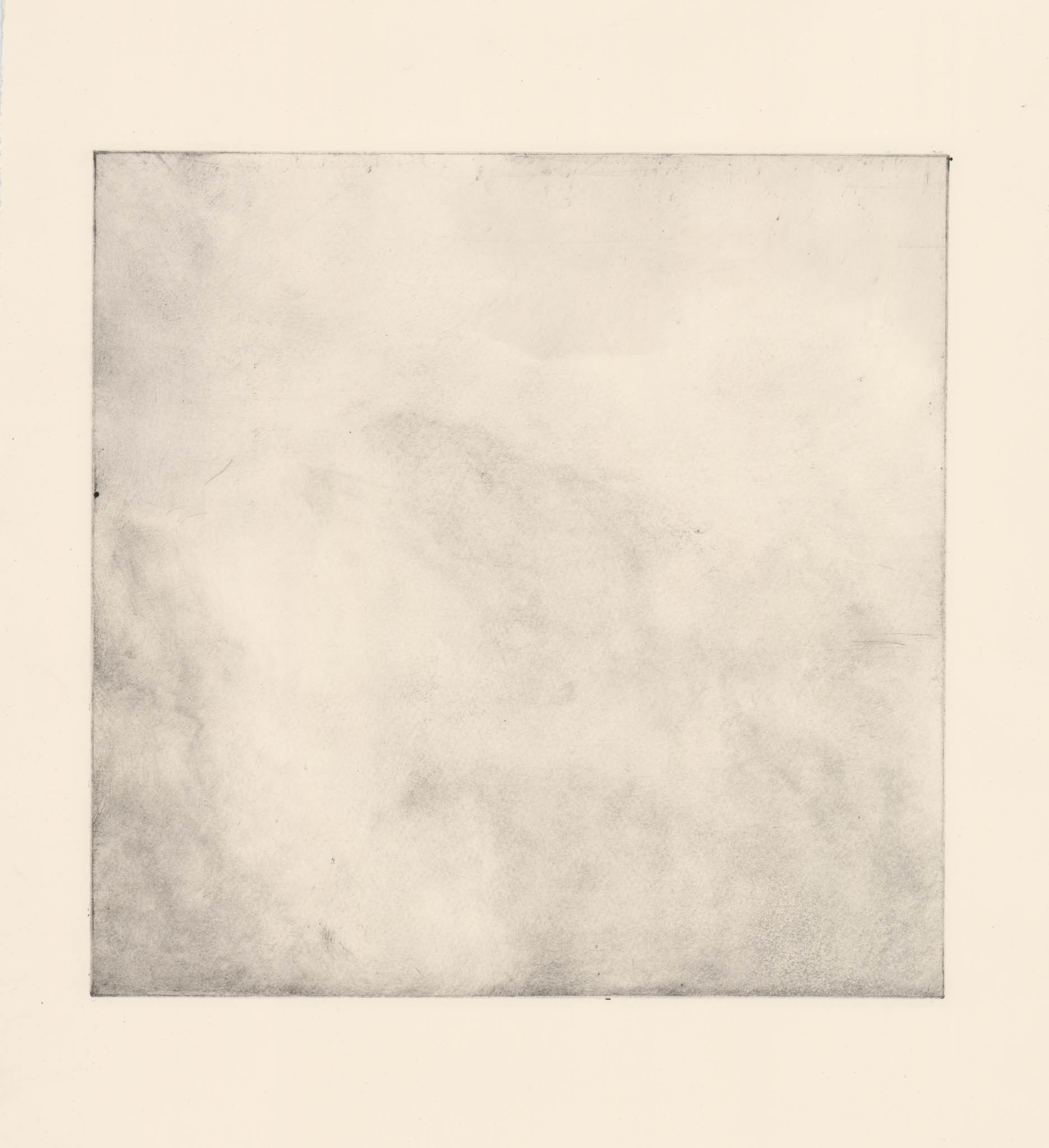
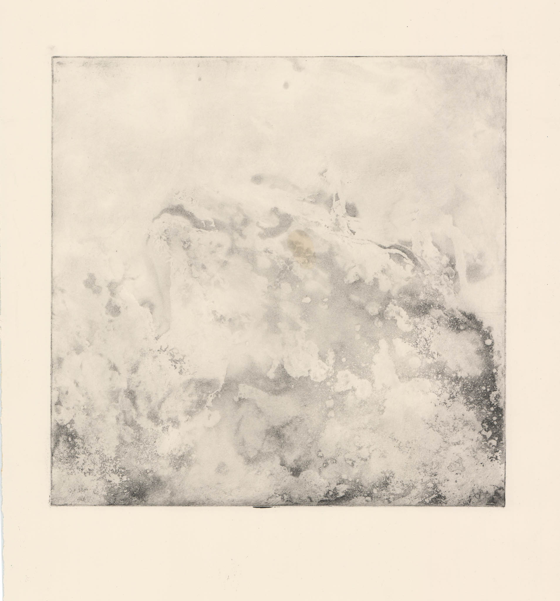
Lithograph (46x35cm) Lithograph (42x38cm)
Lithography Induction-
At this early stage in the project, I didn’t have a proper idea of what I wanted to make work about. I decided to allow the imagery to lead me towards a concept that I was interested in. I chose first to draw onto a stone from a picture of a gnarled tree in Healey Dell, Rossendale. I find that I draw in a very different way when approaching litho as the resistance of the medium and tools used, as well as the difficulty of not touching the stone while drawing doesn’t allow me to work in the more detailed fineline style that I usually employ. However, I do really like the way that litho changes my drawing style. In the second half of the day I decided to draw a foetal-posed hare. I’ve always been interested by folklore and had a line from Ian Duhig’s poem, ‘The Lammas Hireling’ stuck in my head while making this;
“I hunted down her torn voice to his pale form.
Stock-still in the light from the dark lantern,
stark-naked but for one bloody boot of fox-trap,
I knew him a warlock, a cow with leather horns.”
Here, the poem discusses a farmer’s seasonal helper, who turns out to be a shapeshifter who assumes the form of a hare. I love drawing the form of animals, especially lithe and muscular, hares, horses and sighthounds and I enjoyed creating this one on a litho plate. Lithography is a medium that I really want to love, but I just can’t seem to get along with. In Unit 2 I really want to break out of this and try and make some more lithographs.
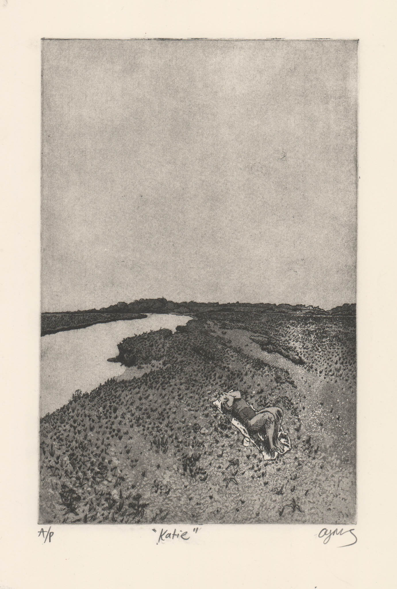

Etching and Aquatint on Somerset (38x28cm)
Etching Induction-
As my first etched piece since the start of Summer, I decided to create something that I was comfortable with, I took an image of my girlfriend on the salt marsh from a trip to Norfolk. I decided to focus on developing an atmospheric quality and a moodiness with this piece and I chose to illustrate this by having half of the composition being sky. I’m really impressed with the quality of this drawing and the sense of depth and perspective created. This is also the first time I had utilised a hand shaken aquatint, I’m really impressed with the saltiness that this creates in the piece. I’m also quite impressed with my very subtle creeping aquatint, I build this up by mirroring the handshaken aquatint and slowly stippling stopout varnish from the front to the back of this piece and building up a 15 stage stop-out; it’s a lot of hard and delicate work but I think it’s really worth it in the outcome of this piece. The subtle moodiness in the sky was only created with one solid tone of aquatint that is then accentuated by careful and subtle retroussage to bring out these dark and foreboding clouds. If I was to make this piece again I think I would keep the compositional elements of 50/50 sky and land but I would rotate it and make it landscape to really accentuate the flatness of the marshes, as well as to forefront the way I see them, as a whole panoramic view, rather than this unnatural perspective. I would also remove the figure as I believe it makes the piece seem too illustrative and less magical and otherworldly. It also takes you out of the image, you begin to see the image as the figure, rather than seeing it as a window into how I feel about this place.
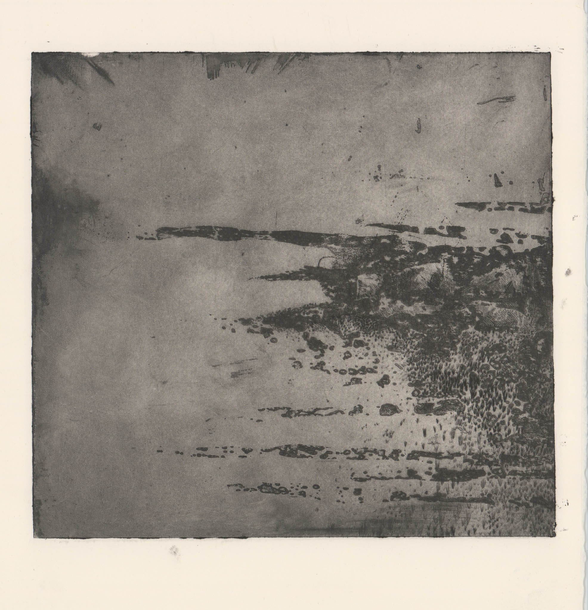
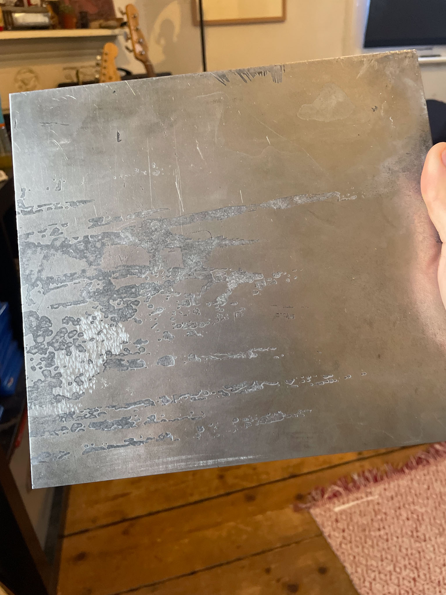
Found Steel Plate Experimentation-
I found a steel plate in the etching studio that had an interesting bite due to the degradation of straw hat varnish on the backside of the plate. I decided to drypoint into this plate (I later found out that drypoint into steel isn’t too conventional due to the hardness of the steel but it worked nonetheless). I immediately began to pick out the corner bend of a creek of the Stiffkey salt marshes. It was really interesting to work with an uncontrollable element and I think this really changed my mindset of the drawing of my pieces. I found that using abstract methods such as white ground was still too in control, whereas here I had to work with the natural accidental marks in the plate. I added an aquatint to this piece which I also found out wasn’t necessary with steel as it etches tone naturally without the need of rosin, however, this allowed me to add a course, handshaken aquatint to add even more uncontrollable organic and natural marks. Overall I was really happy with where this experiment led me and this massively contributed to my later experiments utilising natural degradation of plates created by the environments I am trying to depict.
Etching and Aquatint on Somerset (21x19cm)
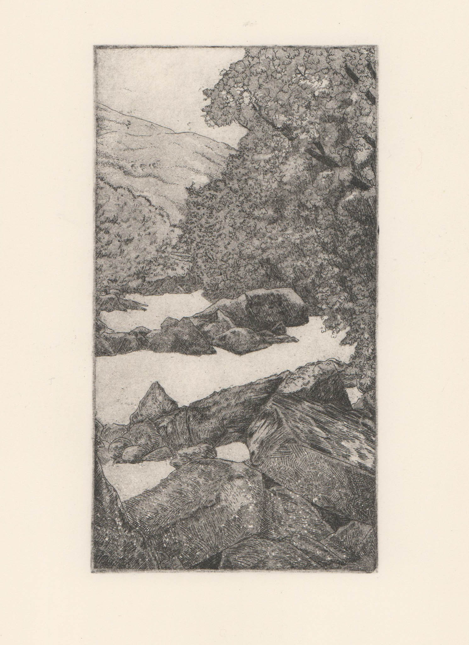
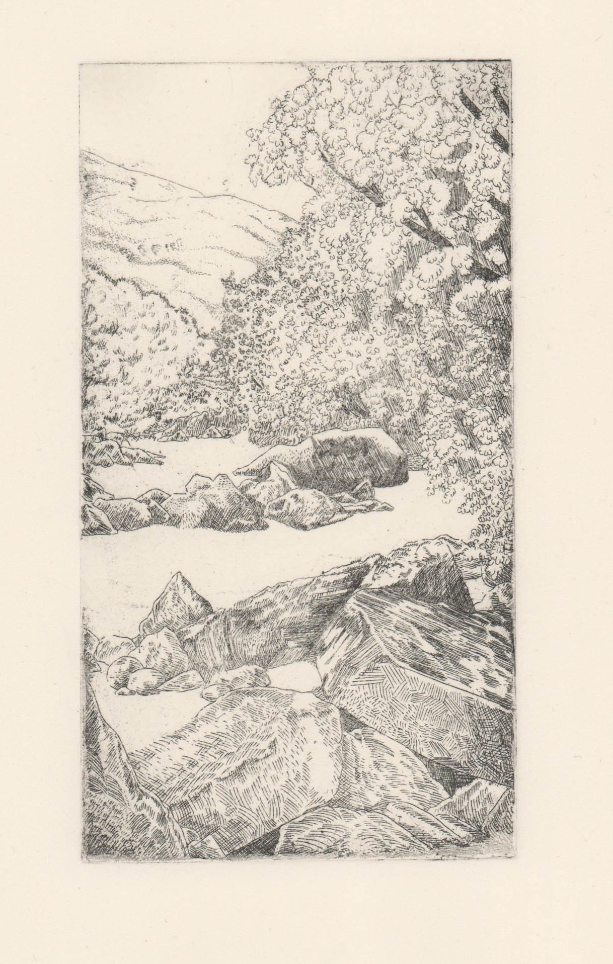
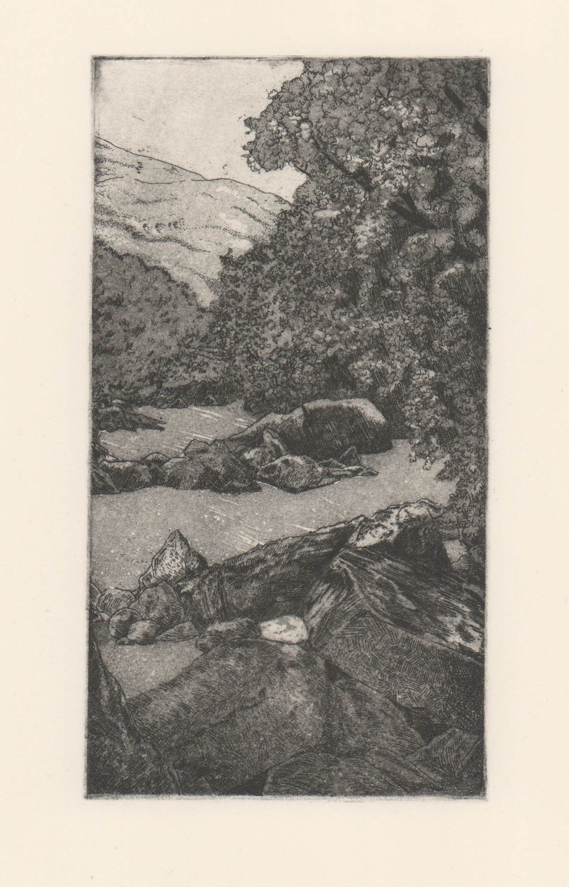
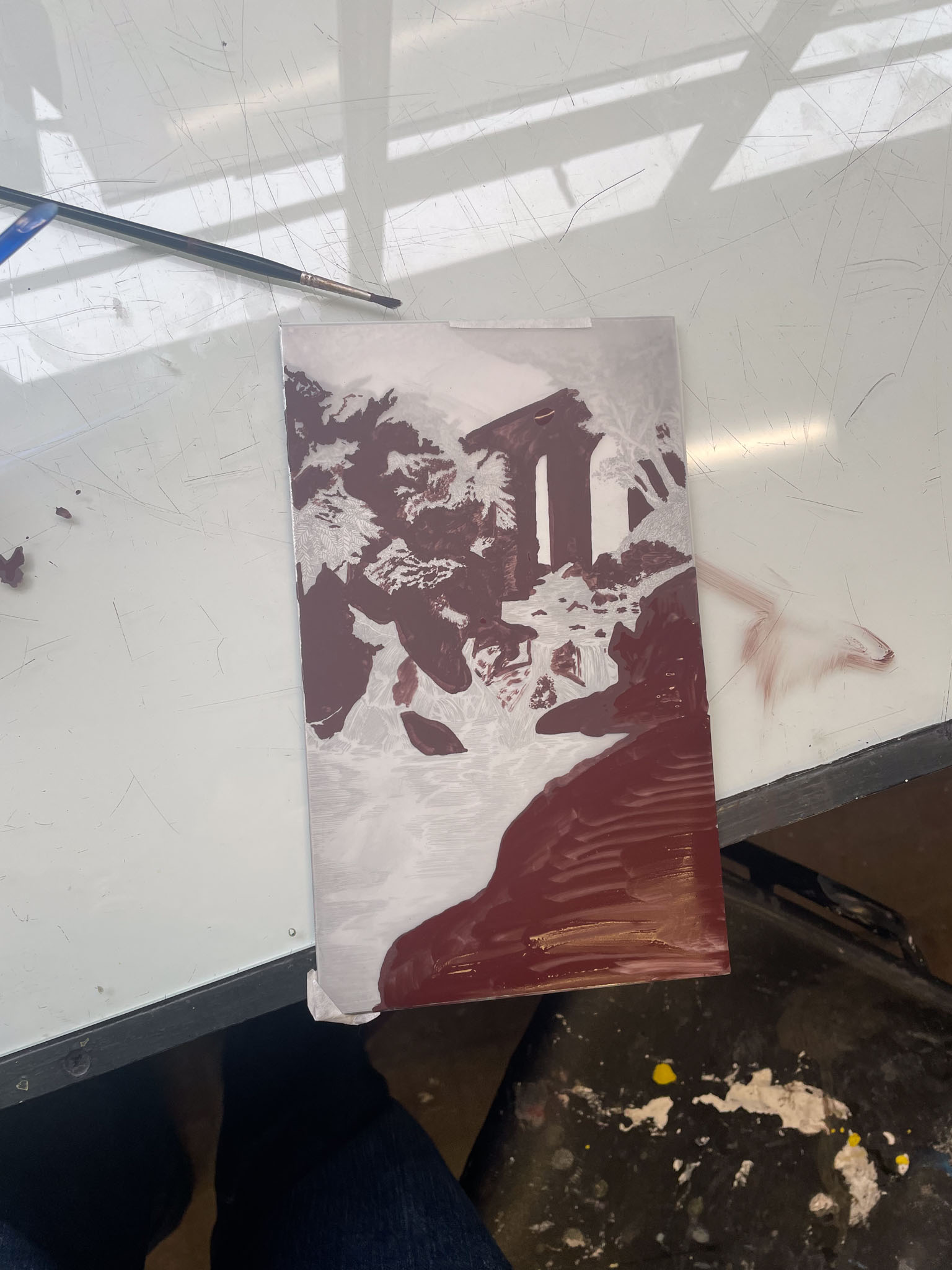
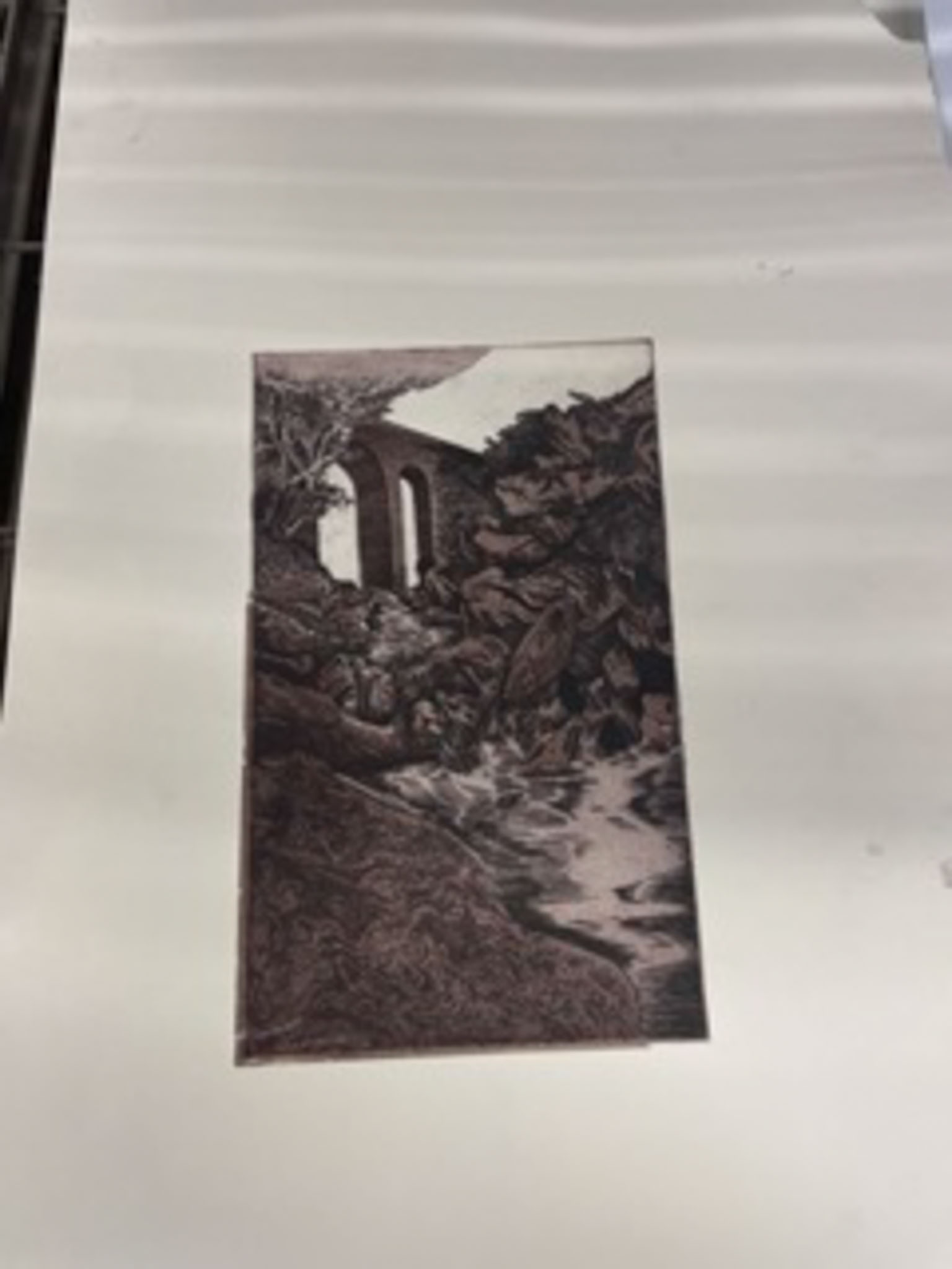
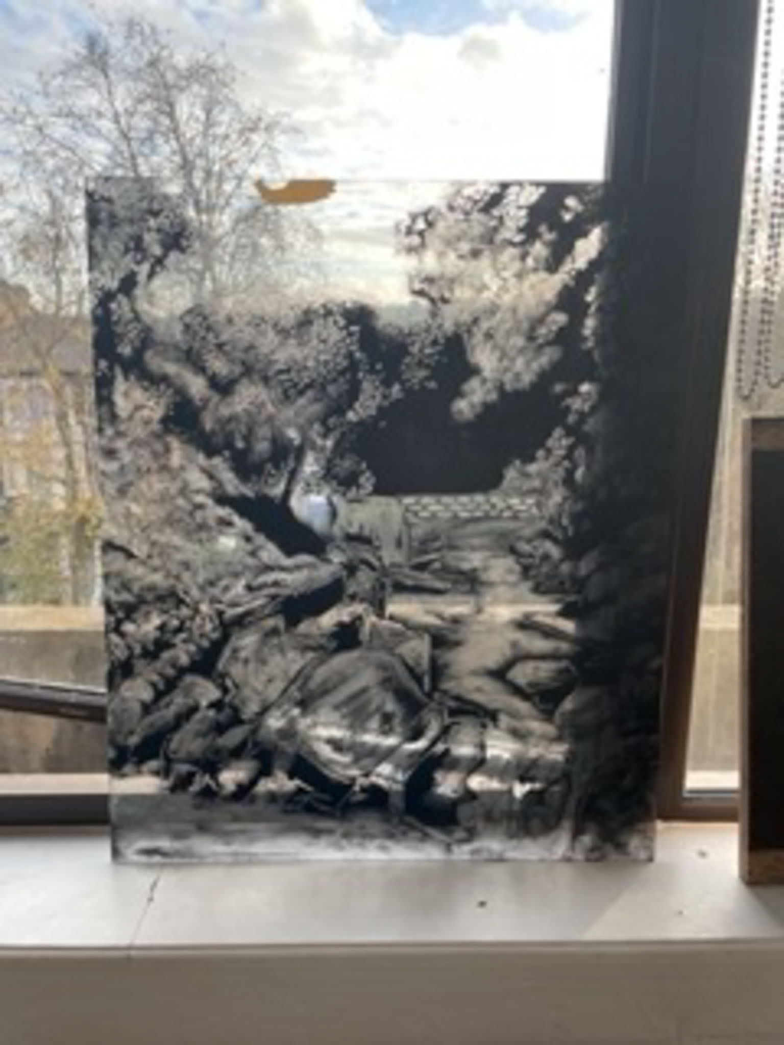
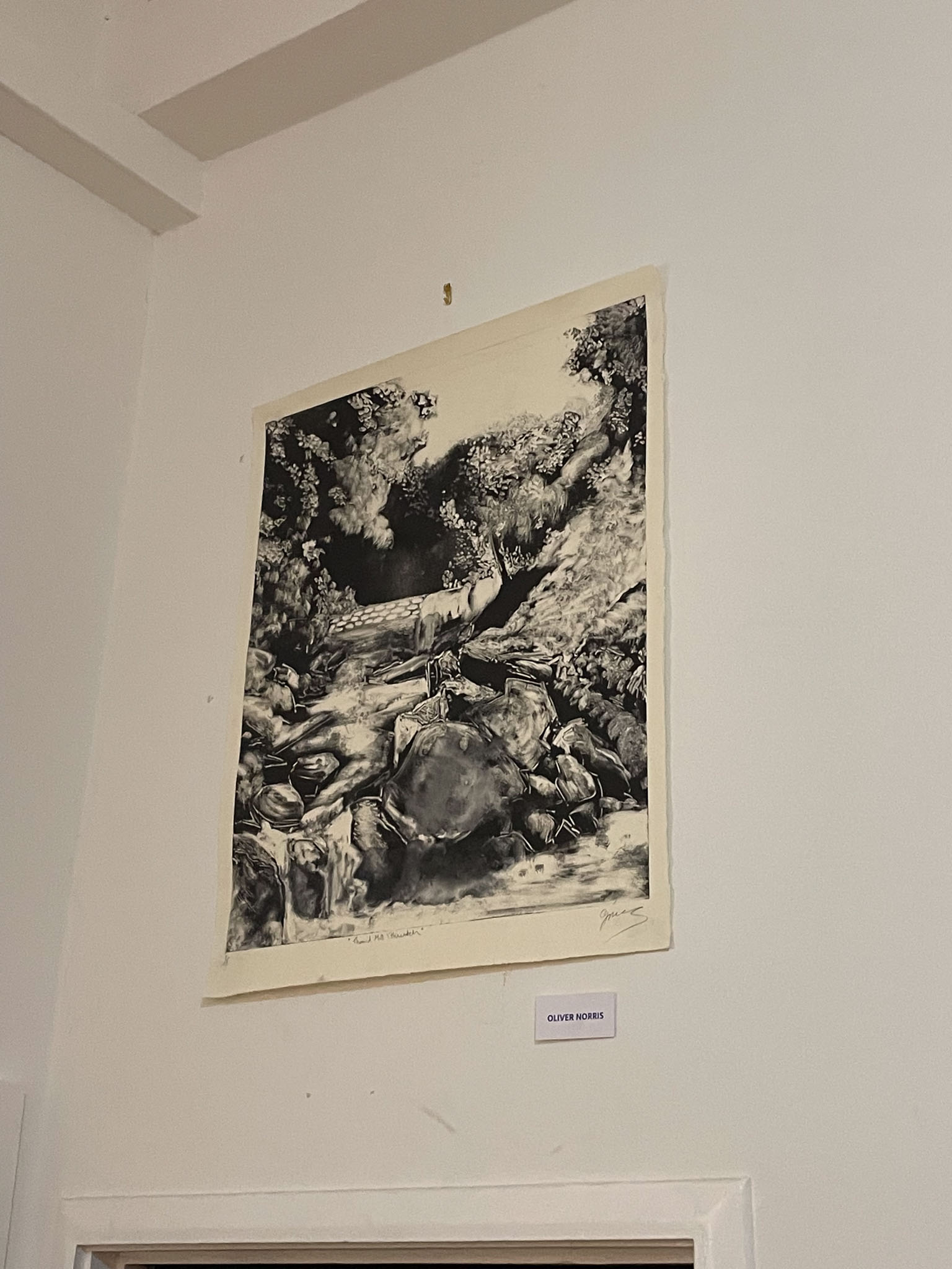
Th’Owd Mill I’Thrutch copper etching-
This piece was another depiction of the beautiful Healey Dell. This was a super small scale etching on copper, a material I’m not used to etching with. I started to realise when creating this piece that I much prefer drawing around natural degradation in a more abstract way, this long detailed drawing process has started to become more and more tedious and much less interesting. Although I’m really happy with the technical drawing and the aesthetic of the image produced, this work feels like a postcard, rather than an invitation into how I personally feel when I am in the space. I also found the copper really hard to work with, especially on such a small scale, although the line quality in copper is really lovely, after the first stage of the aquatint, it’s almost impossible to see the line etch on the plate and this makes the subsequent stages of aquatint really difficult to create. It took a long time and a lot of patience to stop out this piece and I’m impressed that I managed to make it so neat when I was completely blind throughout the whole process. This piece was a real turning point for me in deciding the trajectory of my future work, I don’t really want to carry on creating these ‘comfortable’ images, I want to break the mould a little bit and make my pieces feel more emotional, personal and evocative of me.

Experimentations with colouring etchings with photolithographic layers-
I took an old misprint of my etching, ‘The Coffin of the Faerie King’ and decided to experiment with adding colour layers behind it. I only had time to print one of these layers and while not really happy with the result, I can definitely see that the process could hold some promise. I think that with better choices of colour, and layered transparencies of colour, this could be a great way to add a bit more technicality and depth into my work. This process also made me want to explore relief rolls on top of plates, mono printing on top of plates, and multiplate etching, which I’m excited to pursue in the future.
Both, White Ground Aquatint on Somerset (38x28cm)
White Ground Experimentation-
After seeing Norman Ackroyd’s beautiful work, I decided to pursue something along the same lines, as an exploration into his technique and composition. Originally, I was going to spit bite, like Ackroyd, but after a conversation with Brian Hodgson about wishing I could get the painterly marks of stopout varnish to etch through to a plate, I decided that I wanted to give white ground a go. After a quick trip to Sainsbury’s to get a few bars of Dove soap I returned and we got to work creating the imperfect ground. I ground and refined the dove soap into a fine powder, and then in equal parts added titanium white pigment and plate oil. I then added some water to make the ground more viscous and got to work painting it onto a copper plate that I had stopped a negative sky onto. I wasn’t exactly sure what to expect here so I decided to just etch the ground through to black to allow the ground more time to degrade in the acid. The results were unexpected but definitely promising. I love the really defined painterly qualities of the ground and I think that this used with more subtlety and layered up would be really interesting to take forward into other work. The Picasso Printmaking exhibition at the British Museum really suggested to me that these very strong and opposing etching techniques such as sugar lift and aquatint shine the brightest when they are used carefully and subtly in conjunction with each other. I’m excited to take the white ground forward and utilise it in other pieces.

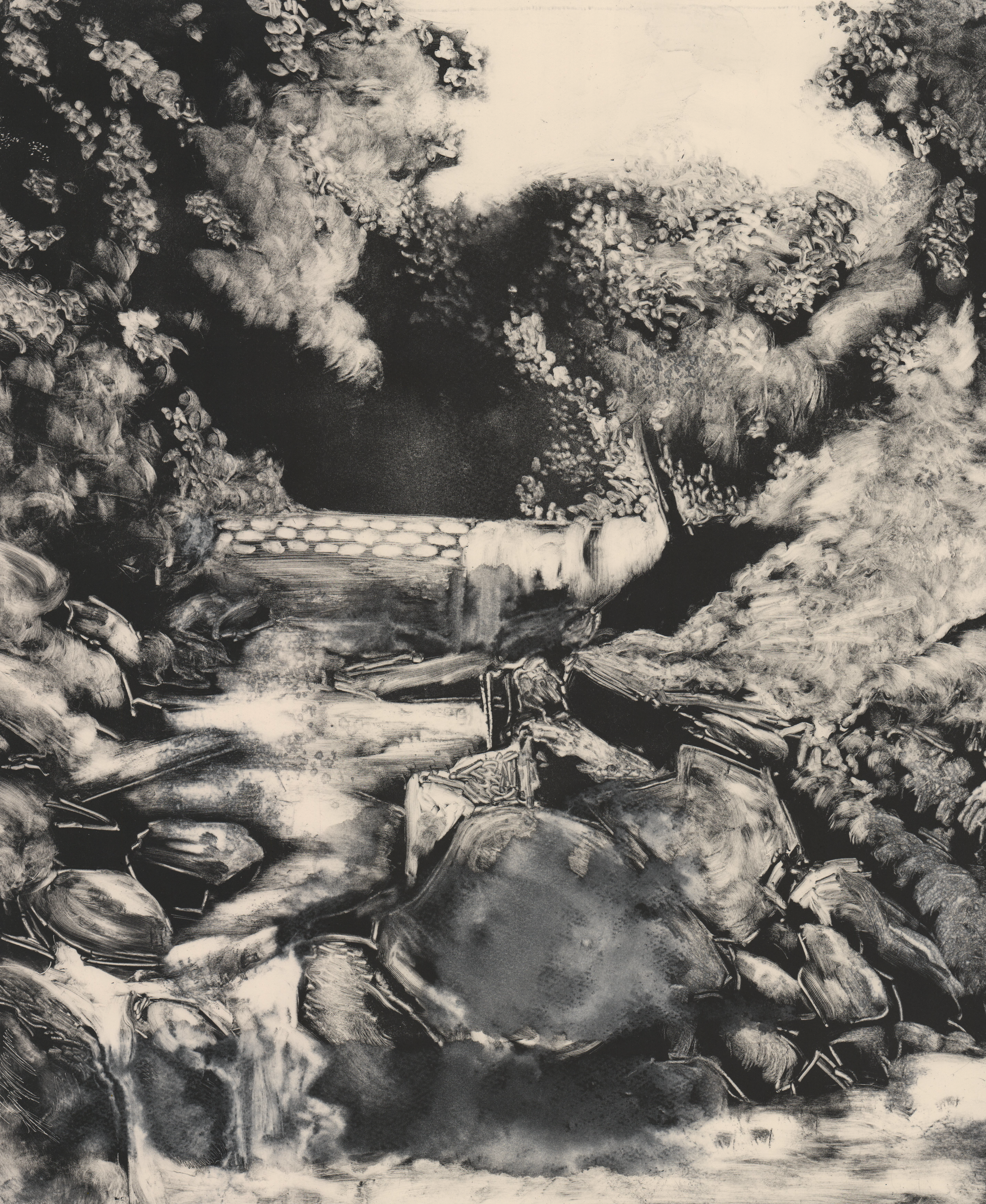
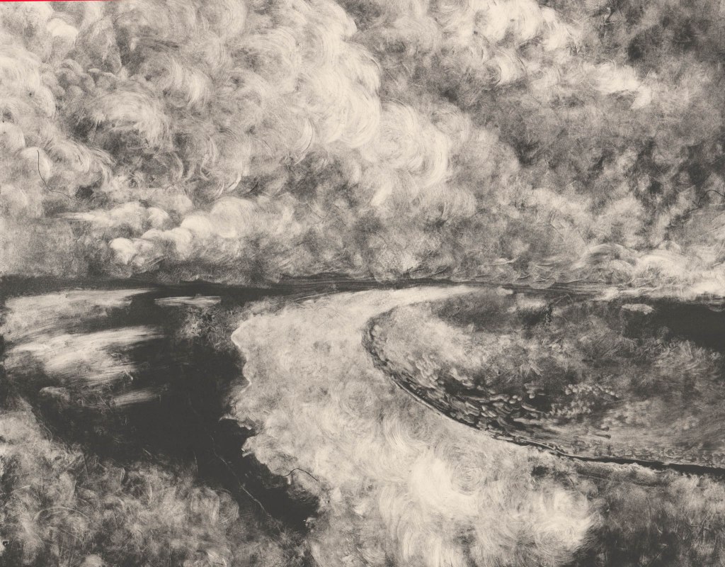
Reductive Monoprint on Somerset (60×49.5cm)
Experiments with Monotype-
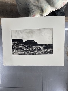
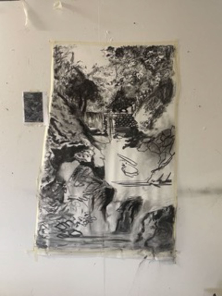
I created the upper left image as a large-scale experimentation into breaking down an old photograph of Healey Dell, that was provided to me by the Whitworth Historical Society and Museum. I enjoy working with charcoal as it allows me to explore a piece freely and work much larger than with other materials. This work was the first stage in a three-day image making workshop where we took one photograph and played with it for the full three days. Pete convinced me to try monotype, something that I was never really fond of as I always remembered being forced to do trace through single colour mono prints on my Illustration BA and always felt that it never looked great and that you might as well draw with pencil. However, I had never been introduced to reductive monotype, wherein a perspex sheet is rolled up with ink and then slowly wiped away to create an image. This was mind-blowing to me and I feel that I took to it really well. I only used cotton buds, white spirit and a rag to create this piece and I really enjoyed the fact that it felt like reductive painting, I thought about this drawing in the same way that I would think about cutting a relief print. I’ve always really liked painting but something about it never quite worked in my head, however, the use of unconventional tools like a rag to create texture and tone in this piece really bridged a gap that a paintbrush just can’t. I think this piece really says what I want to say. I think it deifies nature and has this really definite movement and ethereal power behind it. I love the quality of the marks made and the subtle textures given off by the weave of the rag. It was also really exciting to create a large scale piece such as this in a very short time period, it felt much more freeing than slaving over a tiny metal plate for a month like I would in etching. This form of mono print is really really exciting to me and I can’t wait to make more pieces like this. I am also really excited about taking this forward into etching and using mono print to create tone in conjunction with or instead of aquatint.


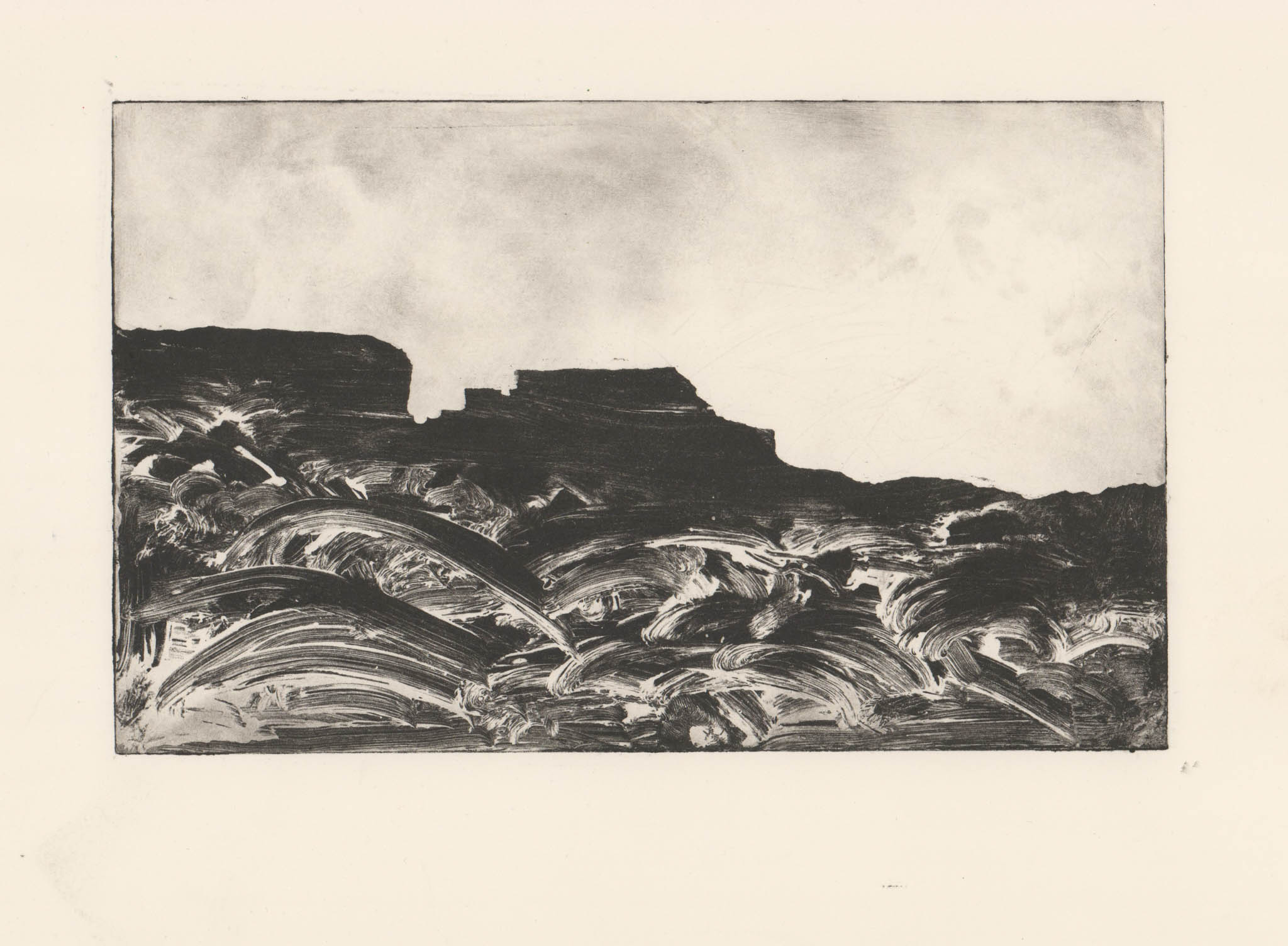
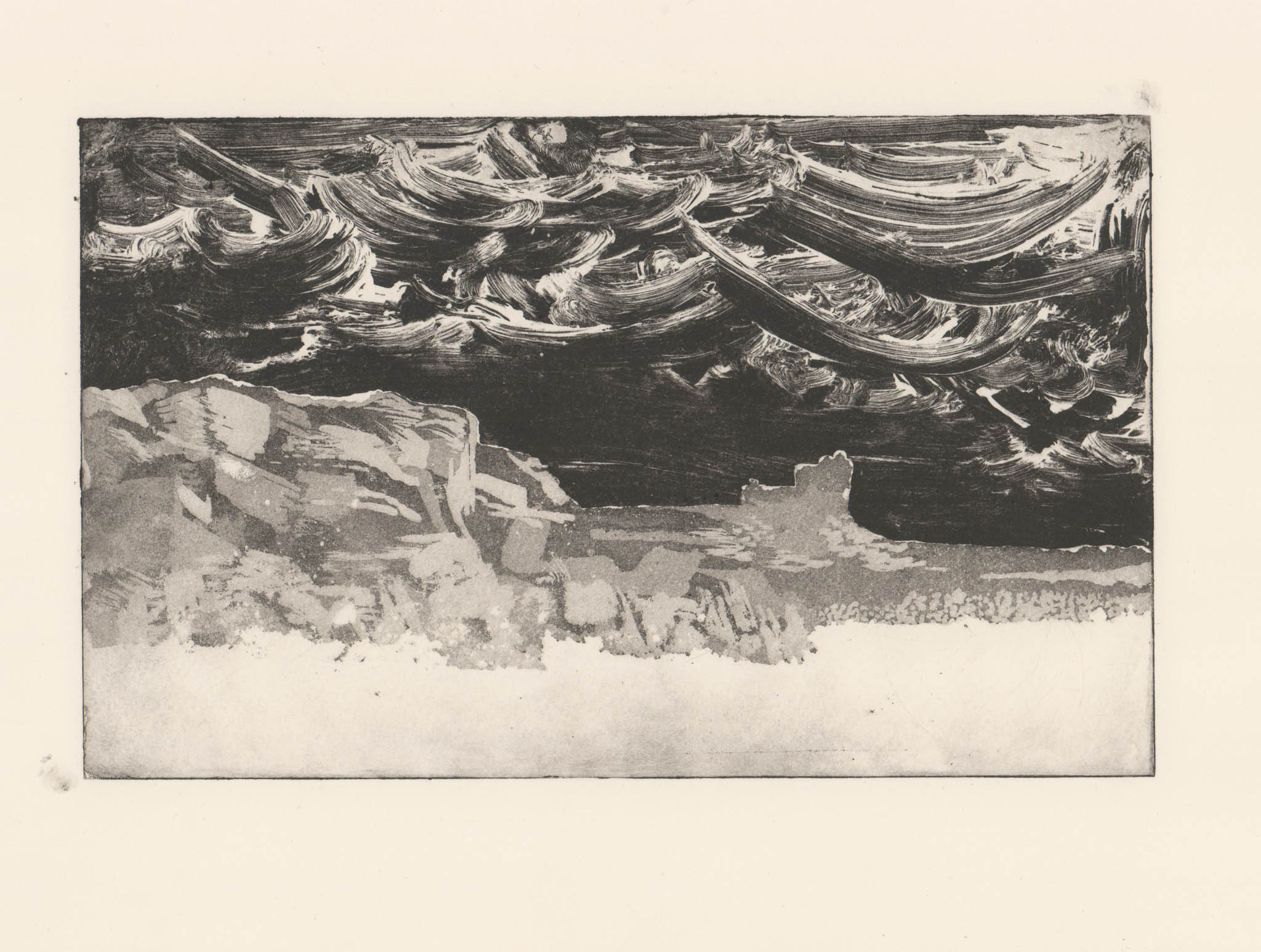
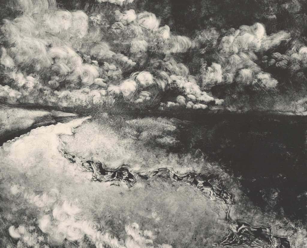
More Experiments with Reductive Monotype-
Here are two more abstract examples of exploring landscape through reductive monotype. Here I really wanted to lean into the strengths of the medium and create these lovely textural abstracted scapes. The image on the right this time was made with a thin sheet of aluminium which I didn’t massively enjoy working with due to the fact that a gradation in tone is really hard to see on the matrix, while on see-through perspex it is much more visible. I really like the form of the piece in the middle, I managed to find a broken sheet of perspex and I really love the natural quality of this as a canvas, almost echoing a broken piece of rock, or a shard of an ancient religious stone tablet. I have taken this sheet of perspex and kept it so I can continue to experiment with this form. It would be really interesting to create a piece on multiple pieces of one shattered whole, this is something I’m determined to explore soon.
Experimentations in Digital Print.
I am not a lover of digital print at all due to the fact that I can never really feel a piece is finished when the final product is produced by a single click of a button, no matter how much editing work or physical work has contributed to it’s initial conception before this. However I committed to experimenting with new methods during our image making workshop and had had great results with pushing the boat out with experiments such as monotype. I took a high definition scan of my large scale mono print of Healey Dell and cropped this down before editing with layering and filters on photoshop. This was then printed at a very large scale. I have to say that I did really enjoy the process of taking a small part of my image and making it huge. There is a definite elect of natural uncontrollability in the process of digital print that I really enjoyed that almost reminded me of working with found plates. Myself and fellow students had fun trying to pick out new forms in the image that the machine spirit had created, managing to see a reclining male figure in the centre of the image. Conceptually I don’t think that digital print supports my themes or what I want to say with my art work, I don’t want to champion the natural world and forefront the human experience by having a machine do the printing of my work, I still think that the hand touch is massively important to me, however, I have not written off digital print and think that there is a lot for me to discover with it in future experimentation.


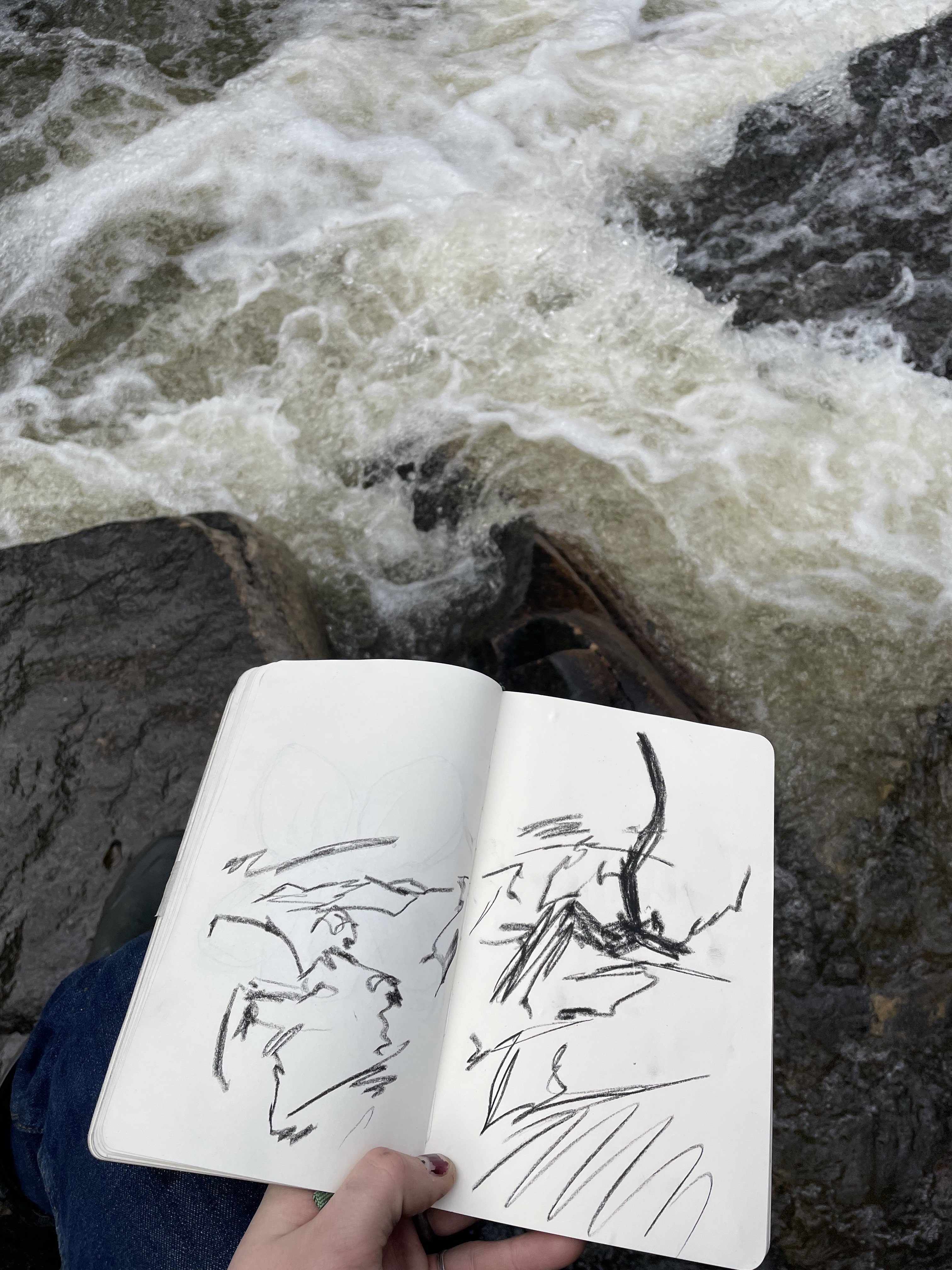
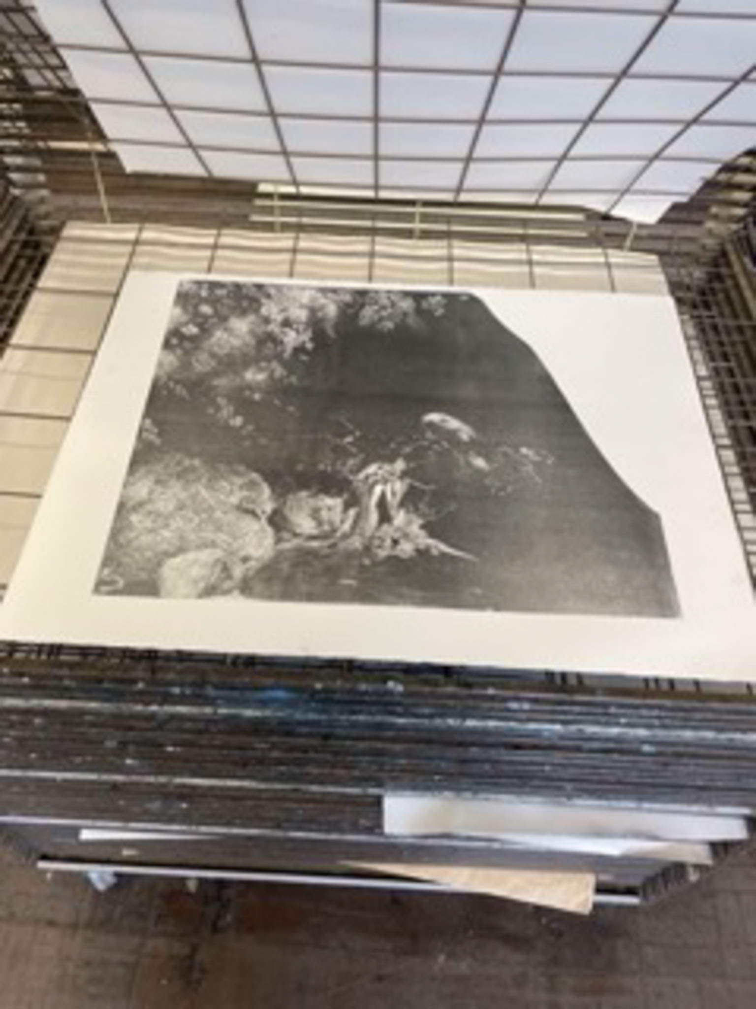
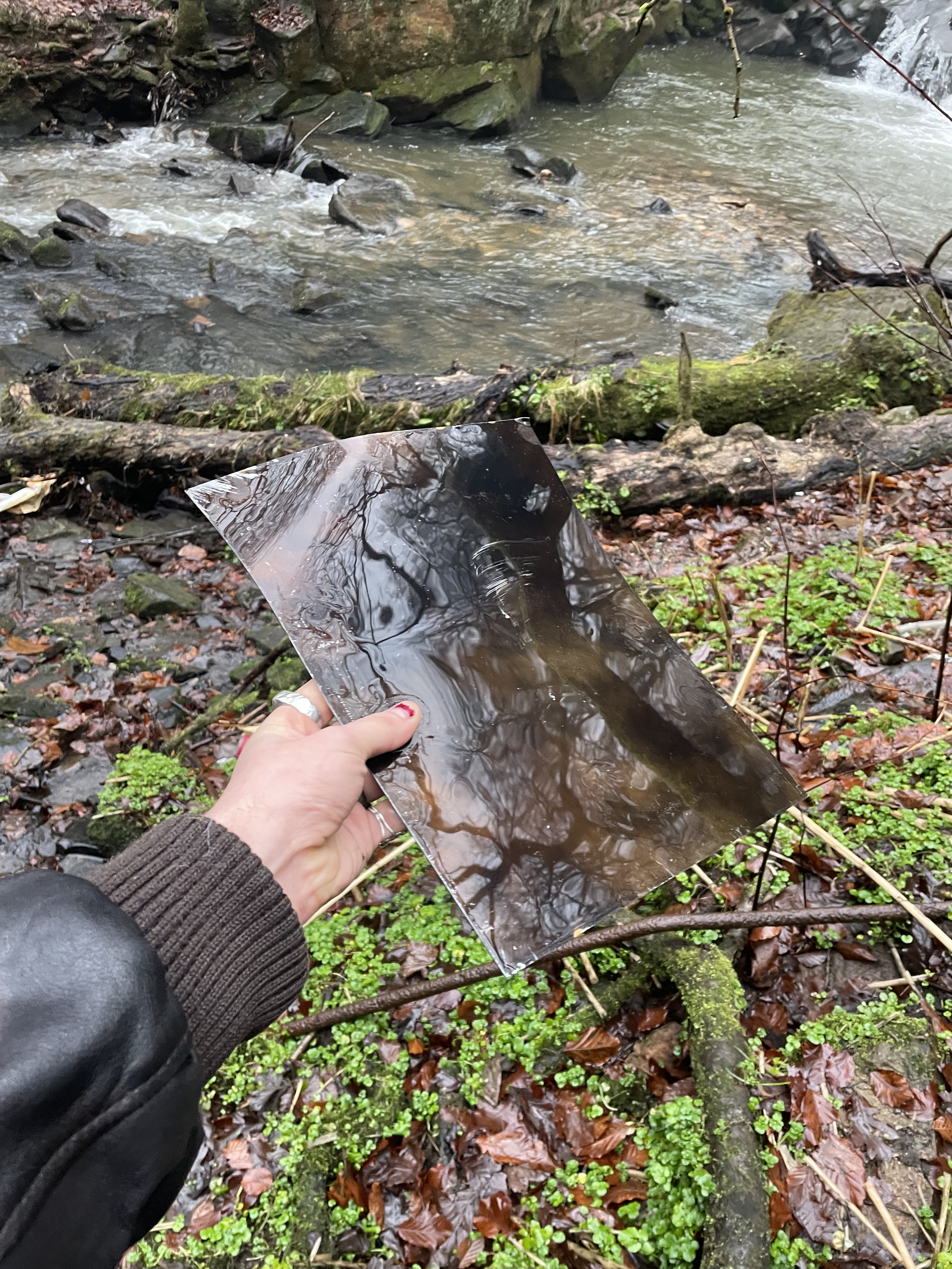
In-Situ Spitbite Experimentation- Healey Dell
I often struggle drawing in situ due to my drawing style being quite delicate and taking a long time. This process, however, felt amazing. I enjoyed every minute of being in this area of natural beauty and making work. I positioned myself within the waterfall itself, in an area that had a great view of the Owd Mill, as well as a tall stone formation that created an almost pulpit-like desk for me to work on which I found quite fitting. I loved being deafened by the rush of water and the feeling of it beating against my wellies. Water would splash onto the plate and move and dilute the acid, allowing the environment to really inform and take hold of the piece. I found myself collaborating with the setting and this really helped my thinking process; I want to create work that encompasses the power I feel when within nature, and by releasing control and letting the waterfall take control of the piece I’m allowing that power to shine through the work. I have never spit bitten copper before so I’m unsure of the quality of the print that will be produced, I’m hoping it will retain the marks I made and that it has a lot of tonal depth. After the piece is proofed, I’m not sure where to go with it, I may drypoint into the copper or create a multiplate etching with a hard ground, ultimately this will be informed by the proof.

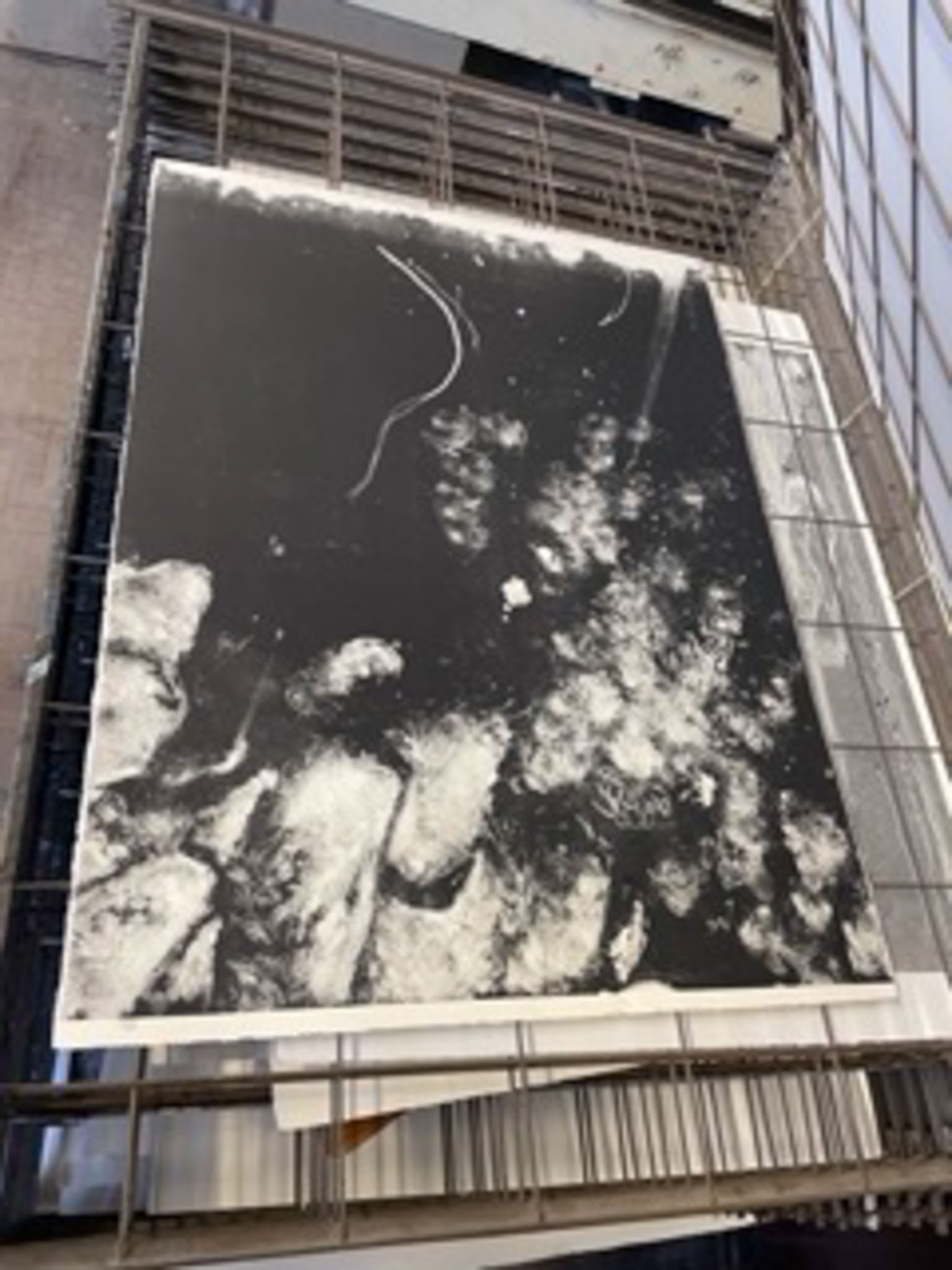
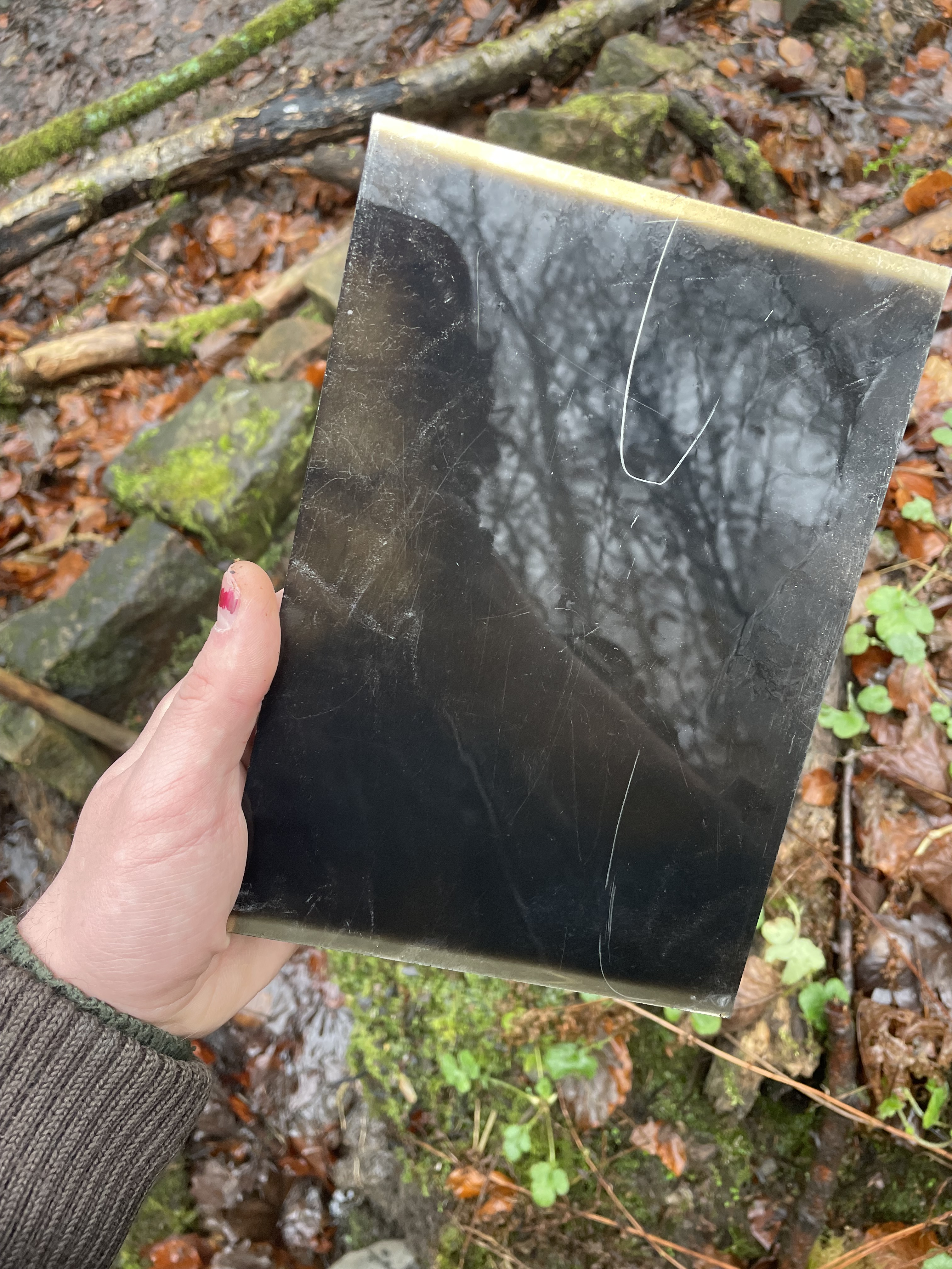
In-Situ Spitbite Printing-
I was quite disappointed after printing my plate to discover that my spitbiting hadn’t etched deeply into the copper plate at all. I felt reluctant to carry on adding more spit bite in the studio as this didn’t feel authentically ‘of the waterfall’. However, after a discussion with Brian Hodgson, I decided that due to the time limitations of the course, it wasn’t possible to wait months before taking this piece back to the waterfall to continue working on it. We also discussed that the staining on the copper itself was, in fact, drawn by the waterfall, and if I was to continue stopping out with varnish and spitbiting, following the sketch that the waterfall had provided for me, it still is, by nature, a print created by the waterfall. In an ideal world, all of this work would be created in situ, however, I was happy enough that the end result was at least informed and set into motion by nature. I got to work biting the plate in the studio, this time with undiluted nitric acid and tried my best to follow the staining on the plate. After a proof I decided to go back in again with another round of spit bite. After the third proof I was happy to leave the plate as it is for now. I’m unsure whether to leave this plate as is, or whether to carry on working on it, as I believe that every bit of studio work done to this plate takes away from it’s authenticity. I often love the plates way more than I like the final print, and I felt this especially with this piece. The red and blue staining brought on by the ferric and nitric was exceptionally beautiful, and this idea of preserving the matrix over the print is something that I took forward into my next piece of in-situ work below.


Plates Left in Situ- Healey Dell
I left a large and small plate in two different stages of the waterfalls in the Dell, The idea behind this was to let the erosive power of the swell to eat through the ground on the plates, which would later be deeply etched and printed, before dry pointing or laying another ground on top of the plate and drawing back into it. I left the plates for a total of 7 days in the waterfall, checking on them almost daily to make sure they didn’t wash away. The smaller plate didn’t realise amazing results, with a few interesting scratch marks that may etch nicely if left for a while in the acid. The larger plate, however, got washed away on the day of pickup, luckily I found it downstream snagged up on some rocks heavily battered and deformed, the ground sadly was relatively untouched but noticeably thinner and more transparent than before. I realise that it would be interesting to somehow chain a plate to a rock in the waterfall and let the swell batter it over a matter of months, I’m not entirely sure what to do with this larger plate, whether to etch it and attempt to flatten it for printing, or whether to draw more into this plate, etch it and then leave it unprinted and present a matrix alone. There’s something about the pure brute strength of the bent metal that would be a shame to get rid of.
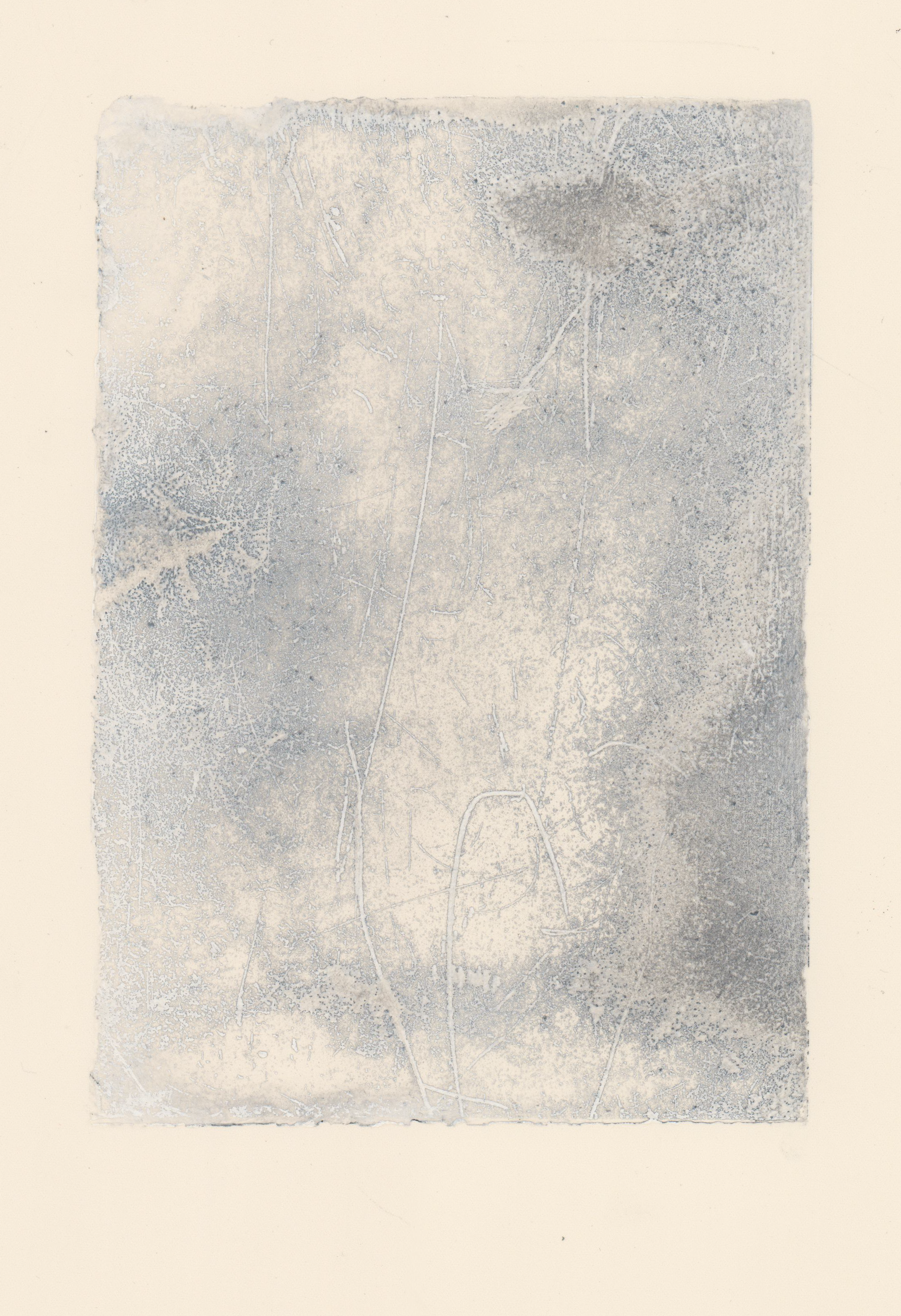
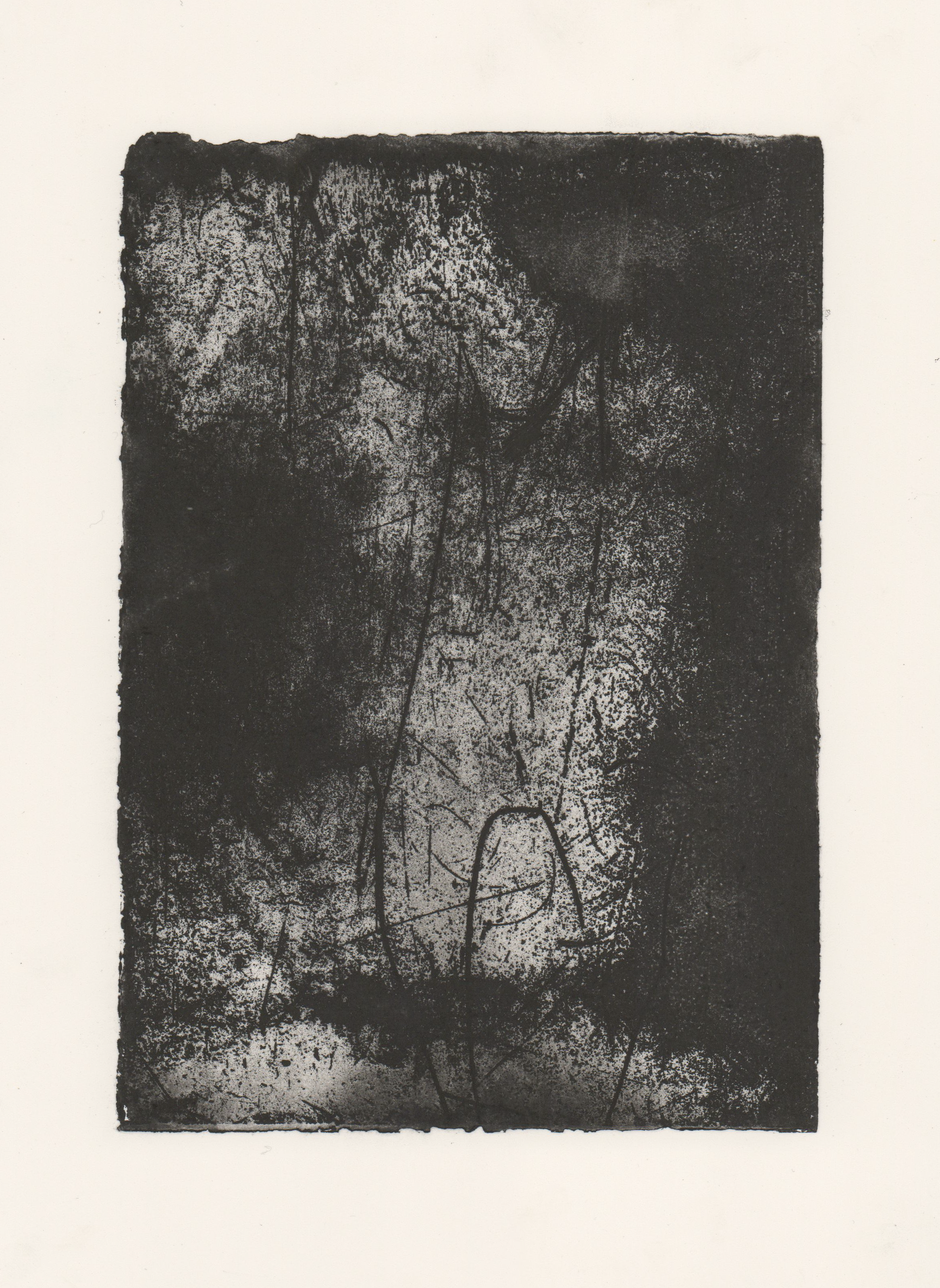
All, Etching and Waterfall on Somerset (29x21cm)
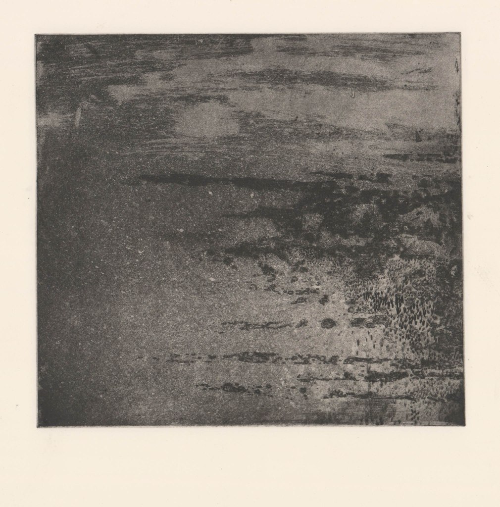
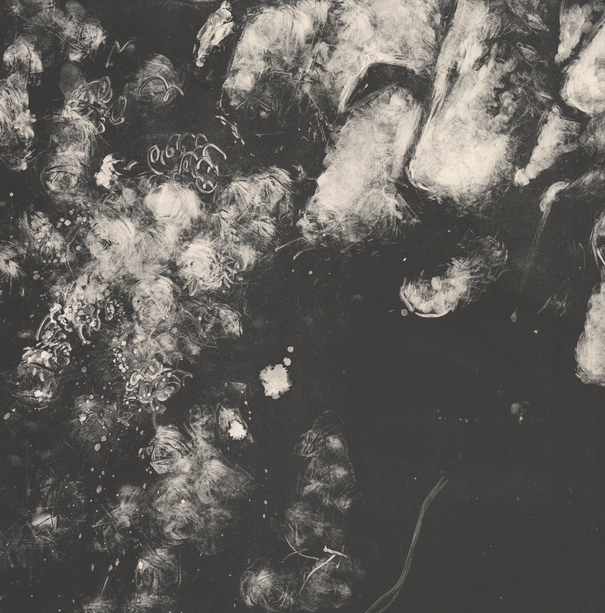
Waterfall Etched Plate One-
Although I wasn’t really that impressed with how this plate looked straight out of the waterfall, after a very long time spent in 1:4 nitric acid, I began to get really excited. The plate had this beautifully deep etched tone and cavernous etched lines within it. I got to work straight away proofing the plate in black ink. I was so amazed to see how without any human influence, the waterfall and process had revealed a beautiful abstract landscape that was really evocative of the location. it was created in. With peers I discussed what we could see starting to emerge within this plate and we all noted the skinny, wintry trees and water and soil that were all present in Healey Dell. I love that this piece breaks out of it’s confines, with deeply bitten edges.
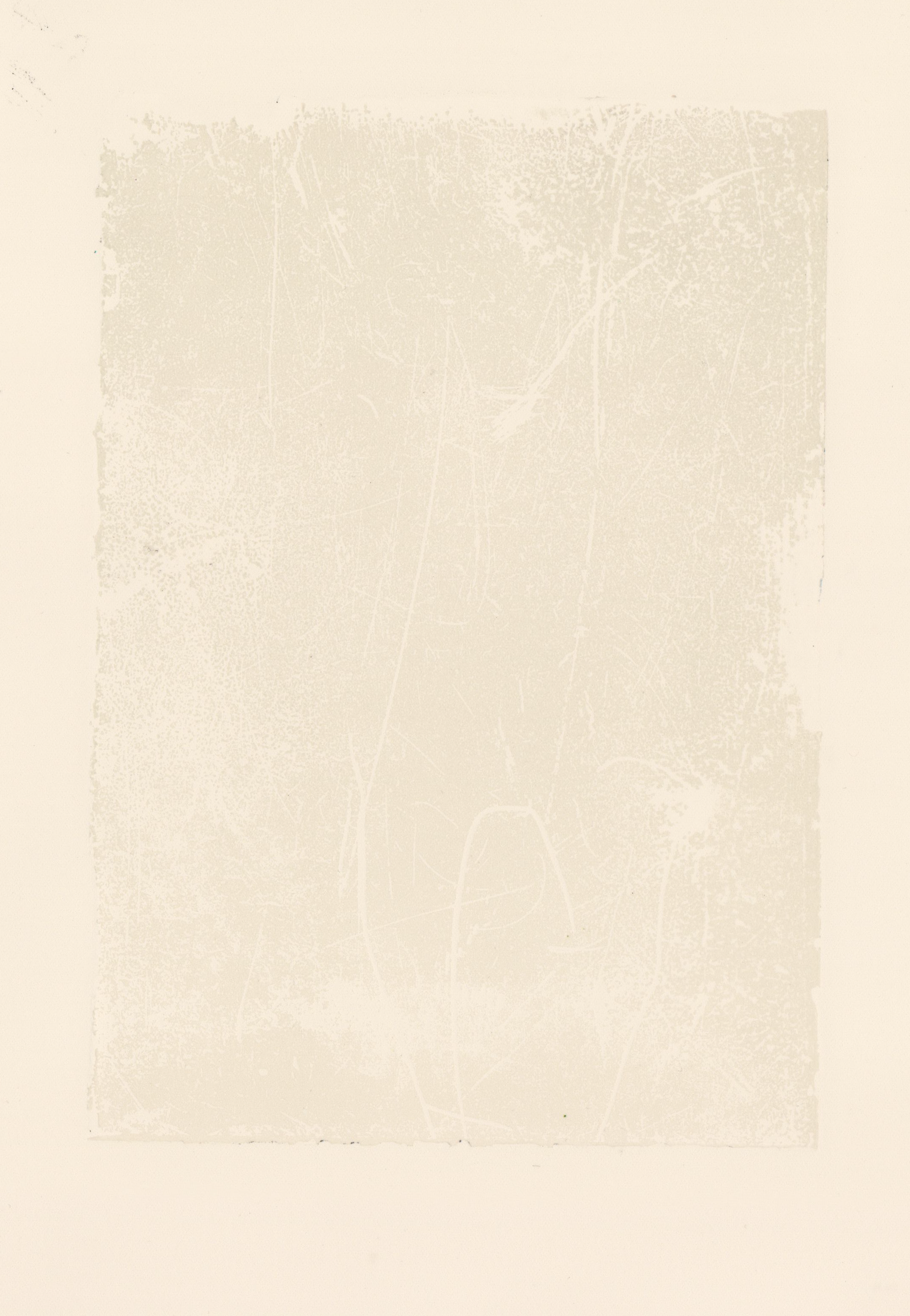
I then decided to experiment with some different colours, after repeatedly cleaning and printing the black ink out of the plate I inked up with white intaglio ink and really started to see this almost sculptural emboss in the paper. This print just seemed to become more and more alive with every reiteration. I was also really impressed with the discolouration of the white ink brought on by the oxidisation of the zinc plate, giving this icy slate grey colouration to the image. In this process I’ve really loved releasing control and allowing nature, process and material take the wheel. My practice has always been so meticulously detailed and obsessive that I never thought I’d be able to dabble in more abstract experimentation, but by completely releasing control and working with whatever nature gives me, I think I’ve found something really interesting. The work doesn’t feel so much as artwork anymore and instead like bottling lightning, trying to catch these fragments of nature and stilling them forever.
The final experimentation I have enacted with this plate so far is some relief rolled embossing. The emboss seemed really exciting with the last white prints so it felt right to just try and capture that alone. I used relief extender and the most minuscule amount of Prussian Blue intaglio ink and rolled a very thin layer over the top of the plate before printing on soft white Somerset paper. This results in the most delicate and subtle prints that just slightly highlight the emboss. I love the chameleonic nature of these prints as they are so changeable based on light. In direct sunlight the emboss is really strong, but then in darker light or artificial light they’re barely visible. These pieces have really made me think about how to present work like this. I’ve begun thinking much more about where they’re printed on the paper and what weight this gives them, as well as how they’re cropped down, are they a fragment of a moment or a closed and bordered example of it? I can’t wait to exhume my other plates that are currently buried in-situ to see what they hold!


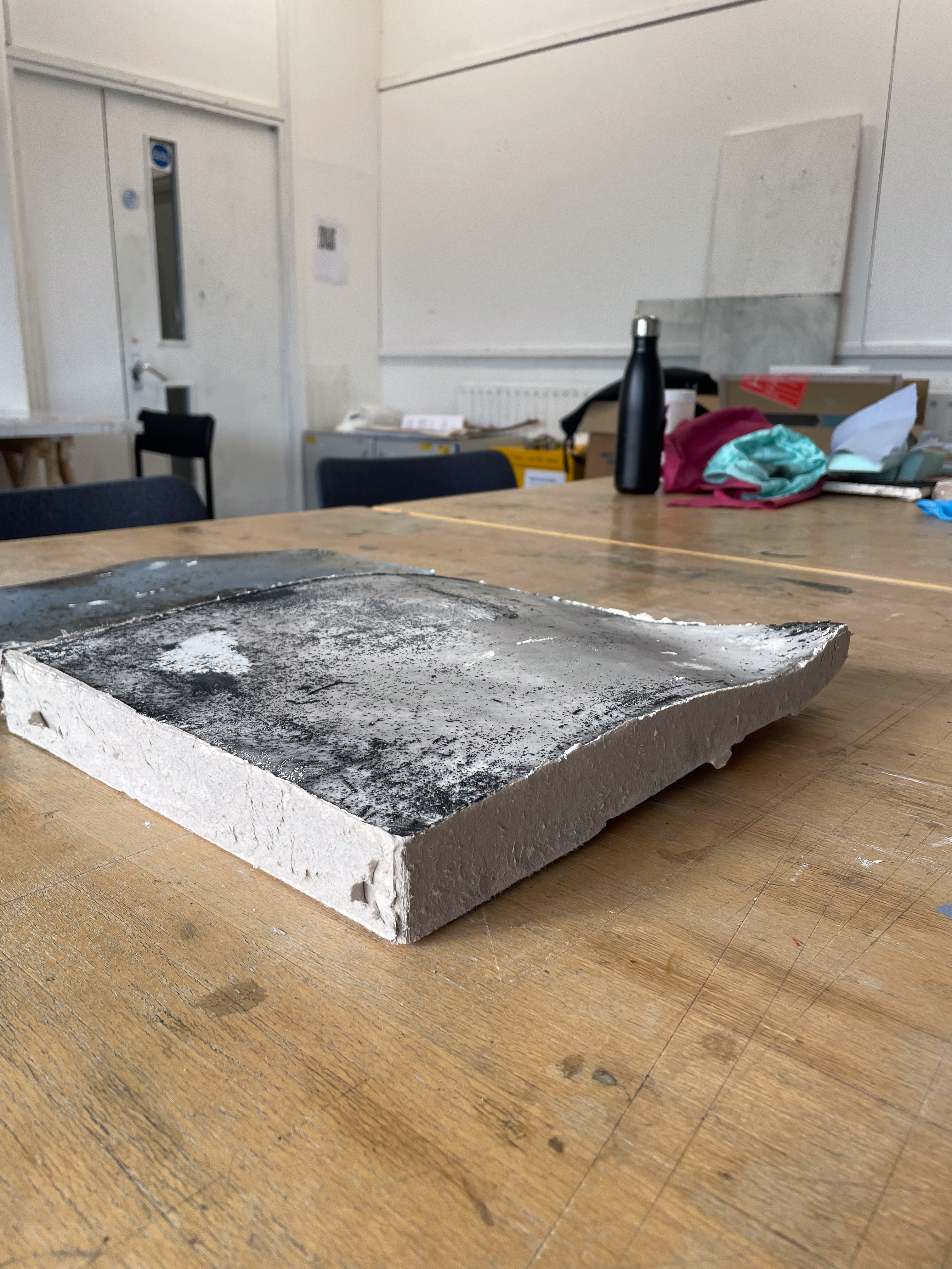

Cast Etching in Plaster (4×37.5x27cm)
Waterfall-Formed Plate Casting-
After the spit bite experimentation I decided that preserving the individuality and state of the matrix was really important to me, after etching this plate very deeply I could have put it through the press and flattened it to take a print, however, it felt much more important to preserve it. The almost sculptural emboss of my other waterfall plate led me to casting this one in plaster. I created a cardboard box to pour plaster into and created the casting above. There is a physicality in solidifying an abstract and non-corporeal action, in this case the power of a waterfall, in heavy and solid plaster that is really interesting. The form that this piece takes on is almost religious, like an ancient stone tablet, inscribed with esoteric and cosmic runes, however, I want these pieces to reflect the boundless nature of what I’m trying to capture and the rectangular form doesn’t really reflect this, perhaps if this piece was smashed and then took on the form of a fragment, this would be reflected more. I will explore this much further in Unit 2.


Drawing and Platemaking on the Stiffkey Marshes-
The Stiffkey Marshes hold a special place in my heart, a liminal space between the havens of the forest and field, and the terror of the harsh, unrelenting North Sea. Despite the beautiful sunny skies in the photos, there was a high, biting wind over the weekend we spent here and it was a massive struggle to sit and draw on the plates. I pushed through this struggle over a couple of days and began to realise the more sparse and frantic line quality of the drawings I made. I was feeling the ‘interference’ of nature, the atmospheric qualities, invisible to the naked eye that build mood- see the shafts of light piercing through Rembrandt’s trees. I made a small dry point etching and another small hard ground plate. I also buried a plate deep into the mud next to Cabbage Creek. The Stiffkey mud is renowned for its dark blue-black hue, it’s oily and sticky and has stained the local cockles along a small stretch blue. These cockles are affectionately known as Stewkey Blues. I chose a secure spot that is washed by the sea daily, my zinc plate essentially assumes the role of the Stewkey Blue, or the Samphire. Being nourished and touched by the minerals and salts of the sea, and the embrace of the mud. I hope and pray that this plate is still there when I go back and I believe I will receive the best results from it. The plate was buried on the 16/12/2024 and I plan to pick it up sometime around the end of January. It’s exciting to be away from the plates as they become their own entities free from my influence. I Have no control over what happens to them, or even if they’ll be there when I go back for them.


Reductive Monoprint on Somerset (49.5x60cm)
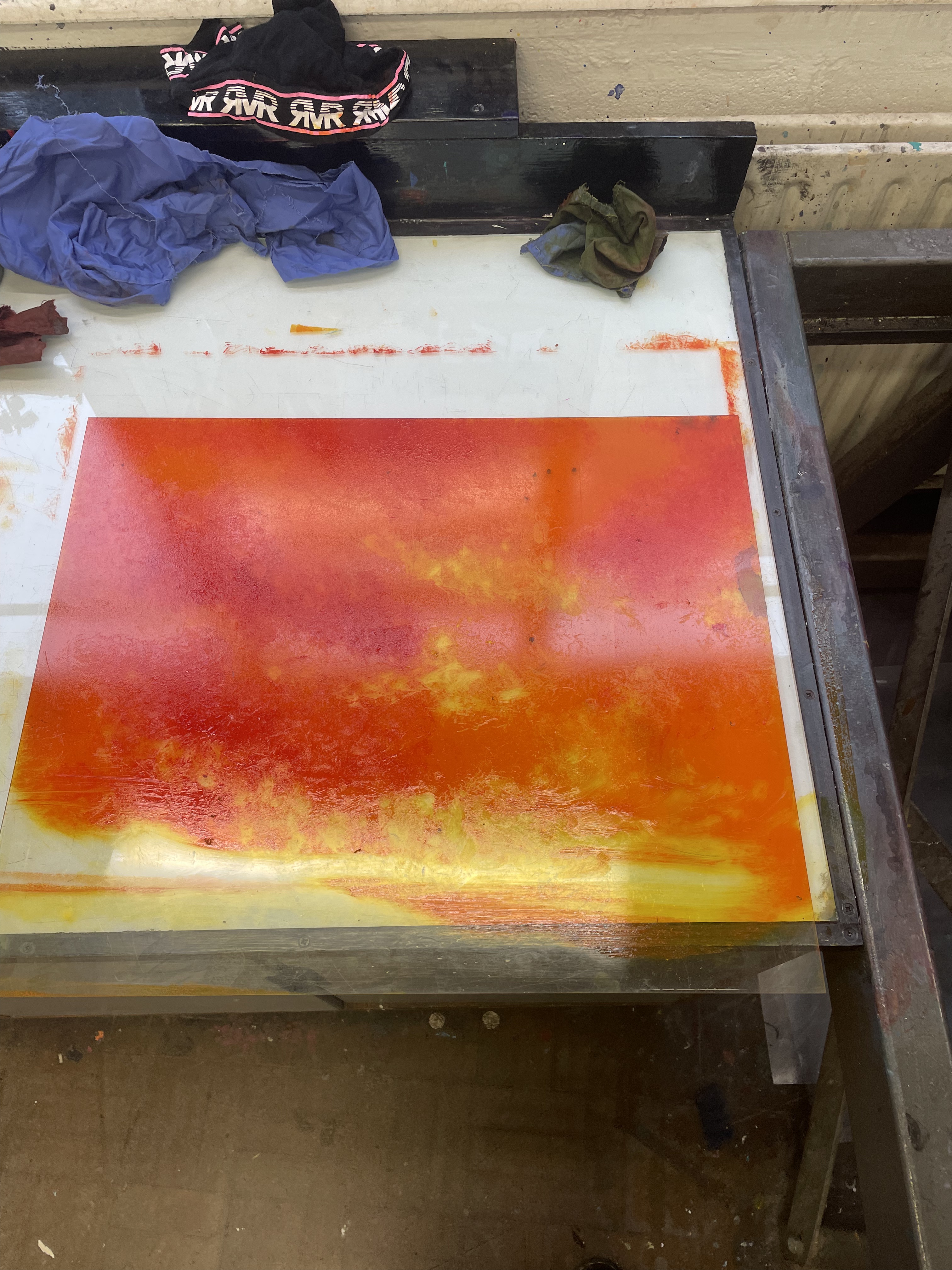
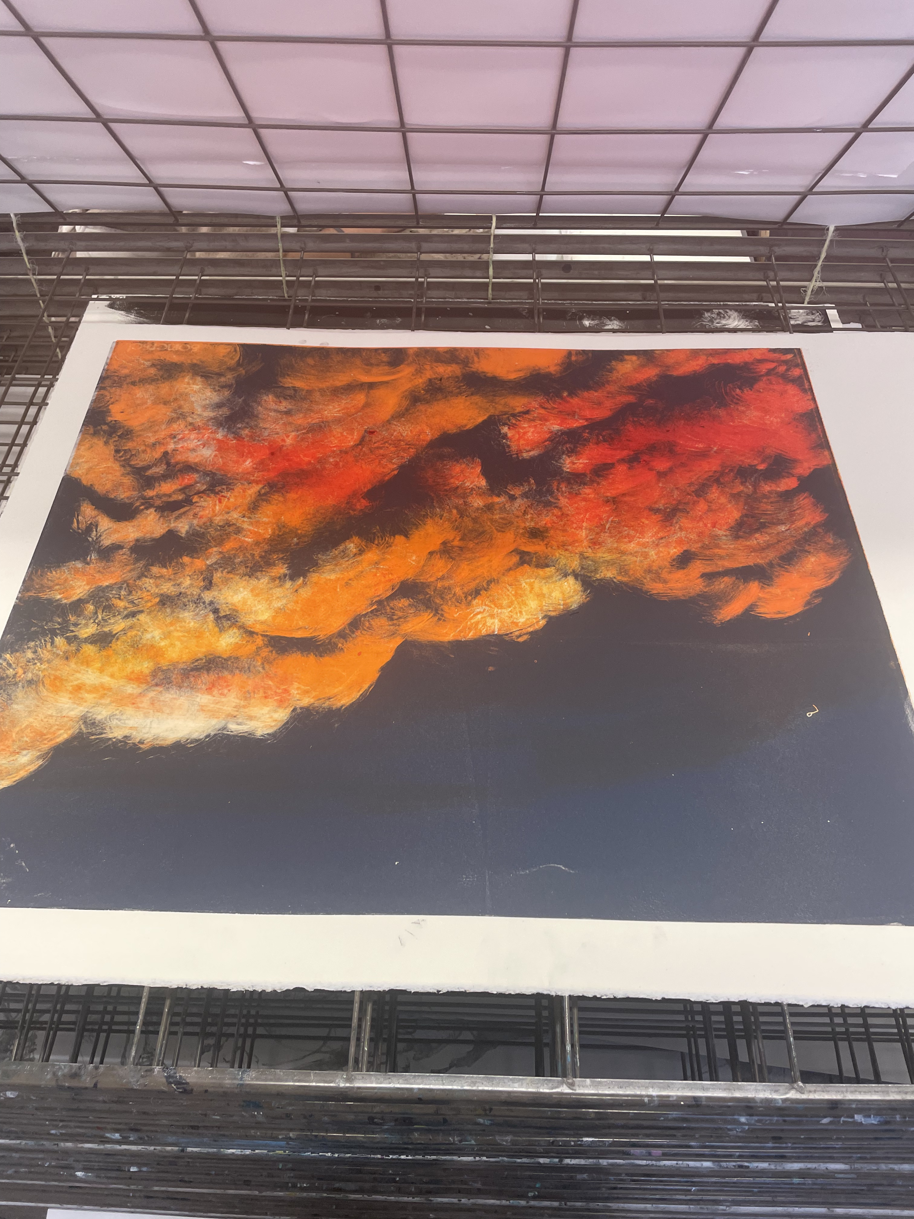
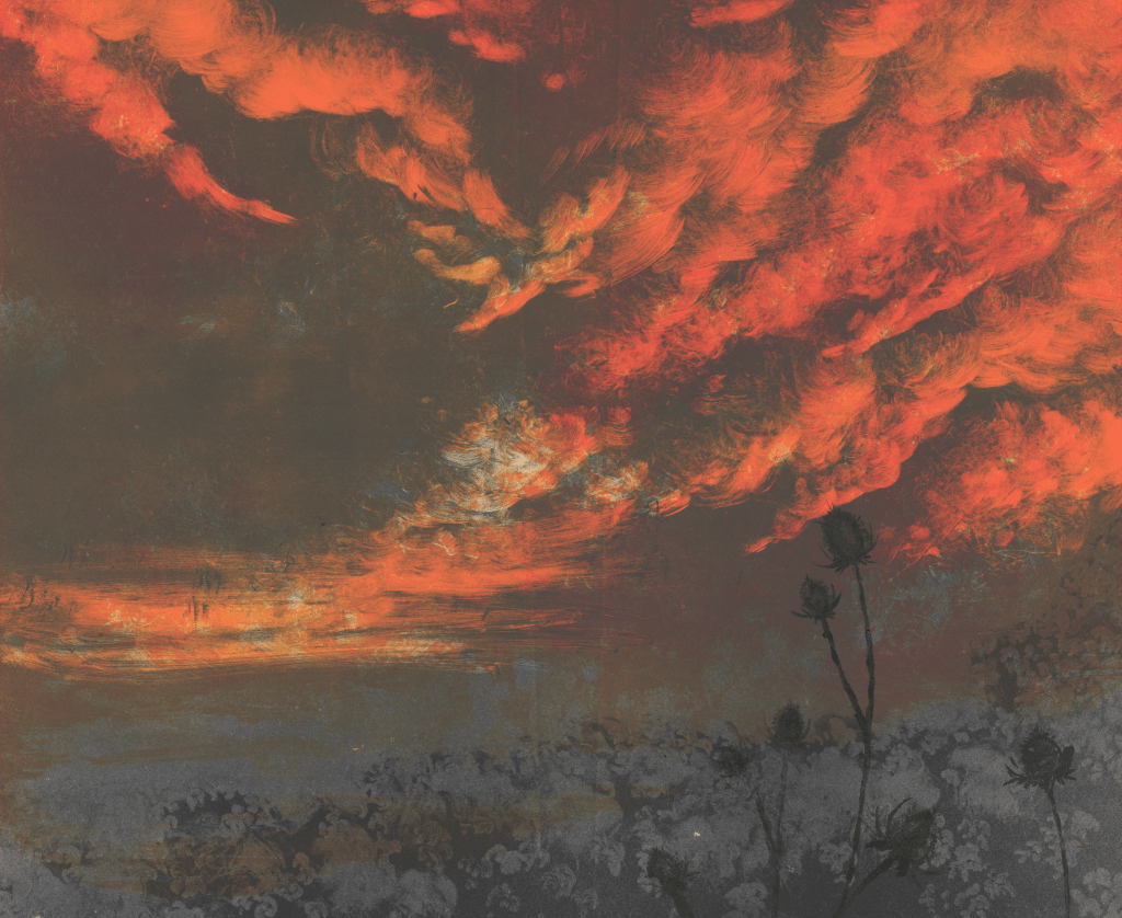
Experiments in Colour Monoprint-
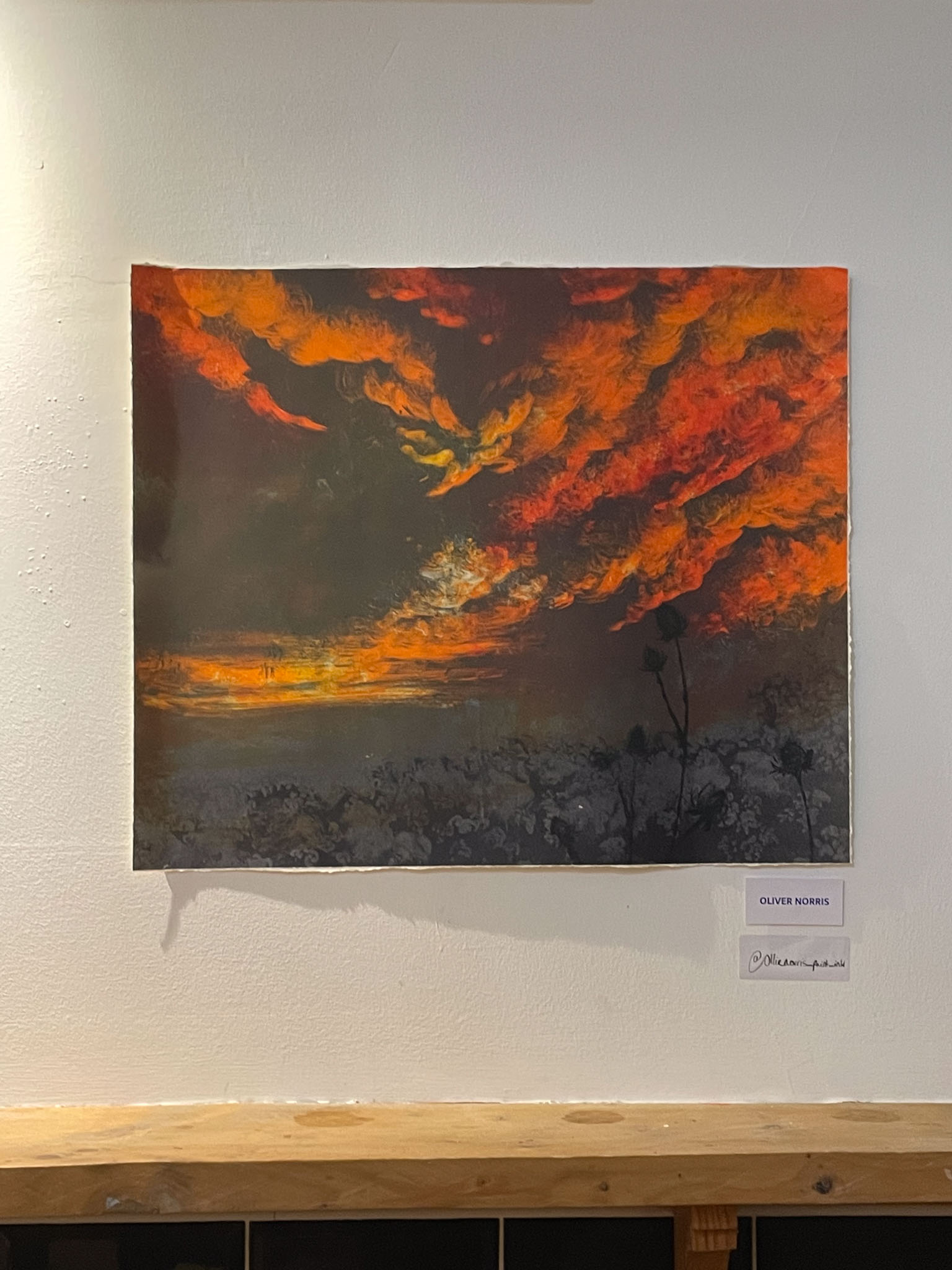
I’ve always remembered the incredible lightshows that happen in the Norfolk skies. I was lucky enough to see one on the evening we got the train back to London. I don’t usually venture much into colour, but after my first mono print, and with a lot of inspiration from seeing the fantastic Tacita Dean’s cloud screen prints at the Kip Gresham exhibition at Eames Fine Art, I had an idea for how I’d make a nice marshland sky. I rolled up and printed the colours in layers. This feels like a much more accessible way of using colours, I find that it makes more sense in my head than painting with multiple colours at once. This was also a really exciting experiment in pushing the mono print further, allowing the interplay between layered transparencies of colour to really shine through and create this completely organic and natural dappled sky. I went into these pieces with no reference except the views of the marshes in my head and thus the layered approach was really fundamental in the genesis of these images. I loved the finalised first image with the teasel blowing in the wind but have found that subsequent moody skyscapes feel formulaic. There is definitely something here to be pushed and I’m excited to use these layered techniques to create complex landscapes.
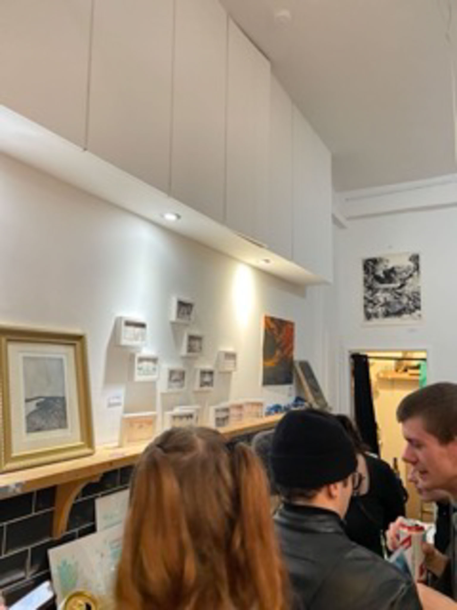
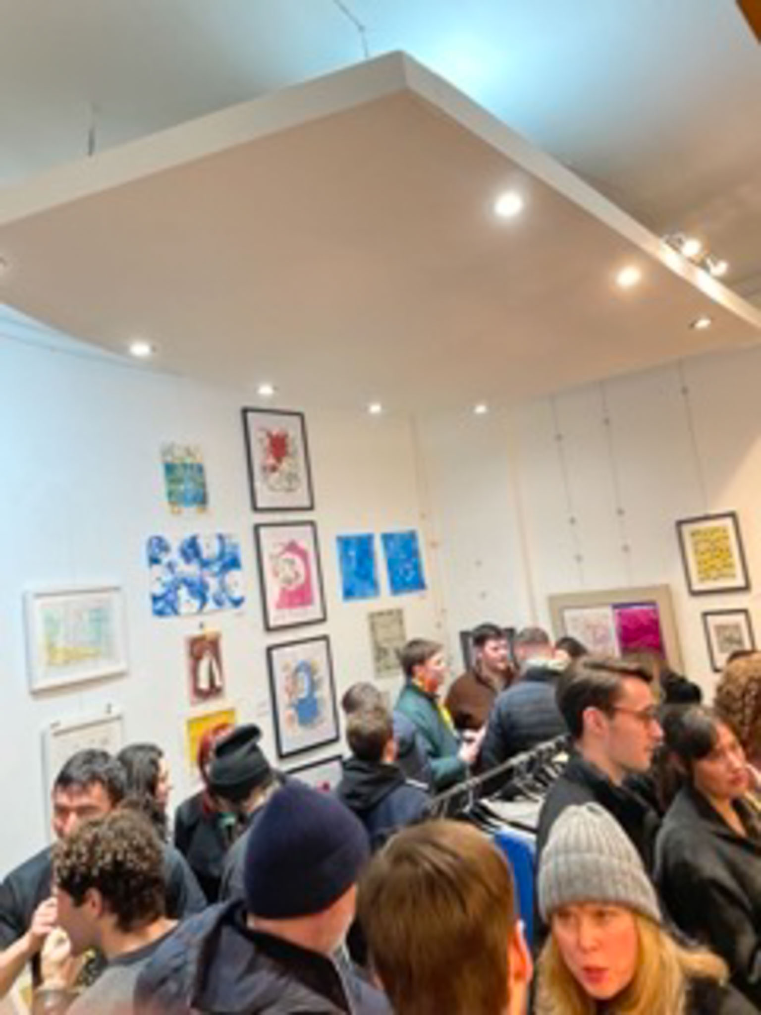
Unpressed Exhibition-
I was very lucky to have a good friend, Sarah Tuk, reach out to me and offer me a place in her group exhibition, focusing on experimental print processes. I chose to present three pieces, ‘Katie’- etching, ‘The Stewkey Blues’- reductive mono print, and ‘Th’Owd Mill I’Thrutch’- reductive mono print. It was really nice to be placed within a very diverse range of really beautiful print. It was also really good to situate some of my older work and newer experimentations together and gain feedback from them. It seemed clear to me that people much preferred the larger scale and more emotive mono prints than the smaller, more calculated and clinical etchings.
Further Monoprint Landscape Experimentation-
I chose to create more mono print marshscapes, these ones are made with slightly blue/black ink and this was in order to go back into them with more layers of a deeper black, or even to layer with trace-through mono print or multiplate drypoint or grounded etchings over the top. Although I love these mono print pieces because of their expressive softness, I now think that I need to go back and add some form of harder line or detail to go into them. I’m looking forward to revisiting these in Unit 2.

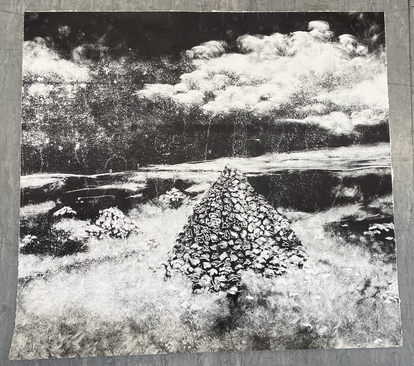
Reductive Monoprint (75x80cm)
Original Plate size before crop (84x119cm)
Large-Scale Monoprint Experimentation-
My favourite part in working with mono print is the impressive scale that the method demands, the marks I want to create with these prints feel like they want to be made at a larger scale. This is really lovely as I feel it breaks me out of my minutely detailed much smaller scale etchings. My friend Boris had found a huge sheet of perspex at uni that he was going to drypoint into, he very kindly allowed me to first create a mono print with the surface before he made his own piece on it. I didn’t really consider printing the piece and just thought I’d make the drawing and deal with that aspect later. The subject matter is the top of Brown Wardle hill, situated not far from my house in Rossendale. This hill can be seen from almost anywhere in the valley, and as such stands as this omniscient presence in my village of Whitworth. Brown Wardle is also home to one of the largest discoveries of Mesolithic and Neolithic flint scatterings, making it an archaeological wonder, there are also many standing stones and ley lines that intersect the hill. It boasts stories of witches in wells, apothecaries and herbalists lived nearby and collected their reagents for tinctures and potions around the hill’s base, as well as the ‘Limer’s Gate’ an ancient and important pack-horse route that passed through. I was especially interested in the ruins of the famine towers, however. Built during the Lancashire Cotton Famine (1861–1865), the towers were over 20 feet tall and were left to be destroyed by the harsh biting winds and rain of the Pennines. This is important to me as when we were younger, me and my friends used to scale Brown Wardle on warm summer’s days to get a view of Oldham and Manchester far in the distance. This place was so important to us that when my good friend Isobel’s mother died of cancer, we scaled the hill once more and scattered some of her ashes in the cairns created by the wrecked famine towers. Depicted in the image is the stone cairn, standing sentinel against the Pennines, where Tracey’s ashes were scattered. It’s a shame that the only press I could fit this plate in really didn’t want to print an image this large, and led to lots of dead pressure spots in the print, as well as destroying the horizontal edges of the print, meaning that the image, while still way too big to fit in the largest scanner at Camberwell, is a lot smaller than intended. I still think there is some merit in this piece, the grain created by the dead pressure spots almost feels like dust or grain on the lens of an old film camera. I don’t think I’ll attempt a monoprint this big again, and if I do I will definitely hand burnish it on some thinner paper, however I’m happy that I attempted to push the boundary of scale as far as I physically can.
What’s Next?
In Unit 2, I want to continue to develop my in-situ work and carry on burying and exposing plates to the elements, I think this is where my most interesting work in this unit lies. I would also like to keep on pushing my mono print pieces, I believe that there’s something more in these images to discover, I have plans to create large scale multiplate mono prints as I believe that I’ve lost my obsessive detail. I think that there’s really something to be done to combine all of my methods of working and turn them into succinct pieces that feel like me. I also want to think more about how my pieces are presented, what paper have I chosen? where is the image located on the paper itself? I’d like to perhaps even utilise some ambient soundscapes and experimental musical accompaniments to make viewing my work an all-encompassing experience.
