
Millbank Tower first Draft of Installation
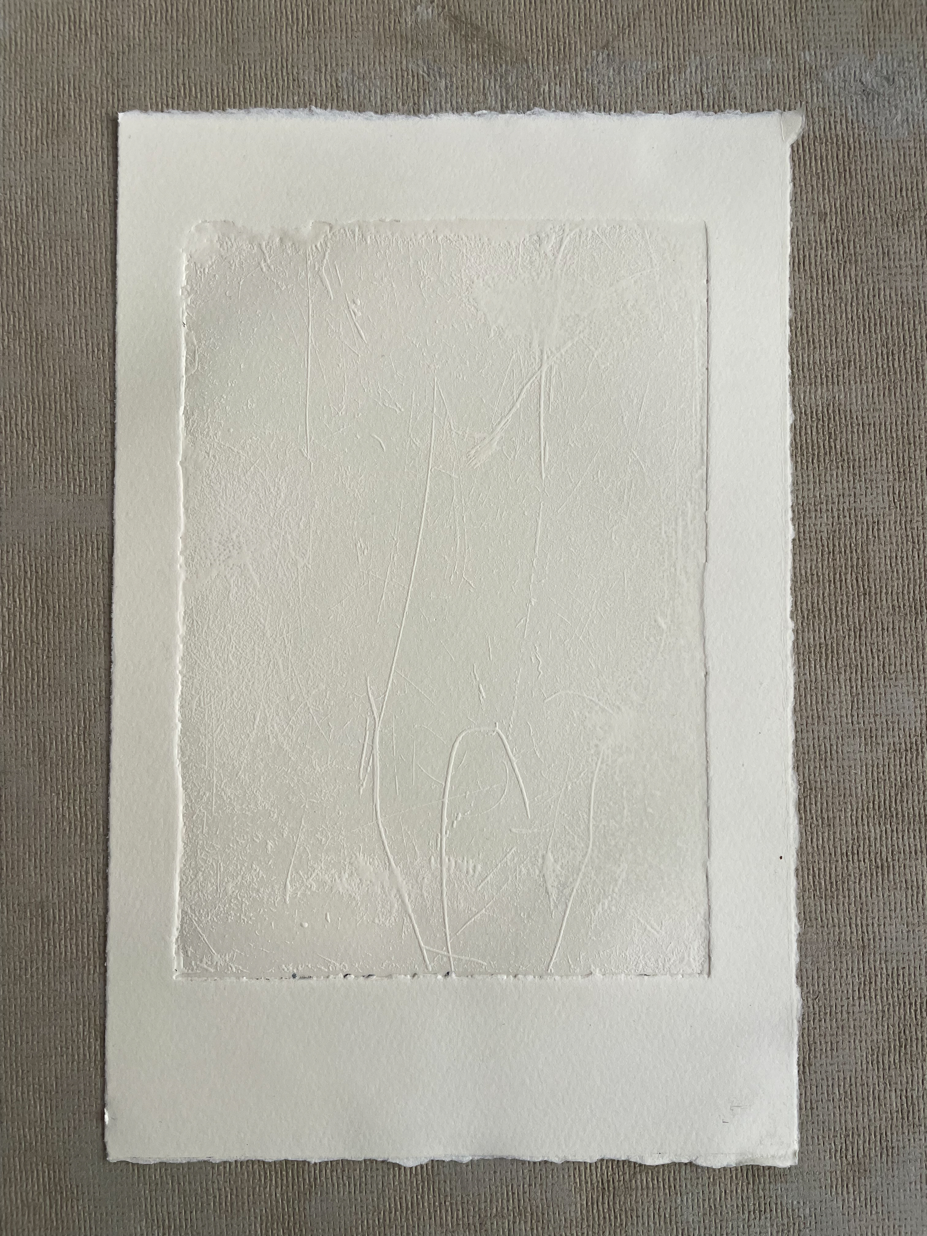
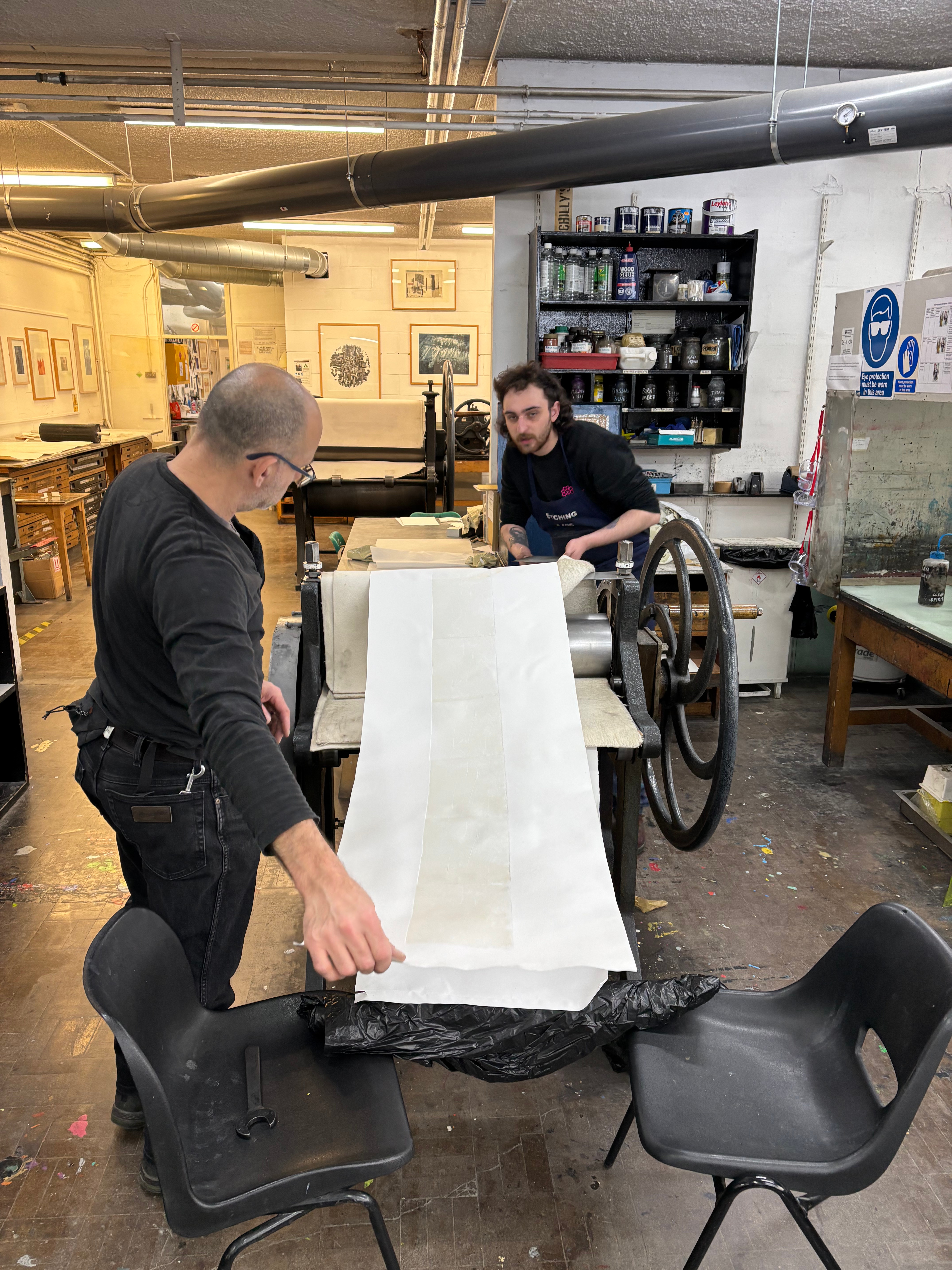
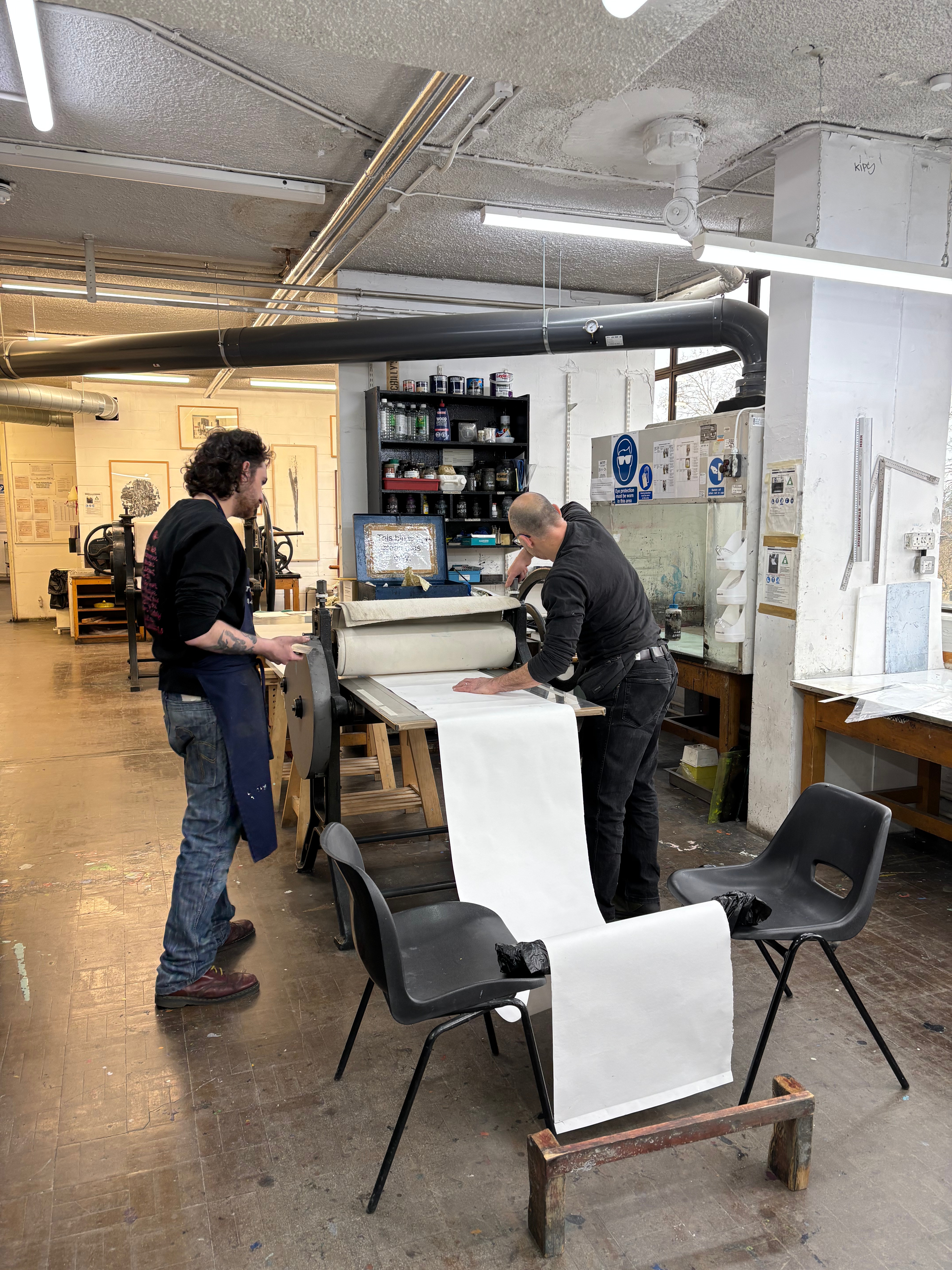
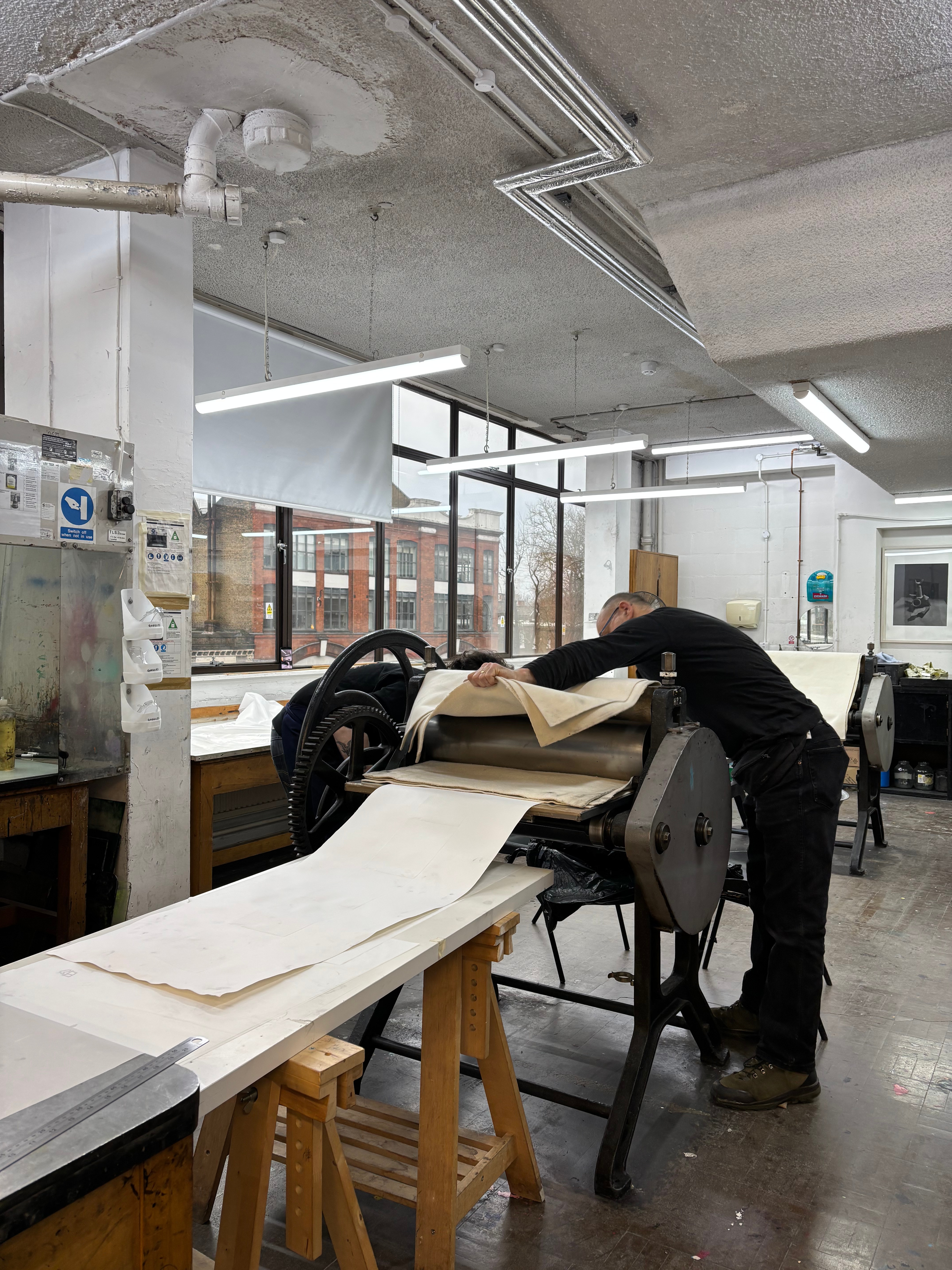
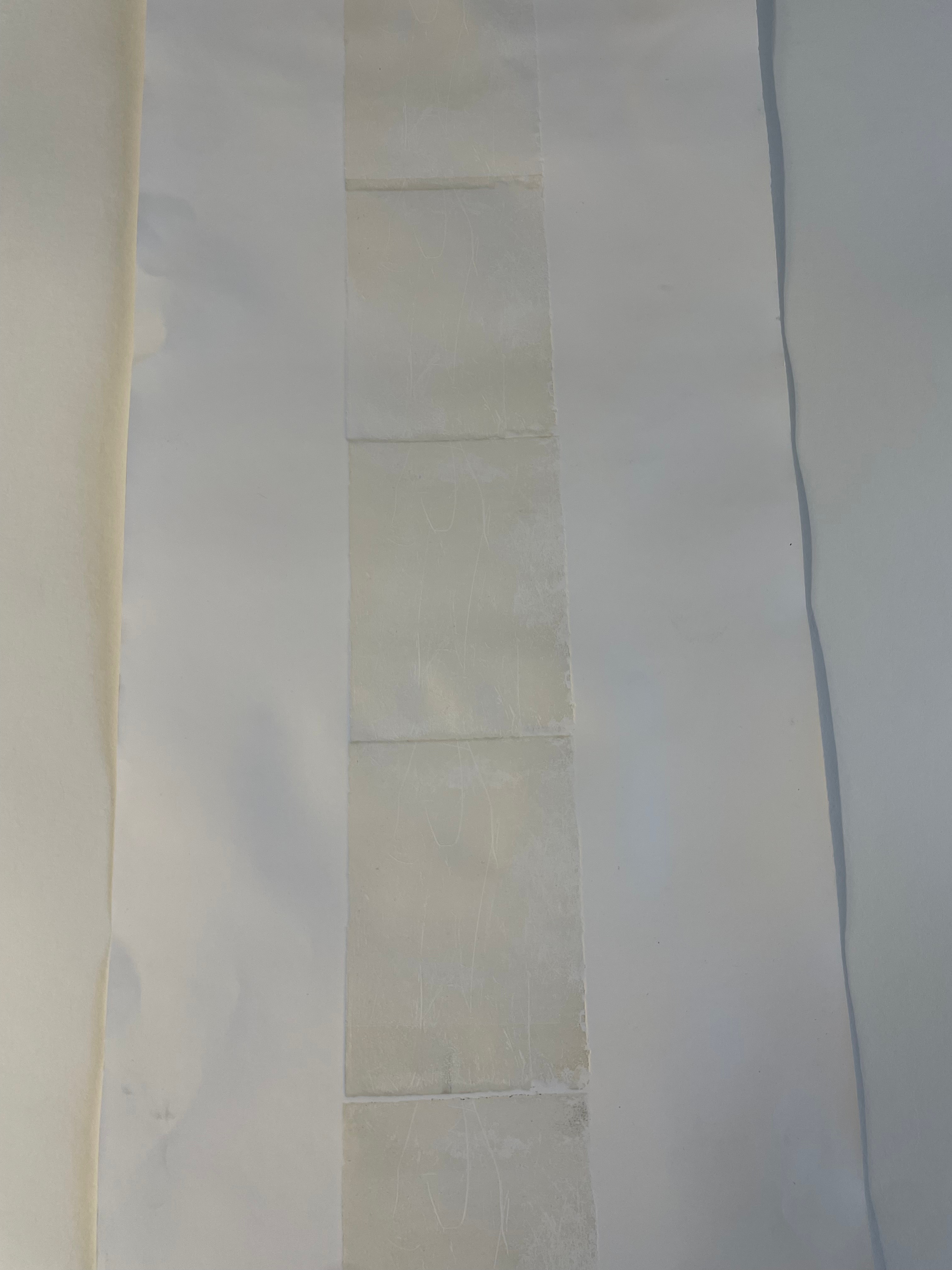
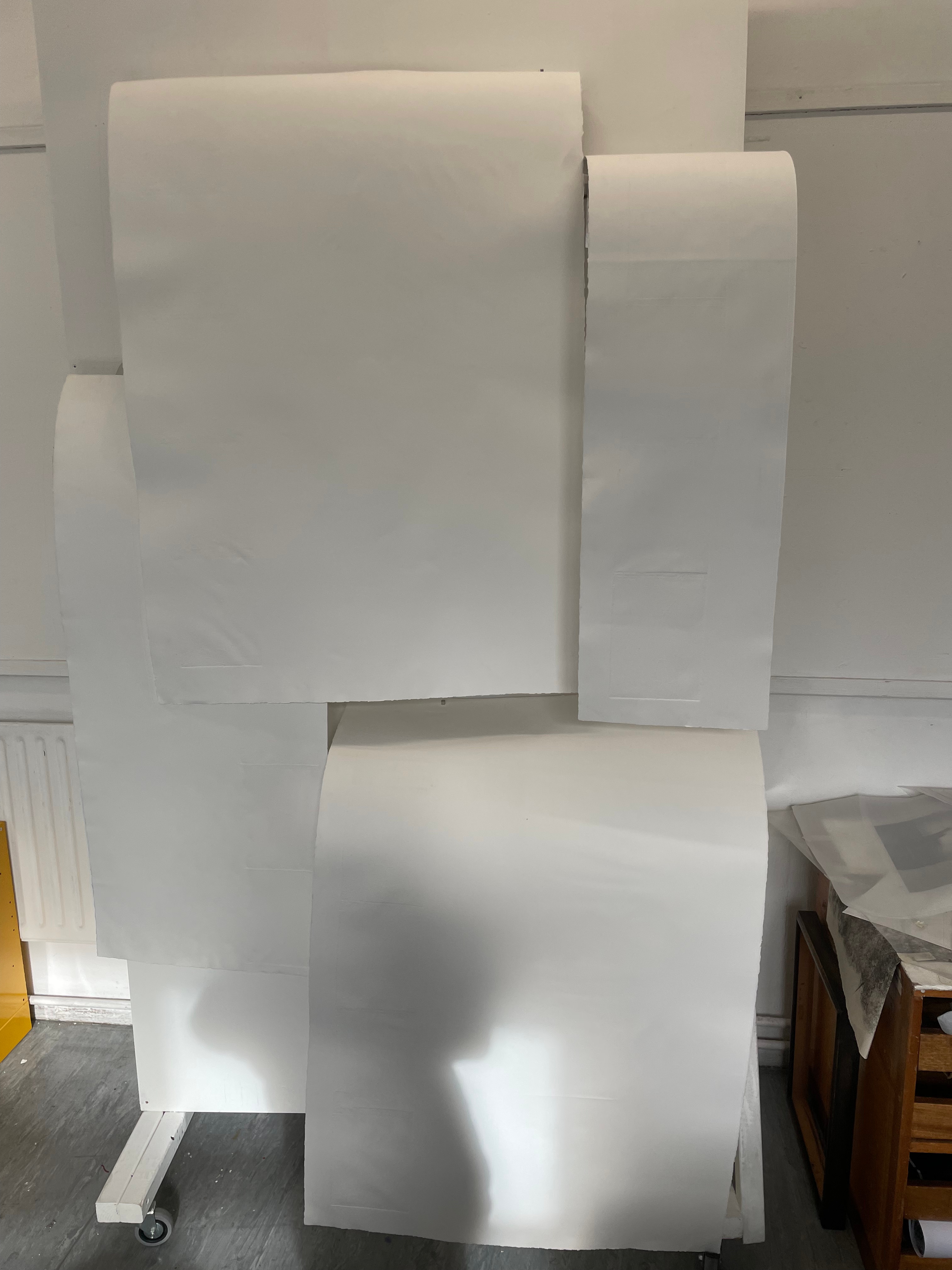
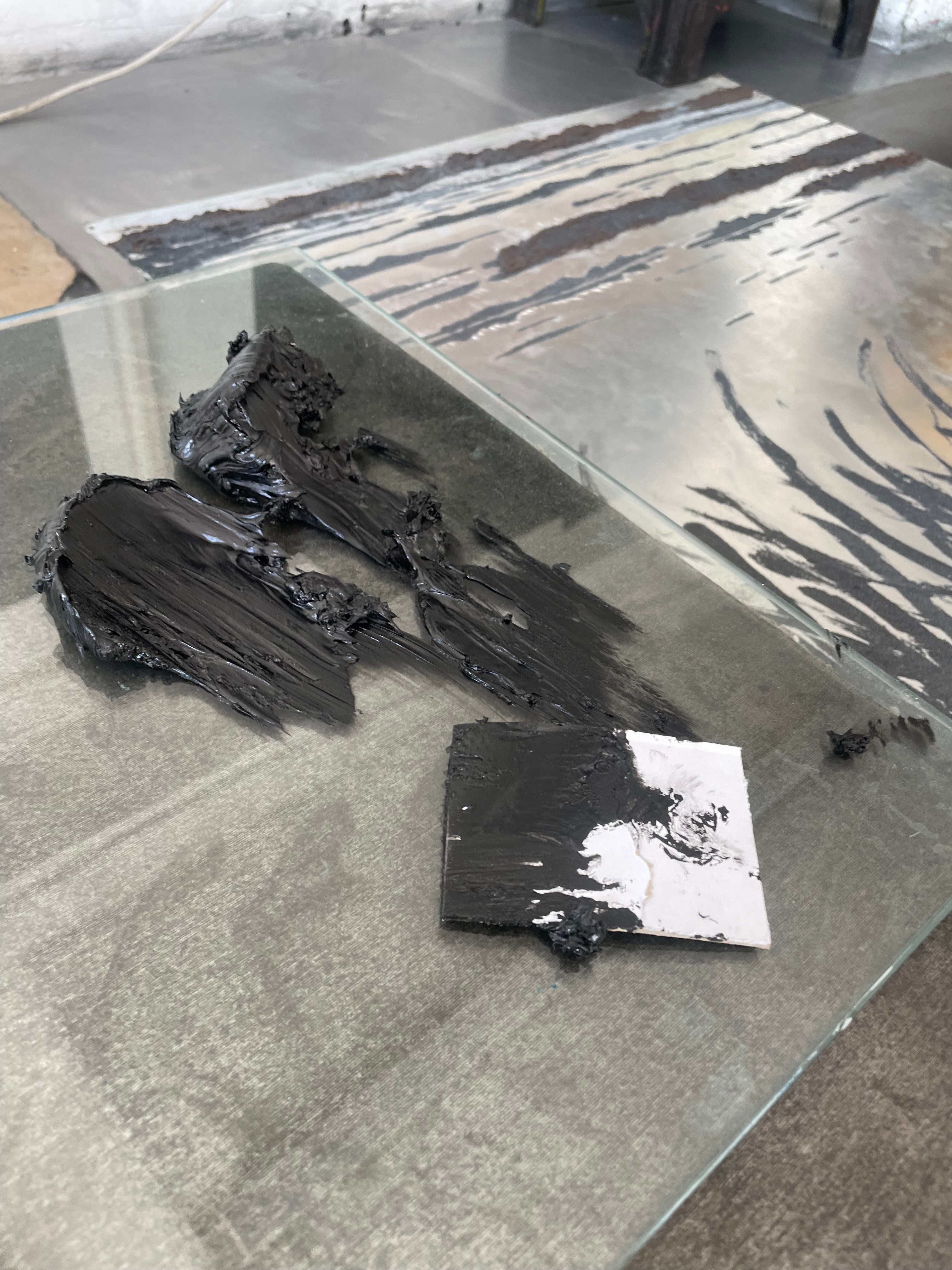
For the Millbank Project, I decided I wanted to create an installation to really push myself and experiment with form. As this exhibition was only on for a few hours in one evening, it felt the perfect chance to go a little bit wild and make something more interesting than a piece simply hung on the wall. I decided I wanted to emulate the flow of the waterfall in the form of the print, so I took one of my waterfall plates and repeated it on a very long sheet of paper. In an ideal world with unlimited time, I would have left a few very long plates to infuse in the waterfall and taken long uninterrupted impressions of them, however, due to time constraints and practicalities of visiting the waterfall again I had to settle on repeating one of my previous plates. I chose to give the plates a very subtle relief roll to really accentuate the lovely emboss. I didn’t think that repeating a plate on a very long piece of paper would be that difficult but I was instantly proven wrong. The first attempt in printing this piece was a disaster. The longest roll of paper I could find was some form of cartridge that just didn’t give a very nice emboss. It also creased very easily. We decided to print this piece on a Hunter Penrose press as it had a sprung roller that could be lifted, we put the paper and plate through the press, lifted the roller, pulled the bed back, rerolled the plate and then pulled the roller back down and sent it back through the press again. This method really didn’t help the state of the paper as it was being constantly wetted, rewetted and handled. I knew that this piece wouldn’t look fantastic on location at the Millbank, and also was having second thoughts on the form. Originally, I was going to suspend the plate from the ceiling and have it draped over a metal frame, to give an impression of the water’s action over a rock, but I knew I needed to do something a bit more evocative of the waterfall.


Millbank Show- Further Testing and Revisions to Installation
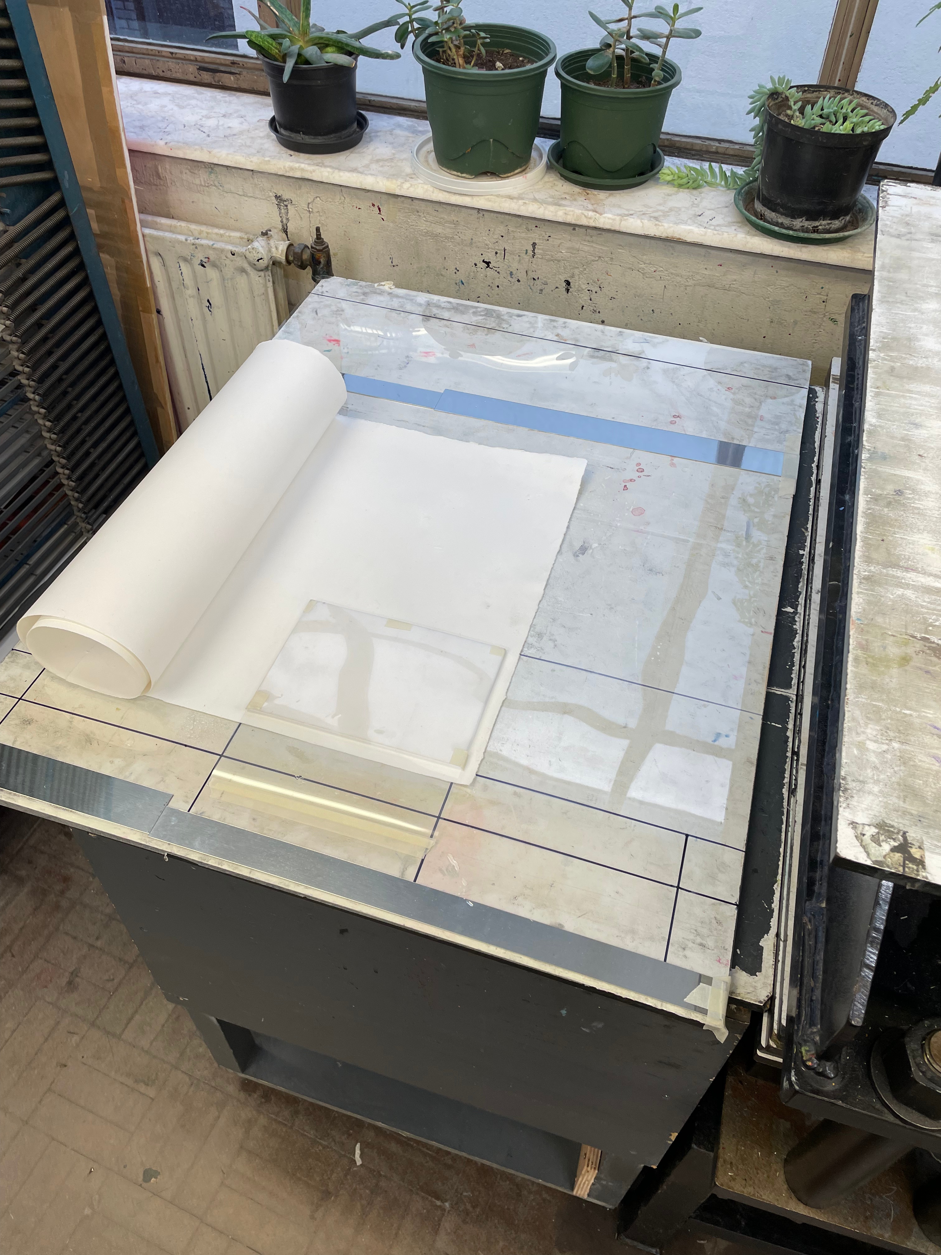
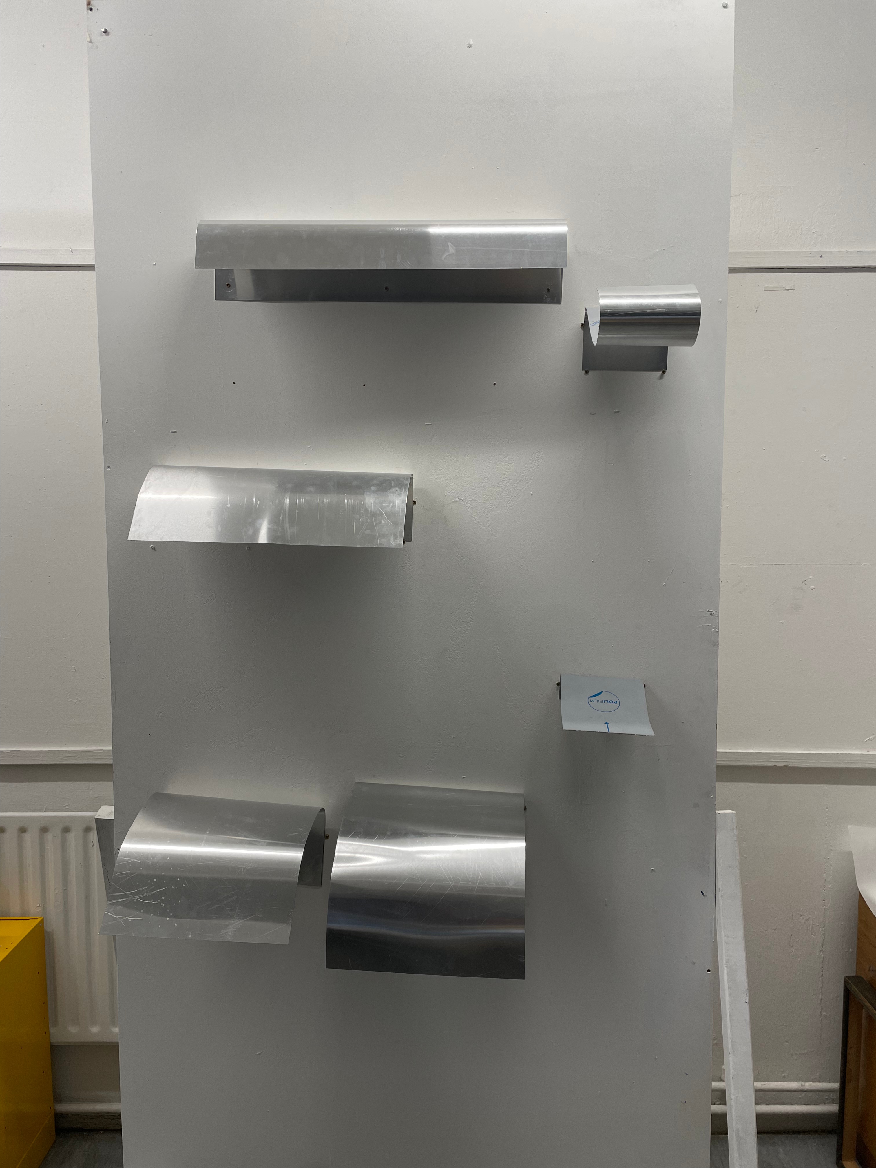
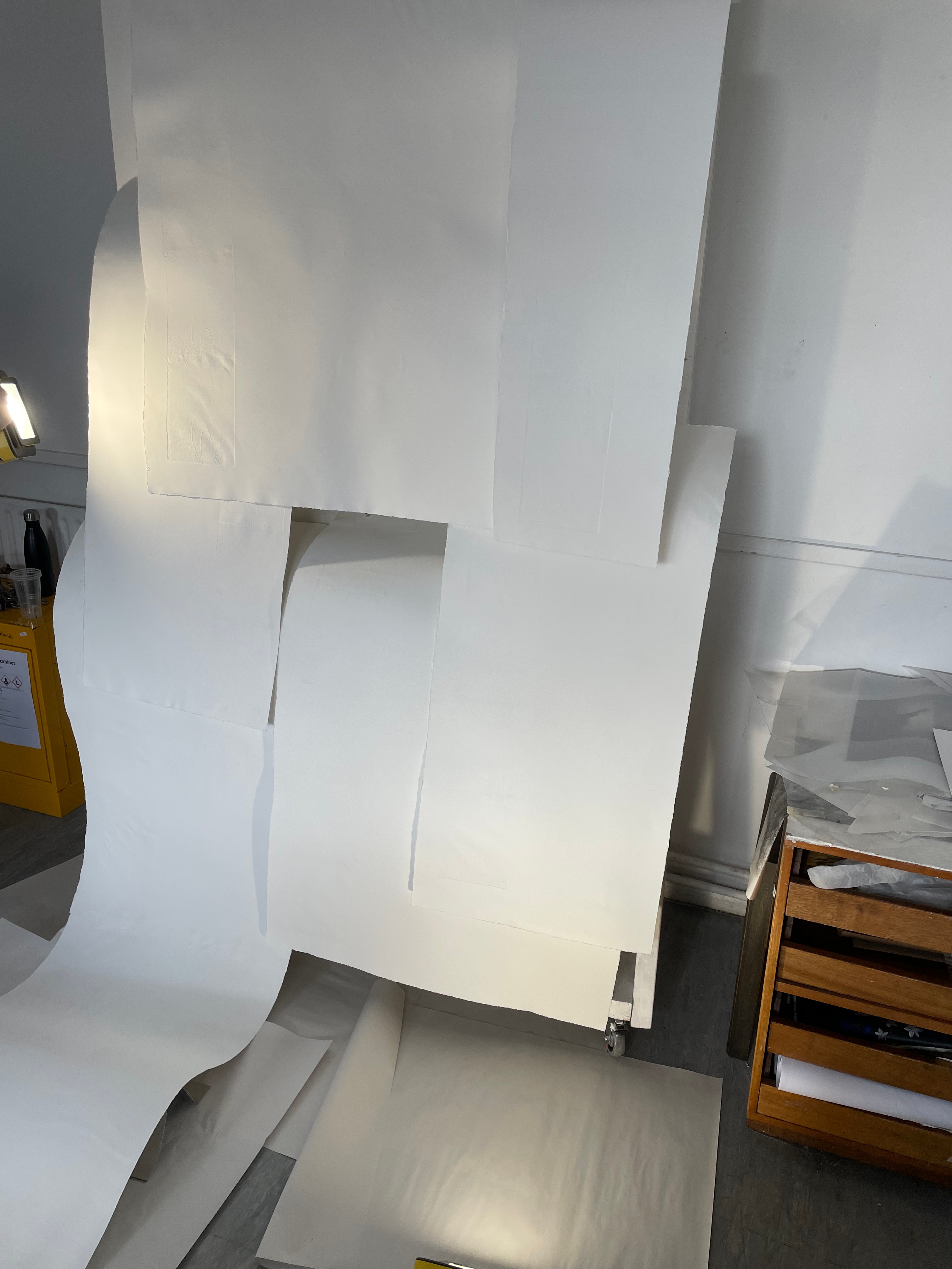
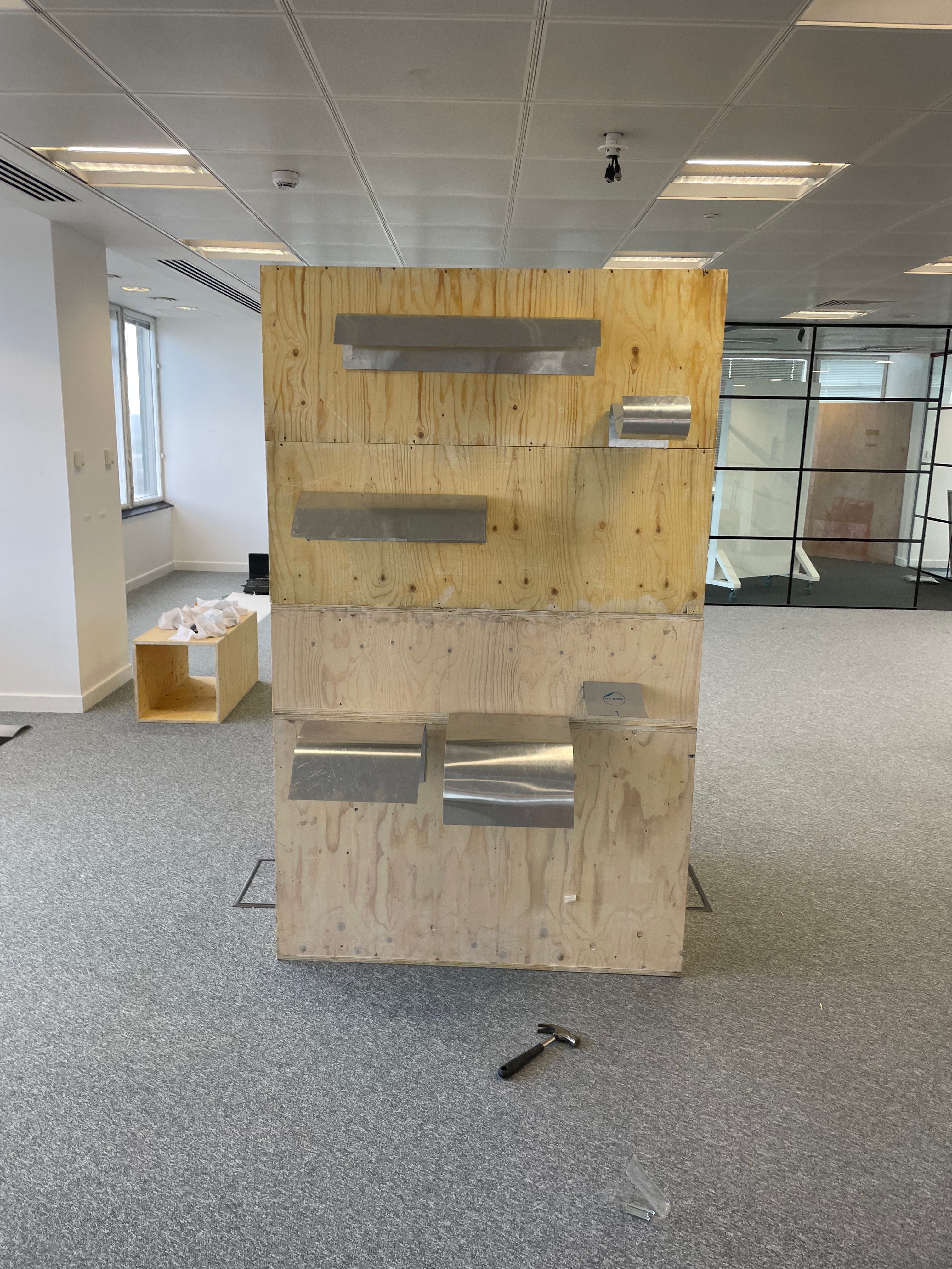
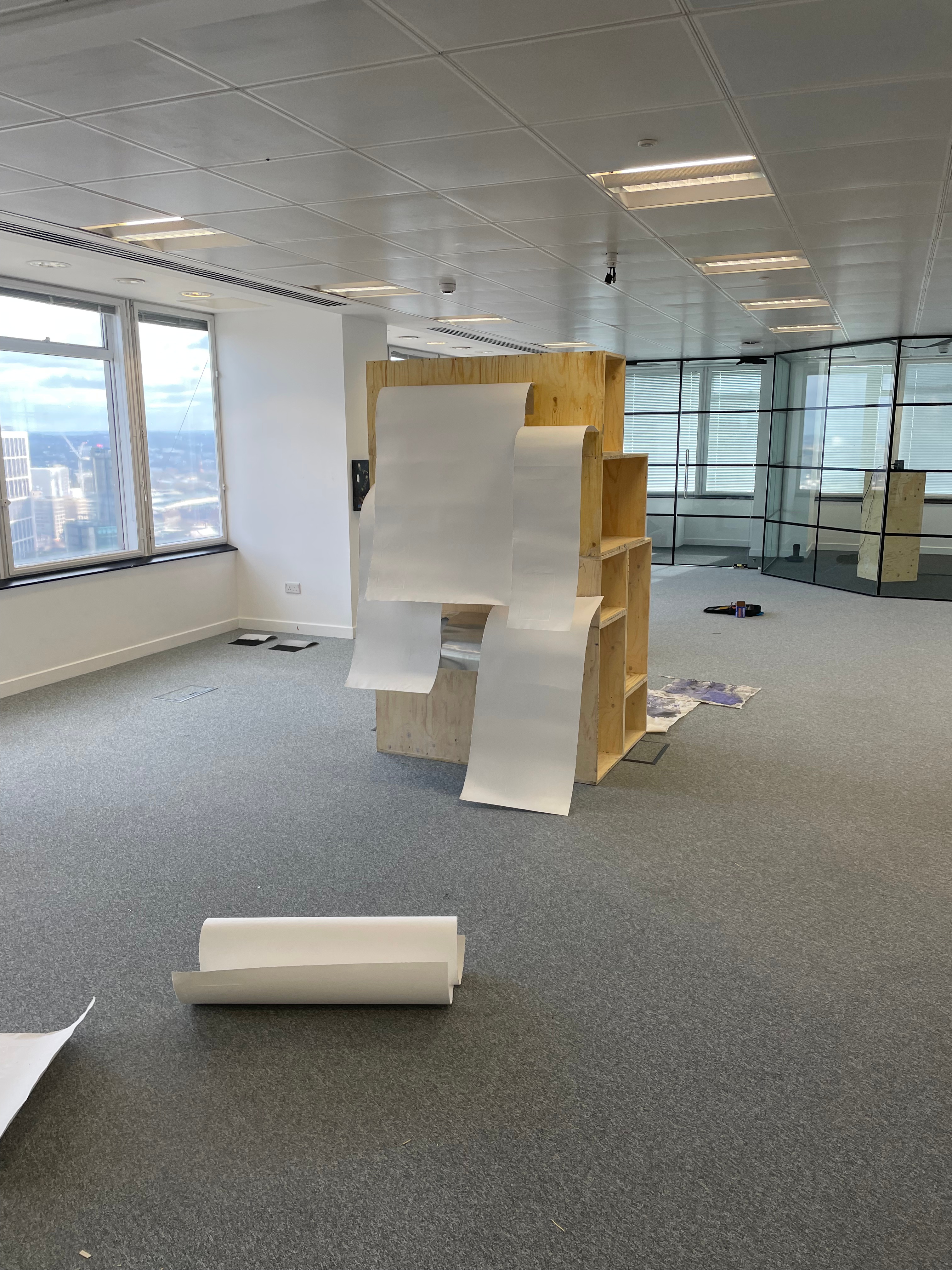
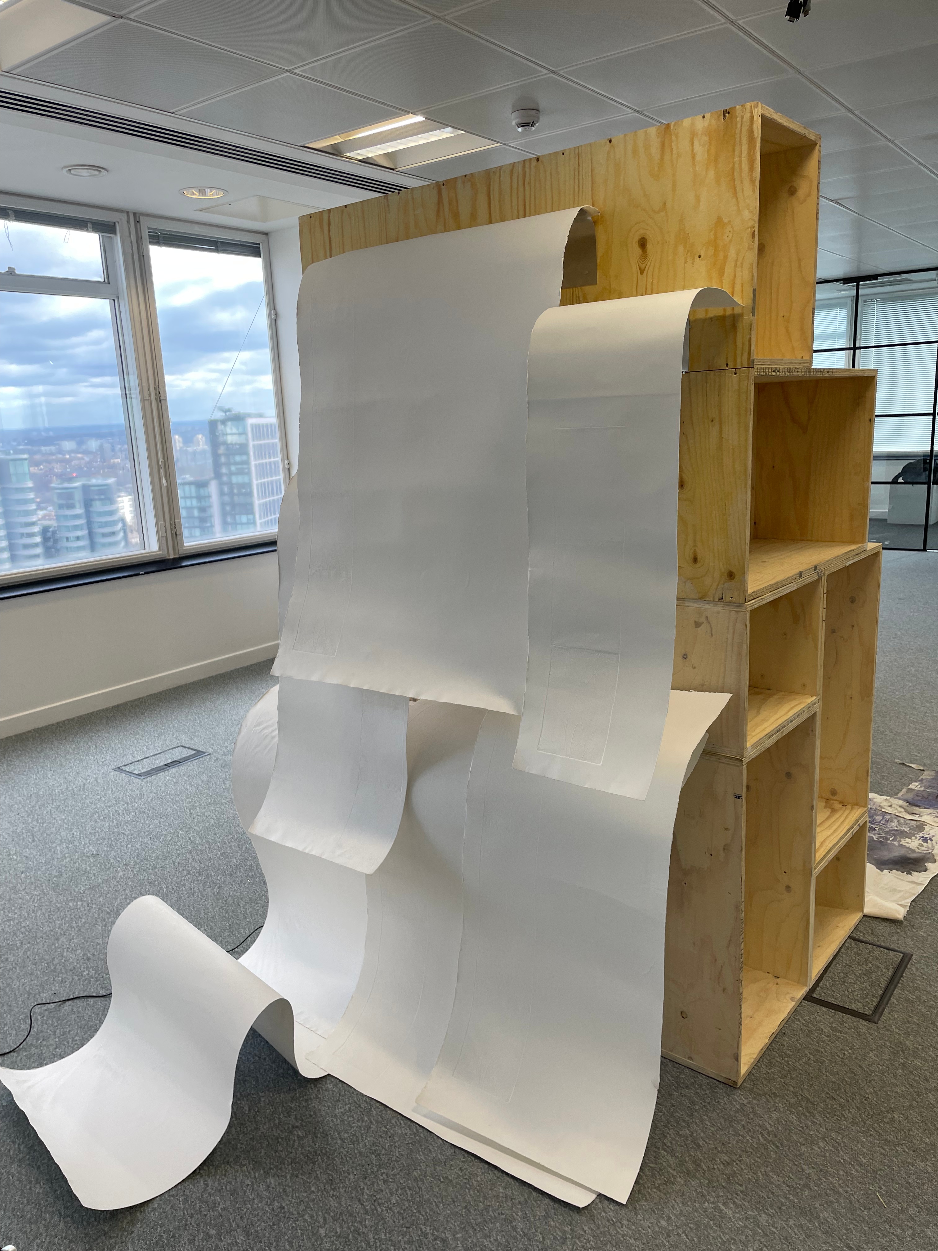
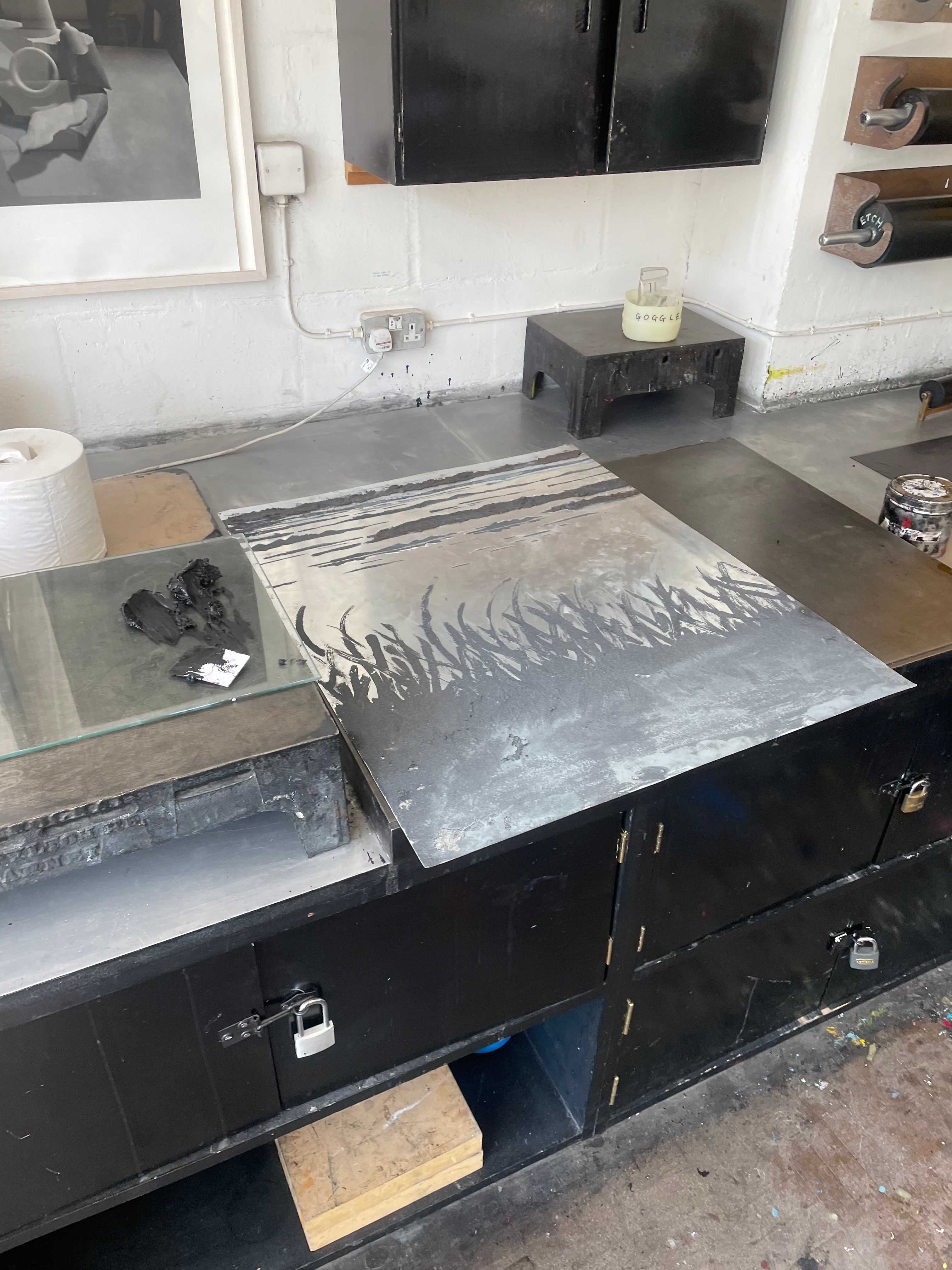
I decided to use several sheets of tub size Somerset of various lengths and widths, cascading over one another. This time in printing, I decided to use the Beevers Hydraulic Press as I’d had great results with the emboss before, and Pete Roberts told me that we could remove the guard rails on the back of the press to accommodate longer sheets of paper. We did lots of experimentation with printing the plate and devised a jig wherein the plate would sit in a marked square of acetate, while the paper would rest on aluminium rails to ensure perfect registration. We also encountered an issue where the pressure of the press would destroy the very subtle emboss on the previously printed impressions. To accommodate for this we used a very heavy piece of foam, to pack the press, meaning that pressure would only be applied to the area of the paper where the plate sat. This led to much better and more consistent embossings, that were registered perfectly. The choice of Somerset was also very helpful as the thick paper could handle the constant handling and rewetting, whilst also providing the means for a lovely emboss. Once all the elements of the piece were printed, it was time to assemble them. I bent pieces of aluminium into forms that would allow the paper to cascade gently over each other, creating the effect of the waterfall where the plate was created. After several revisions in the placement and form of these aluminium brackets, I finally settled on a configuration that would give the very ethereal delicate feeling of the breathy action of the waterfall against the plate. I chose to have some of the paper cascading onto the floor, invading the viewer’s space when looking at the piece. Once the rough form of the piece began to take shape, I became a bit worried about the light in the Millbank Tower. On a site visit a couple of weeks before the installation, I had noticed that the light was very clinical and artificial in the space, it was also very top-down, so it wouldn’t do a good job of showcasing the very subtle impression of the plate on the paper. I used some spotlights to offer directional diffused lighting to the emboss, and this really illuminated the subtle effect I had created on the paper. I then tried to book some lights from the Loan Store to use for the exhibition but was denied as they can’t offer them for exhibitions, which I found quite annoying. I decided that I would have to trust in the positioning of the piece in the space and its relationship between the windows and overhead lights to really let the emboss shine.


‘Untitled’, Paper, aluminium, waterfall, dimensions variable
Millbank Show- Realisation
At the install of the show, I was given a tall wooden construction to display my work. I think this really took away from the overall effect of the piece, making it not feel floaty and ethereal, and instead heavy and constructed. I did however manage to find a position in the room that really captured the emboss of the plates. We were very lucky that by the time of the PV, the light had turned into the most fantastic golden sunset. This lighting really made the emboss of the piece shine. I received good feedback from peers on the day of the exhibition, but I found that people only really appreciated the piece after they asked about the process behind it. This comes back to the grapple in printmaking of wanting the work to stand on its own and not rest on its printed origins. I think, however, the genesis of this work is probably it’s most important factor, the fact that the plate was created not by me, but by the very subtle action of the water against the ground is what makes this piece shine. One thing that I was happy about was the fact that people referred to the piece as a ‘waterfall’ before they even knew what it was, this felt like I had somewhat achieved my goal to let the form of the piece inform it’s perceived meaning. I also composed a piece of experimental music with my analogue synthesiser, where I improvised over a 12 minute recording I had taken at the waterfall. This felt like a further collaboration between me and the waterfall as I actively responded to the swells of the water and sound. I think the accompaniment of the music worked well to situate the piece within its meaning and backstory, this accompaniment is attached below. I think this will be my last exploration into the waterfall plates for a while, although I love them and what I’ve created with them, I’m struggling to see how I could develop them into more emotive pieces of work. Now I’ve made a few, they begin to feel formulaic, the plate is left in the waterfall, etched and embossed. I’m sure there will be a time where I feel like I can develop this methodology further, but I now feel that I want to explore other forms of the landscape that appeal to me more emotively.

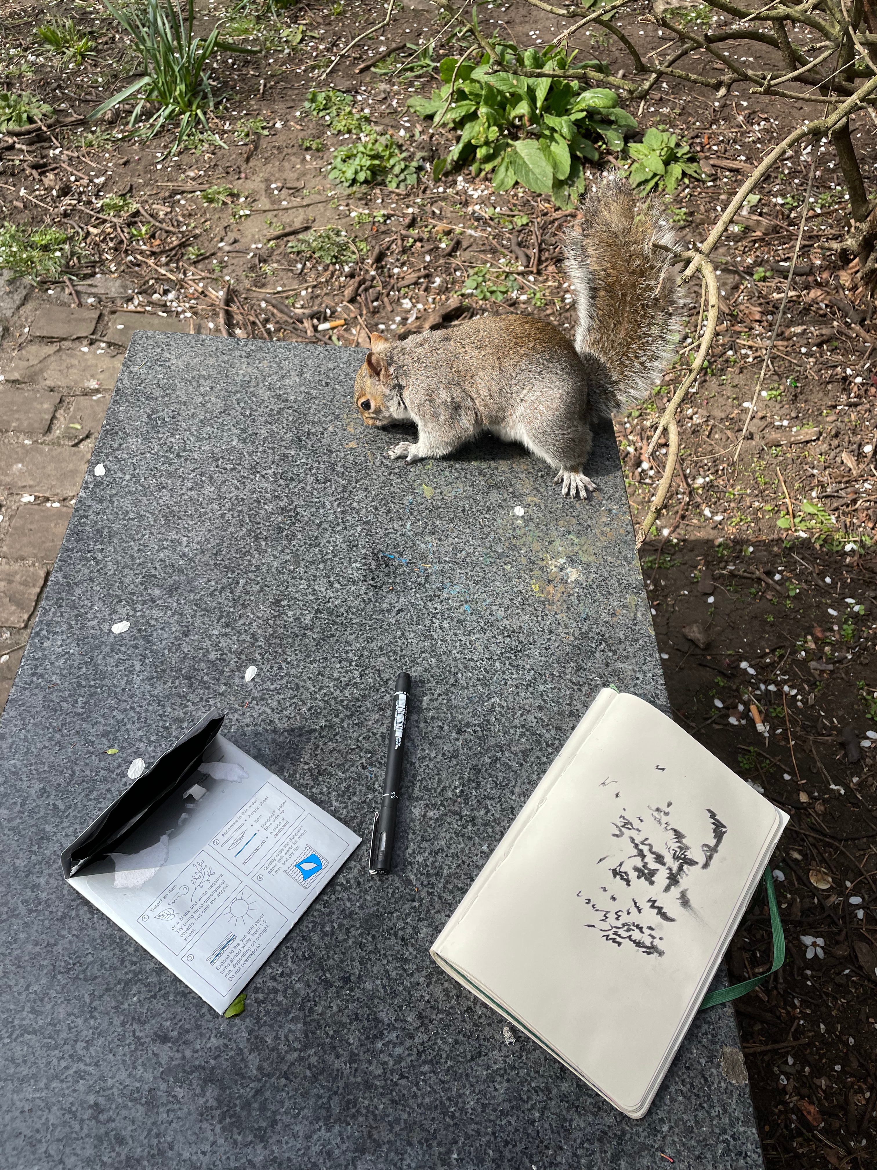

Making ‘Wild Marks’- Workshop with Lucie Winterson,
I sadly missed Lucie Winterson’s first lecture due to illness, but I had been informed that her work with nature, and specifically waterfalls would really appeal to me. I was sadly a bit underwhelmed with Lucie’s process, of allowing pigment to dissolve over paper in a waterfall, as I was already coming the the realisation that my waterfall techniques were hard to develop further for me. I also disagreed with her discussion of ‘wild marks’. Lucie showed us a presentation full of other artists using these ‘wild marks’ but personally, I don’t think there is such thing as a ‘wild mark’ that is created by a person. I think that my own waterfall plates are nearly as close as you could get to a mark created solely by nature, as I had no control over creating them, the waterfall had ultimate control over the marks. But even then, there is a conscious choice by me, in how long they are etched for, how they should be inked, on what medium or substrate they should be printed on. All these conscious human choices immediately ‘de-wild’ the marks in my opinion. We were told to go to the local park and create some ‘wild-marks’. I remembered that I had some cyanotype paper in my draw that I’d been waiting to use for the right purpose. I decided that no mark I could make could be wild, and instead offered a canvas for nature to create its own marks. I situated these papers around the park, under bushes, in holes in trees, etc, and allowed nature to make an impression onto them. For me, nature’s mark is breathy and ethereal, it cannot be felt or captured by a human hand and translated onto medium. While my prints were developing under the sun, I decided to close my eyes and record the bird song (middle image). I found it funny that when I opened my eyes, I could differentiate between the long caws of jackdaws and crows that I had recorded, and the more subtle chattering of robins and tits. I think that the way I created my wild marks, especially in the sun prints, were a lot more authentic than the ones Lucie showed us.

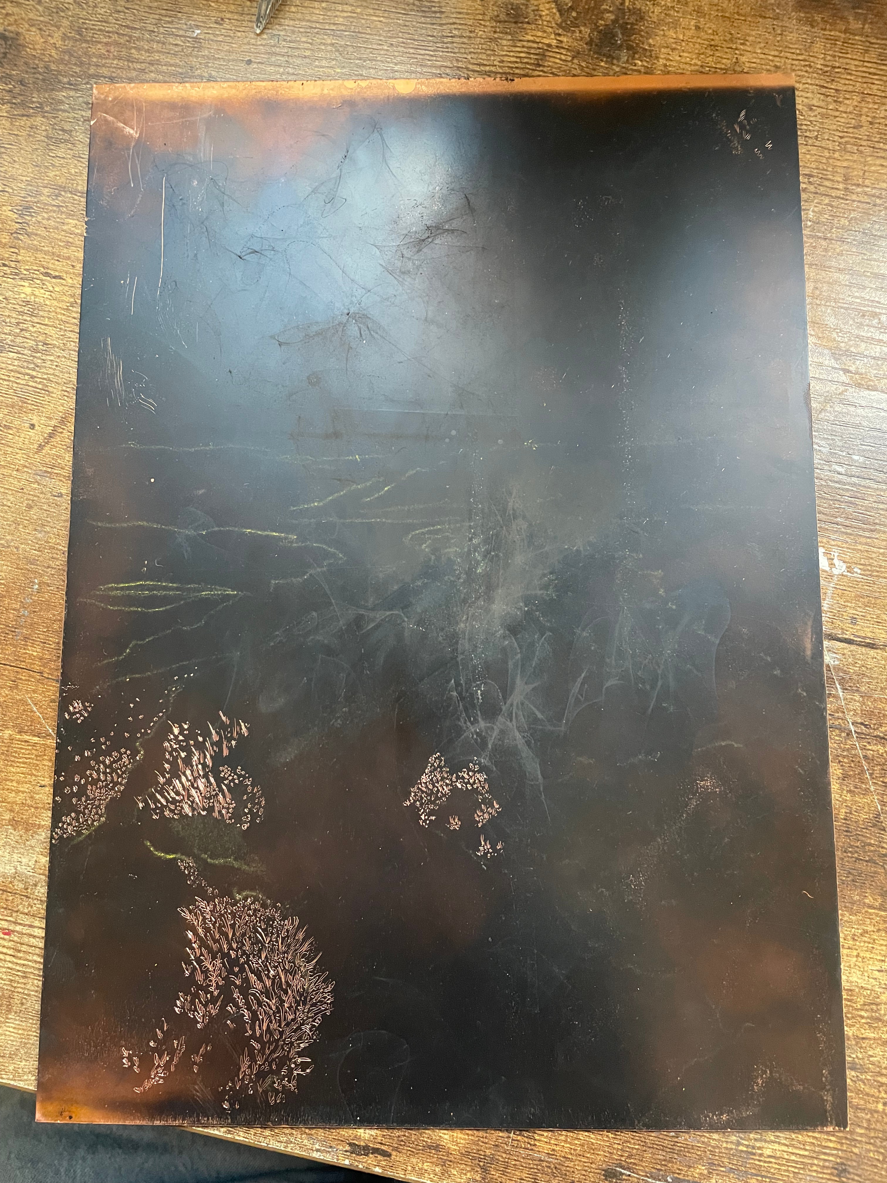
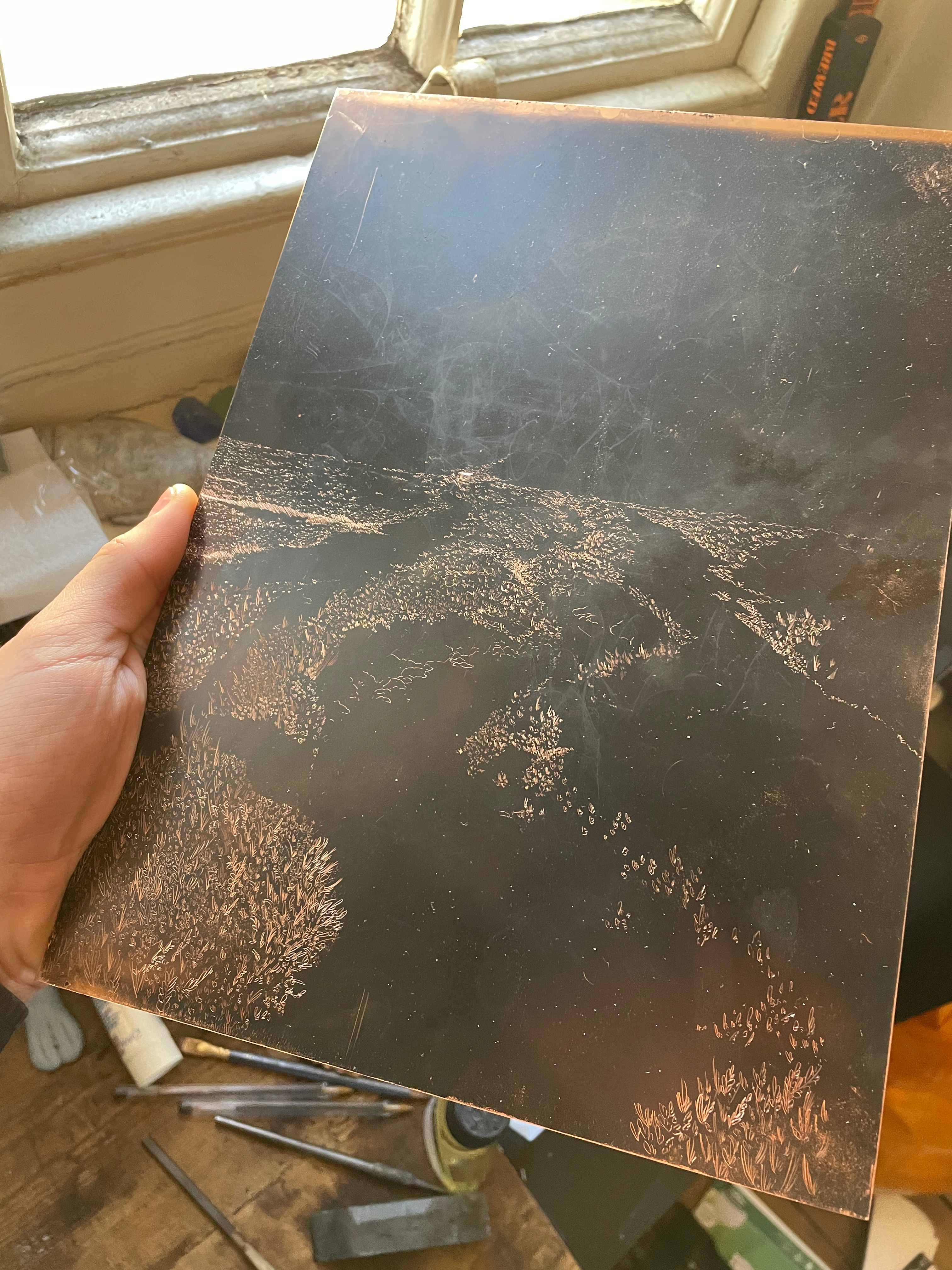
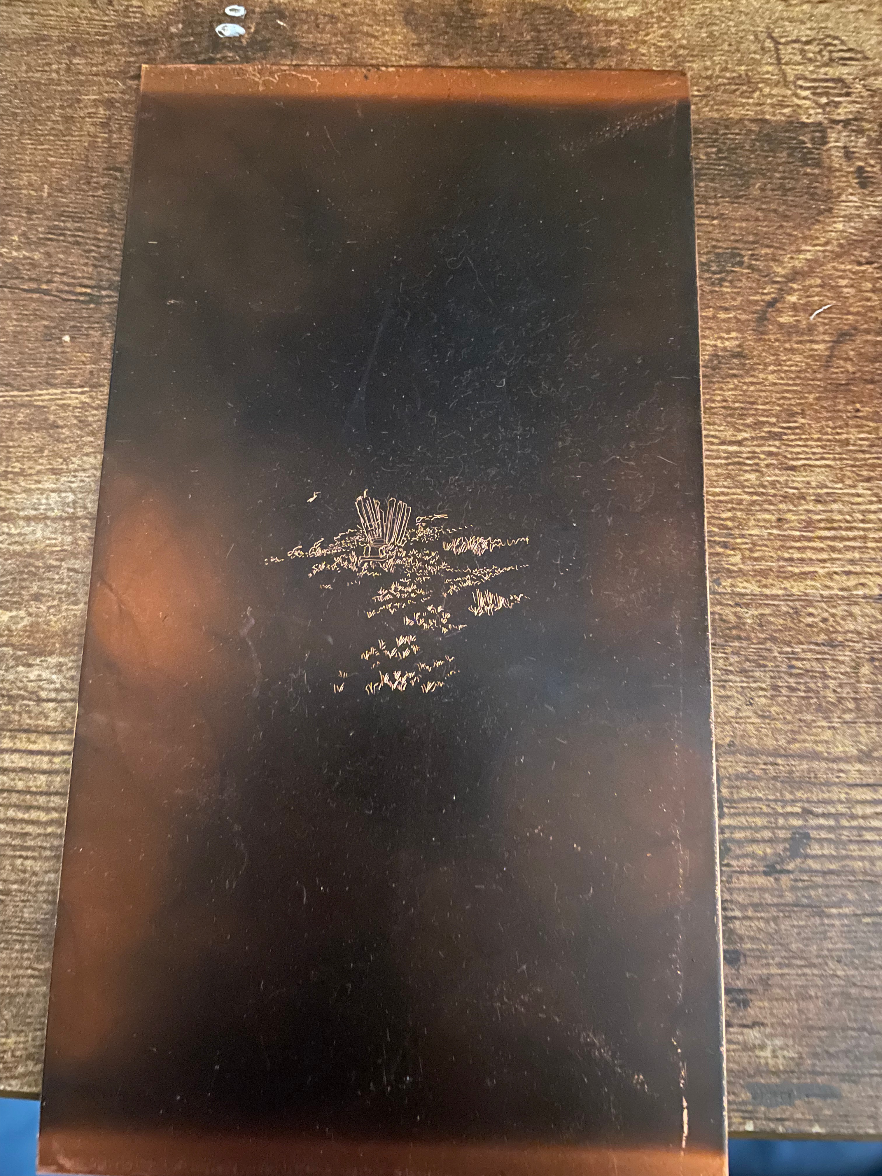

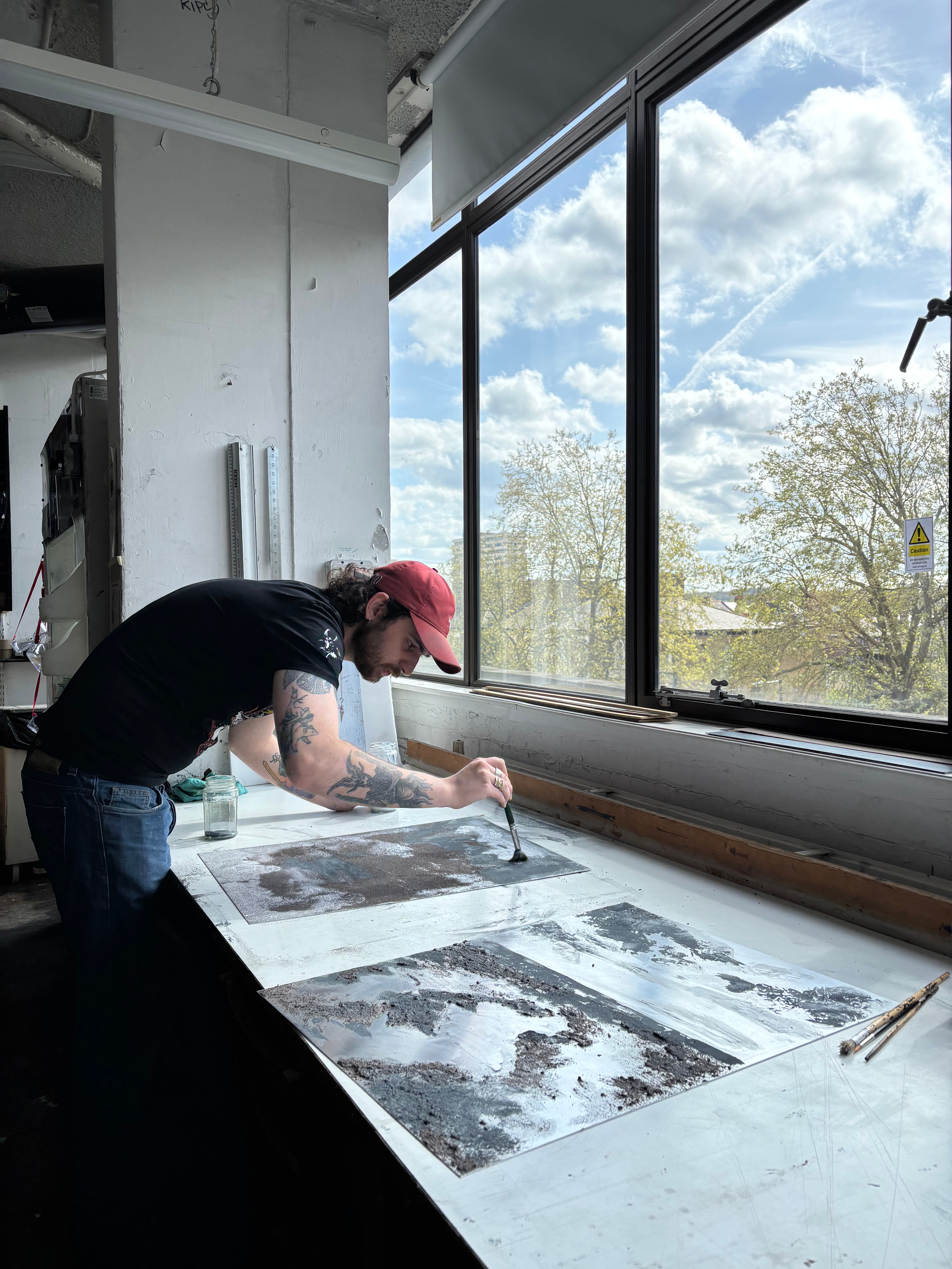
Marsh Etchings-
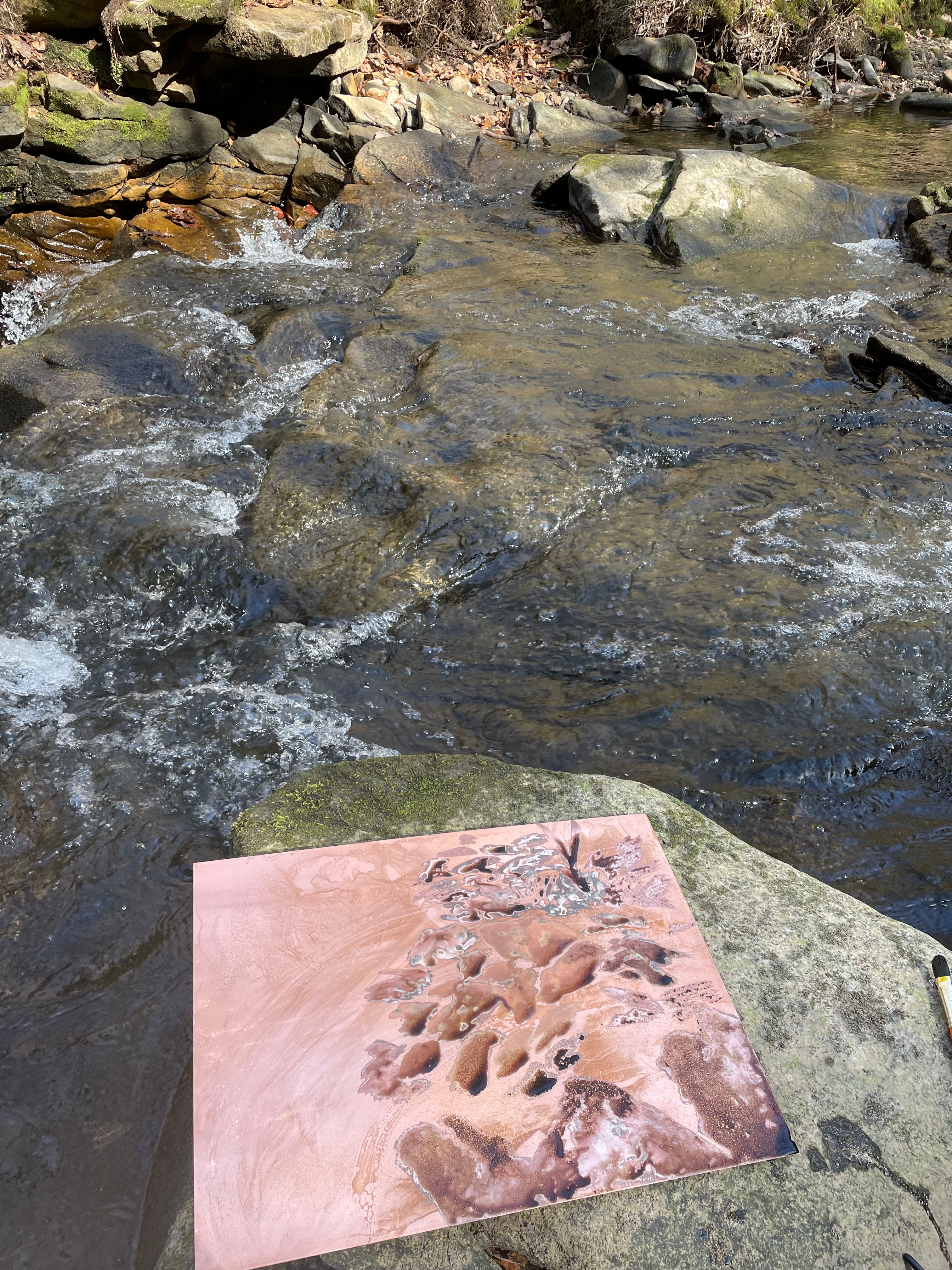
I created a series of etching plates of the marshes on copper, however, while drawing them, I found it more of a chore than usual. In the past I could meditatively zone out for days on end drawing up these intricately detailed etchings, but now it feels more mentally taxing, and while I love the end result, I no longer feel like I enjoy the process of the drawing as much. However, the smaller plate with the wooden bridge (bottom left) was a joy to draw. I made this on location on the marshes, whereas the other two were made from reference photos I had taken on a visit. I think that there is something that I need to work through with etching that I can only get through by exploring other mediums. I have found mono print to be much less restrictive and much more expressive. These feeling aren’t helped by the fact that there was a problem in the etching of the upper plate that meant that the acid crept under the ground and destroyed two weeks of drawing and left me with a landscape shaped grey haze on paper. I created multiple test plates afterwards and etched those and the same happened every time, so I would lean towards a problem with the acid, rather than a problem with my own preparation of the plates in polishing, degreasing and grounding. I will return to etching in the future, but first I must explore some more evocative and expressive mediums that are speaking to me in my current state at the minute.


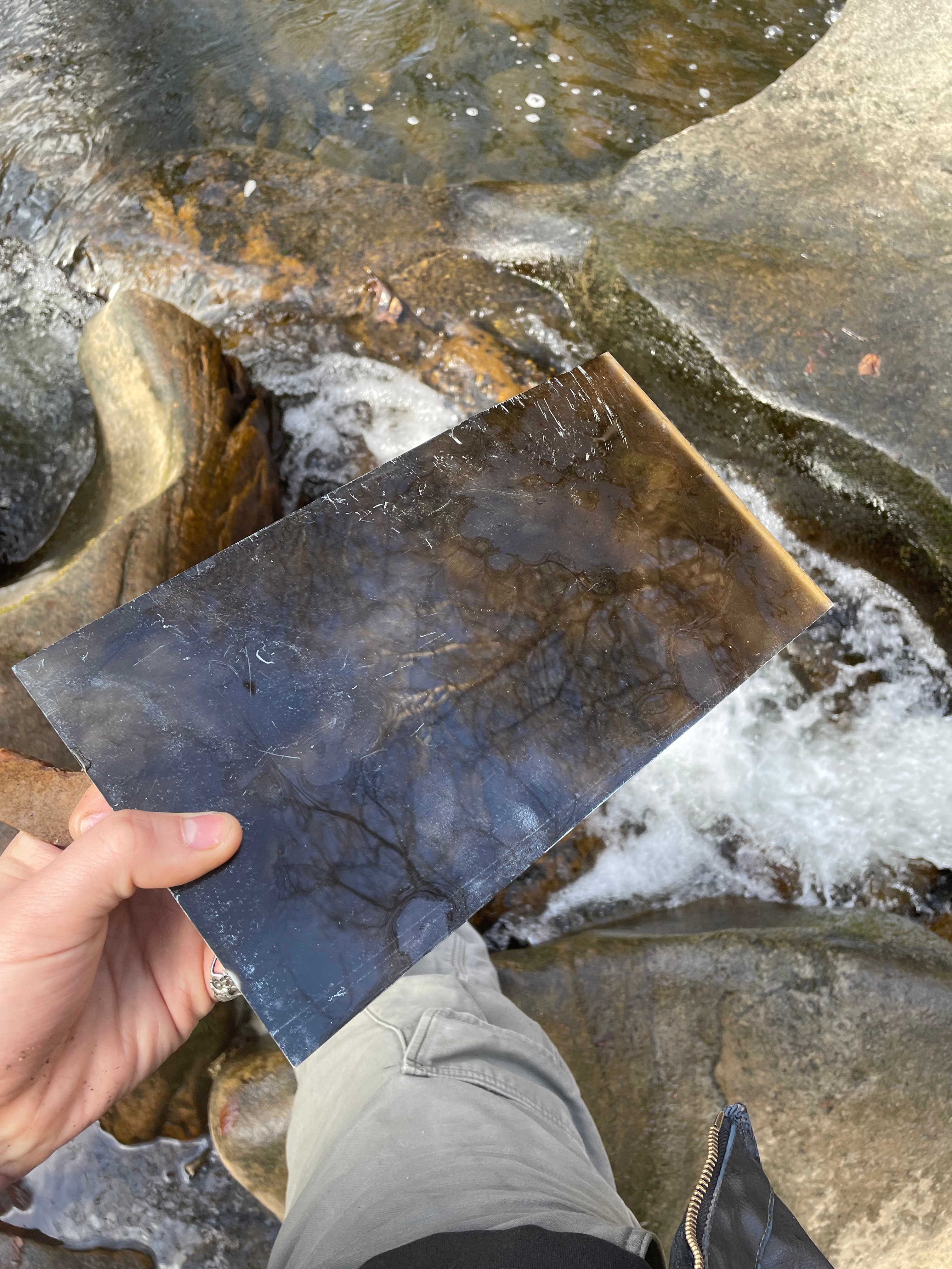

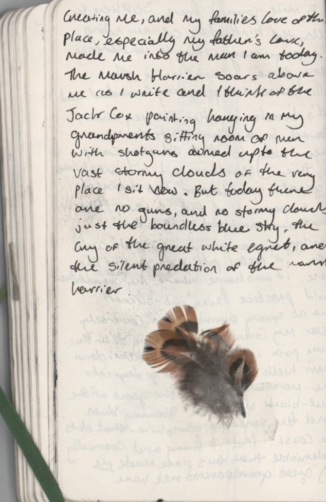
Drawing and Platemaking in the Waterfall,
I managed to find a weekend to return to the Dell and was confronted with the most beautiful weather, something that doesn’t often happen in the Pennines. I arrived late on the first night and went to our local pub with some friends to celebrate a birthday, I told them about my intentions to do some drawing down in the Dell and they informed me of a suicide that had occurred the day before my arriving. Sadly, Healey Dell has become a hotspot for local suicides, since I can remember there were stories of people who had thrown themselves from the viaduct to meet their watery end in the Thrutch below. But this time, something really brutal had happened, a man had thrown himself from one of the rocks into the waterfall. The next morning I descended down the stone steps from the road into the Dell and immediately saw a bunch of dried up flowers on one of the rocks. This really gutted me to see, the place that I love so much, that offered such hope and brightness for me, was the place where someone felt their last moments, just tens of hours before me being there. I had an urge to take out my sketchbook and write. This writing was for my own personal use, and wasn’t meant to be shared, but as I wrote in-situ, thoughts and feelings began to spill out on the pages and I found that I couldn’t stop. On the train home I read my notes and came to the realisation that I’d said what I’ve always wanted to confront in my work, something that feels too raw and painful to say out loud. I’ve always struggled articulating these complex feelings about why I make the work I make, but through this spontaneous writing in these spaces, it feels easier to articulate myself. I’ve included below the excerpt from my sketchbook as these words feel to me irreproducible. I chose to sit on the rock where the poor man had so sadly been standing and drew what he may have seen before taking the plunge into the violent waters of the Thrutch. I intend to explore this drawing on true grain further by exposing it onto photo etching plates and working back into it. I also left a plate in situ for a few days, but sadly this had washed away when I returned. I wasn’t completely annoyed by this, it feels like it came as a sign to leave the waterfall etched plates for now, and explore something new. I also came with a large plate of aquatinted copper and a bottle of ferric chloride to try and do some more spit bite in situ, after my previous failed attempt. I assumed that because it was a much warmer day, I’d have much better results than last time. I also left the acid on the plate for much longer than I did with my last experiment, to try and get a stronger bite, I spent around 3 hours spitbiting this plate, allowing the acid to really take a hold, but I was saddened on my return to London that the plate printed with no tone whatsoever. Despite a lot of things going wrong on this trip, the realisation about my writing was one hundred percent worth the visit, the two pages that I took away became really important to me in the genesis of new work.
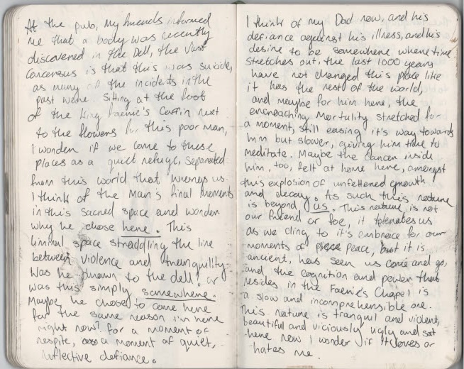
Writing in the Dell.


‘A View from a Bench’, Carborundum, (61x49cm). ‘A View of a Bench’, Carborundum,(49x54cm)
Experiments with Carborundum
After seeing Hughie O’Donoghue and Ailbhe Barrett’s beautiful carborundum prints at the Original Print Fair at Somerset House, I became obsessed with the fact that I must try out carborundum. The first Monday back after Easter I stormed into the studio and begged somebody to show me how to tap into its gritty, inky magic. I created two plates with marsh scenes, with quite a thick layer of 60 grit carborundum. I love the deep intaglio depth and emboss that the method creates and the lovely textures unlocked through it. I did, however, find the medium to be quite resistant and tricky to work with. I think that these carborundum prints work well in my practice due to their horribly scarred and brutal feel. They have this very guttural, impactful quality that resonates with my own emotions within the landscape, they transform something outwardly beautiful into this horribly violent and heavy-handed image. Carborundum is definitely something I want to take further in my work, especially with the use of multiple plates and colour.


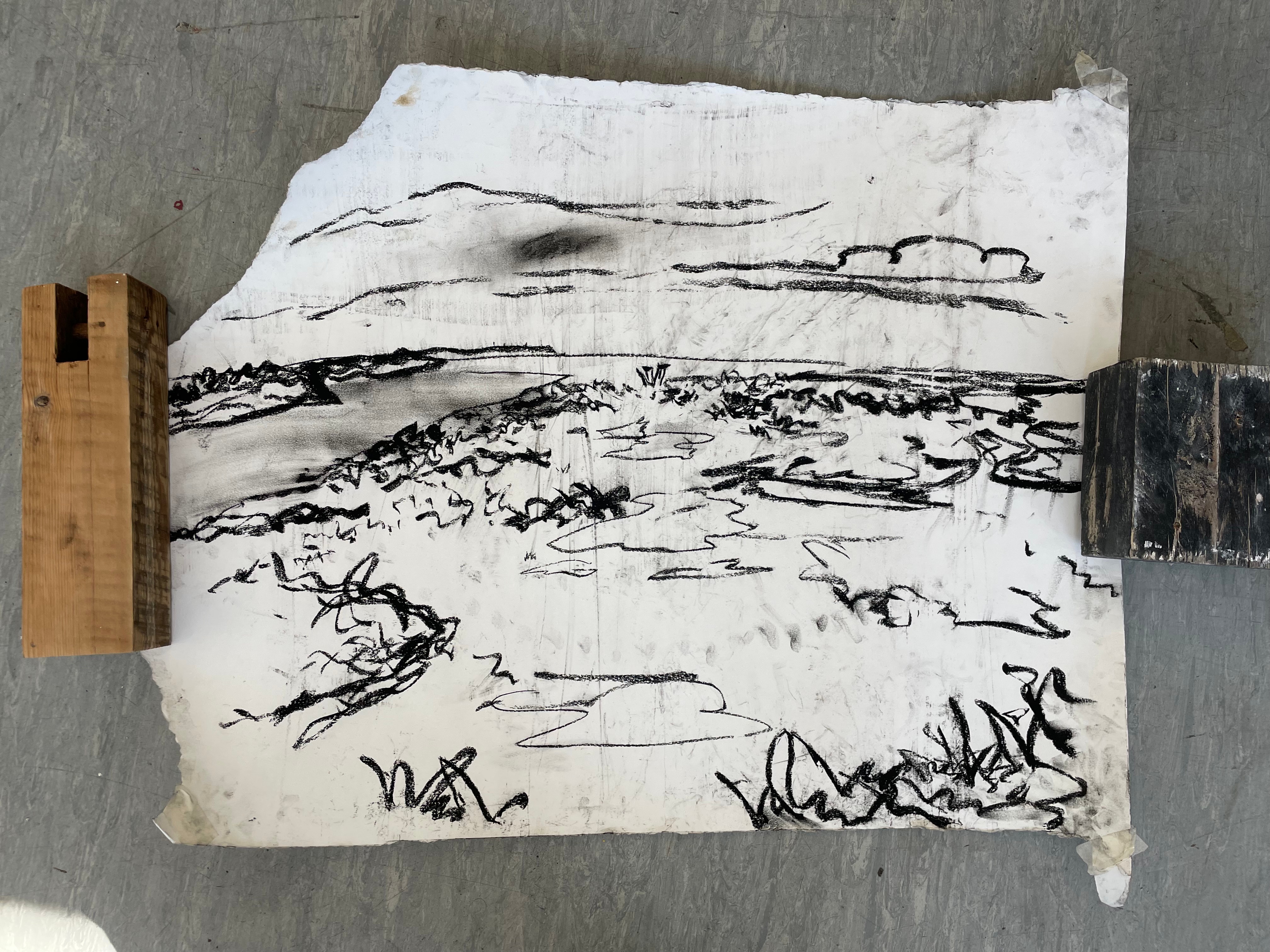
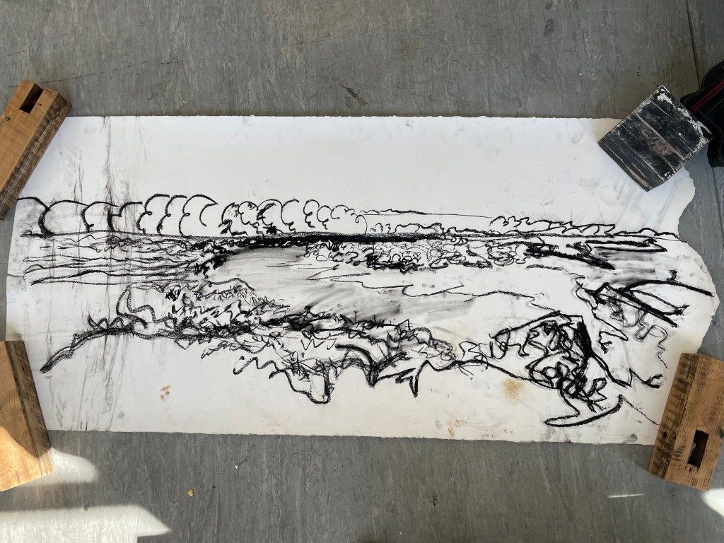
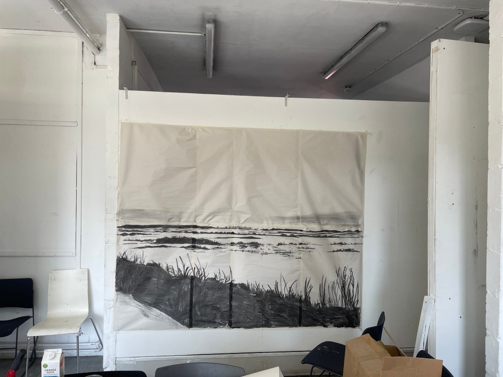
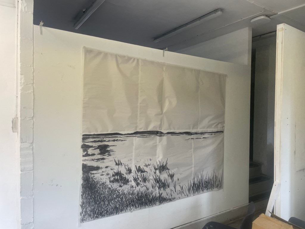
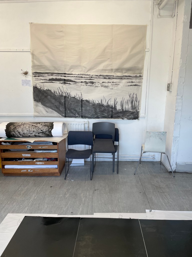
Sketching out the Marshland-
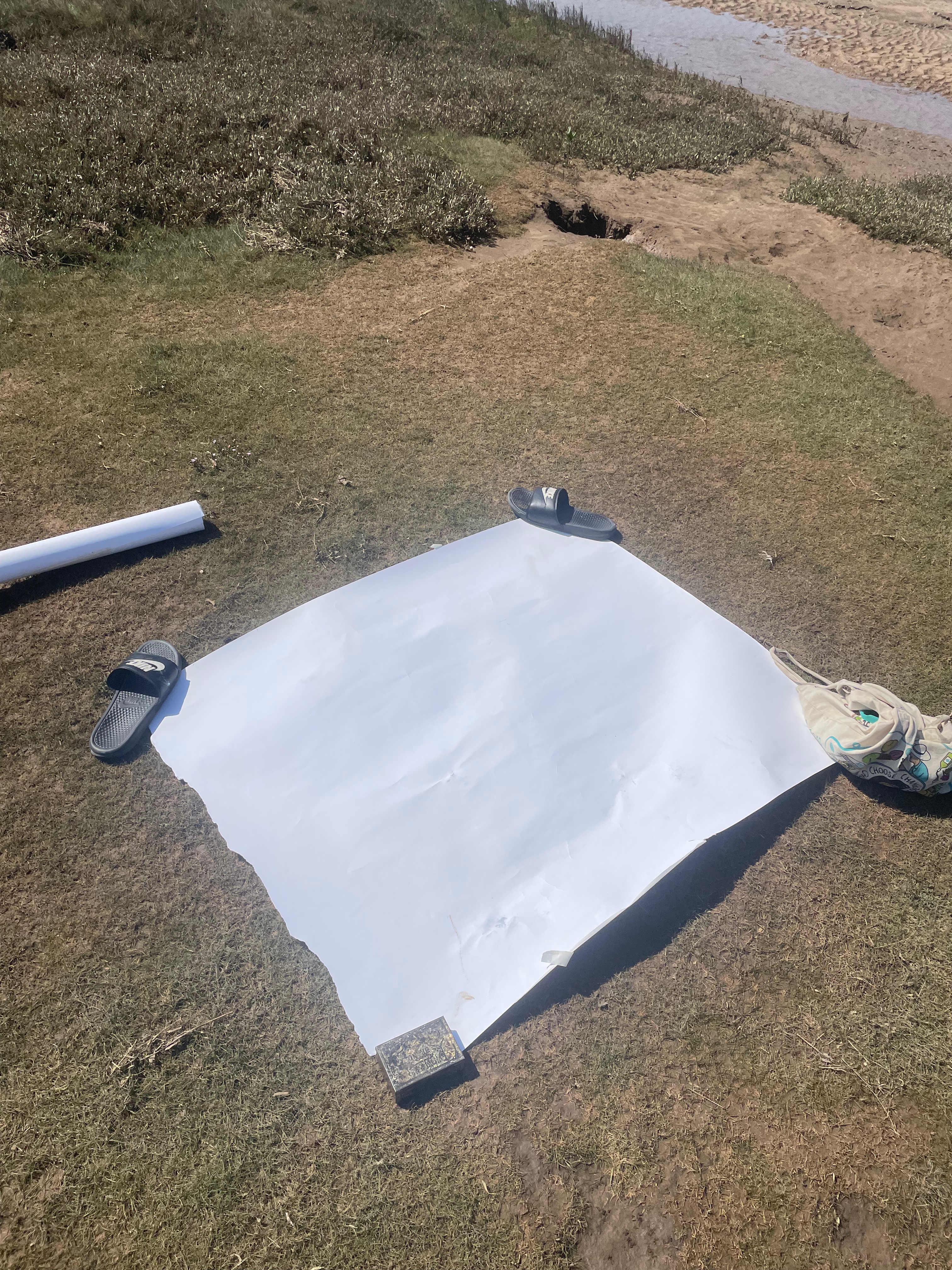
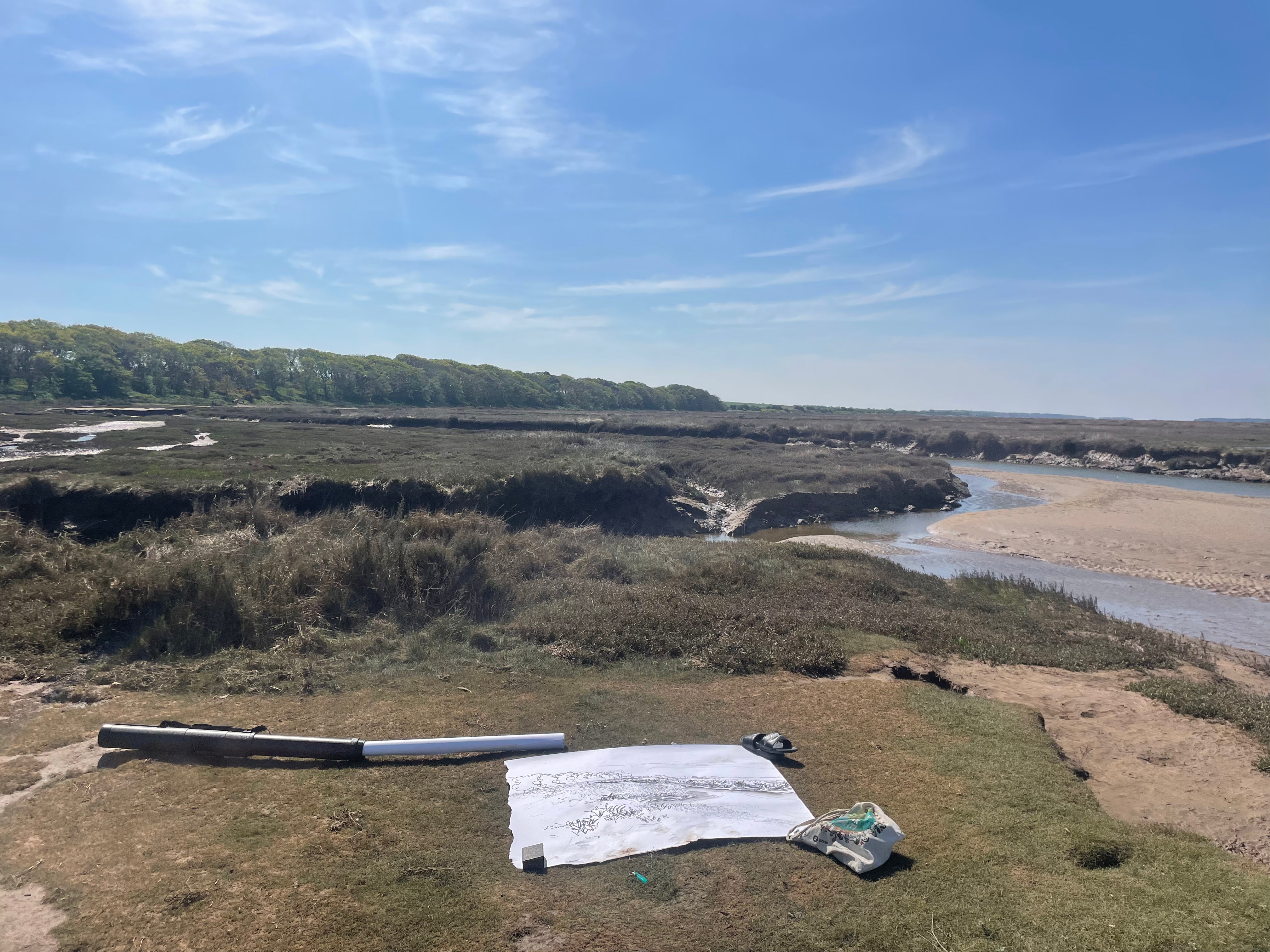
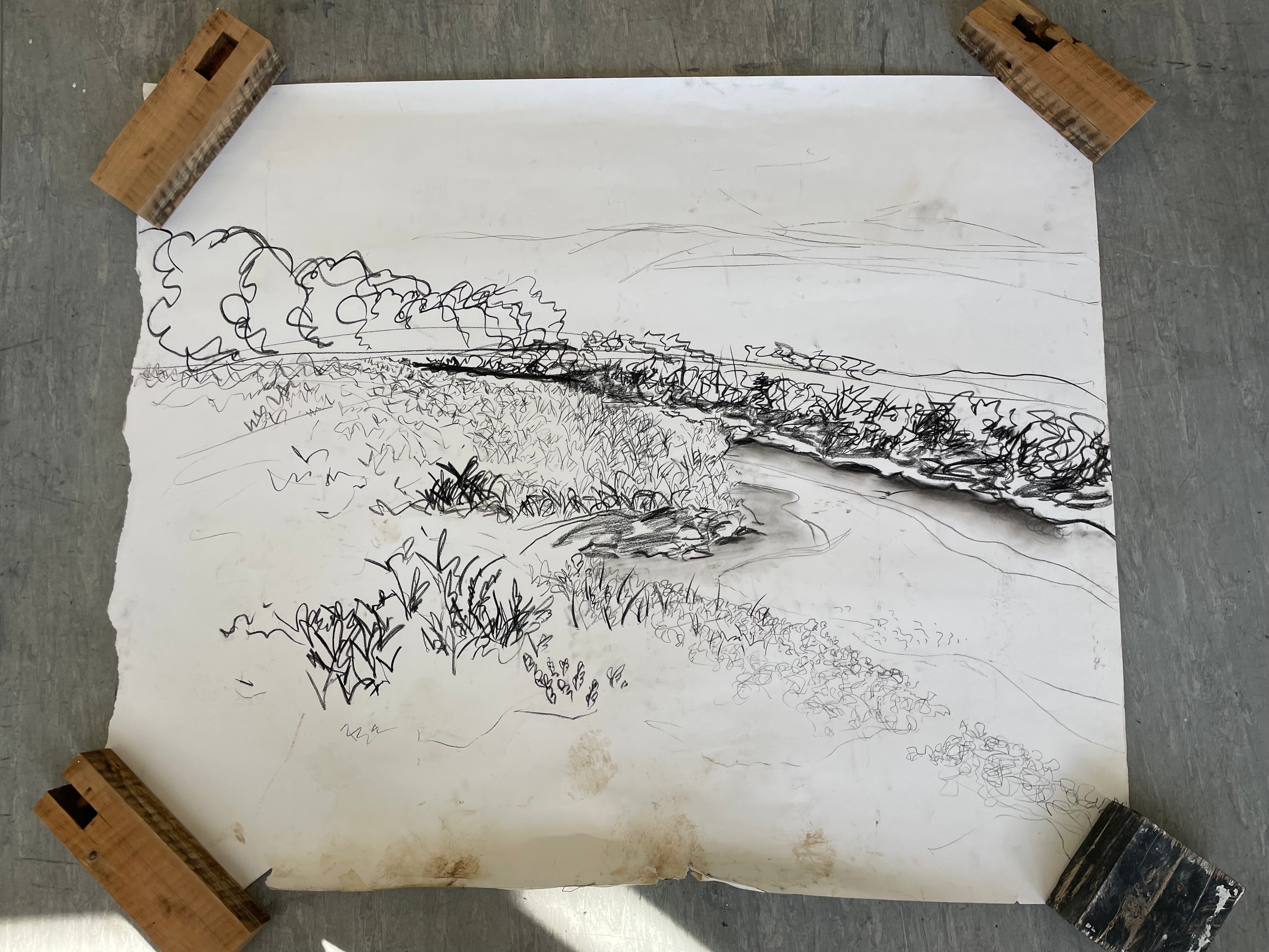
After presenting these carborundum prints in a crit, and explaining where my current body of work was going in respect to my feelings of loss about my dad, I was asked, “what’s the next step?”. The only answer for me is scale, I feel like my work is becoming more and more a reflection of myself and a portrait of the relationship between me and my father and the subsequent loss of it and I’m becoming more settled with the visual language that reflects this. Since I started creating monoprints, I was quickly forced out of my love for small work, I could only think about going bigger and bigger, to really envelop the viewer in the scene, to make them feel like they’re standing next to me, as I look out on the marshes. I think that the more visceral darkness within my work could only be developed and become more emotive at a much larger scale. As a result of this I decided for the degree show, I’d like to create a huge monoprint with carborundum overprinting. Although I have countless sketches of the marsh on a small scale, I realised that they would not be adequate to create these much larger pieces of work. So I set off on the train that weekend to Norfolk on a solo trip. I took with me various rolls of different sized paper, to try and capture a composition that would be suited to become a very large scale print. I was massively unprepared for the difficulty of using such large sheets of paper on the windy marshes and spent most of the time battling with the wind. I do love the freedom of drawing en plein air, the vibrancy and emotive qualities of my drawings really come out when faced with the interference of the wind, water, sun, etc. I was also on a massive time crunch due to the ridiculously high tides we were experiencing over the weekend I visited. There was a blood moon a few days before, meaning that the tide was rising to terrifying levels while I was working. Luckily I have enough knowledge of the marshes to know where to sit so the creeks didn’t come up around me and trap me. I was really happy with these compositional sketches and I’m very excited to blow them up to a larger scale and create prints from them.
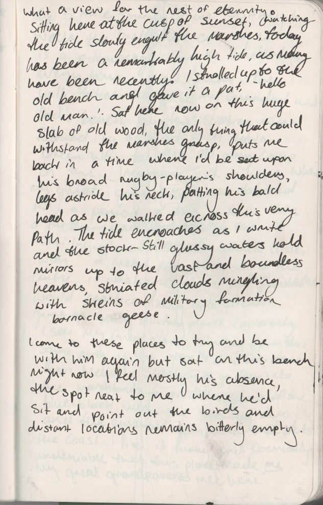
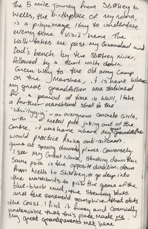
Marsh Thoughts-
I did some more writing on the marshes to try and nail down even further how I felt about my work and my reasons for making it. The first sketchbook excerpt is from the first night I arrived, waiting for the sunset to roll in on my dad’s memorial bench right on the edge of the marsh. This night felt particularly emotional for me and I realised that it was my first time sat on that bench fully alone, without any family around. I suddenly felt this great feeling of release, I felt that I was finally allowed to sit down and process my emotions alone, on a silent stretch of marsh. The other two pages come from a much more positive mindset the morning after, on a sunny walk to Wells-Next-The-Sea from Stiffkey. I don’t want to talk too much about my sketchbook writing as I feel they should stand alone and express themselves, moreso than I can sit down and type on a computer about them.


Where it All Went Wrong, or Right?- Click Here for Exhibition Proposal Form–>
I began to create a draft for the work I wanted to submit as my piece for the MA degree show, due to its size, I knew I had to begin testing and trialling the imagery and the work now, just to pre-empt the fact that things are most definitely going to go wrong at this scale, which they obviously did. I began by creating large scale sketches for the carborundum elements of the print, I chose two compositions from my photographs in Norfolk that I thought would be beautiful at a large scale. I slowly took over our studio with these sketches and was happy with seeing the work at the full scale of the print that would be made. I decided that the whole piece wouldn’t be carborundum based, and that I would use a large scale mono print as the background, to really accentuate the beautiful skies that I love adding into my work, and their reflection in the glassy waters of the high tide. The idea was that the top plates would be the sky, while the lower three plates would be the same sky, reflected back onto itself. I was really happy with this upper area of the image and thought that I had achieved the effect of those huge cosmic sunsets over the salt marsh. The problem came in adding the carborundum for a multitude of factors. The first factor that made this test unsuccessful was the fact that I used Charbonnel Doux ink, which I really really detest. It doesn’t have the same intensity as other Charbonnel etching inks, such as my favourite, 55985 black, and even in well-printed areas, really didn’t do much to make the carborundum sing. This brings me onto the second and third factors that really didn’t help the work. I wanted to ink the plates at the same time and print them together, however, I decided to do this on an excruciatingly hot day, and for the first time ever in my printmaking journey, I think the etching ink dried up on the plate, leading to the horrible patchy effect you can see in the print. The other factor was that the carborundum on the horizon line at the top of the plate was way too thick, meaning that the dry point impressions I’d made on the carborundum plates didn’t show up when printed, and this also took a lot of pressure off the thinner areas of carborundum towards the grassy areas at the bottom of the plate. Finally, I think that the intensity of the carborundum, and the softness of the mono print just don’t sit well together, and feel like two separate, unmarried entities on the paper.

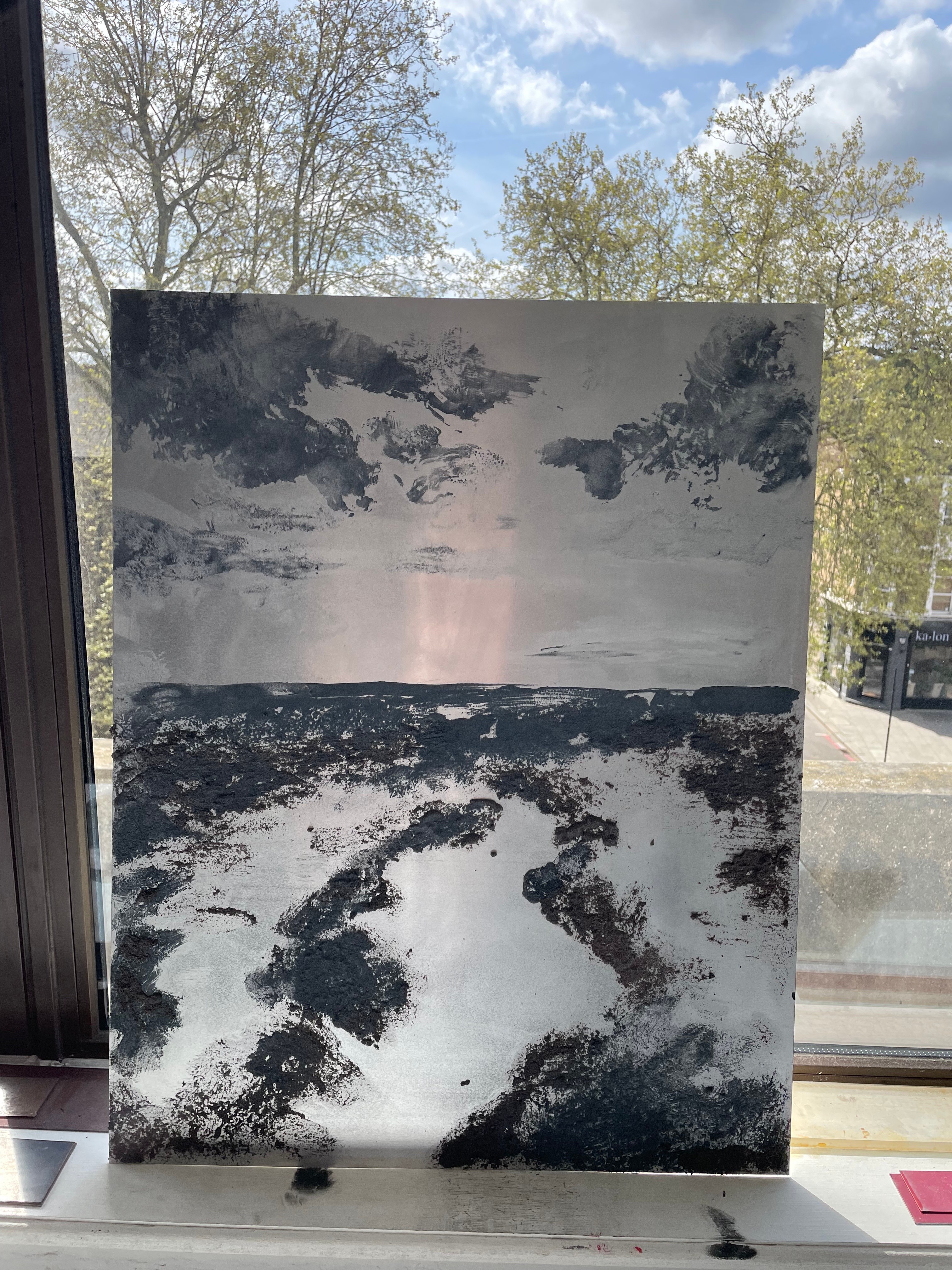
What’s Next?- ‘Receding’ Monoprint on Somerset (51.5x 43cm)
I created this piece in around 20 minutes for a small pop-up exhibition my group was holding in the MA and Staff bar at Camberwell. This piece for me encapsulates everything that I want to show in my work and its immediacy only supports this. As a result of creating this piece after the failure of the carborundum prints, and the success of the monoprinted background, I have decided that the carborundum isn’t what this degree show piece needs, and instead should take the form of a very large scale mono print on its own. I’m much happier with this decision and think that this new piece that I will create will be much more successful. the elements that work in this piece are simple, the encroaching darkness, and the small flashes of light in the clouds, horizon and water, that just subtly denote where the elements of the landscape sit, I can’t wait to take these large mono prints further.
Research Festival Proposal-
Throughout this project, I have identified the areas of the landscape that appeal to me as an artist. I have found that the elements of the landscape that speak to me, my process, and my experiences of loss and grief, are light, clouds and the horizon. For the research festival, I would like to create an artists book documenting light and clouds, and their relationship to grief and the landscape. Over Summer, I intend to draw and record clouds and light in the landscapes that I draw from, so that when I come back in September, I have a vast breadth of imagery and ideas to work from.
