Belkis Ayón Exhibition and Pitt Rivers Museum- Oxford
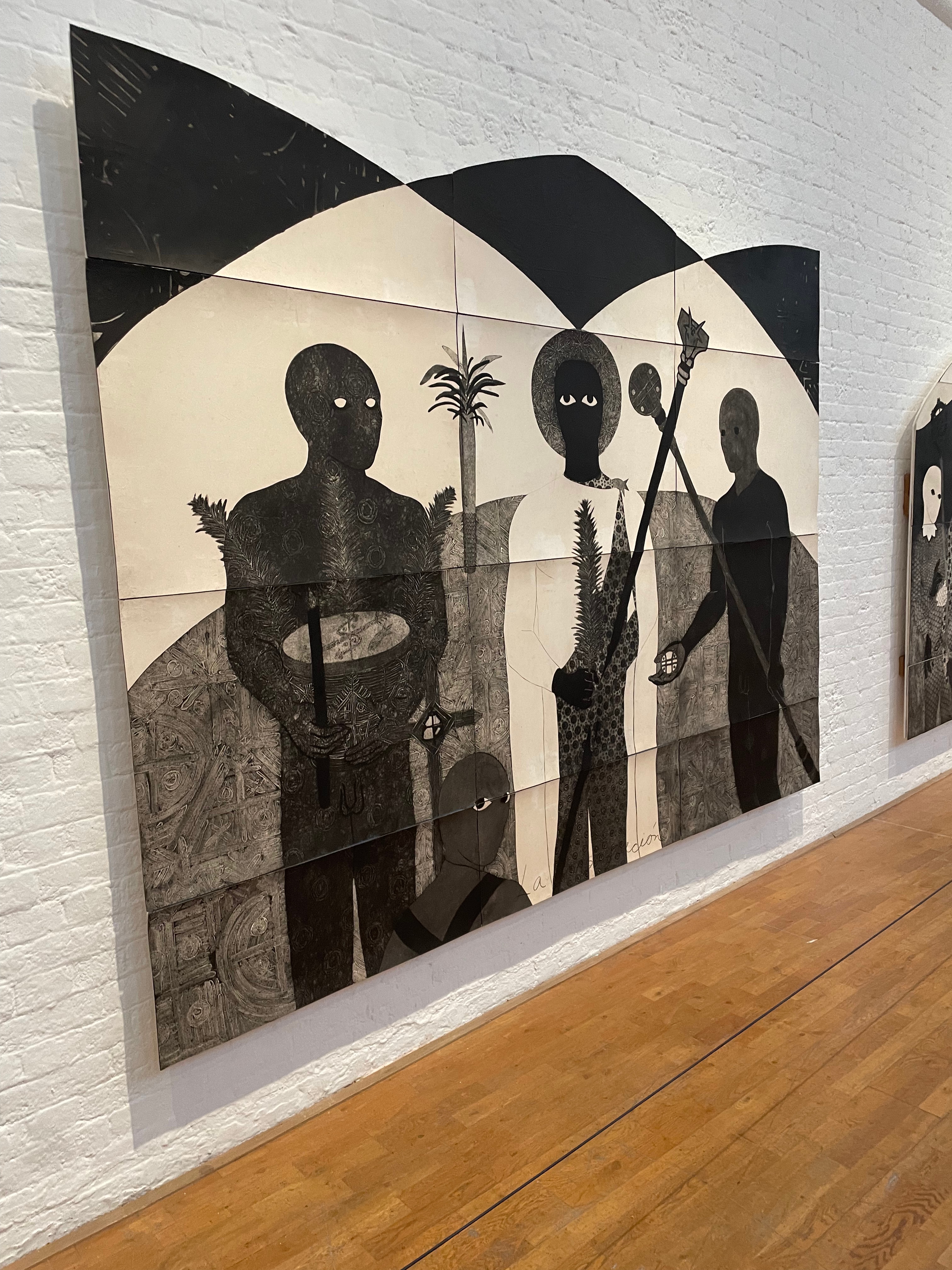
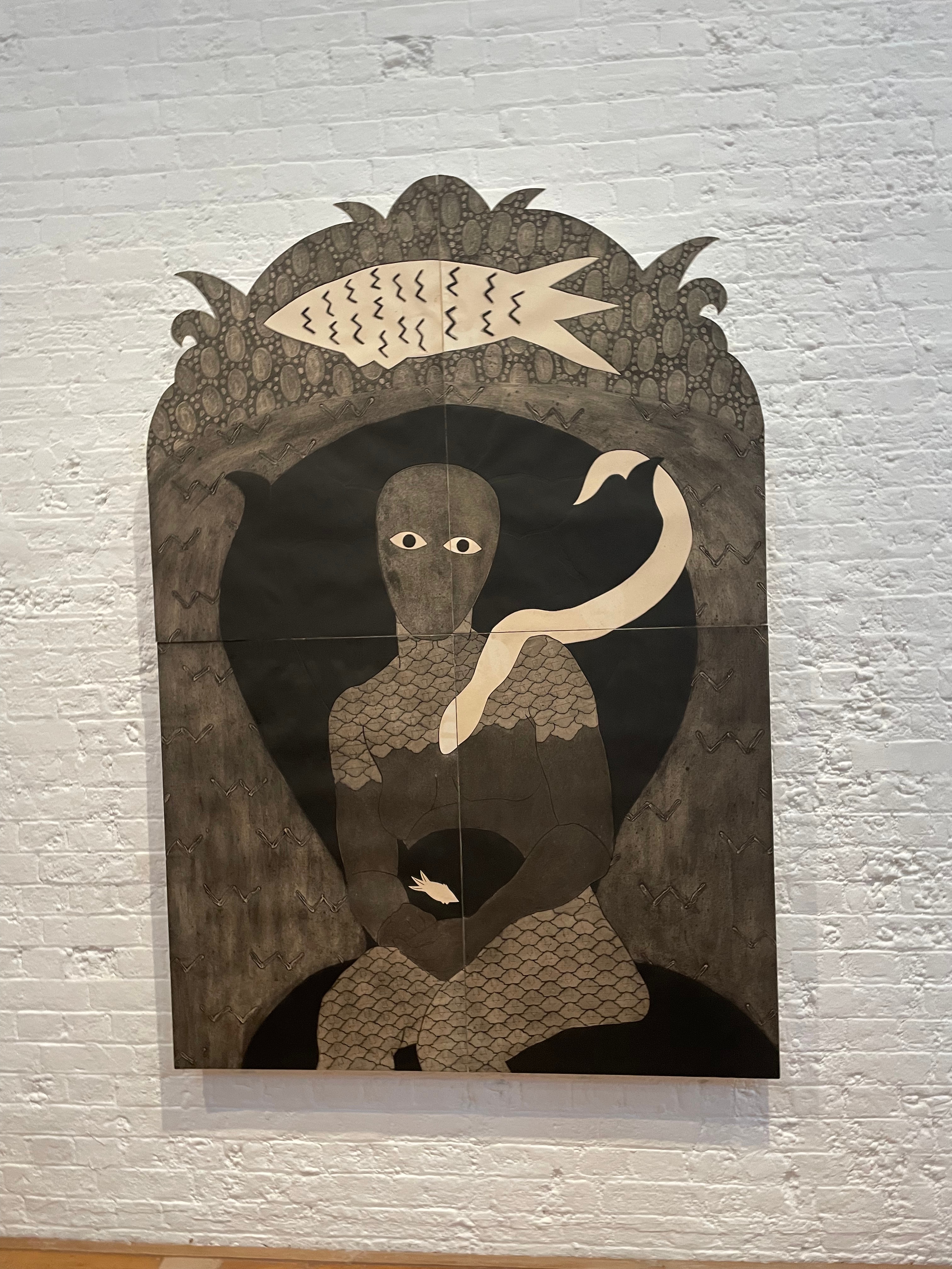
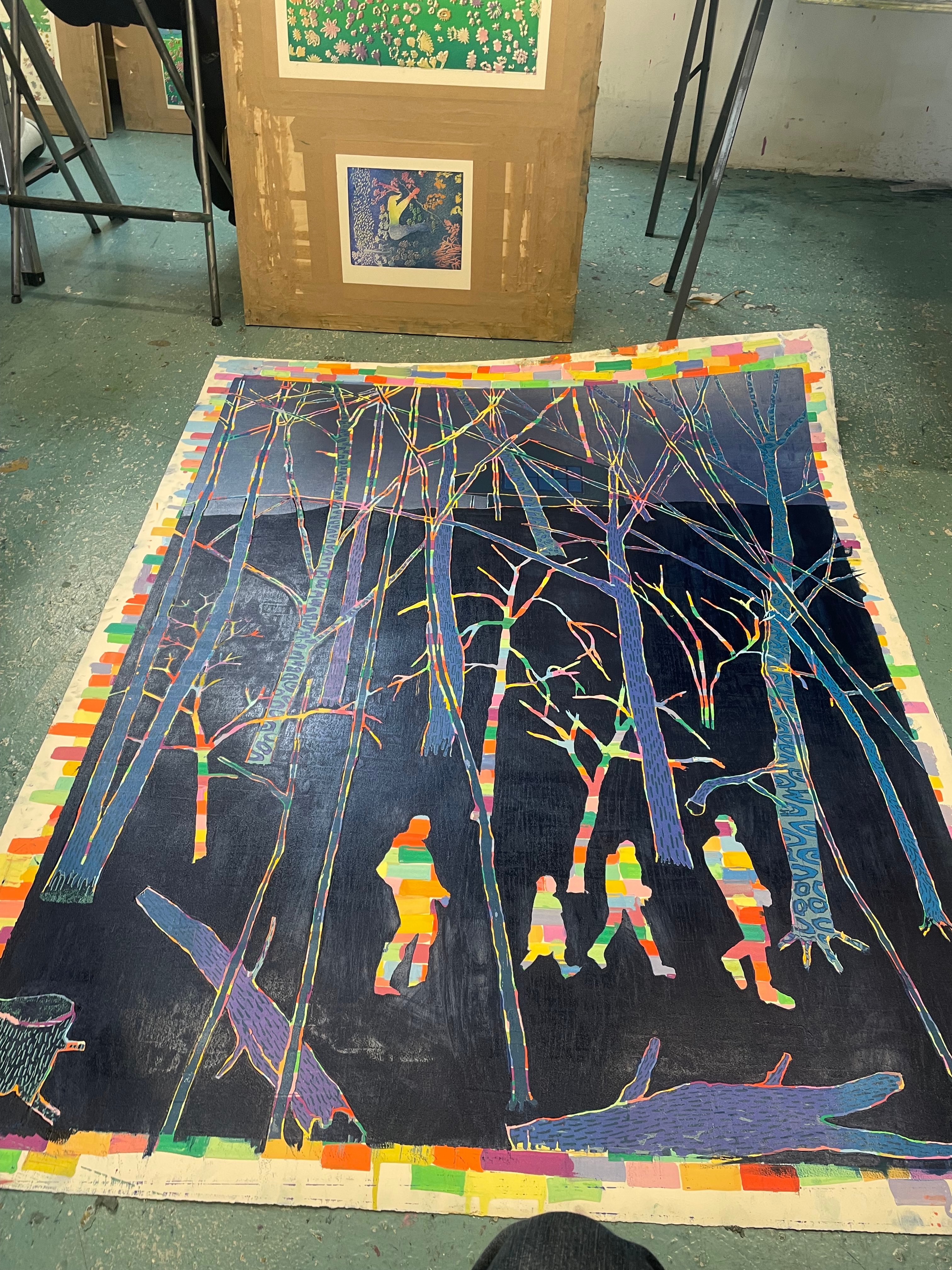
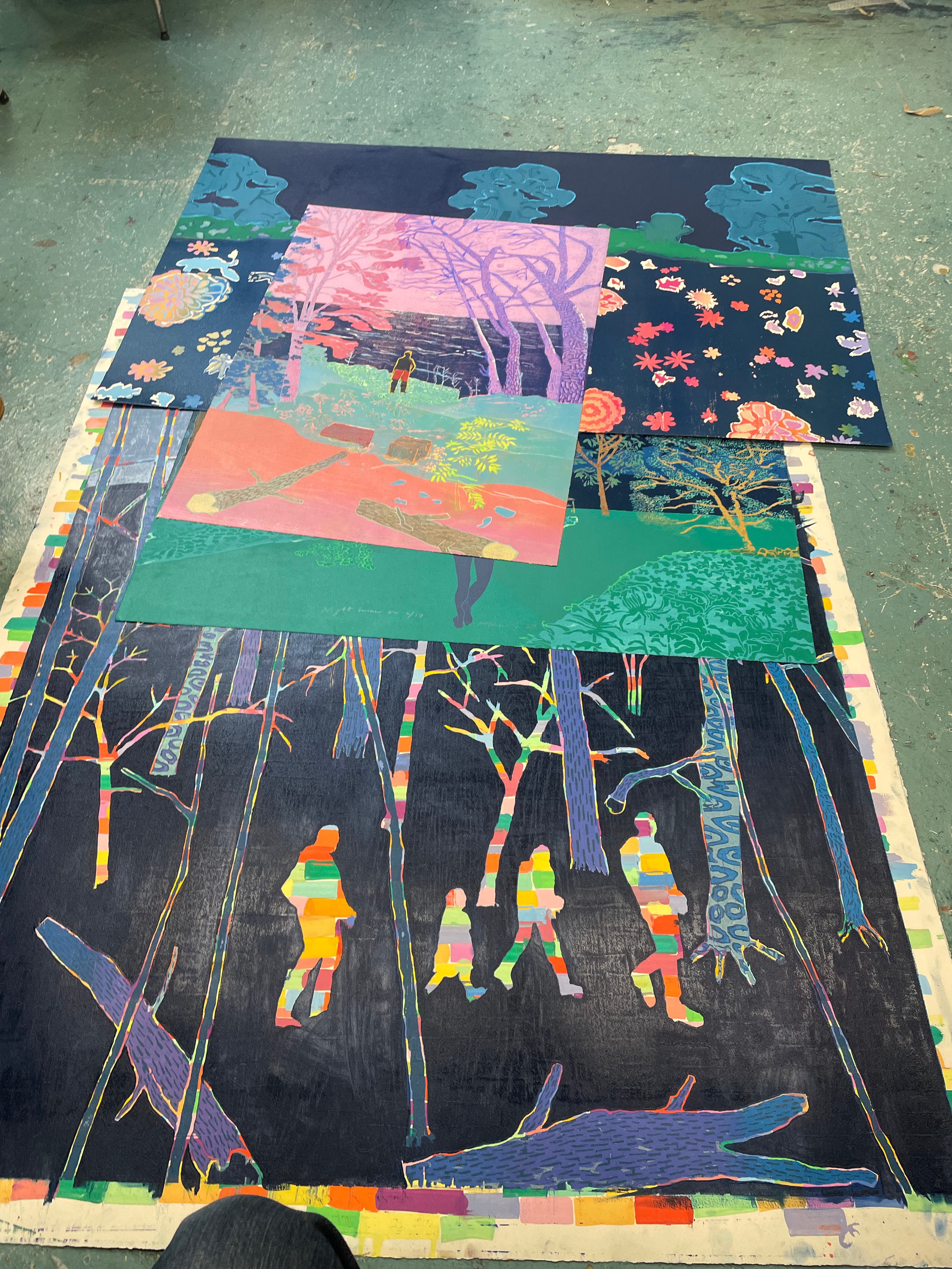
Our trip to see the artworks of Belkis Ayón was fantastic, what strikes me about this work is its huge scale, created from individually printed plates that are then assembled together. I don’t know why I had never thought about this very simple idea, rather than using huge plates that don’t fit in presses like in Unit One. Seeing the works looking so successful at this scale definitely gave me a need to push the size of my own work. The subjects of Ayon’s fantastic collagraphs are also fascinating, depicting the Abakuá mythological character, Princess Sikán. There is a very strange esoteric feel to all of these works, characterised by their strange shadow figures with piercing white eyes, often clad in strange fish-scaled armour. The works were really magical to see, and it was interesting to see some of the collagraph plates that Ayón had used, next to the work itself. With Printmaking, I feel it can be very easy to heighten certain mediums such as etching and lithography, because of their use of prestigious materials such as copper and stone, and because of their classical use by greats such as Rembrandt and Géricault, and I myself am guilty of this, however, this project has really allowed me to realise that the materiality of the process is always secondary to its use and desired effect. Here, the cardboard collagraph plates create these beautifully rich and fantastic prints, without the need for expense.
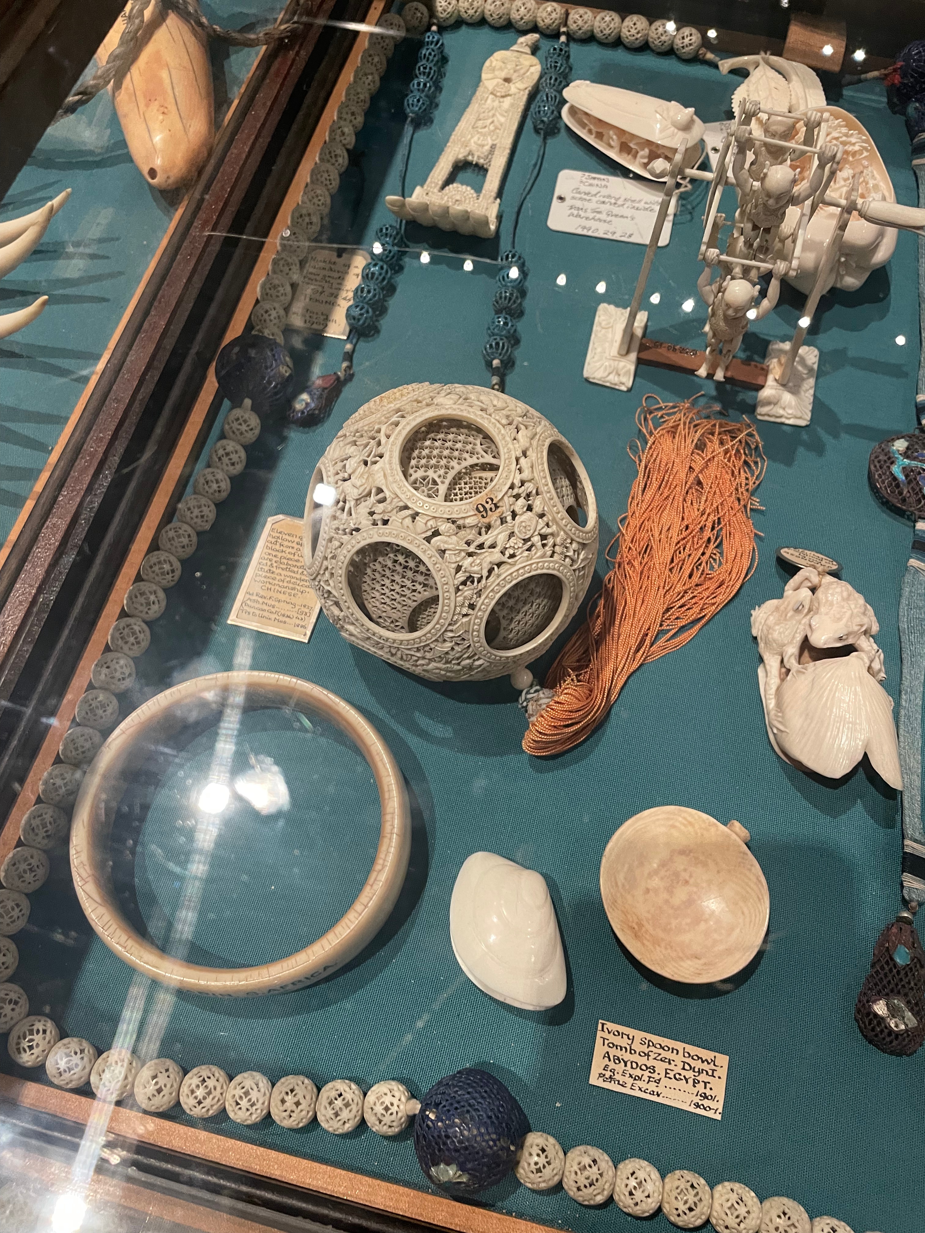
I found the Pitt Rivers Museum to be very interesting, less so for the contents of the items within, but for the sheer amount of them, their classification and curation within the museum itself. On walking into the museum, you are transported to a 19th century explorer’s hoard. There are hundreds of thousands of items on display in antique wooden cabinets, and even more hidden away in little draws underneath them. We were also told that what was on display is but a fraction of what the collection holds in storage. I have always been interested in the idea of these travelling Wunderkammers and old travellers’ cabinets of curiosities, this has always been an element of my interests that I would love to explore within my work.
Natural History Museum, Research Dept. Visit
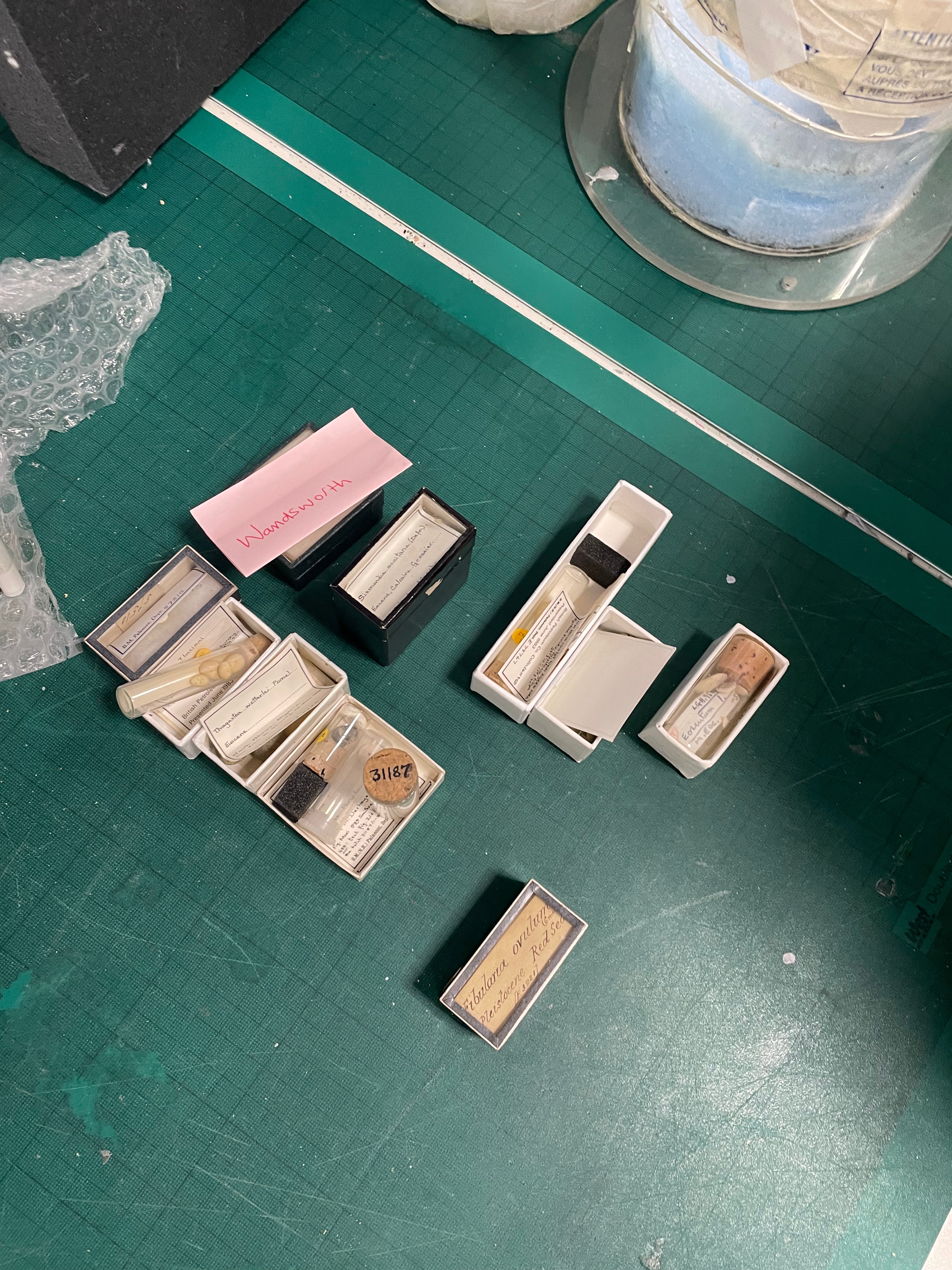
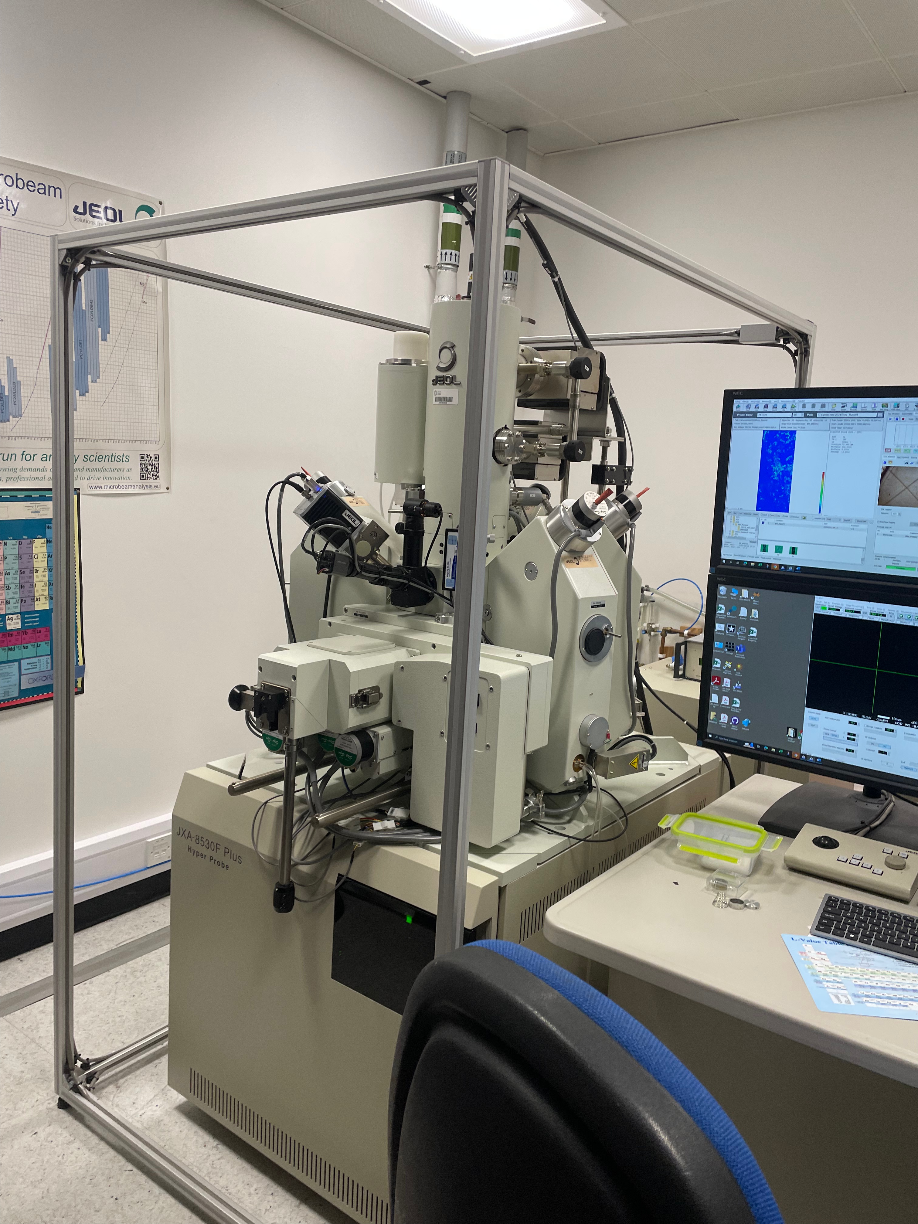
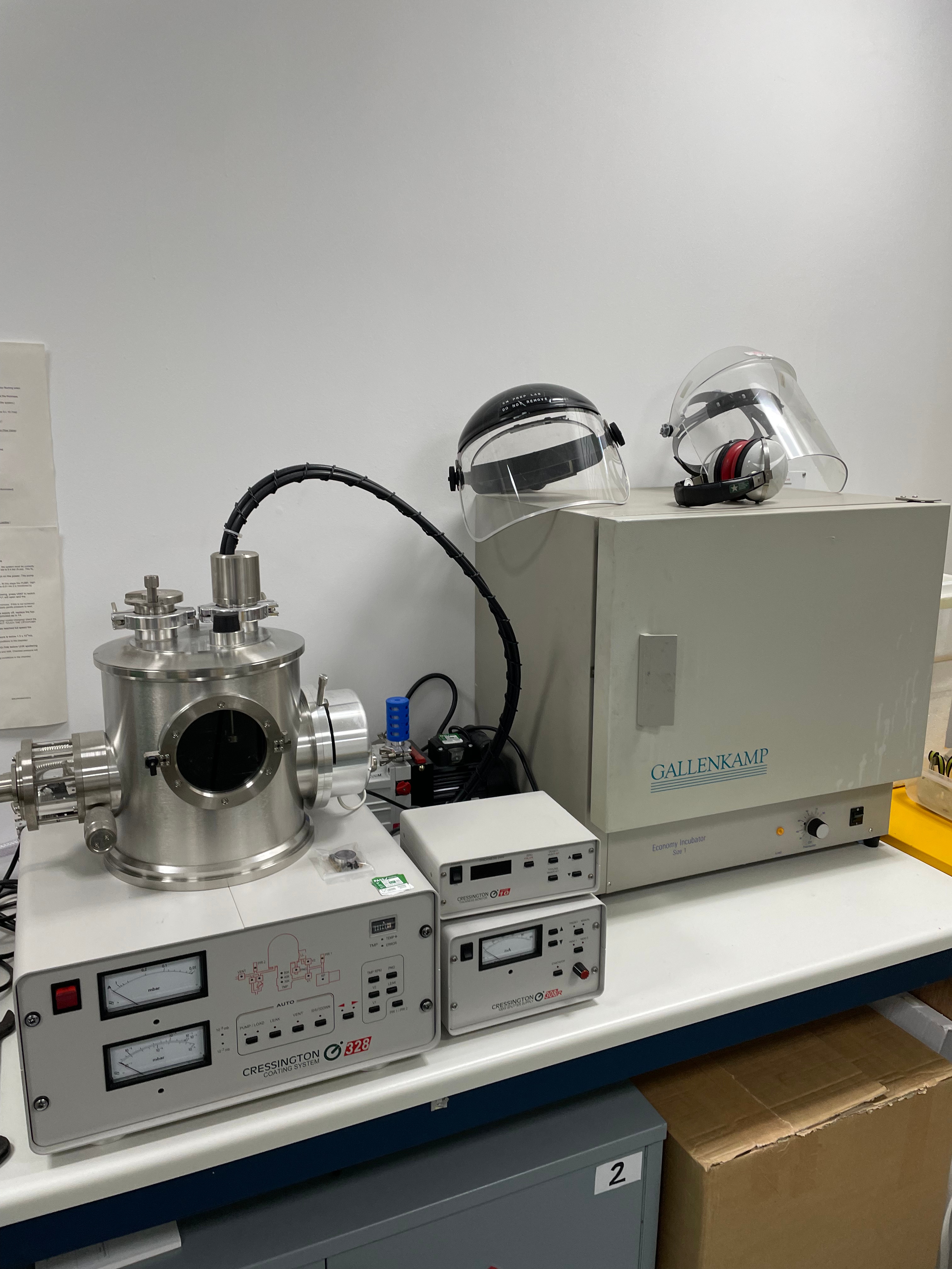
I really enjoyed this visit to the Natural History Museum’s scientific imaging labs. I found myself more interested in the machinery and potions and vials than the things they were looking at through them! The tiny staubs and labeled vials reminded me of some old fashioned Wunderkammer. I would really like to look at some of my own samples through this machine, specifically some of the lovely mud from Norfolk that contains Prussian blue, this mud stains the local cockles a beautiful rich navy colour. Seeing this thick salty substance through a microscope would be unbelievably interesting.
Tom Hammick- Studio Visit
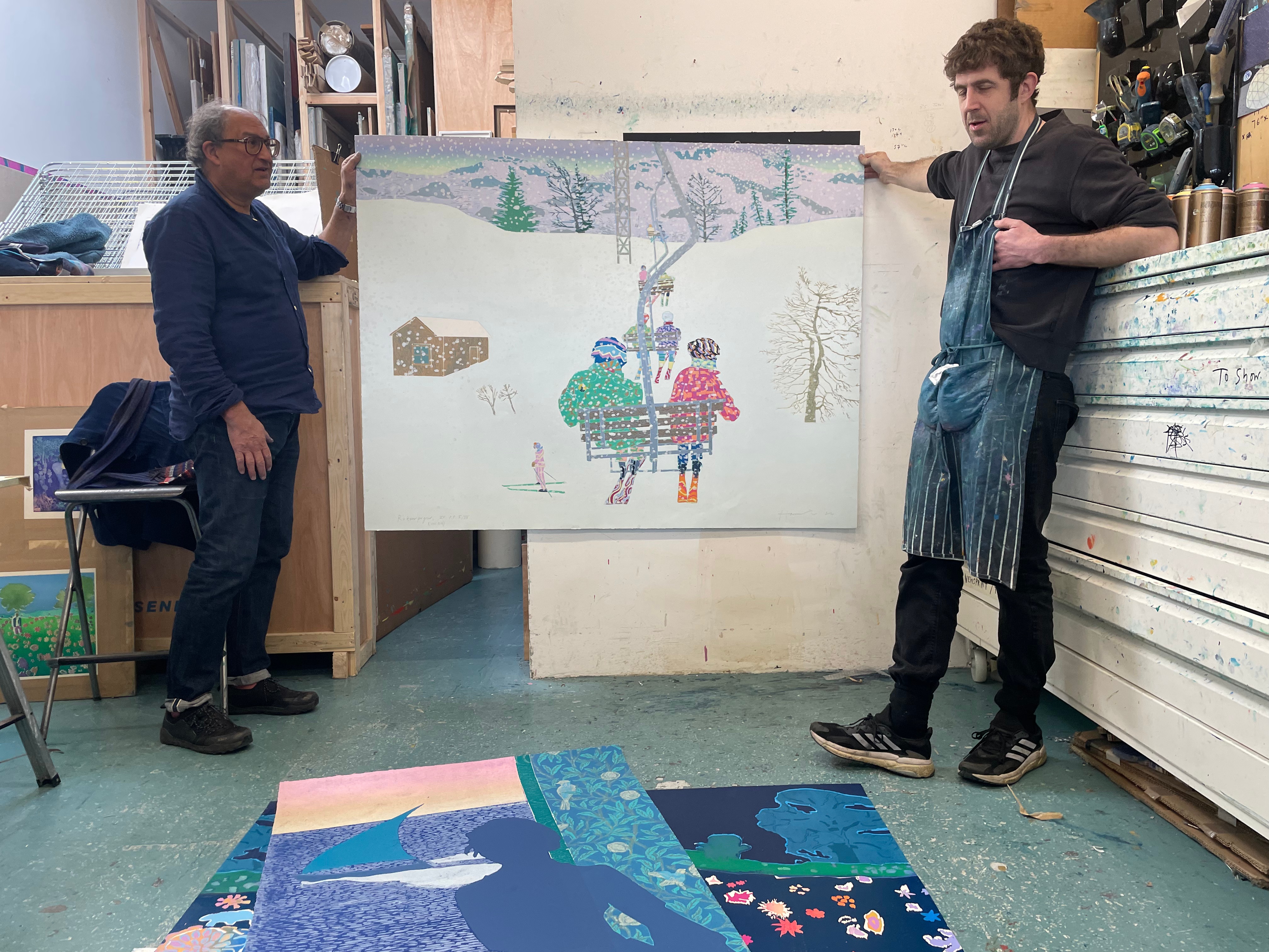
I was so happy to visit the studio of Tom Hammick, his generosity and enthusiasm about his work, as well as his excitement to speak to us was really lovely. It’s often easy to think that when trying to get a foot on the ladder in the art world that everyone is against you and won’t want to help, meeting Tom definitely instilled me with some hope that this isn’t always the case. Although Tom’s work isn’t necessarily to my taste, his methods of print are really fantastic. I particularly enjoyed the piece in the middle, depicting people sat on a ski lift; the immense scale of this work, as well as the unbelievable shimmering depth to the whites were really fantastic. As mentioned before, Tom’s style may not be completely up my street, but his attitudes to artwork and printmaking echo a lot of my own. Tom repeatedly talked about the tactile sensory elements of print that really excite me too, the lovely warm smell of linseed oil and the thick viscosity of ink, he described these as like ‘sweets’, which I completely understand- one of my own first experiences of printmaking was walking into the Camberwell etching studio and instantly being hit by this gorgeous smell of ink and white spirit and oils. The subject of Tom’s beautiful work was also really interesting. Despite his jolly demeanour and very colourful, cheerful work, Tom spoke about his unhappy childhood and struggles with mental health. A really lovely phrase that Tom mentioned has stuck in my head since our visit to the studio, he stated that his work was his own ‘quiet defiance’ against a very hostile and sad world. This really resonated with me and my own work, I choose not to create work about political matters and choose to instead surround myself with the complete antithesis to the nasty and scary stuff around me, being in the landscape is my own quiet defiance against a sad and depressing world.


Original Print Fair- Somerset House
The Original Print Fair was probably the most fantastic collection of work that I had seen in person, the collection consisting of Dali’s woodcuts, Ackroyd’s spit bites, Paul Nash’s engravings were awe inspiring. A few pieces at the fair particularly interested me, one of which was the beautiful multiple panelled large scale etching by Maite Cascón. Like the Belkis Ayón pieces, this really interested me in taking print to a larger scale. It was interesting that when speaking to the artist, she stated that the whole image was not planned out from the beginning, with plates being created separately and added on to complete the image. As these plates were not drawn, aquatinted or printed together, the artist had to keep meticulous notes on the printing process. This really helped me to work out how I could print my own larger pieces, and in fact, I decided to not follow how Cascón made this piece, instead choosing to ink and print together, as I don’t believe I would have the skills to create such a consistent print in different pieces, printed at different times!
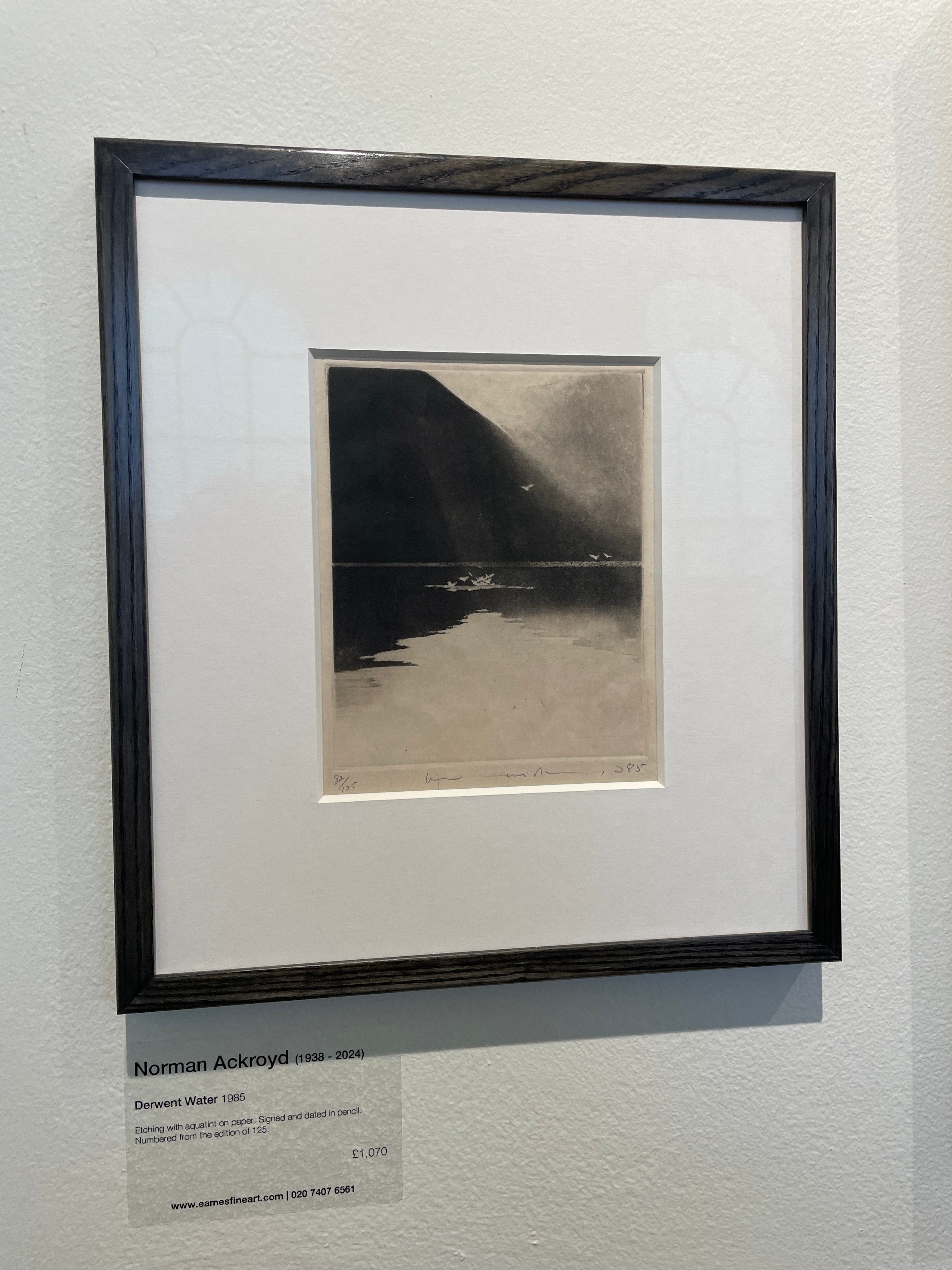
I was also really excited to see a large body of Norman Ackroyd’s work in the flesh. I very sadly missed out on Ackroyd’s large exhibition at Eame’s Fine Art last year and have seriously regretted it ever since, luckily, the Eames stall at the print fair had the whole collection that was on display and more! They very kindly allowed me to paw through this large collection. For me, Ackroyd’s moodiness and darkness within his work is a massive inspiration, I think that his work definitely contains this melancholic aura to it that really translates to the viewer. His beautiful use of high contrast whites, greys and blacks master light in a similar way to Turner, but for Ackroyd, this doesn’t come across as some over dramatised image of the Sublime, it comes across as very still and thoughtful, with a much larger air of melancholy. My only criticism of Ackroyd, especially after seeing so many pieces in person, was the fact that his images start to feel formulaic, mountain, sea, cloud, configured and reconfigured in a hundred ways. This is something I don’t want my own work to fall into, I think it’s easy for the landscape to become formulaic, especially when drawing from the same places, and as such it’s important to me to find interesting compositions that feel exciting and fresh, and that convey something new with every piece.
Another interesting collection I saw were the fantastic cloud etchings by Ian Malhotra, although these pieces are a little bit too linear and illustrative to my taste, their expressions of clouds through vertical lines were fantastic. I also really loved the fact that these prints were created with a white line on beautiful black Somerset Velvet paper, which I will be investing in. I don’t believe I’ve ever seen an etching take this form. The beautiful control over these lines were fantastic, and I think that clouds are an amazing aspect of the landscape that really grip me.
Perhaps one of my favourite artists that I discovered at the Original Print Fair was Gregor Smith. I approached Gregor for an interview but sadly didn’t hear anything back from him. Gregor’s mezzotints really capture some fantastic light, and this light is dramatised and animated in such a beautiful way, acting as a medium to highlight a very dark and silhouetted landscape. I love the mezzotint for its deep and brooding black qualities, and its very beautiful softness. I think that Gregor’s work occupies a similar space to Ackroyd’s in my head. The lovely thoughtful stillness in his work really shines through and shows a much softer side to the landscape.
Interview with Ailbhe Barrett- ‘Coalescence’, Carborundum Print
I think that Ailbhe Barret’s piece, Coalescence was probably the most exciting piece of work that I had seen at the print fair. The beautifully subtle use of multiple plates of carborundum create this really haunting, ‘dying of the light’ landscape. The subtle and very gentle use of colour is really fantastic, and in my opinion, overshadowed the fantastic work of Hughie O’Donoghue that it was situated next to. I reached out to Ailbhe and she was generous enough to let me have a short interview with her over Zoom, I have attached the audio recording of this interview below. In our interview, I discussed with Ailbhe about the importance of place within her landscape work. She mentioned something that really resonated with me, she stated that most of her work is about the landscape in Limerick, where she grew up, and that after moving to Dublin, she felt more of a draw back to illustrate these places. This is obviously something that is reflected within my own work, after moving to London, I felt this very real need to go and draw from Lancashire and Norfolk, and there is a definite desire to create work about these places after a separation from them has formed. We also discussed the motif of memory and time in nature, and for Ailbhe, this materialises through trees.For Ailbhe, the landscape holds this sentience and memory that sees humanity come and go, this notion of deep time and some greater power within nature is a huge aspect of my work, and I feel that we definitely connected over this notion. We discussed the use of printmaking as a medium, and for Barrett, a painter-printmaker, who works pretty much 50/50 between the both mediums, she discusses that certain images call for being either a print or a painting, and this is very apparent in selecting the imagery before creating the artwork. The sky is obviously a massively important quality in my own work, and I see this also in Ailbhe’s gorgeous pieces. I think that Barrett shares similar feelings around this to myself, for her the sky connects to this vast insignificance we feel, and a connection to heavenly bodies. It was very helpful to talk to a fellow landscape artist whose imagery is so successful in achieving a very atmospheric, thoughtful and moving response from the viewer. It is deeply comforting to know that people experience the same feelings and reasonings behind making work about nature as me, I’m very grateful for Ailbhe giving up her time to speak to me.
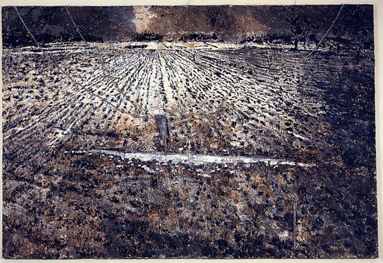
Hughie O’Donoghue- ‘Around the House’, Carborundum Print
I had never heard of Hughie O’Donoghue’s work before the original print fair but I was absolutely amazed to see this piece in person. The colours that O’Donoghue employs are absolutely fantastic, offering a warm Autumnal vibe. The criss-crossing fields are such a lovely and recognisable aspect of the countryside, and this destroyed old farmhouse in the middle reminds me of the old disused barns in North Norfolk. I was surprised to see that a lot of O’Donoghue’s previous work was intensely dark and macabre, his paintings describing these almost Biblical forms contorted in a very organic feeling sea of colour, or works on tall dark ships at sea that feel like a more modern form of Turner’s famous depictions of mast ships and galleons at war in a stormy sea. These works are contrasted with the more calm domestic and rural scenes, such as ‘Around the House’ above. Even then, however, this piece contains a strange darkness to it that contrasts with the lovely warm colours, the broken section of roof, and the situation of this house alone, starts to generate ideas of loneliness and abandonment. There is definitely a pervading melancholy behind this piece that connects it to his previous work. I was excited to learn that Hughie is a fellow Mancunian, and his piece really inspired me to try out carborundum printmaking as it felt like a perfect bridge between my moody monotypes and the more visceral and deep qualities of intaglio printmaking. After trying out carborundum, I realise that it does not achieve what I want to go for right now, but it is something that I will definitely return to and pursue in the future.


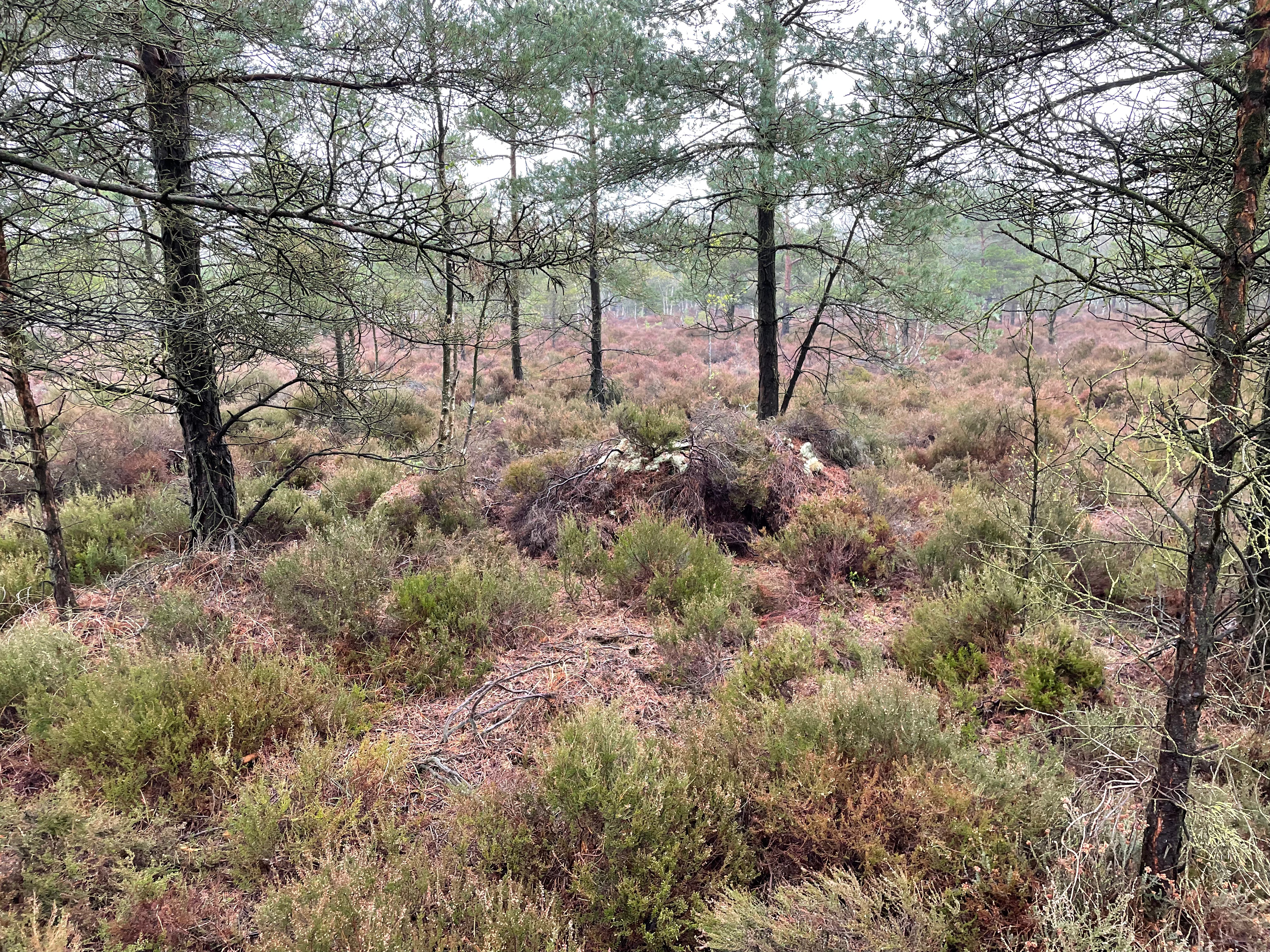
A Visit to the Abbeyleix Bogs,
The Abbeyleix Bog is an ancient landscape that feels intensely strange and alien. In a lot of ways it reminds me of the Stiffkey salt marshes, with its intense flat quality and interesting low-lying flora. The bog feels almost like a coral reef, with some of the largest colonies of beautiful blue-green lichen bursting from every piece of deadwood I’ve ever seen. Meanwhile, the strange red reeds are beautifully reflected in the still glassy waters, creating this strange, curly eldritch mess of tangled grasses. Exploring a different landscape to my usual ones was really worthwhile for me, although I don’t see myself making work about this place right now, because it has no rich history or deep resonance that relates to me personally, viewing different places and seeing different compositions of landscape, really expands your knowledge of the landscapes that you are acquainted with and used to. I think the bogs really made me want to experiment with colour again, and I will most likely come back to these spaces once the MA is over to create work about them.


A Trip Back to the Motherland,
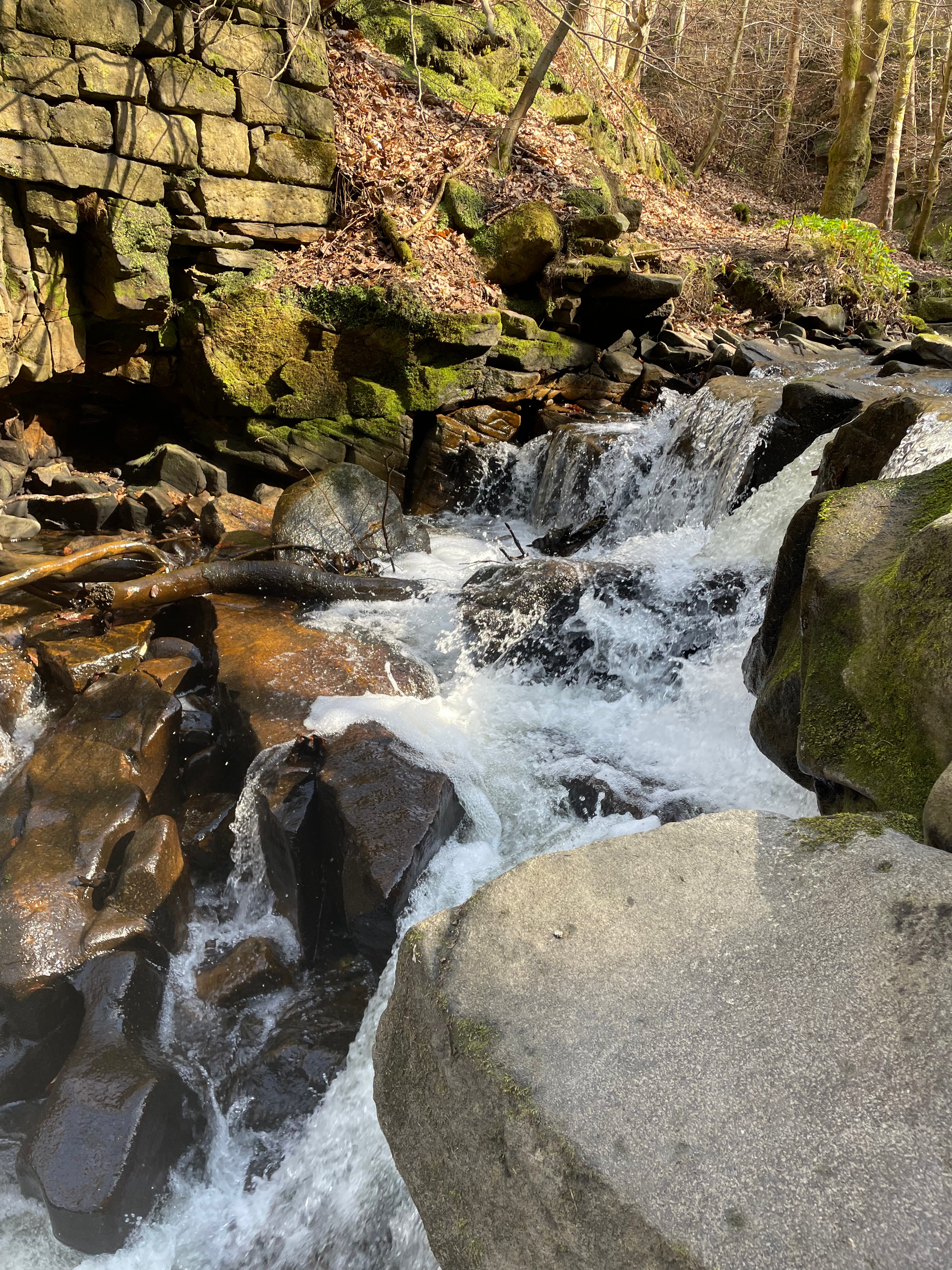
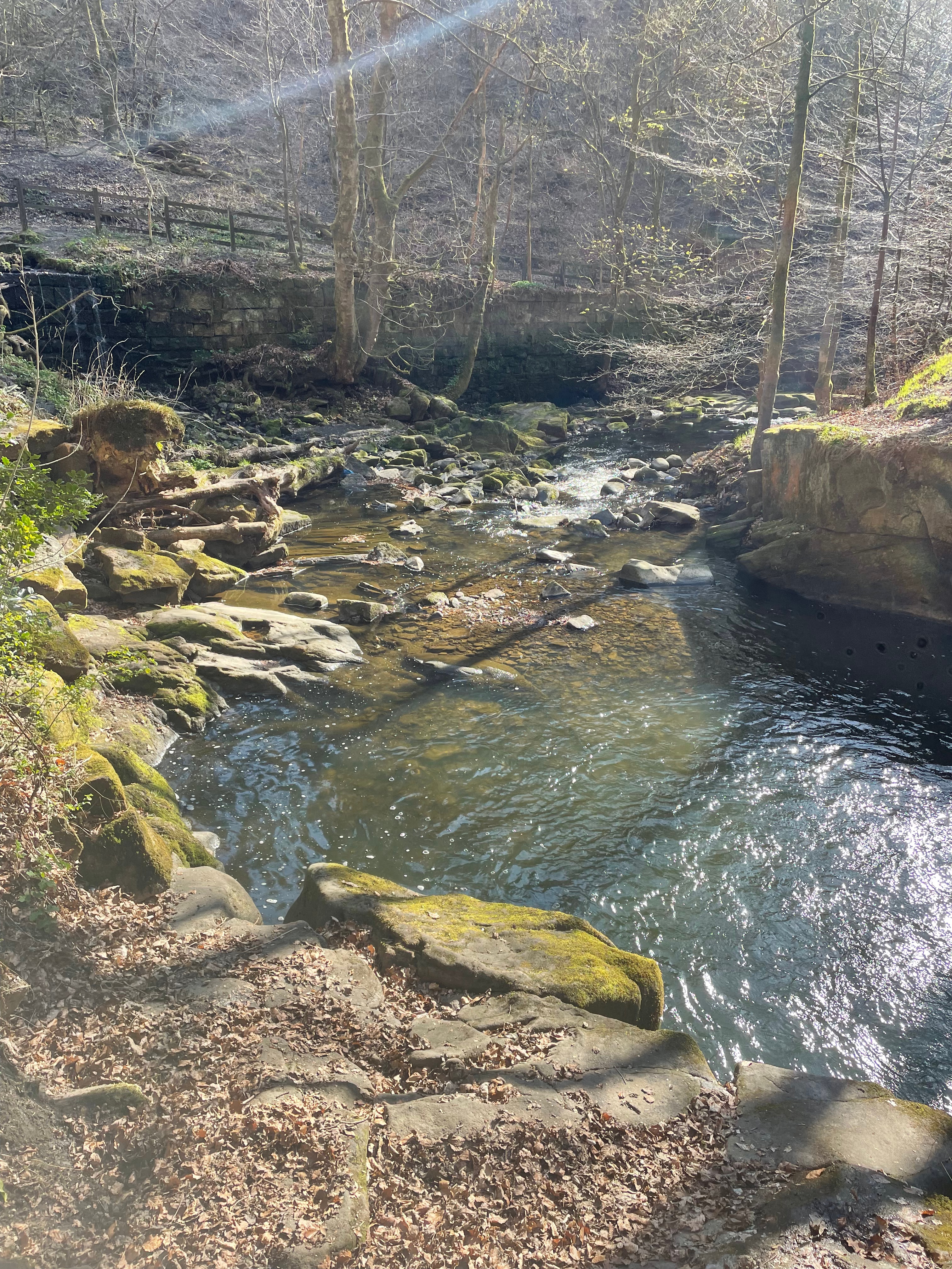
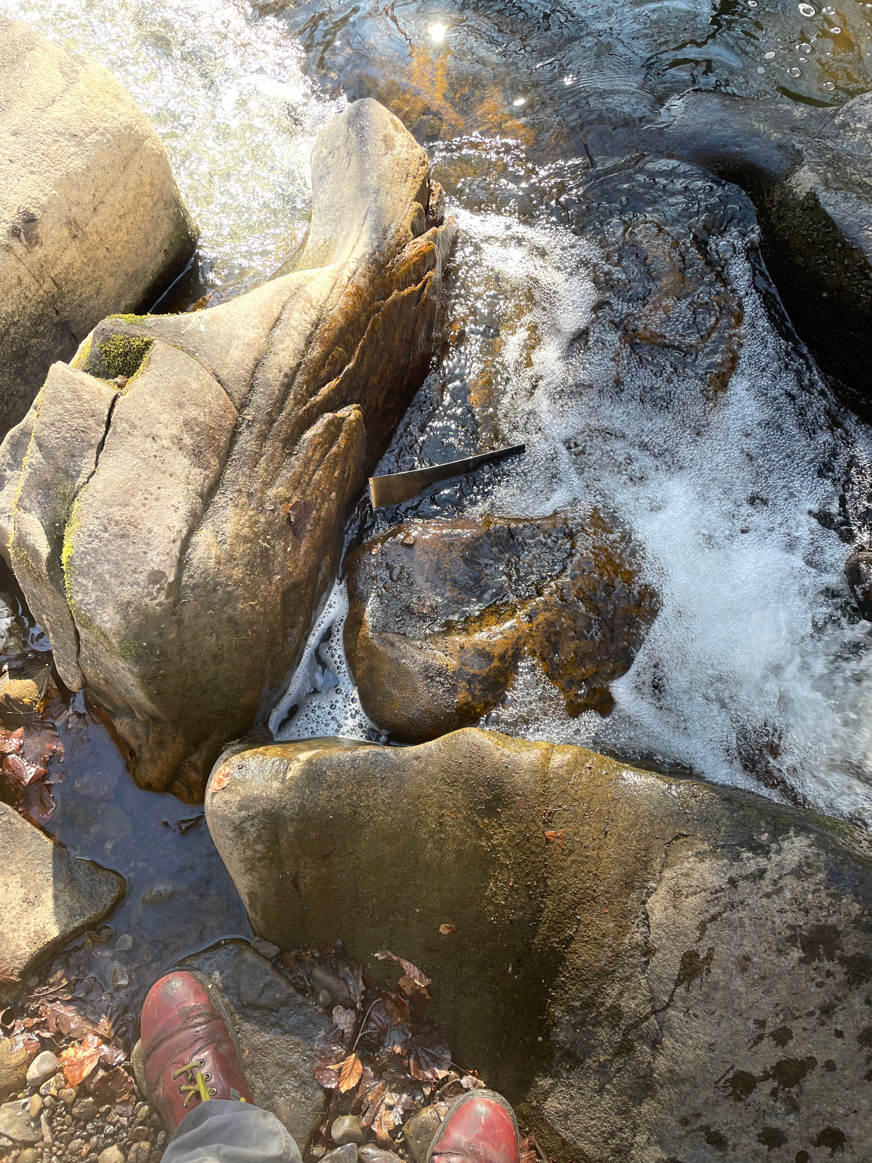
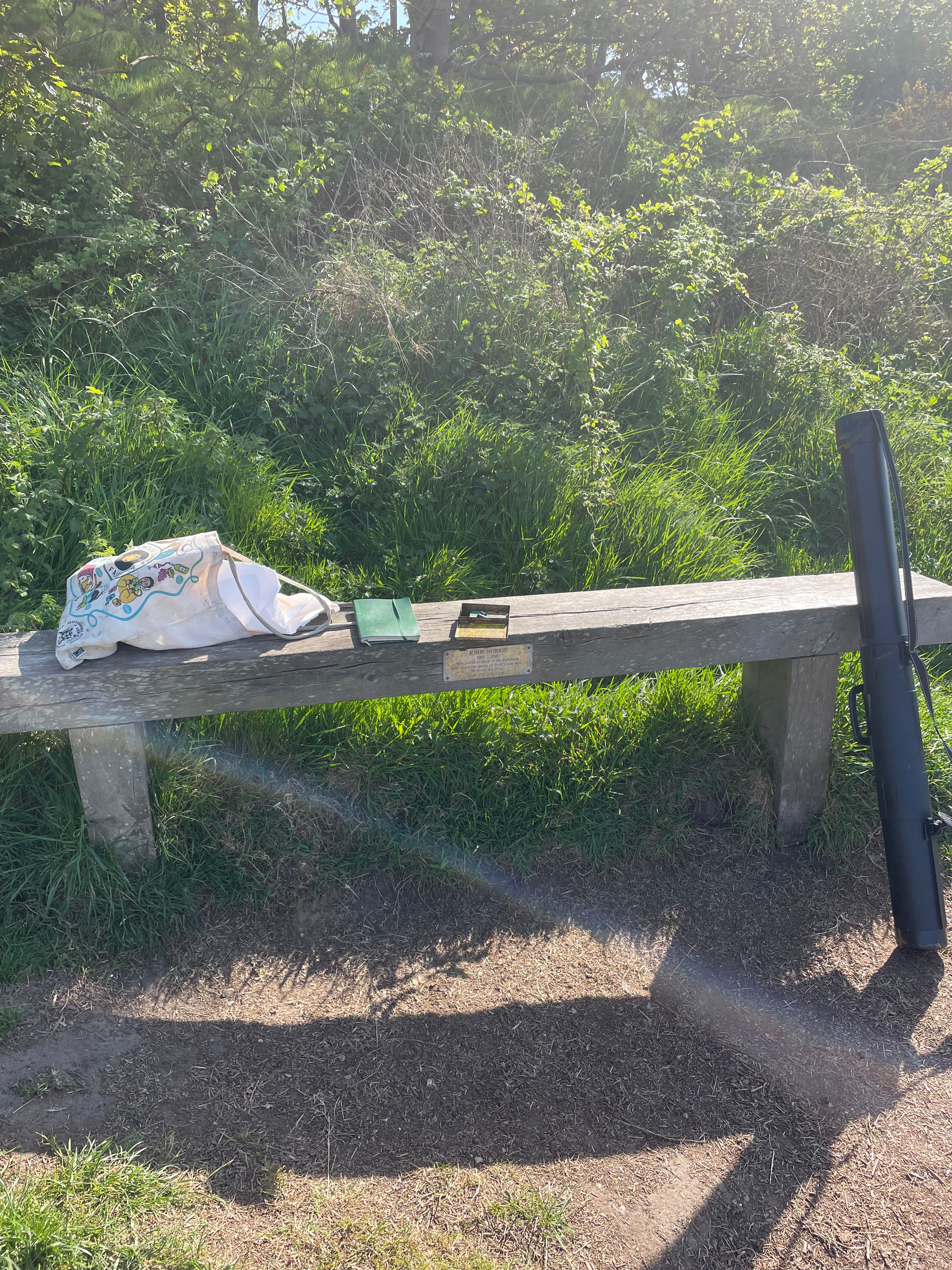
I was lucky enough to get a couple of days to return back to Manchester to make some work. I find that being physically present in space is the most important form of primary research for me, I feel like I can’t formulate ideas about these landscapes without being there, and letting the waterfalls whisper ideas to me. While in the Dell, writing and thinking, I began to see the waterfalls as these brutal givers and takers of life. I researched into ritual uses of waterfalls, and became acquainted with a Japanese practice known as ‘Takigyo’. The esoteric Buddhist practice involves sitting under a waterfall and allowing the powerful water to hit you and pass over your body while chanting or praying, this allows the participant to cleanse his mind and spirit. In this ritual the water is said to symbolise amniotic fluid, and the participant is symbolically reborn through this practice. I began to think of the waterfall as this great womb, the giver of life. This idea is strengthened through the fact that the waterfalls are situated in an area known as the Thrutch, which in the Northern dialect, refers to a very fast moving narrow passage of water, therefore the waterfalls become this womb, a violent passage that begins life. I made sure to take hundreds of reference photographs to work from, in various areas and in different levels of light.
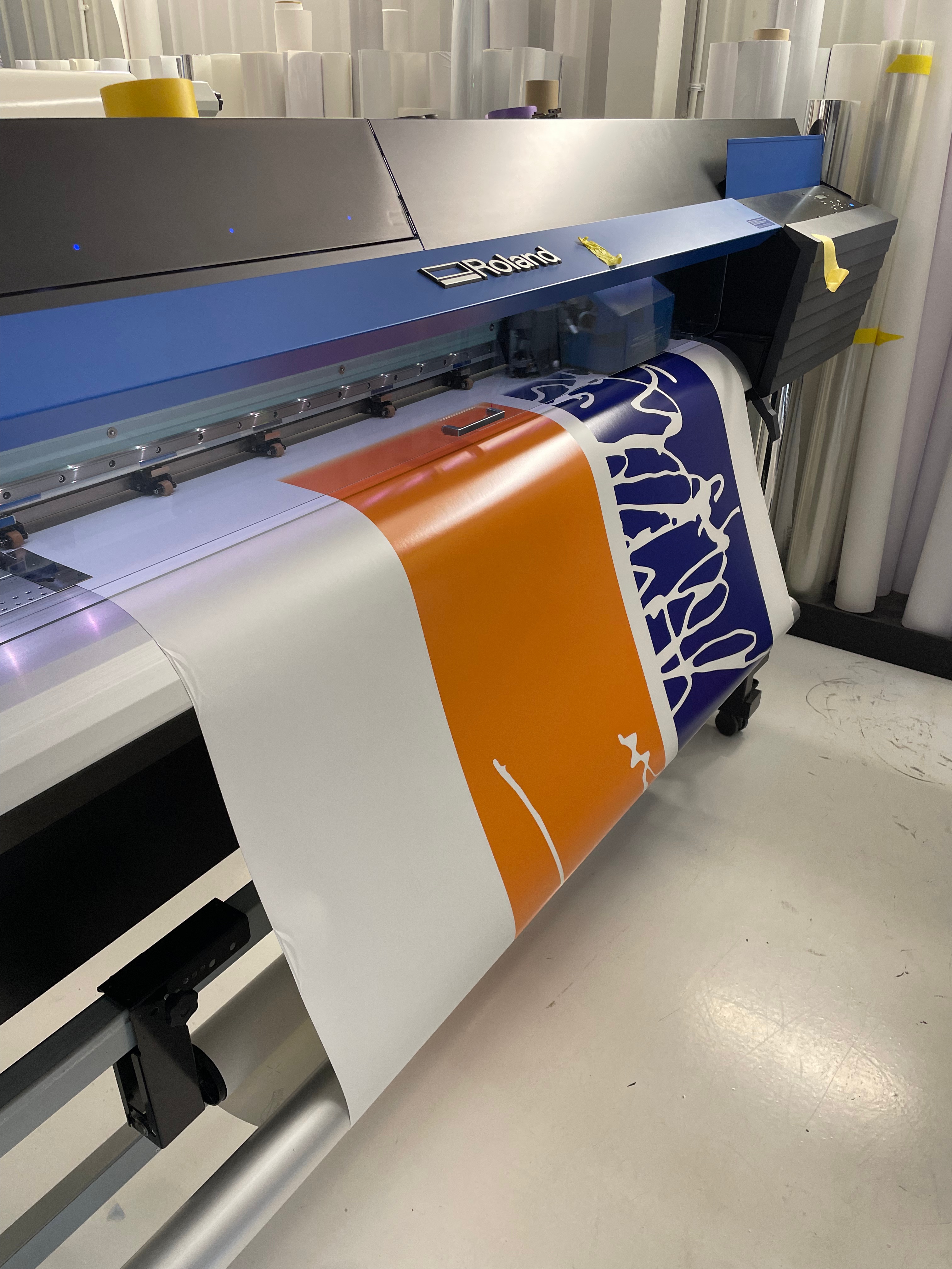
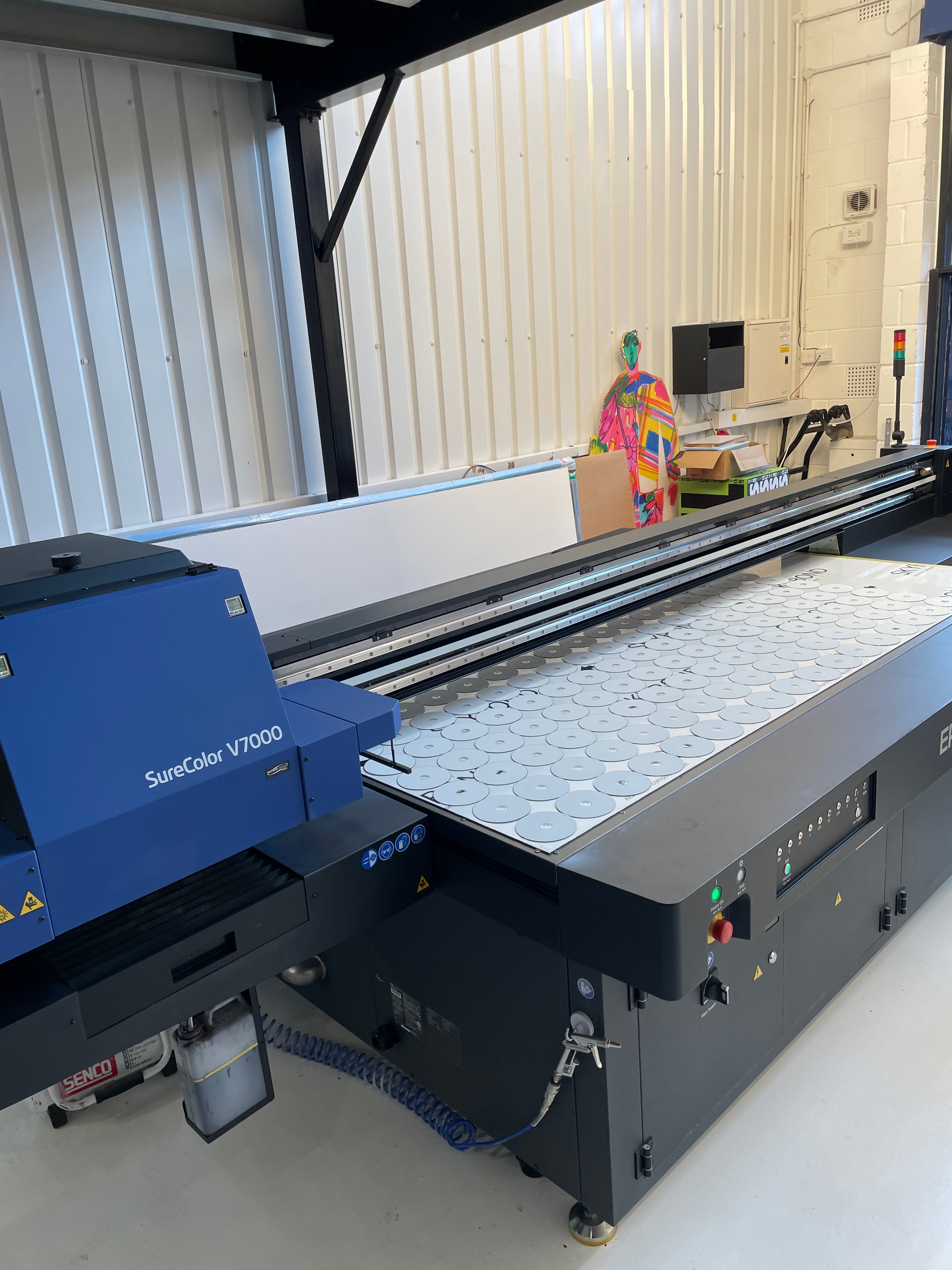

Working at Puck Studios- A Digital Fine Art Print Studio in Bethnal Green,
Over Easter, I worked for three weeks in Puck Studio, I was offered the opportunity to work here by my friend, Sarah, who I completed my BA with. It was very interesting to see a completely different side of print than what I was used to, and how working with print happens in a commercial context. Sadly, because I was new to the company, I was put on the jobs for commercial clients, rather than for artists. I did, however, create signage and advertising for huge companies such as War Child and Don Julio Tequila, which was fantastic experience. I was primarily working on a solvent based digital printer, pictured on the top left, and I took the design from the clients file, to a prepared piece of artwork, ready to print, to printing, lamination and on one job, I got to install the material myself. The star of working in this studio however, was using the flatbed DTM printer, which is a machine I didn’t even know existed. This digital printer could print on any material up to 12″ tall, and the staff at Puck were constantly pushing this printer to its limits to create innovative fine art printwork for artist clients. This printer could also print with white ink and a gloss varnish, meaning that you could create raised pieces of artwork. I have been asked to come back to work at the studio over Summer, and after the course has finished, the owner has asked me to work there on a more permanent basis. Although this is not the ideal print job for me, it is a great step to take in my career trajectory. I would be excited to work with the DTM printer and to experiment with its uses. I have already researched into its uses and believe I could create digital relief prints by printing with the raised varnish. As far as my research tells me, the varnish the printer uses resists acid, and can be washed away with white spirit, meaning that this printer should be able to create super high definition ‘screen’ etch resist plates, without the need of using a negative, or hydro coat or photopolymer etching plates.


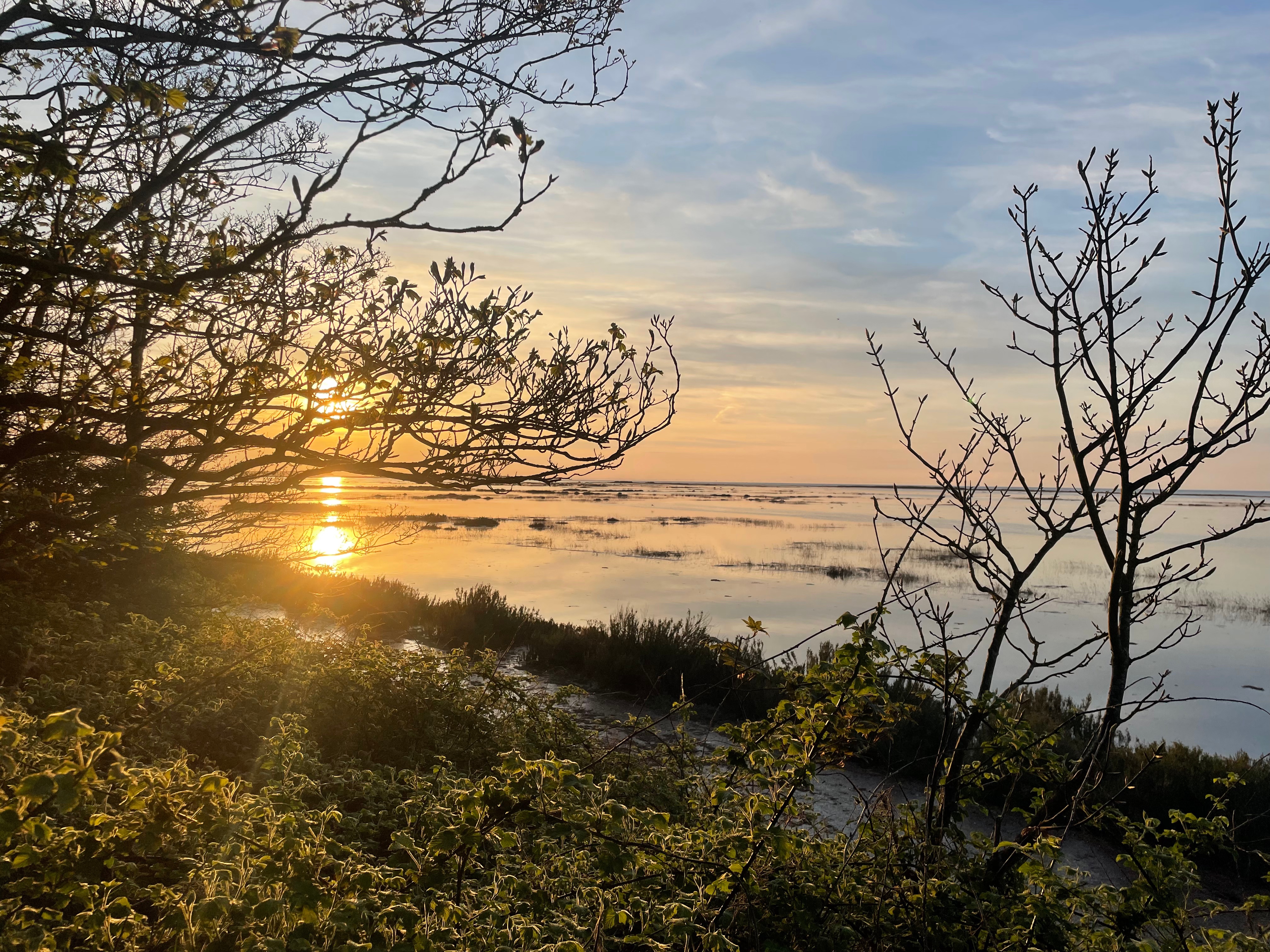


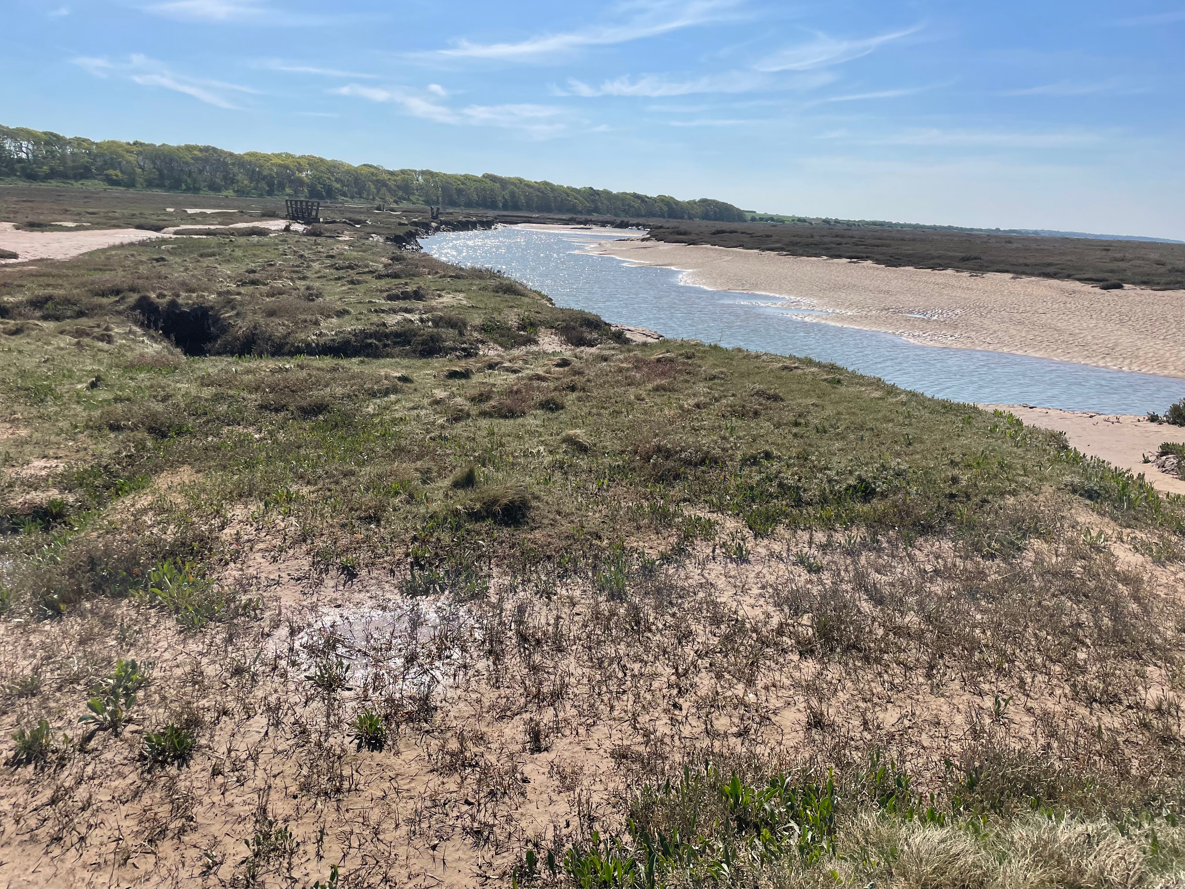
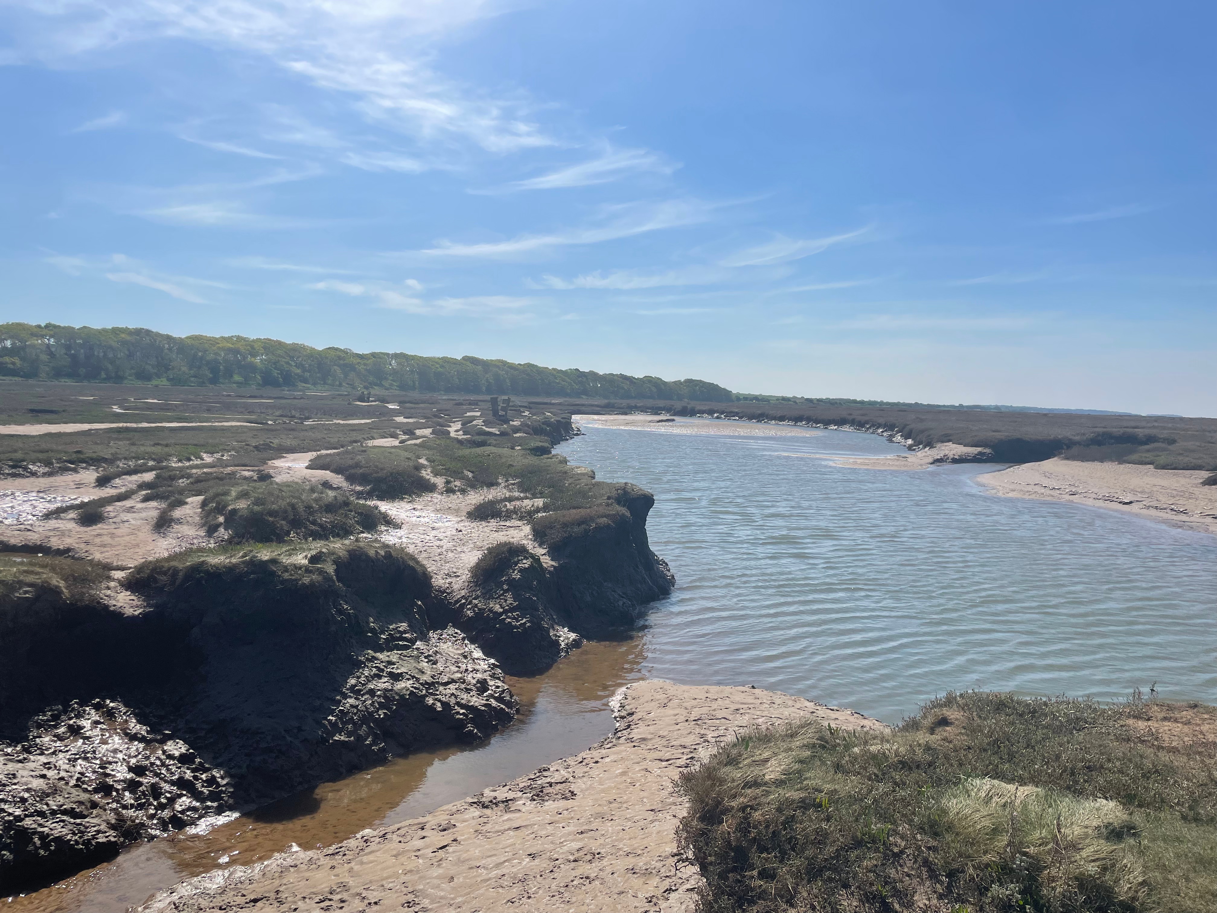
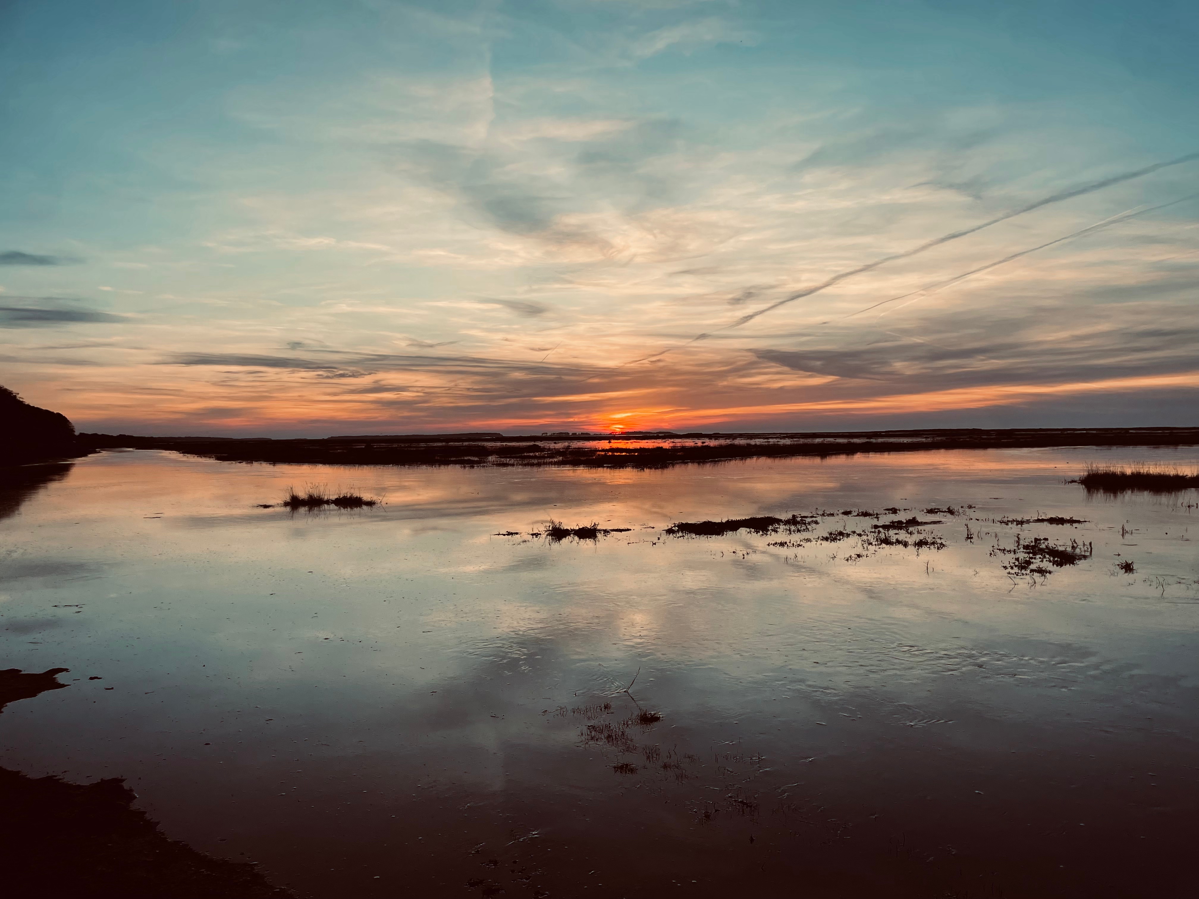
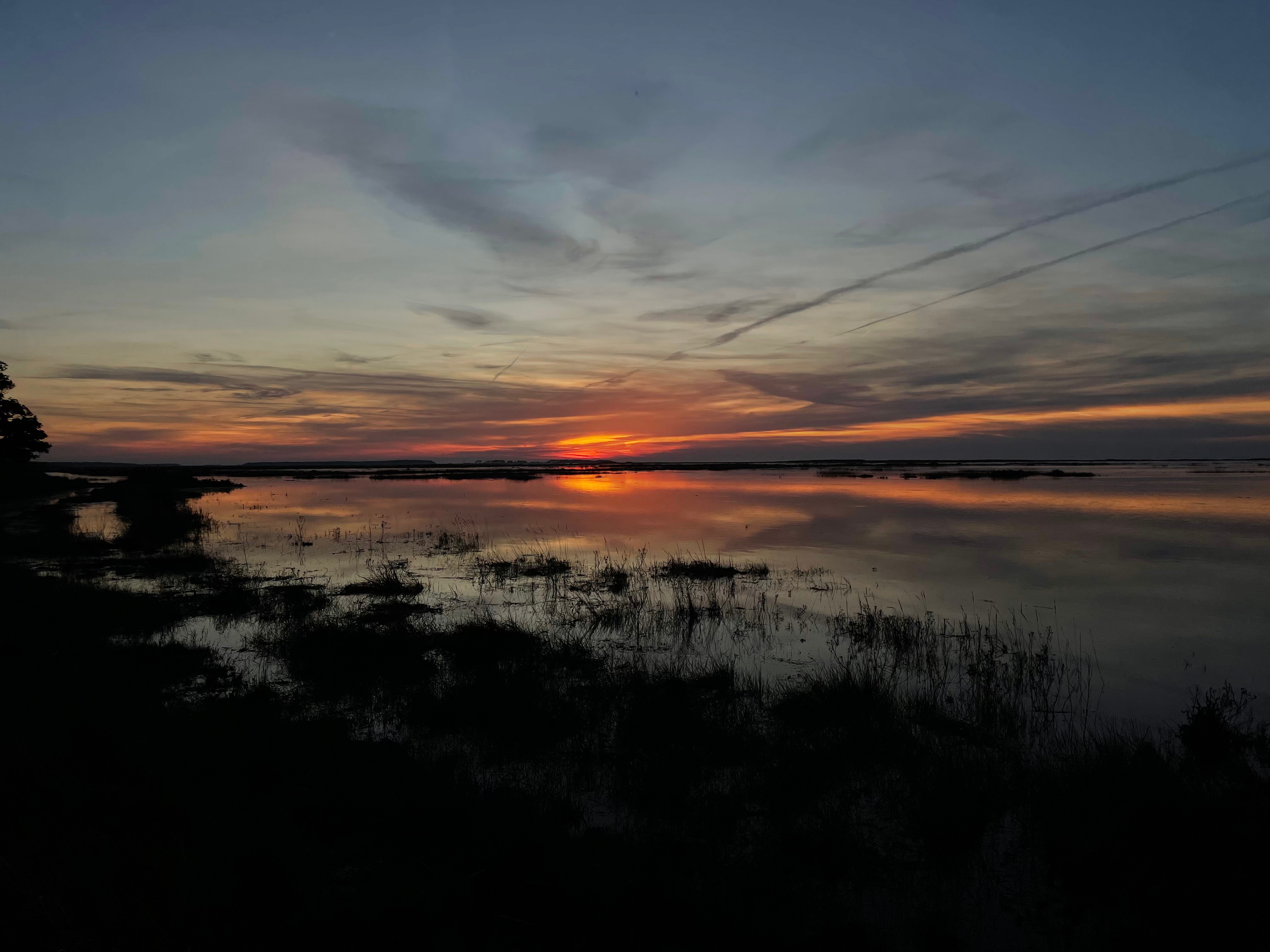
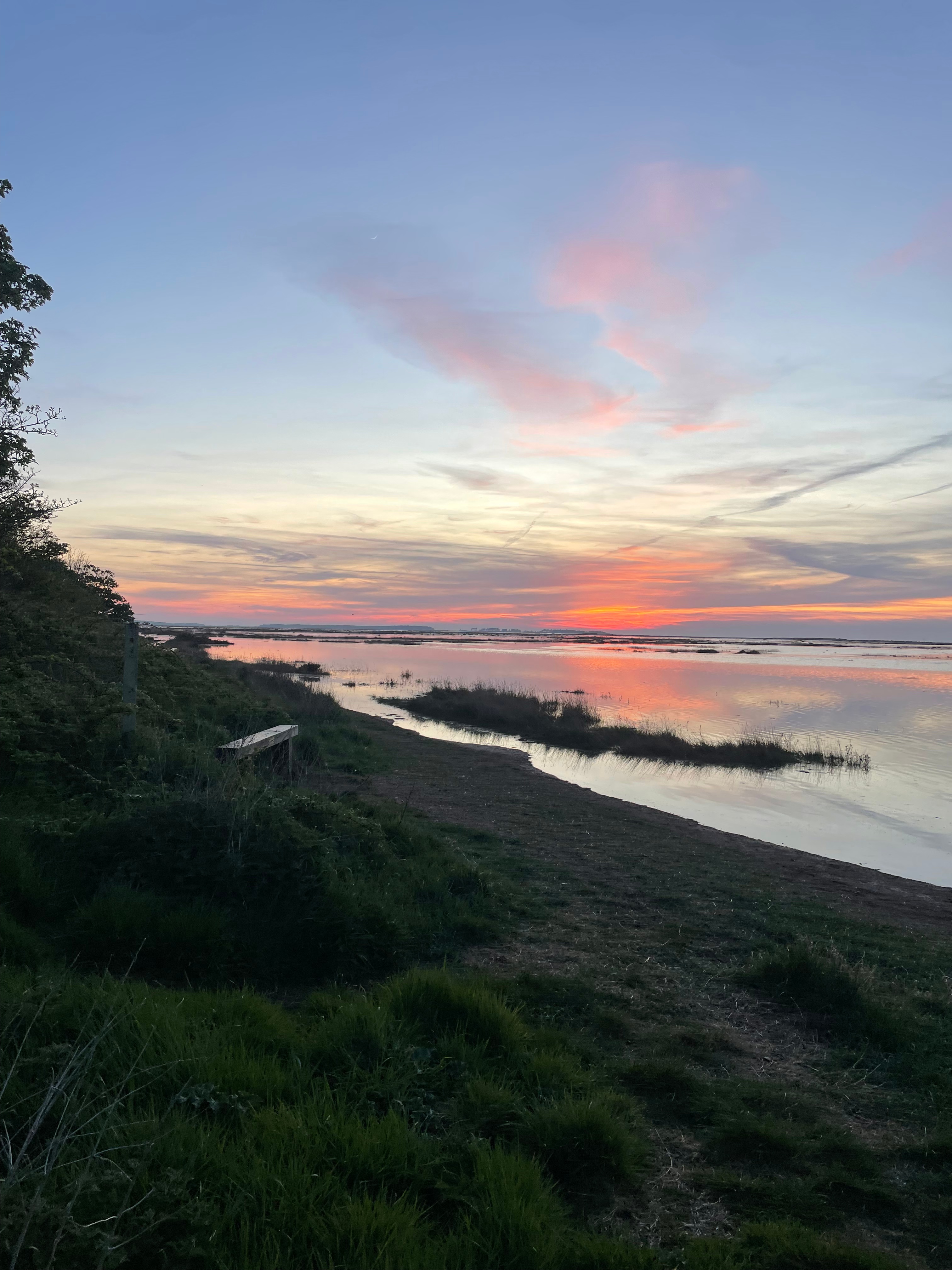
Back to Norfolk,
My trip back to Norfolk was invaluable in my primary research for this project. Like being in Manchester, being in this place really re-energises my ability to create work, and the writing and sketches I made here were integral to the rest of the unit. I went down to the marshes to draw in the daytime when the tide was low, before retreating back to dry land to capture these mesmerising sunsets. I took my dad’s old DSLR and photographed these sunsets with it, and now, I have over 200 original images of this beautiful place to use as points of reference.
Royal Society of Painter-Printmakers Show- Bankside Gallery
I was really impressed with the work at this recent show at the Bankside Gallery, it was lovely to see a very diverse range of artwork, including some by Tony Lee, which is always great to see in a gallery setting!
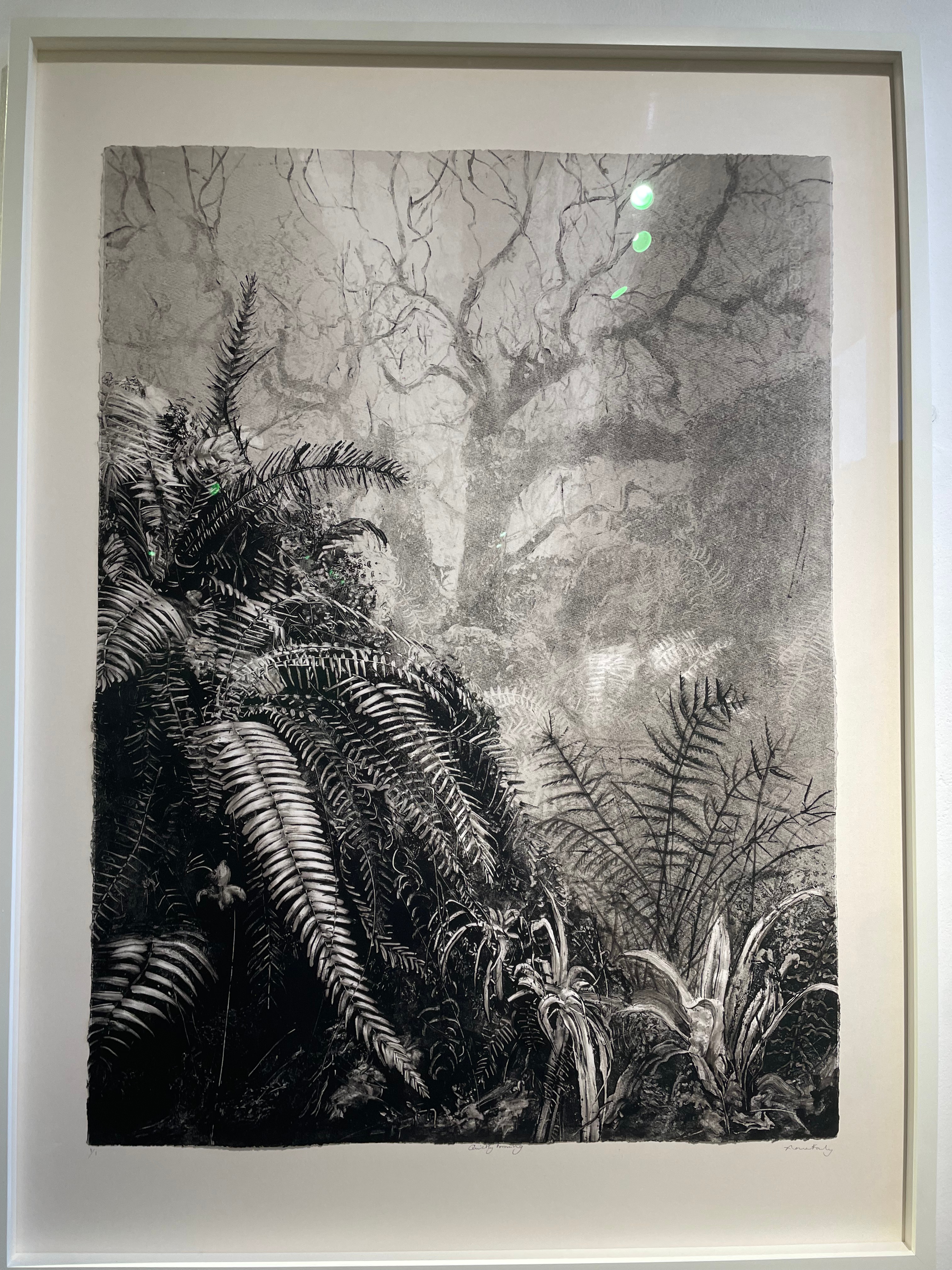
I have always been very interested in the work of Fiona Fouhy, and this piece, ‘Quietly Forming’ was no exception. The depth and level of detail in her mono prints are simply astounding, and always make me stop and spend a good amount of time with her work. I love Fouhy’s use of ghost prints in the background to really push the image back, giving her work this really hazy, wet look. Fouhy is always a massive inspiration in my mono prints, especially of my prints around Healey Dell, with their dense vegetation. I have recently booked a space to a talk with Fiona at Eames Fine Art Gallery on Bermondsey Street next month and I’m ecstatic to be able to hear directly from the artist about her work.
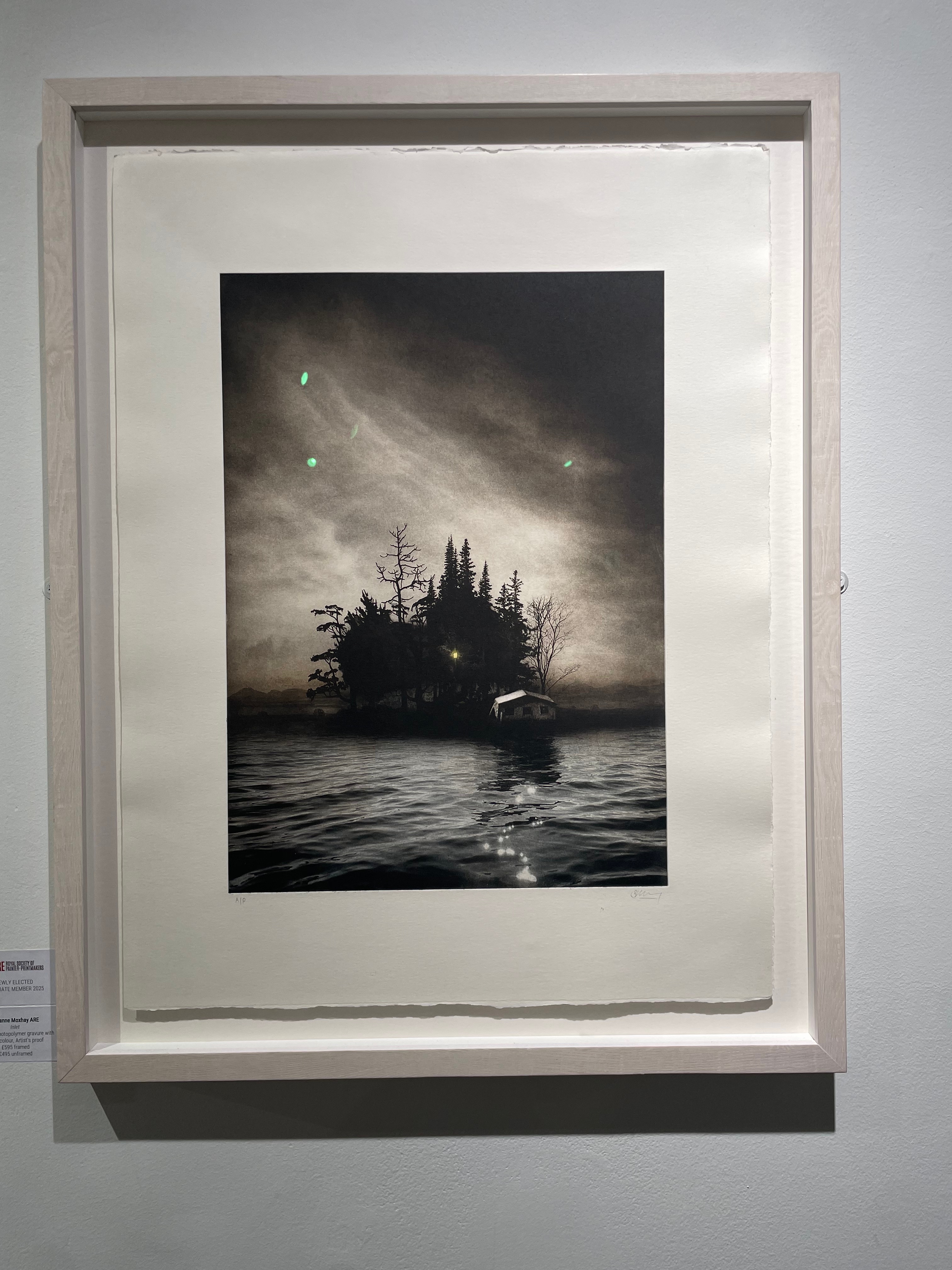
Another work I was interested in at the Bankside Gallery, was ‘Inlet’, by Susan Moxhay. This print is a ‘duotone photogravure with watercolour’, Moxhay uses photomontage and assembled sets to create her imagery. In all honesty, I don’t like the overt scariness in her work, with a lot of it feeling a little bit ‘Cabin in the Woods’, however, in this piece, it was the sky that really captured me. The way the light comes down in shafts to illuminate the subject of the piece is really lovely, and it’s dark qualities, due to it’s medium as photogravure are really rich.

A Discussion with Martin Mitchell,
The most astounding pieces of work I saw at the Bankside Gallery, were a set of two beautiful mezzotints, including the one above. Martin Mitchell is an artist living in Norwich, drawing from the Norfolk landscape, I immediately noticed that we were artists connected by subject. I was initially blown away that this piece had been created using mezzotint, it almost goes away from everything that you would usually try and achieve with the medium. For me, this piece rivals masters such as Rembrandt and I knew I had to try and get in contact with the artist. I emailed Martin and asked if there would be a chance that I could ask him a few questions. Martin stated that he didn’t want to speak over a zoom call, however v very generously offered to speak to me in person in his Norwich studio, and invited me to a talk he was doing at the Norwich Print Fair. He also offered to answer some more of why questions over email, but has not as of yet responded back to them. I will, however, definitely be visiting Martin on my next trip to Norfolk and am very excited to see his studio. Martin did very generously offer a beautiful response to some of the initial questions I posed in my first email to him, the response is quoted below:
“I was 16 / 17, this would have been1981/82 and was on a collage trip to the British Museum. We had been told to look at Greek & Assyrian Sculptures. We had been divided into groups of 5 or 6 and told to stay together. Unfortunately the group I had been put in seemed to want to do it all at a run, then go shopping in the west end. My thoughts were “you’re in one of the greatest Museums in the world why on earth do you want to look at shops which you can do in Southend high street any other day of the week” Left on my own I was happy wondering though gallery after gallery until quite by chance I ended up in the Print rooms.
I was overwhelmed by the variety of the different methods of printmaking and how expressive print can be. I came across Rembrandt’s etching “The Three Cross”. There were five examples of different states on show, one of which had been printed on vellum. Over the centuries, the black ink had separated and bleed out, staining the vellum with magenta’s, ochre’s, sienna’s and blues. I always remember standing in the low light of the print room looking at Rembrandt’s depiction of Christ crucified but this was my supper at Emmaus. This was the moment I went from just wanting to be an artist to knowing I would become an artist and etching would be the root.
For many years I did etchings. I would use hard and soft grounds, Sugar lifts, Aquatints and spit bites. I would work very loosely with rapid, flowing marks. However as my health began to declined I found that wobbly legs and large trays of nitric acid are not a great combination
Mezzotint seemed to be a natural progression for my work. Every part of the process has is it own appeal. Firstly getting into and enjoying the countryside. I grew up always out and about in the countryside walking, camping, Sailing and canoeing. Unfortunately poor health has made it increasingly difficult to get into the landscape but that has made it all the more precious. A short visit into the countryside is now an adventure. Reviewing and selecting the sketches and photos I’ve made. The long, slow hours methodically working the plates. The skills needed in handling the tools and materials. Finally printing the plates, there’s a wonderful sense of excitement and trepidation each time you roll the plate though the press and lifting off the paper to reveal the image.
Why landscape is so important to my work. Blackberry.
We would often go blackberrying at Brandy hole on the banks of the River Crouch in Essex between South Fambridge and Hullbridge.
Sometime with my sister and mother occasionally my older brothers would come along but it was always with dad. For years we seemed to have done this, every weekend from late summer though to October. Carrying great buckets of blackberries home to mum who would turn them in to Pies and crumbles and pots of jam to last us though the winter.
The sharp little pricks on our fingers and hands, the gentle tugging at our clothes as the thorns catch at us
Through a series of small irregular fields of only 2 or 3 acres of hay meadows, wheat and barley fields with the odd tuft of oats dotted about. These were small fields, hardly big enough for a game of football. Fringed by ancient hedgerows, so wide that in places a path ran up the middle. The hedges were made up of standard oaks and a few sycamores with lots of hawthorns Elder and sloe, full of wild flowers that seemed to multiply on every visit throughout the summer. We saw foxes, stoats, weasels and adders and grass snakes. The air was full of bird song and butterflies, with the low murmur of insects. The very air sweet and fresh a verdant idle, a dreamy place that seemed timeless and unchanging.
Then one year I was about 11 or 12. Dad said” it may be a bit early but let’s go see if we can find some blackberries.” Off we set with our bucket, along the ruff unmade road that boarded the borrow dike. Then as we emerged over the bank we stood in horror. Not a tree, not a bush remained. A sharp harsh wind, no longer sweet scented, blew a sting dust off the parched dry earth that stung our eyes. For a long moment we stood in the silences.
“Why?” I asked
“Tractors and ploughs and harvesters are getting bigger, its easier to work one big field than half a dozen small ones” That was my fathers explanation but I knew he didn’t like it.”
“But why?”
“It’s more efficient “
“Yes, But Why?”
As we turned sadly away, for the first time in my sheltered happy life I could sense an unnamed fear of the future, an abiding melancholy and a new arboreal passion.
And even at that young age, in my own thoughts I said “even if they were to replant it tomorrow it will never re-grow in my life time”
And it’s that seemingly timeless and unchanging landscape, that in realty is so fragile and vulnerable. That I so much desire to capture and convey in my work as an artist”
This lovely response was really helpful to me, from a shared love of Rembrandt, to a paternal connection with the outdoors. I find it interesting that for Martin, the choice of mezzotint rather than traditional etching is more of a practical reason, rather than a stylistic choice, although it’s clear that Martin takes to the very difficult medium of mezzotint like a duck to water. Martin is most certainly a Romantic at heart, and this shines through his work, as well as his writing. I’m very grateful for Martin’s response, and like Ailbhe Barrett, his words have been invaluable in my research for Unit Two.
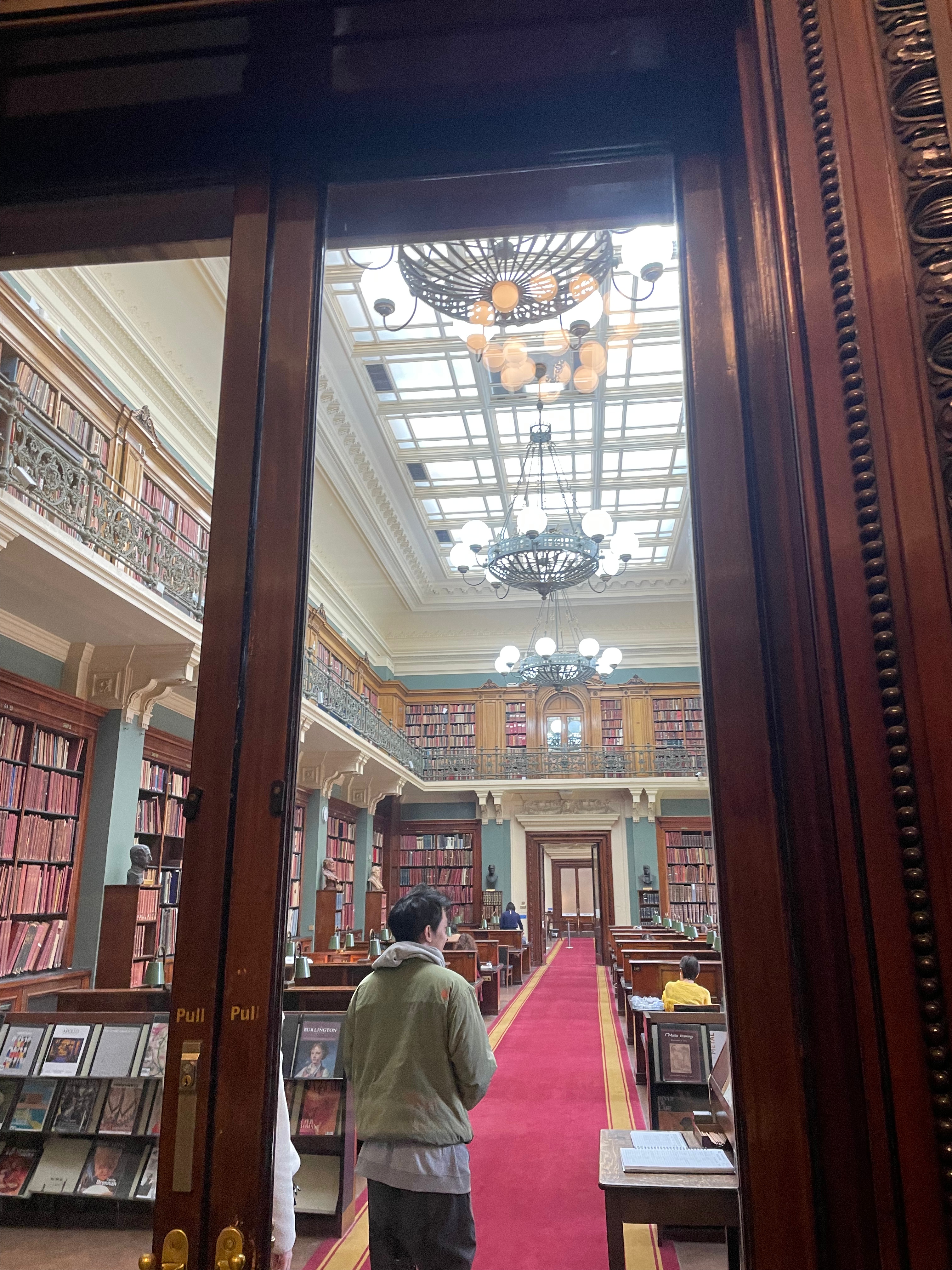
National Art Library- V&A Museum,
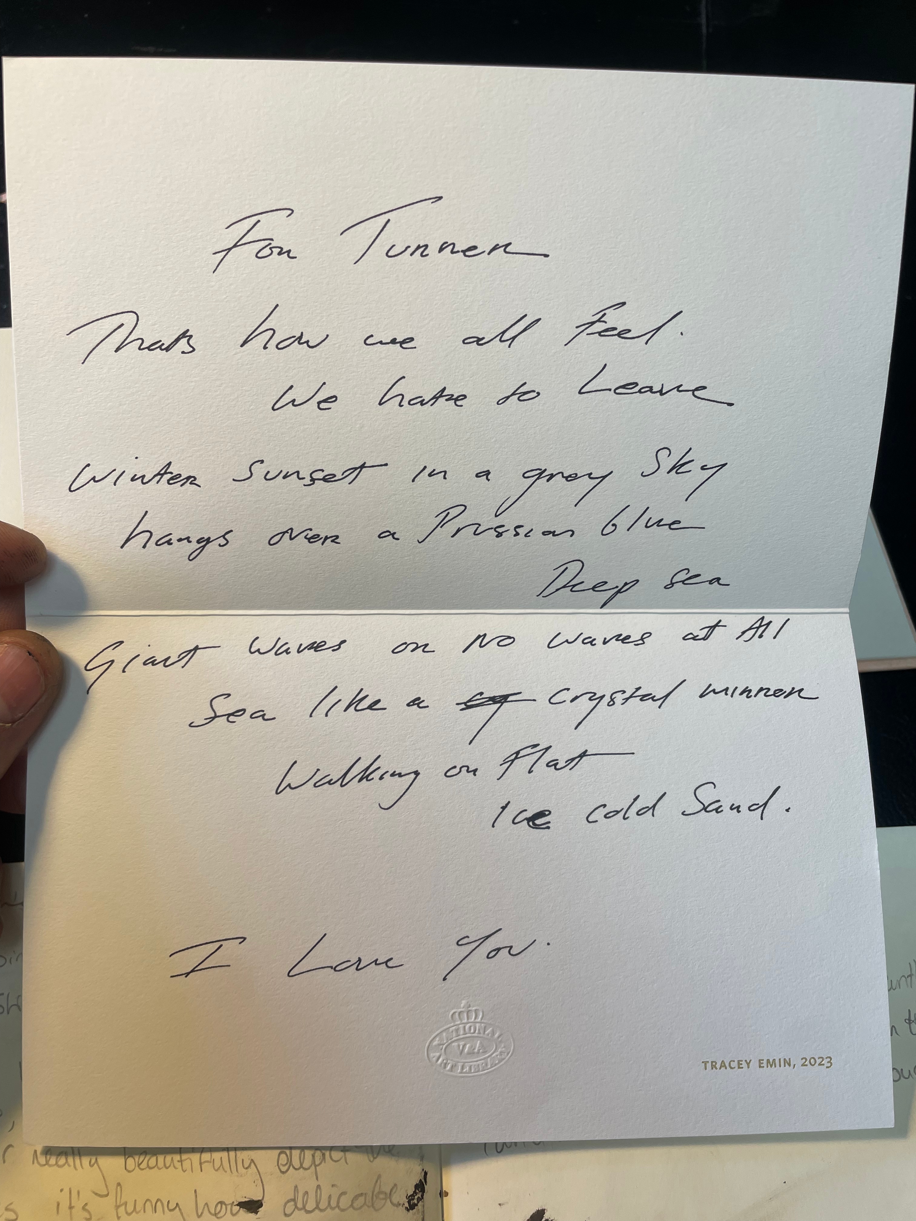
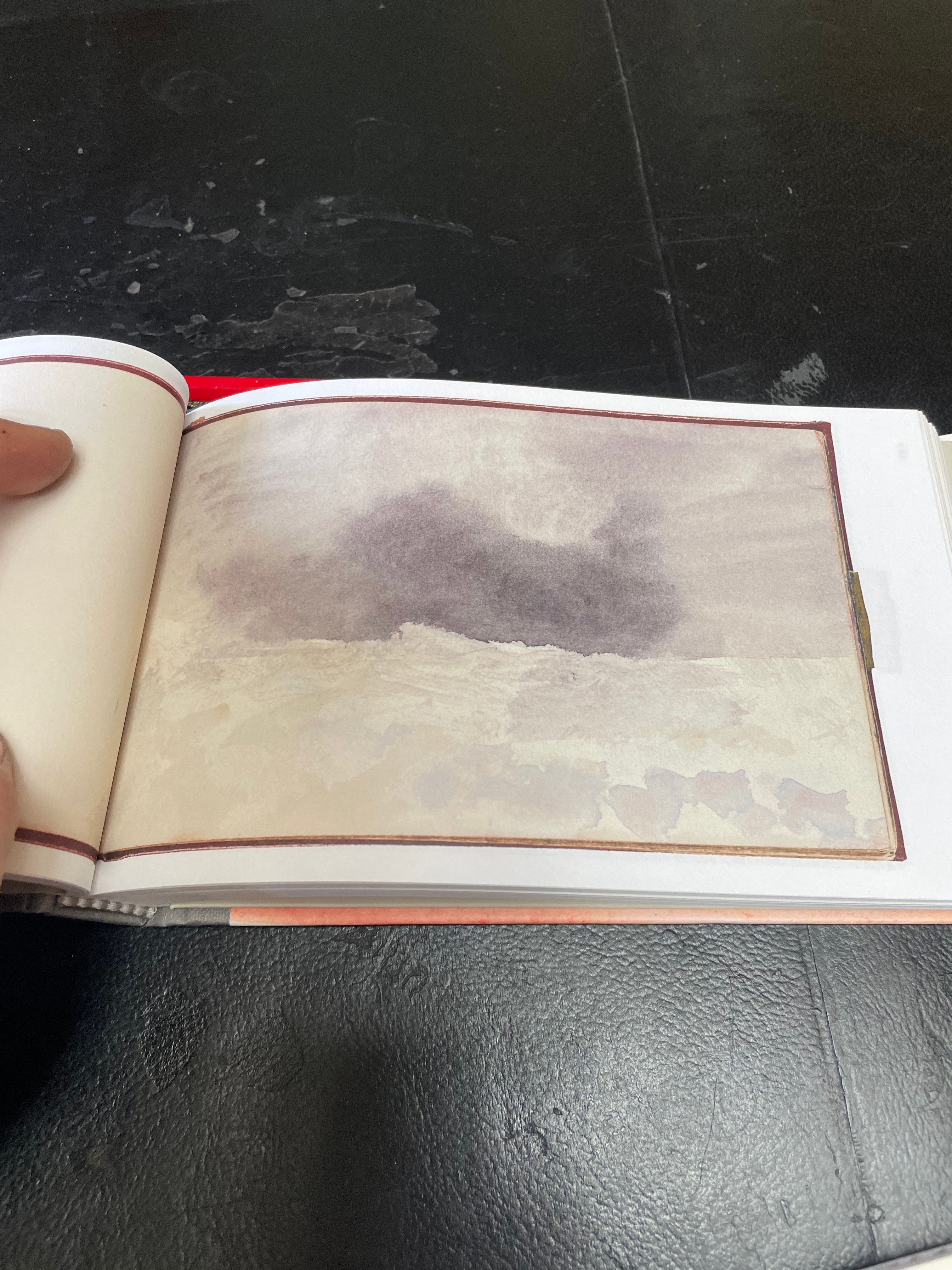
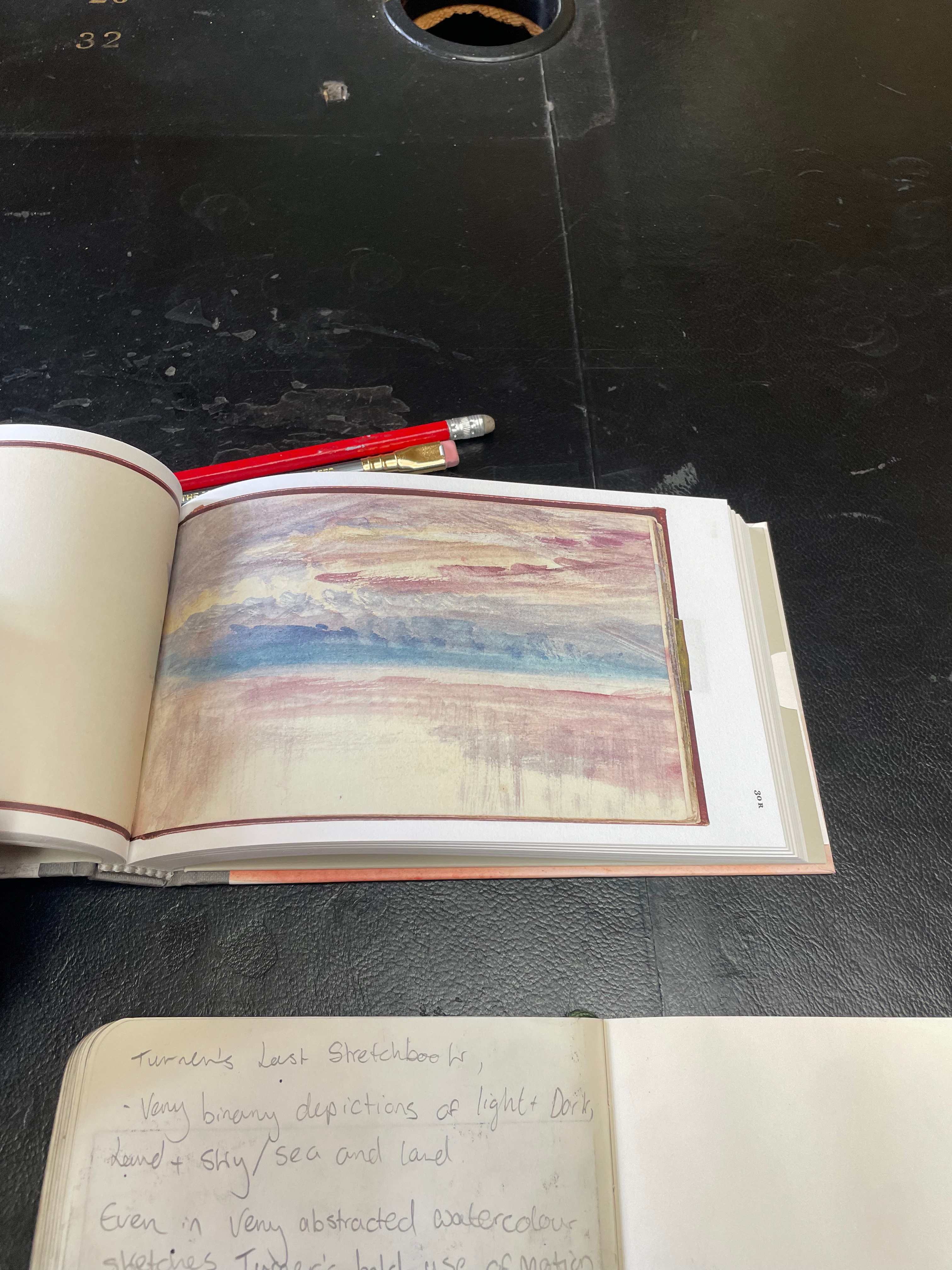
Going to the V&A’s National Art Library was a really lovely experience that allowed me to take out some very old and expensive books to use as reference. Amongst my favourite books that I brought out was a facsimile of J.M.W Turner’s last sketchbook(i), I have always loved Turner’s small scale sketches and studies for larger work, and frequently go and view the small collection of them at the Tate Britain. In this collection of small sketches, the biggest takeaways for me were Turner’s almost chemical landscapes. The vast majority of his work in this small book is a very binary depiction of sky/land, sea/land, or sky/sea, but depicted in the most fantastic way. Turner takes all the base elements of the landscape and depicts them in the most beautiful and subtle form. Pages that just contained a well placed streak of pale ochre watercolour, instantly manifest in the mind as a sandbar against an overcast day. Furthermore, Turner always does a great job of delineating the natural world, and the manmade world in his work through his delicate use of strokes. We see emotive and haphazard brushstrokes in the sea, sky and land, whereas the masts of ships protrude from these more abstract marks as strong and deliberate straight lines. I wrote in my notes that the beauty of Turner’s sketches lie in the fact that when the detail is lost, you begin to attribute these streaks of abstract colour to the landscapes you know. The sketches begin to materialise as family holidays on far-flung beaches, and memories of rocky seas and beautiful sunsets from the past. This book also contained a lovely little poem by Tracey Emin, which I very much enjoyed reading.
I also took out a very old book on Hercules Seghers’ process(ii), which gave recipes on how to create the special sugar lift solution the artist used in a pen to draw his plates in-situ, as well as a detailed recipe on the ground used in the process. I had no idea that this style of etching with sugar lift was possible, and in my head, I’d always considered it as a more painterly process, than a drawing process, however I’m now so excited to go out into the wilds with my plates and draw directly onto them. This book also really excited me about the Seghers print I had requested to view at the Print and Drawing rooms just a couple of days later.
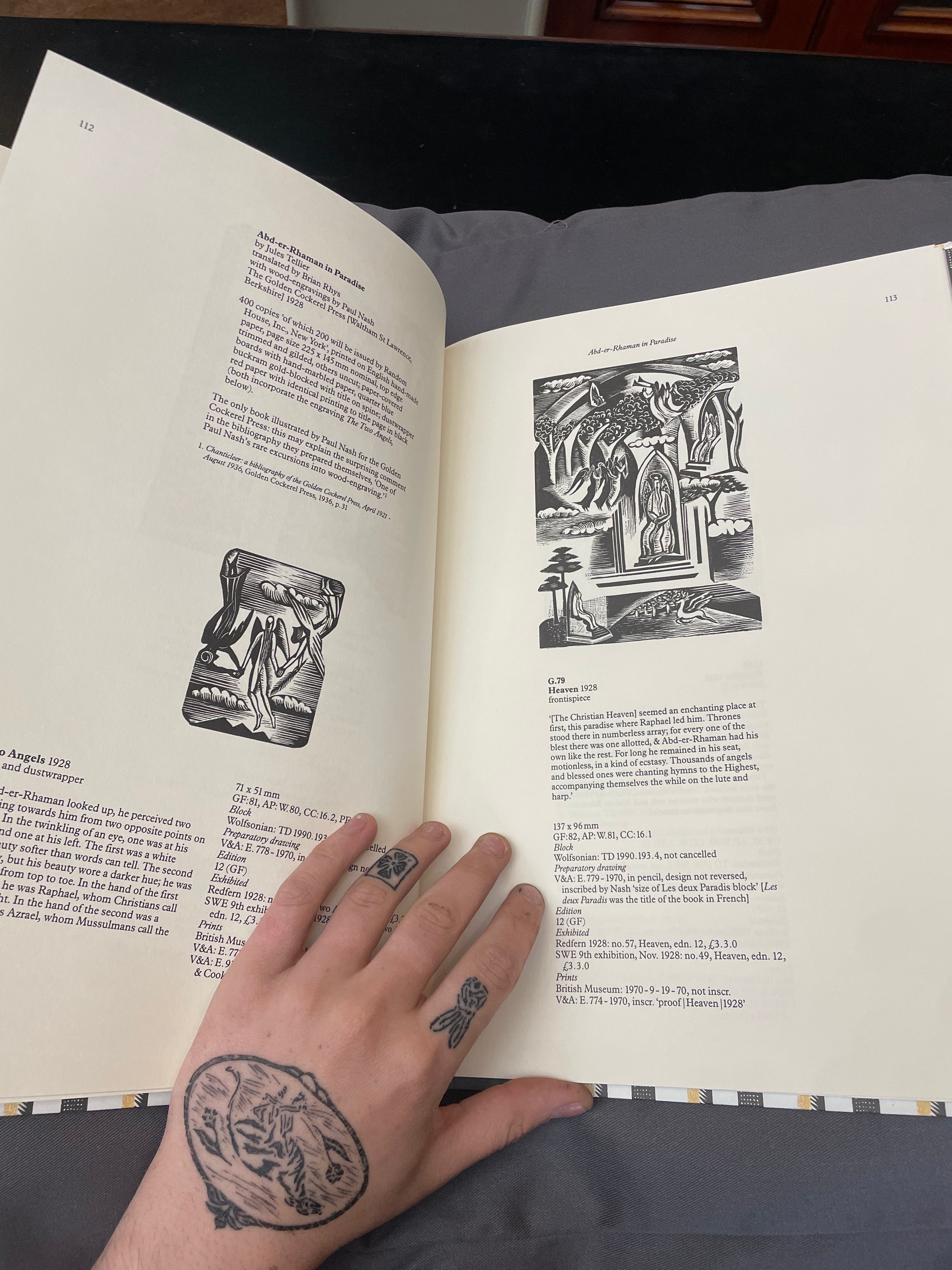
I also took out a beautiful book from the special collections of Paul Nash’s Wood engravings(iii). I love Paul Nash’s work, especially his wood engravings, and Nash has always inspired me to want to try the medium myself, however, after 6 or 7 miserably failed attempts, coming back to the medium feels harder every time. However, it was comforting to note in this book that Paul Nash’s first few years of wood engraving attempts were shockingly awful, and it was interesting to see his skill and style slowly develop through the work. Wood engraving is definitely a process I’ll return to because of this book.
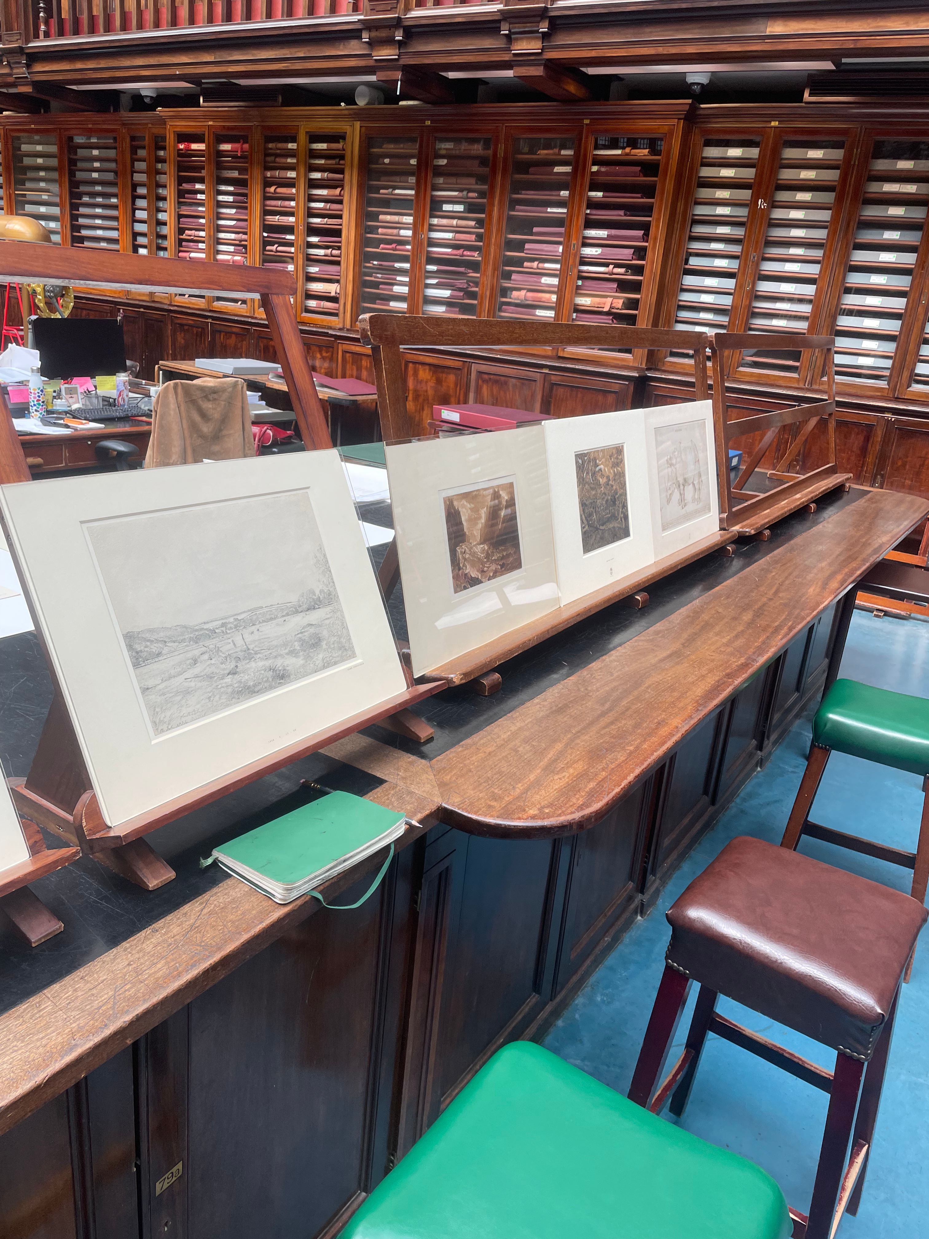
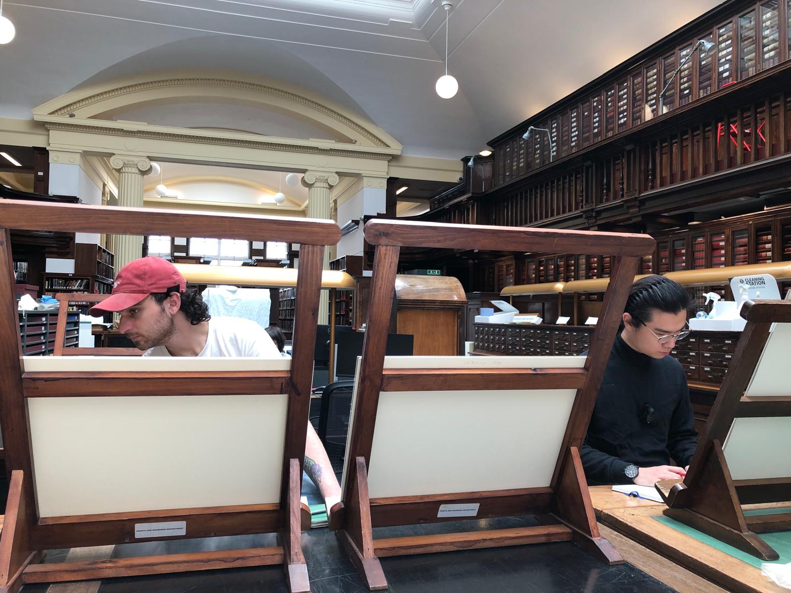
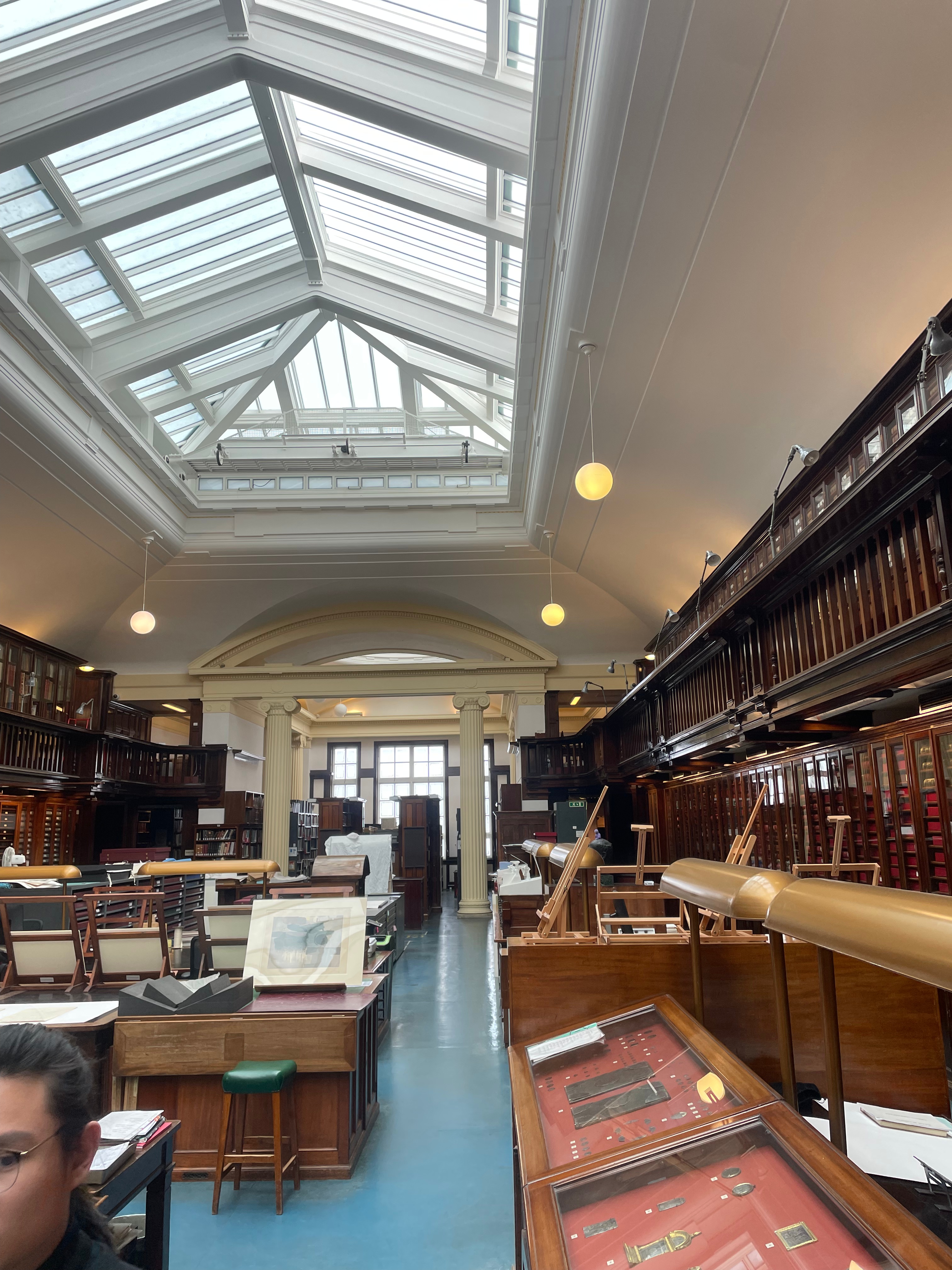
British Museum Print and Drawings Study Room-
On a visit to the Print and Drawings Study Room at the British Museum, I decided to look at some of my favourite landscapes to interrogate what worked in them that I could carry over to my own work.
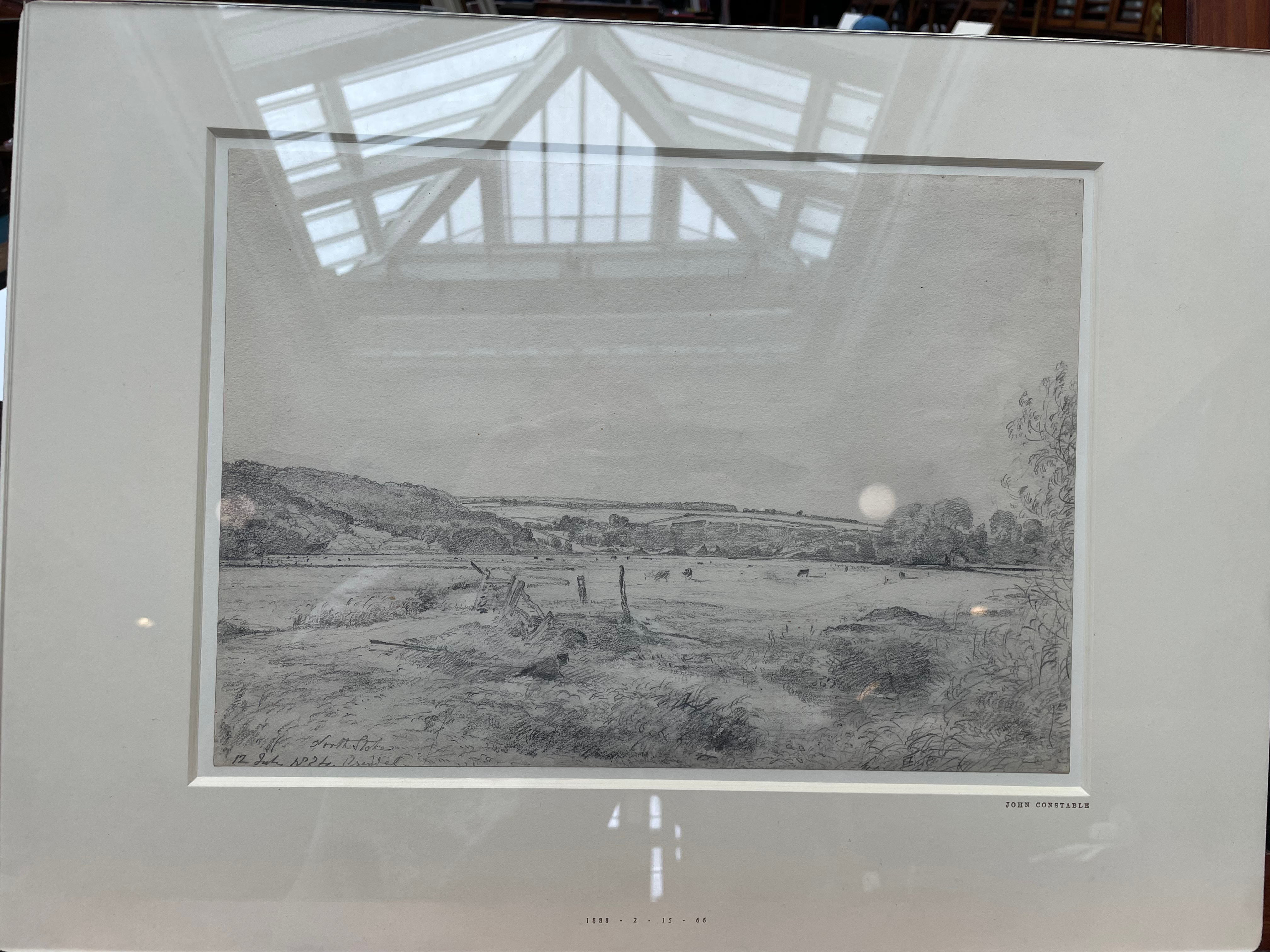
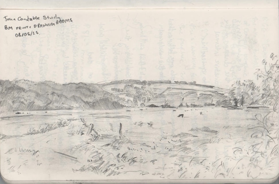
By far the most striking piece I booked out, which was completely unexpected before seeing it for the first time, was a small sketch by John Constable. I instantly fell in love with this drawing and got sucked into the landscape. I spent over an hour just staring at this piece. I think that what makes it such a successful sketch for me, is its rural mundanity. Nothing special is happening in this piece at all, yet it is the epitome of a tranquil Summer’s day, looking out over a pasture. The part of the image that the eye is drawn to is a disused path leading up to a small broken fence, perhaps signifying the passage of human time, but the longevity of nature’s. I made a small sketch of this work in my sketchbook and found this to be a really insightful experience. It felt like I was getting a lesson from Constable himself.
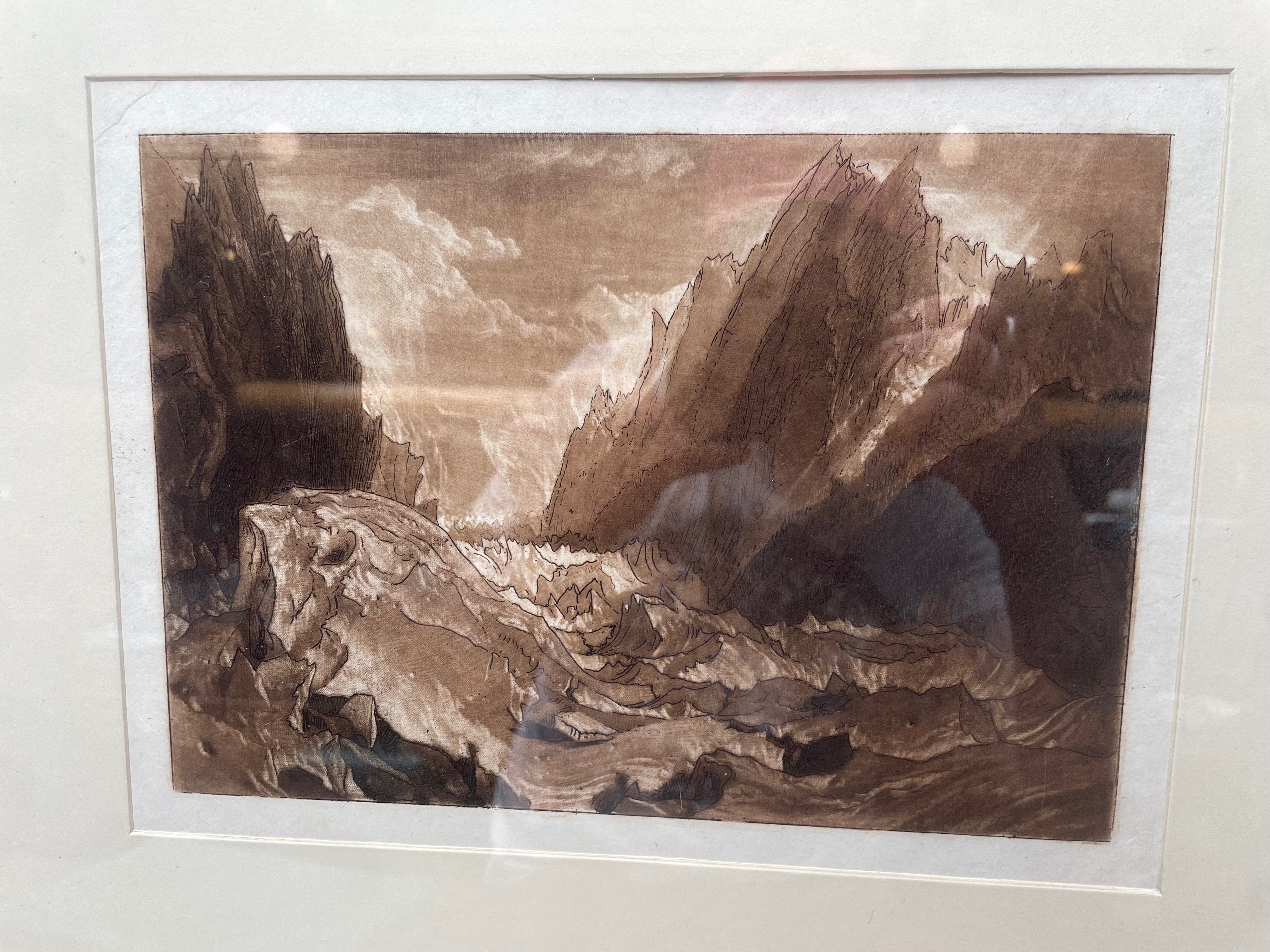
I also booked out a mezzotint and etching by William Turner. I was interested in seeing this piece due to the fact that it in no way looks like Turner would have ever made it. The softness of the mezzotint is cosmic, and really evocative of Turner’s vast and elegant brush strokes within his larger scale paintings. The cloudy skies behind the glacier in the background of the painting are particularly lovely and have really inspired me to create a little cloud study on a mezzotinted plate that I’ve been saving for the right moment. However, what confuses me about this piece is Turner’s hard etched line that contradicts everything I’ve ever seen from his work. It seems to work quite effectively in the rocky areas of the print, but hugely undermines the softness in the water. Myself and Lizzie who visited the collections with me discussed this piece and noticed its similarities to Japanese drawings, illustrating waves with hard lines. Although this piece is interesting, I’m sad to say that it may be one of my least favourite examples of Turner’s work.
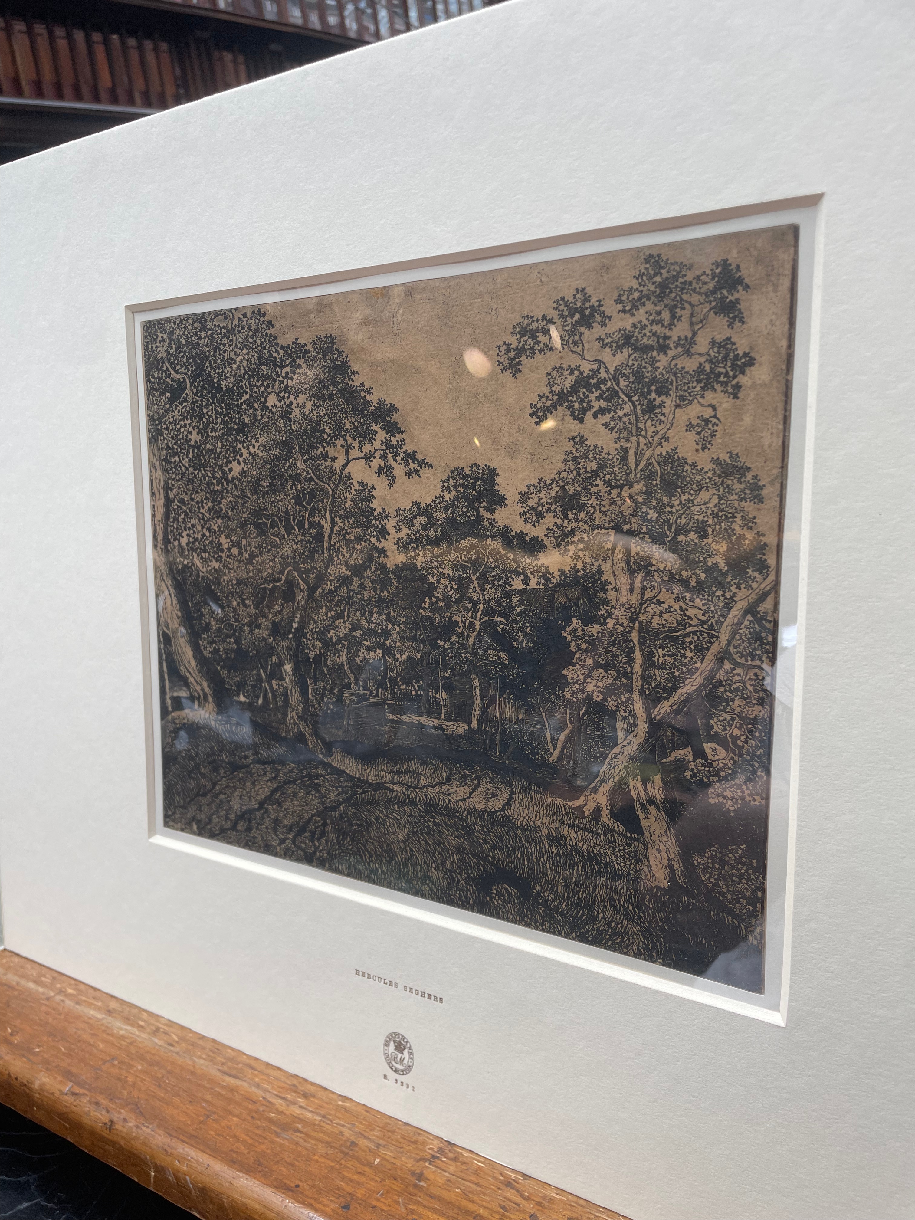
I was so excited to see an etching by Hercules Seghers. Seghers interests me so much because he was a student of Rembrandt’s, but I find that his style of etching is very similar to my own. I was even more interested in seeing this piece after I had read about Seghers’ sugar lift process, that I had read about a few days before in the National Art Library. On seeing the piece in person, it was very clear that this piece was not drawn with a needle, but rather a pen. Seghers’ piece is the most delicate and beautiful pastoral scene, where the trees just animate the whole piece with the sway of the wind, in a way that only a follower of Rembrandt could. A major problem within my own work, especially in etching is my issue with taking a drawing from a sketchbook and transferring this onto a plate before drawing it. This separation between the eye, the paper, the transfer, and the final drawing on the plate is too disconnected from the original subject for me, however, if I could cut out all of these middle stages and go straight onto the plate with a pen, I believe my imagery within etching, and the quality and energy of my work would be vastly increased.
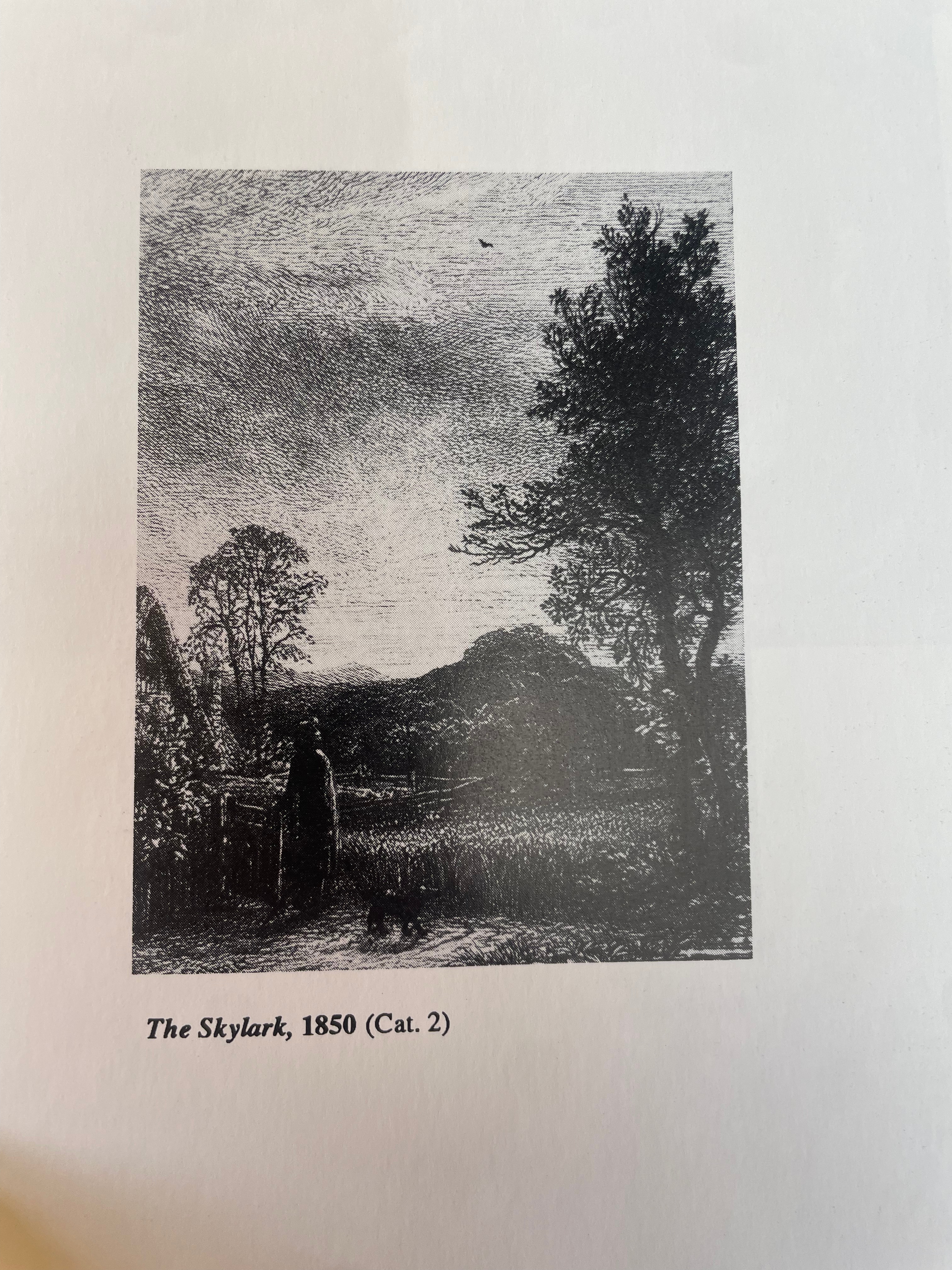
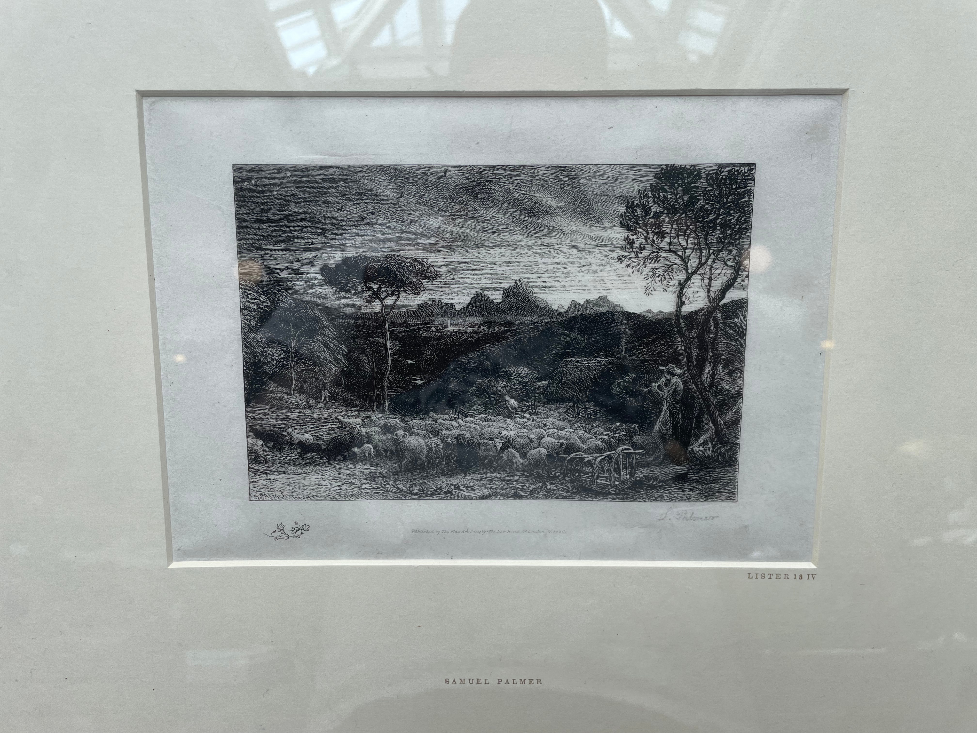
The final piece that I viewed was the most beautiful Samuel Palmer etching, entitled, ‘Opening the Fold, or Early Morning’. While researching, I found out that Palmer was born on the same street that I lived on for two years when I moved to London, I hope that somehow, some of his energy or skill has now rubbed off on me as a result of this! Palmer was an admirer of Turner, and created similar work to him in his younger years. At thirteen years old, Palmer’s mother died, which was a harsh blow to the young man, he was interested in becoming a writer, but after this event, chose to become an artist, as he believed it was what his mother wanted him to do. Because of his poor health, Palmer didn’t like to venture into central London, due to it’s pollution and poor quality of air, Palmer instead, found refuge in the meadows and hills of South London, and this provided invaluable imagery for him to make his landscapes. Palmer’s work often has a dreamlike quality about it, and this is probably due to his love of mythology and his friendship with William Blake. Palmer’s work is magical and lyrical, and the piece I booked to view, while being some of his earlier, more realistic work, still has this fantastical haze to it, venerating nature and elevating it as something powerful and mystical.
Berndnaut Smilde- ‘Nimbus Metaal Kathedraal‘, photograph
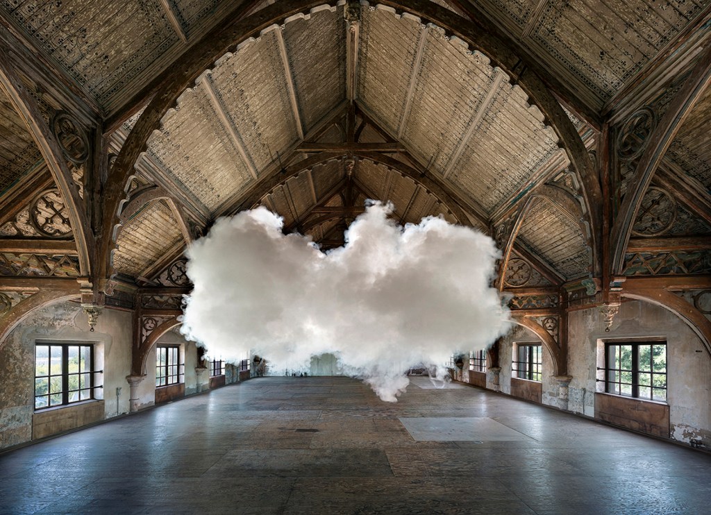
Berndnaut Smilde(iv) is an incredibly innovative artist that creates temporary installations, that last a fleetinraphgg matter of seconds. Smile creates these fantastic installations by finding humid rooms with little to no air circulation, he then uses a smoke machine to create his ‘cloud’, which sticks to the water vapour in the air, and holds its form for around ten seconds, before becoming formless and dissipating. Smile states that while the artwork itself only lasts for a few seconds, the photograph isn’t representative of the art, it merely documents the art taking place. I think that this is a really exciting way of discussing the temporality of clouds, and how they are never fixed, but always in flux. Smilde chooses to create his clouds in settings with beautiful architecture, often this takes the form of churches. This immediately situates the piece with a divine lens, when viewing the piece in these settings, you are instantly drawn to the religious and heavenly connotations with clouds, they feel massively otherworldly and strange. I love Smilde’s Nimbus series because it feels like nature is invading human life. Smilde’s work makes me want to explore the cloud as a symbol of divinity and otherworldliness in my own work, and in future work, I would like to push the boundaries of my own cloud works and try innovative ways of making these formless subjects into a more concrete setting.
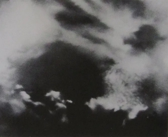
Gerhard Richter- ‘Wolkenstudie (grün-blau)’, oil on canvas
Gerhard Richter(v) is an interesting artist to me because of his extremely harrowing upbringing, Richter was born in Dresden in 1935, Dresden was subsequently totalled and carpet bombed in WWII by allied forces, luckily however, his father had accepted a teaching job in Poland that largely kept the family safe from the effects of the war. Richter’s uncles and aunt, however, were not so lucky, both uncles died in the war, while his aunt who had serious mental health problems, was starved to death in a mental hospital. Richter’s father’s membership of the Nazi party, and subsequent capture by allied forces in WWII made it difficult for the family to earn money, and they were alienated from the rest of society. Richter’s crowded and vibrant abstract pieces, while having beautiful colour, feel angered, frenzied and confusing, reflecting his very difficult upbringing, however, Richter’s Wolkenstudies (or cloud studies) are at complete odds with this abstract work. This series of paintings give off an overwhelming sense of calmness and tranquility, their subtle and beautifully blended brushwork forces the viewer to consider the blurring of the lines between photography and painting, the clouds are just utterly perfect. Clouds for me always have a link to divinity and the heavens, but strangely for Richter this is not the case, he calls these paintings “cuckoo’s eggs”, due to the fact that they present as one thing, while meaning something completely different. Richter paints these pieces from detailed photographs, and this for him, de-romanticises the subject, they are not exaggerated or stylised, they are heavily studied, scientific facsimiles of the clouds he has recorded. It is interesting to see an artist who views clouds in a different light, because it seems so easy to just instantly relate them to the divine. For me, however, clouds can never be anything but the divine, they instantly relate to the heavens and this cannot be taken away from them. I find an interesting relationship between Richter’s work and my own due to the pervading sadness he has experienced, while these works are beautiful and tranquil, they have an underlying sadness to them. The piece I have attached above, Wolkenstudie (grün-blau) contains more of this melancholy through it’s dark colour palette, as opposed to others in the series that have the purity of a summer’s day.
Anselm Kiefer- ‘The Milky Way’, Mixed Media on Canvas
Similarly to Richter, Kiefer(vi) was also born in post-war Germany, being born just a few months after the end of WWII in Donaueschingen, a heavily bombed city. Kiefer’s early life was surrounded with the destruction of the Nazi regime, and throughout his work he aims to confront the taboo and controversial topic of the Nazi party within Germany. I love Kiefer’s work because of its immense brutal and violent qualities, this is mainly translated through the material qualities of his medium. Kiefer often employs lead, straw and ash within his work, that while feeling chaotic, are used with such care and nuance that they aren’t overpowering, they feel at home within the painting. As a massive enjoyer of process and materiality within printmaking and art in general, I have an interest in the fact that Kiefer uses chemical processes such as subjecting his work to acid, and sometimes physically beats his paintings with sticks. I think that imbuing a piece with such anger, makes it hold an intense emotional quality. I also love Kiefer’s use of the horizon line, sometimes having it higher up in the work, like in ‘The Milky Way’ above, making the landscape stretch out further, and in other pieces having it much lower, so that the sky becomes an overpowering presence in the piece. I think the key to Kiefer’s work is its confrontational qualities, that materialise in the medium of the work and its usually large scale, making the whole process of looking at it a rather uncomfortable one for the viewer. In my own work, I would like to instil some of these emotional and confrontational qualities, so that the viewer looks out upon my landscapes, and can feel the mental space that I was in when they were created.
___________________________________________________________________________________________________________________________________________________________________
Bibliography
(i)Turner, J.M.W. et al. (2024) Turner’s last sketchbook. New Haven: Yale Center for British Art.
(ii)Leusden, W.v. (1961) The etchings of Hercules Seghers and the problem of his graphic technique. Utrecht: A.W. Bruna.
(iii)Nash, P., Wood Lea Press and Smith Settle (Firm) (1997) The wood-engravings of Paul Nash : a catalogue of the wood-engravings, pattern papers, etchings and an engraving on copper. Edited by J. Greenwood. Woodbridge [England]: The Wood Lea Press.
(iv)Nimbus Atlas – Berndnaut (no date) http://www.berndnaut.nl. Available at: https://www.berndnaut.nl/works/molds/.
(v)Gerhard Richter: The Secrets Of Clouds (2022) Sothebys.com. Available at: https://www.sothebys.com/en/articles/gerhard-richter-the-secrets-of-clouds.
(vi)Anselm Kiefer: Architect of Landscape and Cosmology | Essay (2022) Gagosian Quarterly. Available at: https://gagosian.com/quarterly/2022/06/22/essay-anselm-kiefer-architect-of-landscape-and-cosmology/.
