For the upcoming Research Festival, I wanted to create a publication that contained my series of cloud prints, originally, I wanted to format this in the style of a very classically leather-bound, old book. I wanted to do this to reflect the more classical format of the mezzotint, and I wanted each image to be accompanied a ‘formless’ memory, or comment. These memories were written down in my sketchbook, as and when I recollected them. I soon realised, however, that the form of this book would be too rigid, and wouldn’t reflect the formless and transmutable nature of both the image of the cloud and memory that I wanted to convey. I instead decided to have the prints and words structured loosely in a copper box, so that any of the words could be associated with any cloud. Below is a log of making this publication.


My original idea was to make the copper box in a much larger format. I wanted to do this because I wanted the words to be printed or etched onto thin sheets of polished framing glass. This was to try and retain the visual language that I had developed for the Degree Show, where my prints were displayed on glass and copper shelves. I quickly realised, however, that the practicality of this didn’t make much sense, and having people paw at thin pieces of glass is asking for disaster, while also being too clunky to give off the ephemeral nature that I wanted to convey. I also realised that the design for the box would have been too complicated and not very streamlined and serene with it’s double hinged lid, that would have to be clasped somewhere. I did enjoy the idea of the transparency in the glass and the ability to look through the words into the print, but didn’t want to use plastic as this would’ve taken away from the experience of touching the publication, I therefore decided to pursue printing the words on thin Japanese paper.
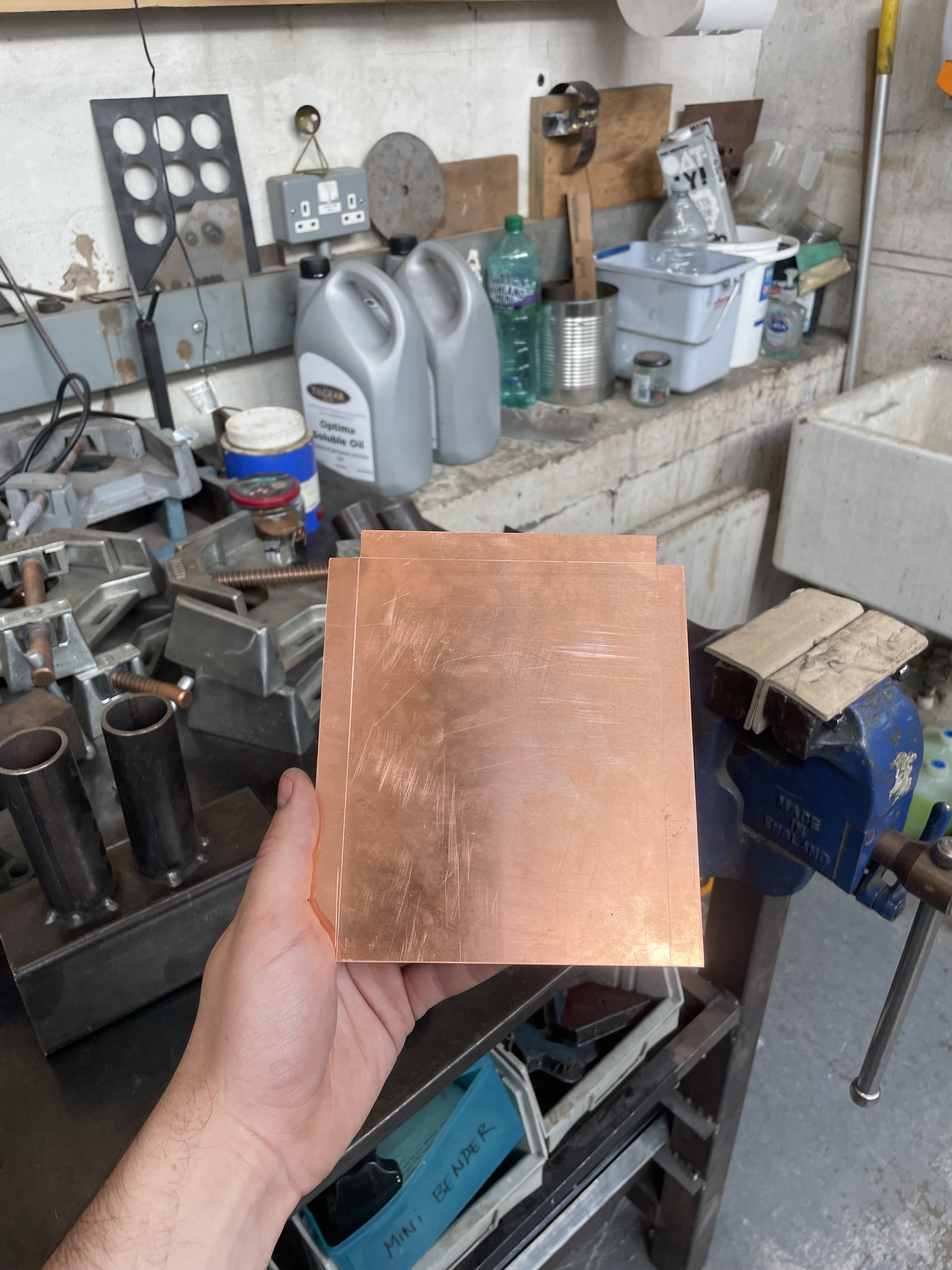

The use of copper is especially important to me for many reasons, as previously mentioned, copper is associated with alchemy, especially the planet, Venus. The material also relates back to the mezzotint process, even though the plates in this collection are zinc, I still wanted to pay homage to the process. I also liked the idea of the copper box as it directly related back to my previous work in the Degree Show with my glass and copper shelves, I really wanted the pieces to feel as if they were crafted with a consistent visual language. I also began to think about the idea of the feeling of holding a beautiful copper box. It was of utmost importance that the whole viewer interface with the publication felt special and comfortable. Finally, I thought that the copper would have the same vibe as a hand-me-down, or a jewellery box, I wanted it to have that precious, intimate nostalgia to it.
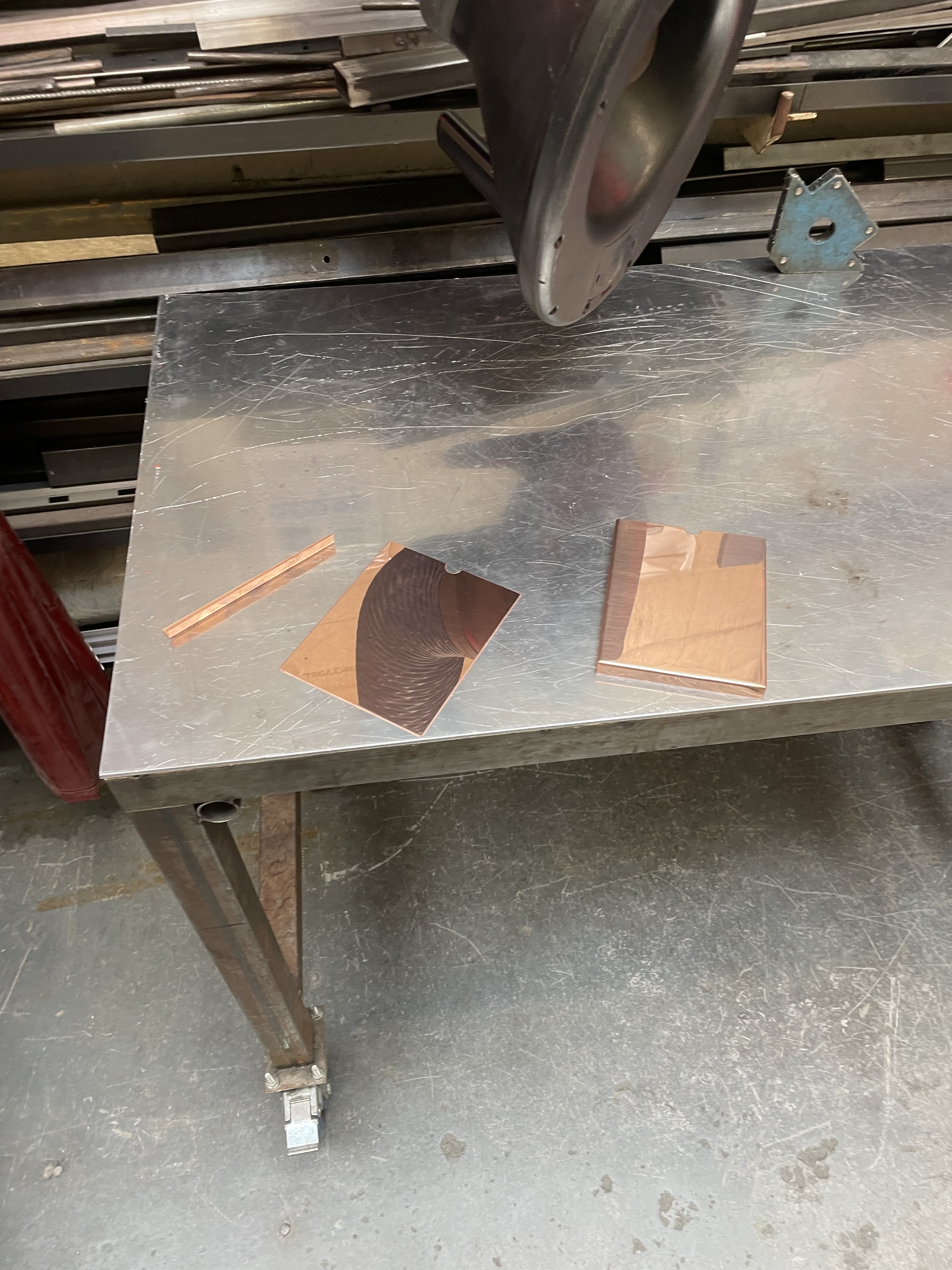
I began creating the copper sleeve by first measuring the size of my insert. I then measured out and cut the copper with a guillotine. I had to remeasure and recut a couple of times due to the fact that I didn’t account for the size of the folded edges. I was finally left with the correct size of copper and measured and scribed the folding edges, before cutting the corners carefully with a jeweller’s saw. It was important to me that the design of the sleeve was as simple as humanly possible, originally, I wanted the whole box to made out of one folded sheet of copper, but this wasn’t possible with the machinery available in the metal workshops, so I settled on two separate pieces that would have to be carefully fixed together. In this cutting and folding stage, I also marked and cut a thumbhole into each piece and filed the sharp edges away. As previously mentioned, I wanted the whole experience of interacting with the piece to be smooth and inviting, and these holes helped to indicate that the box was meant to be touched and opened.
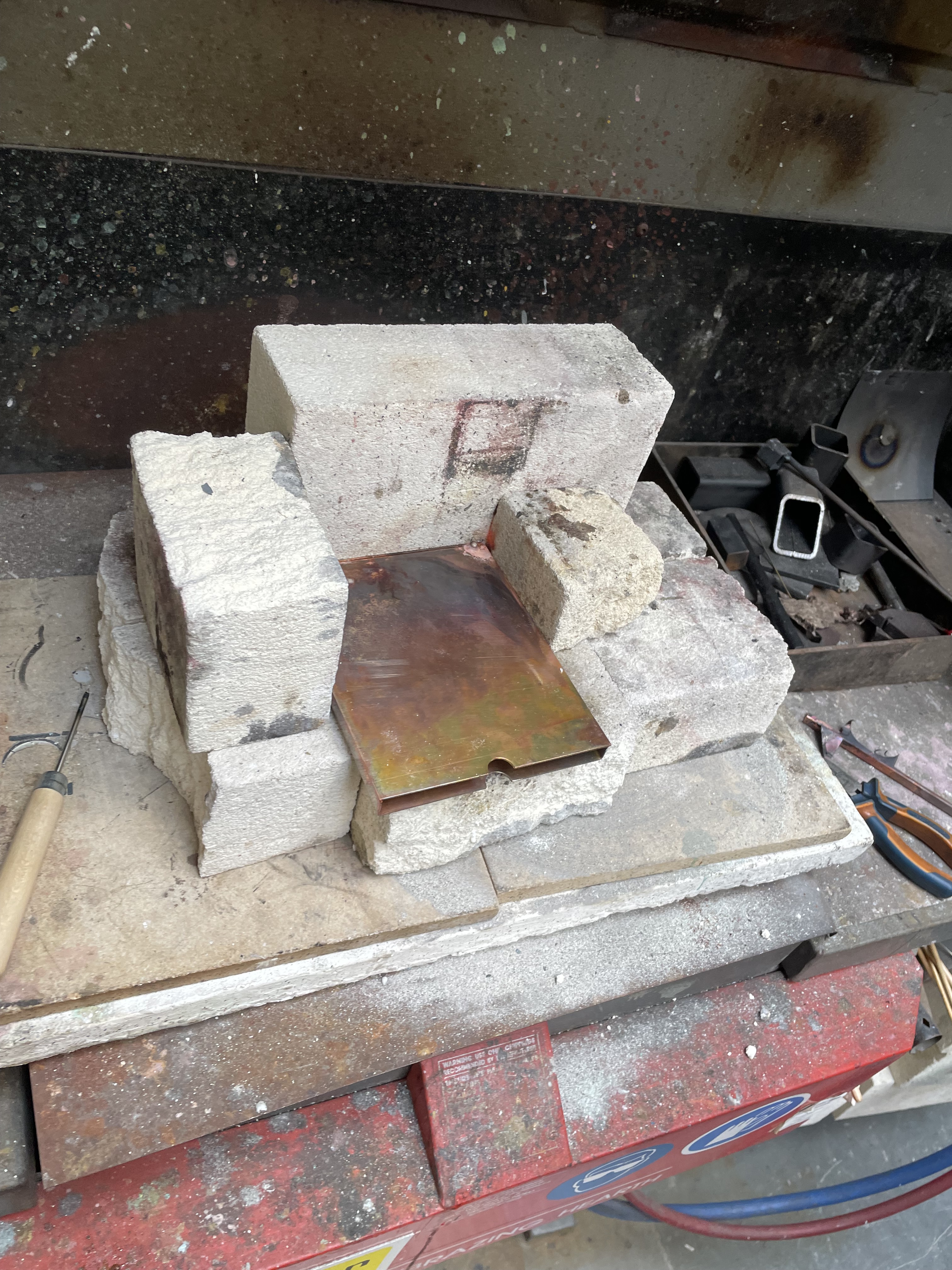

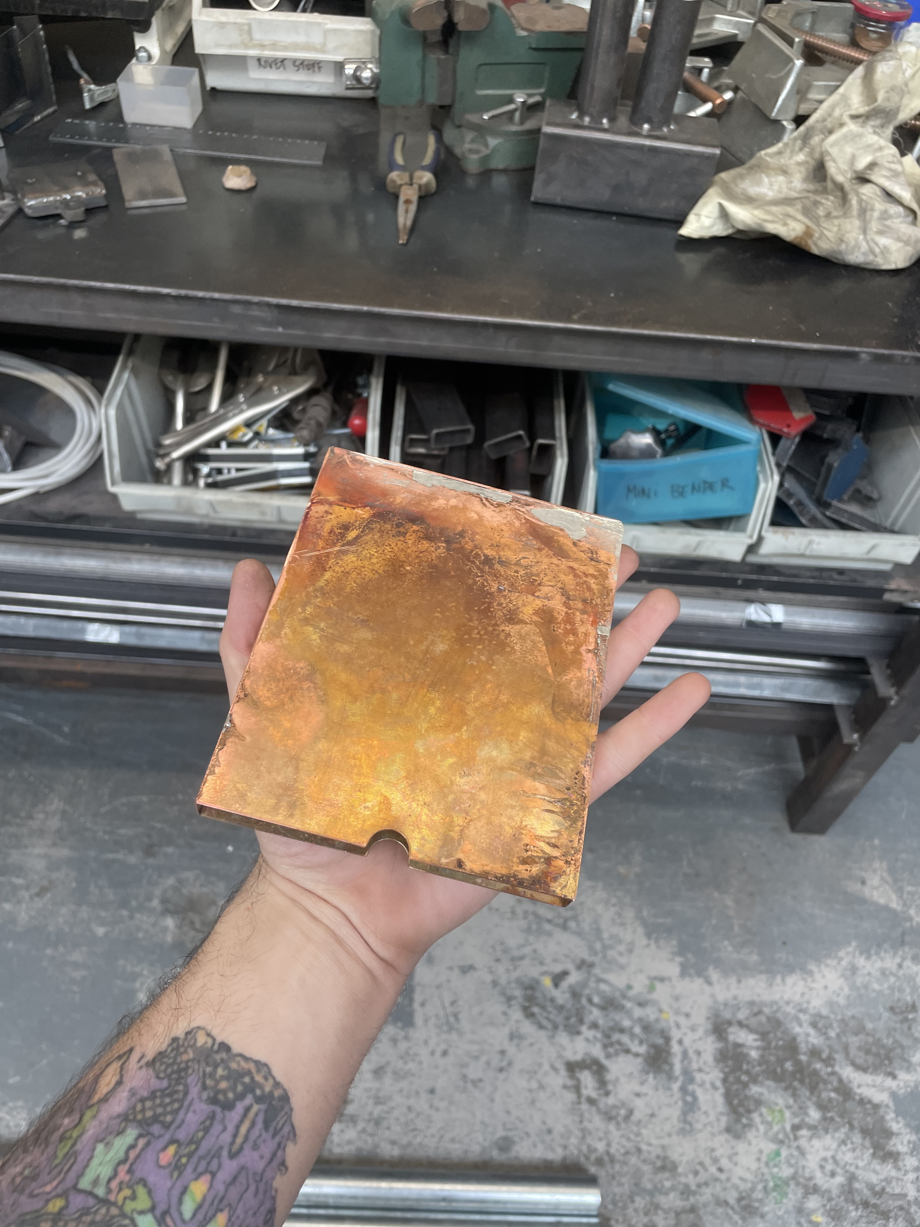
The next step in finalising the sleeve was fixing the two pieces together. I attempted first to braze the copper together with some thin copper rods and a blowtorch. This worked excellently on a small test piece, but in practice on the actual sleeve, the size of the copper, it’s prowess in conducting heat, and the hollow chamber inside wicked all the heat away from the edges I tried to join together. I also tried silver solder, but the same results occurred. After trying these more complex methods, I realised that a plumber would most likely work with thicker, larger pieces of copper, with similar hollow chambers, and they manage to solder copper together all the time. As a result of this, I just bought some tin plumber’s solder and flux and it worked perfectly, but did leave the sleeve in a big mess. As a result of this I had to spend around 3 hours filing, sanding and buffing the copper back to its original lustre.
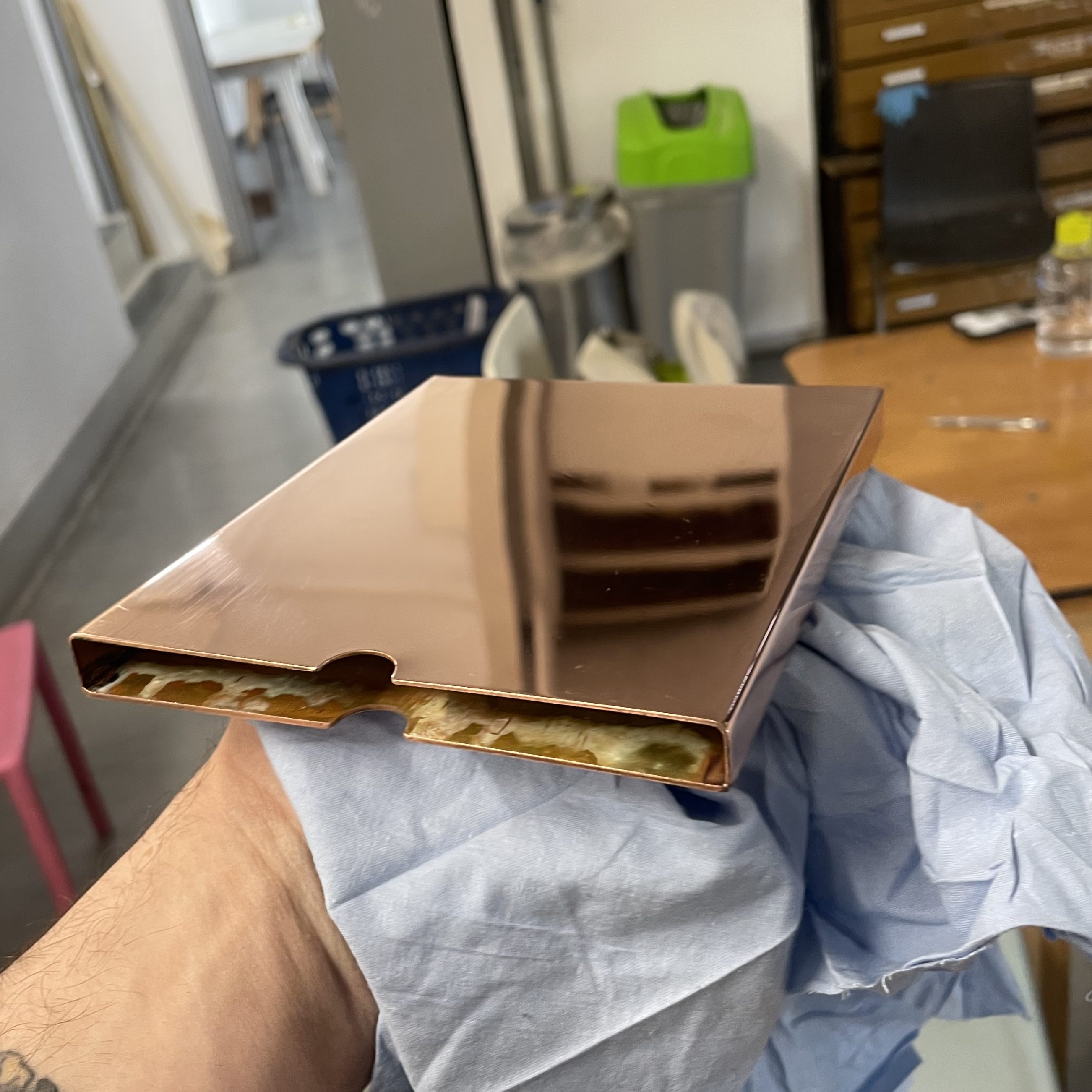
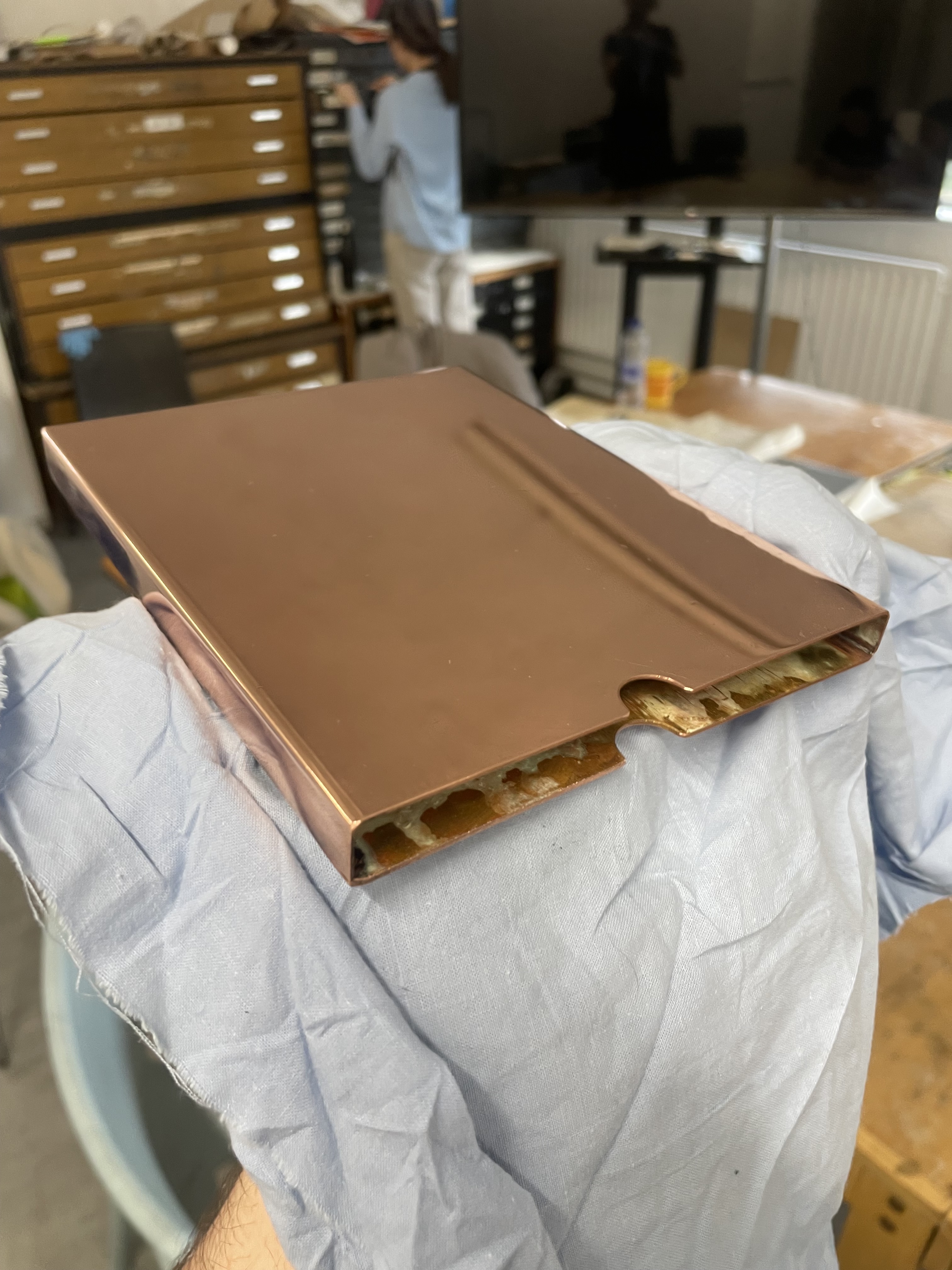
The final result was this beautiful copper sleeve. I’m really impressed with how this came out and at this point I’m very enthusiastic and optimistic about the outcome of this project. The final construction is almost seamless, and is polished to a beautiful lustre. I think that people will pick this up and feel the cool weight of the copper and have a positive experience with interacting with the publication. The weight of the copper, combined with the thin Japanese paper within will really juxtapose each other and reflect the paradoxical nature of the cloud itself, both physical and weighty, while simultaneously floaty and ephemeral. I would also quite like it if the piece was slowly tarnished as viewers touch it, allowing the box itself to become a vessel of human touch and memory.
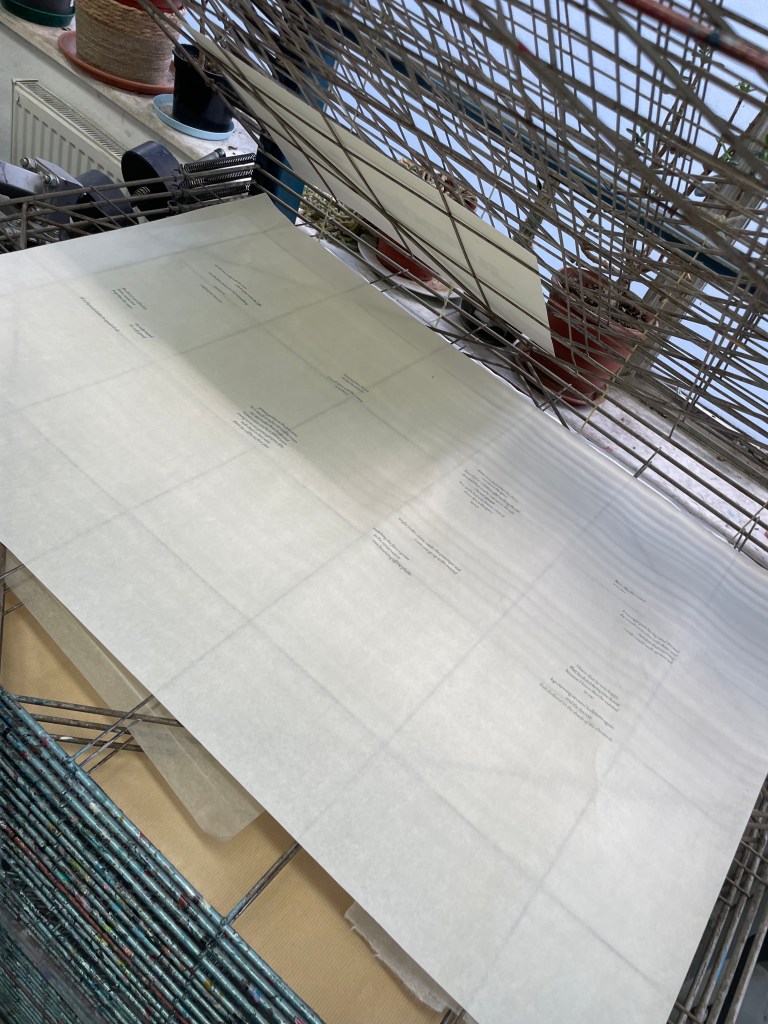
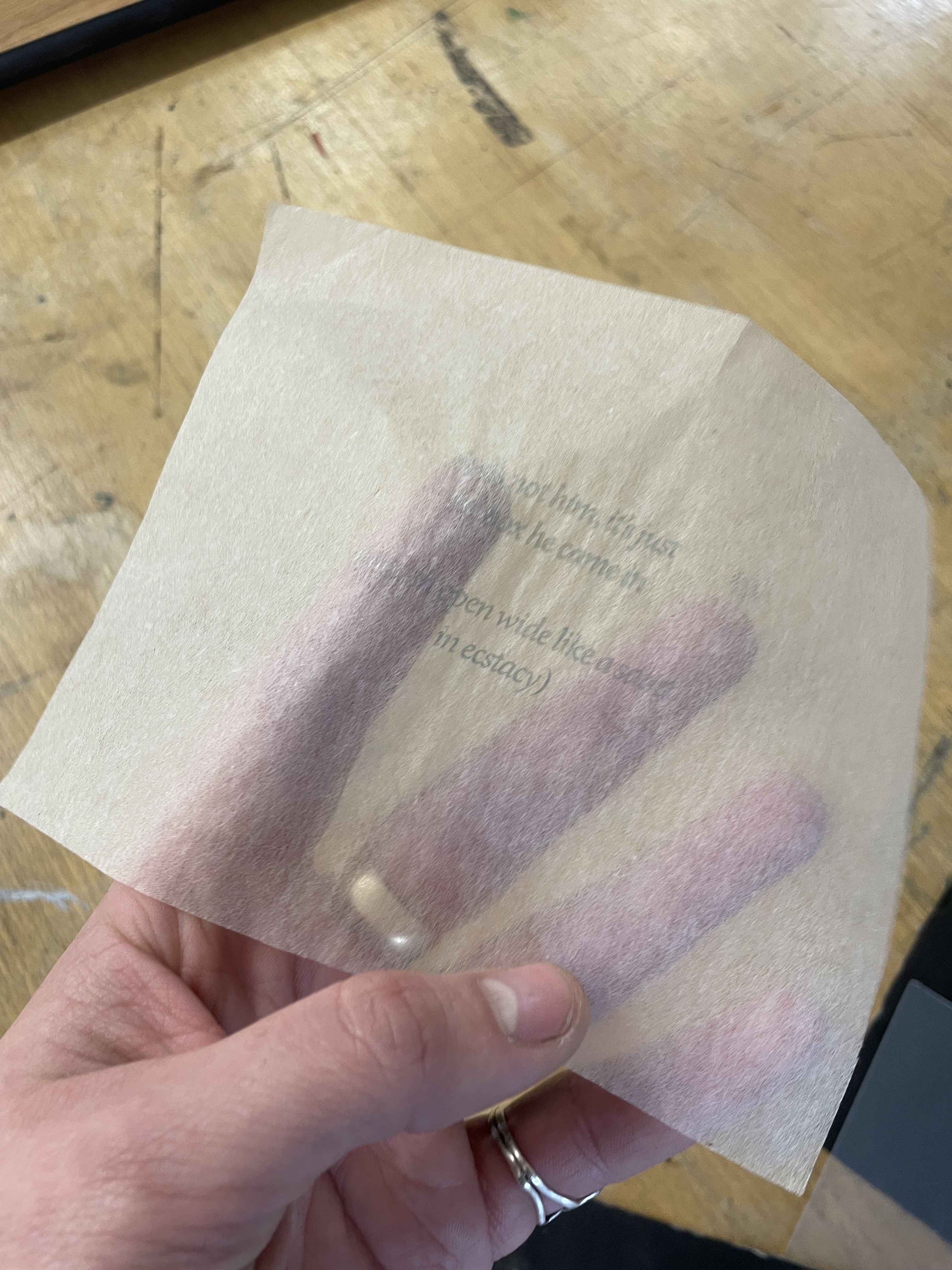
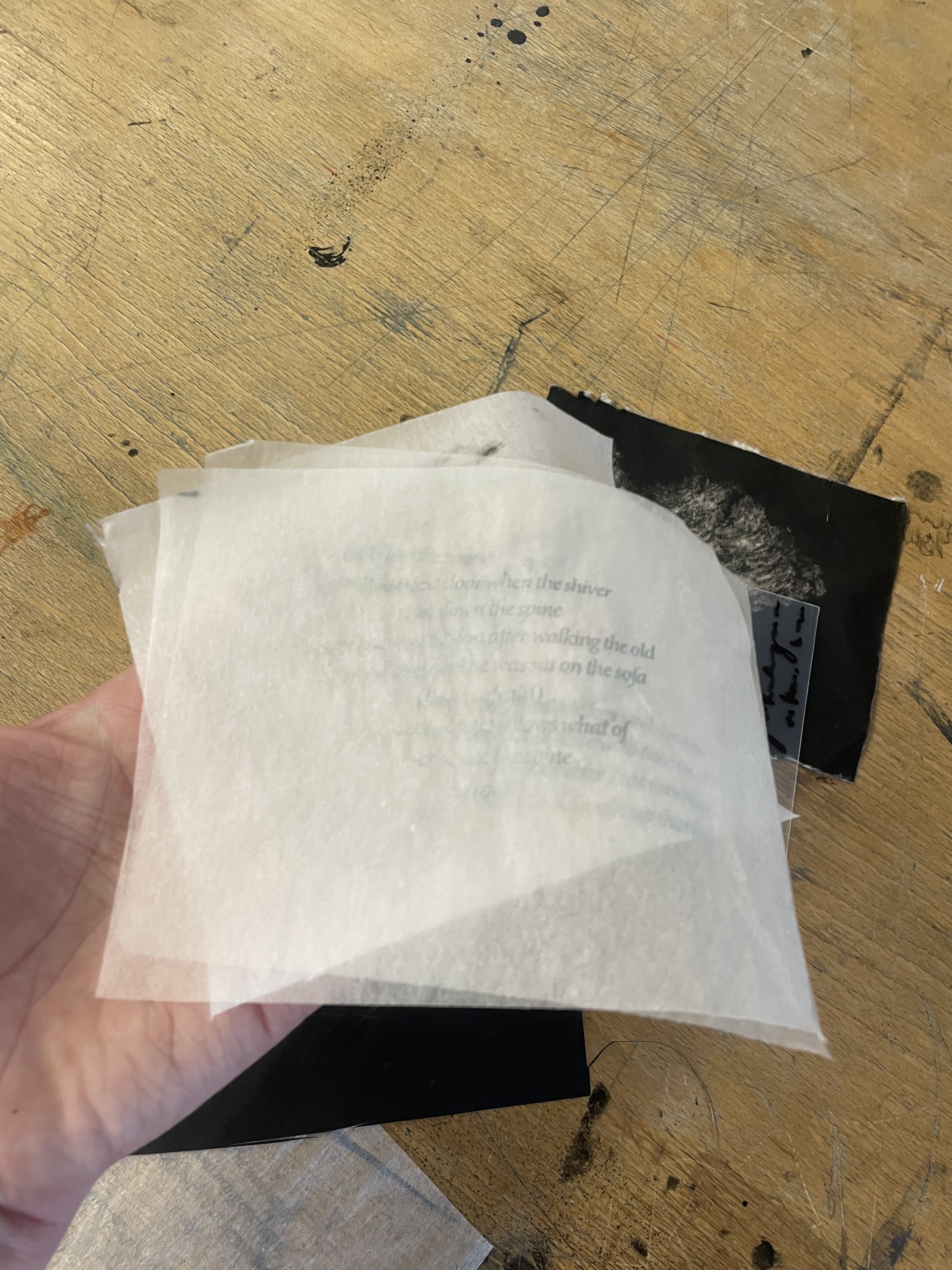
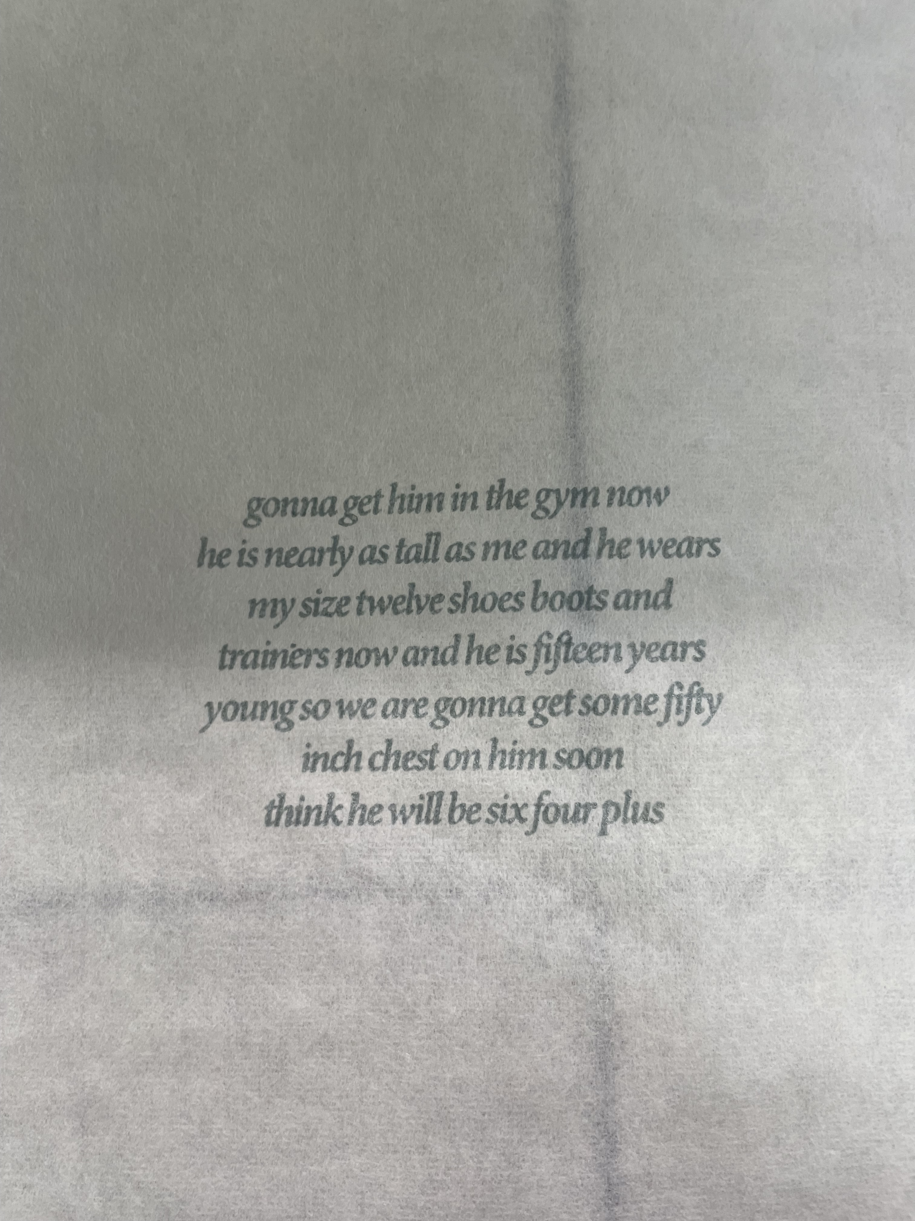
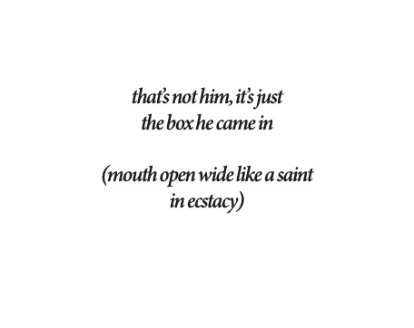
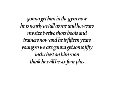
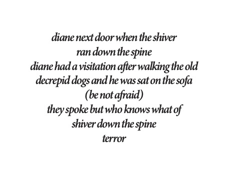

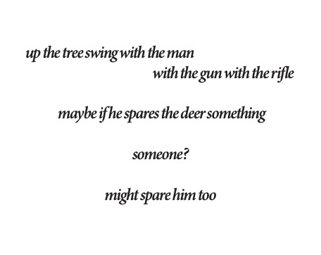

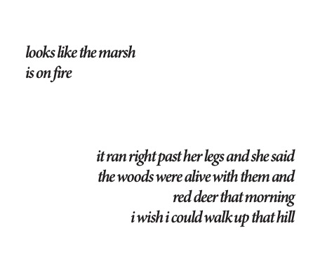
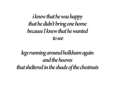
The words that I chose to print are a selection of 8 pieces of writing I made spontaneously over the course of the unit about my dad, some of which are direct quotations from a diary my dad kept when he was ill. I intentionally wanted to keep the words vague to the reader, although every one of them makes complete sense to me, I wanted the words to remain somewhat abstract to the viewer, however, I still wanted the rough idea of the loss of a father to be present. I think I ground these words to relate to my dad through the piece of text about the size 12 shoes, this one is a direct quote from my dad’s book. I think the choice to use both my own words, and the words of my dad to create this piece, was a good idea, as it truly feels like there’s a bit of him in there. It becomes a collaboration between the both of us. Because of the original idea to print these words on thin slides of glass that would be interspersed between the prints, I wanted to print the text onto the thinnest paper I possibly could. I therefore printed on three Japanese papers, Gampi tissue, Tosa Washi, and Kozo. Both the Gampi and Tosa Washi had an unbelievably strange feel in the hand, and really captured what I wanted to express in that very ephemeral, sort of there and not there feeling, both to read and hold. I think that the choice and mixing of ink worked really well. In the end, this ink consisted of roughly 10% ultraviolet blue pigment, silver and bronze ink, with 70% extender and just a touch of black. This allowed the words to sort of appear and disappear as you handled them. Although I do love how these turned out, I don’t believe these papers are a good idea to use in the final piece. The paper is very easily creased and damaged, no matter how gently you handle them. Combine this fact with them being stacked up together and the fact that they will be handled by multiple people, would just make the whole thing a mess after one person had unpacked them. They almost achieved their purpose too well! As a result of this, I settled on using the still very thin, but comparatively thick Kozo paper, with the same ink recipe. This paper handles touching a little more. With more time, I would like to try and either photolitho or letterpress the words onto the paper, so they feel a little less surface level, and I would also like to try and print them on black paper, as the colour of the paper is a little interruptive.
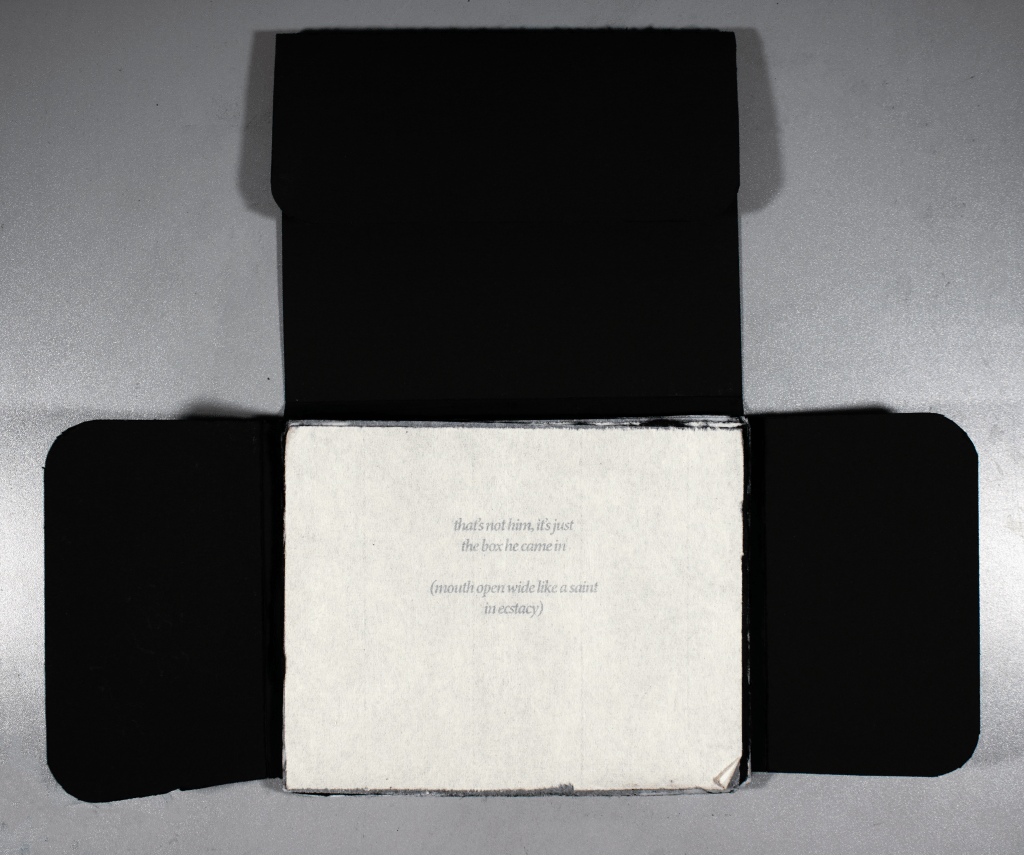
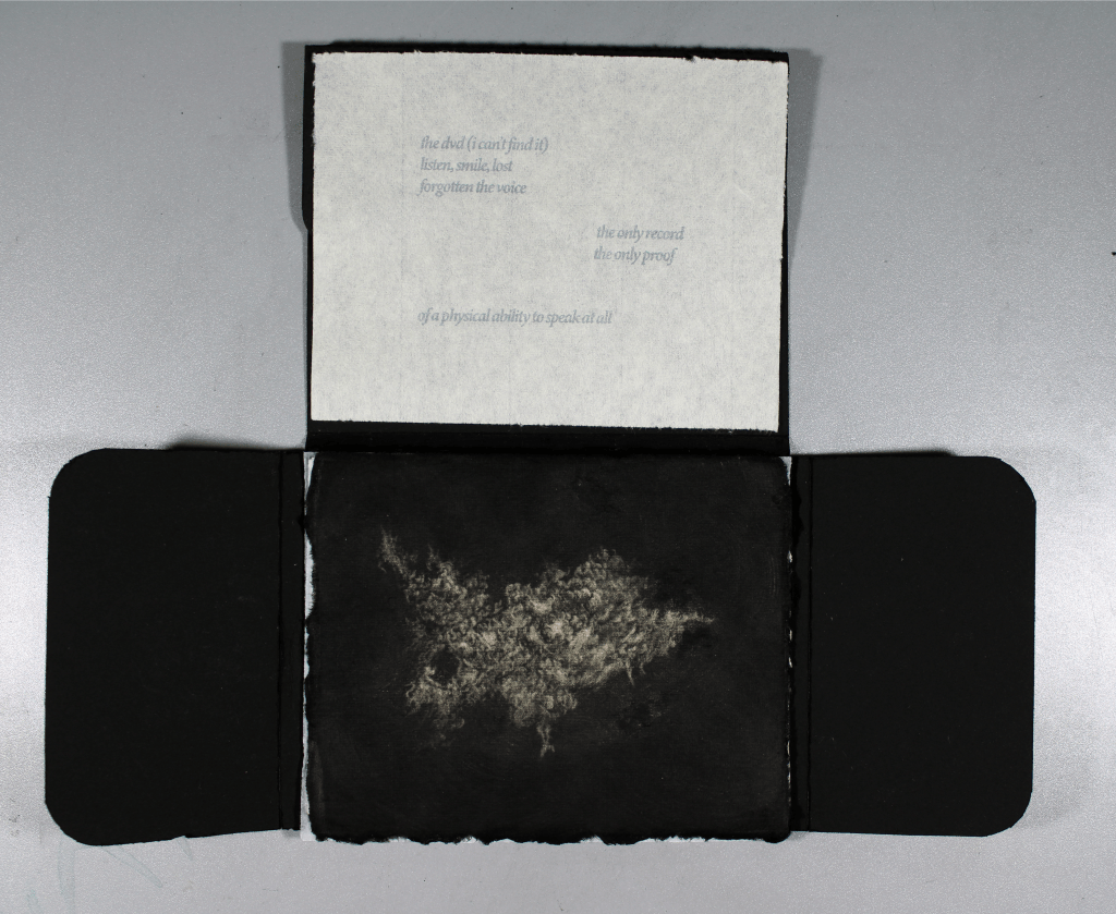
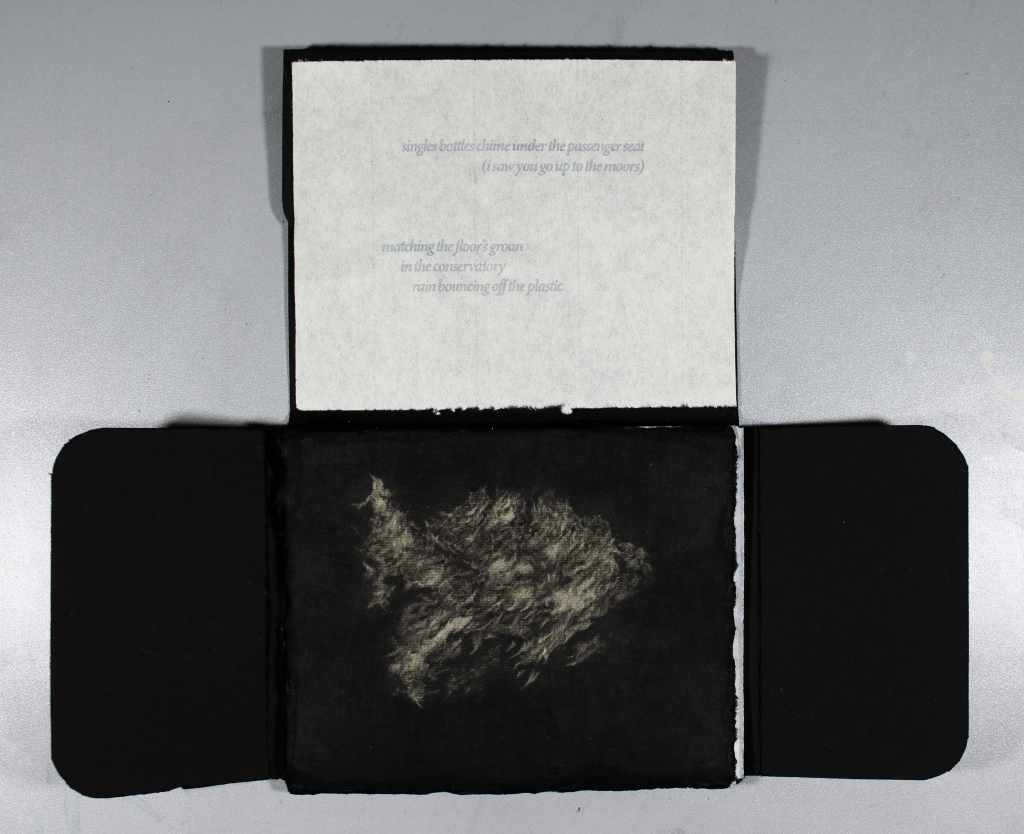
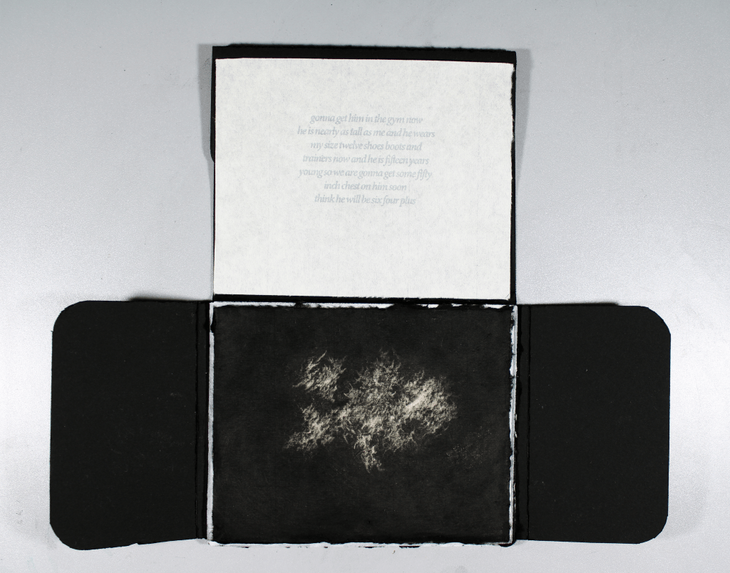
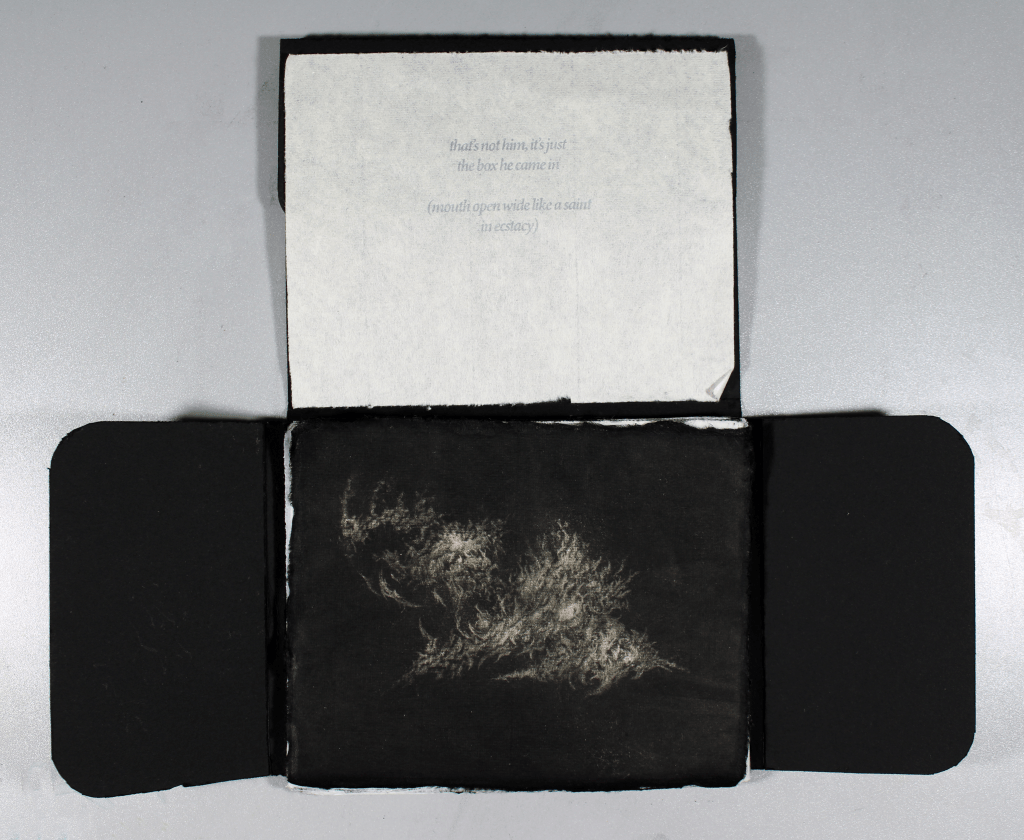
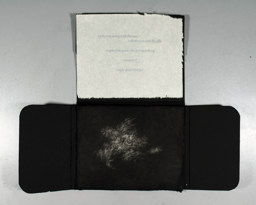

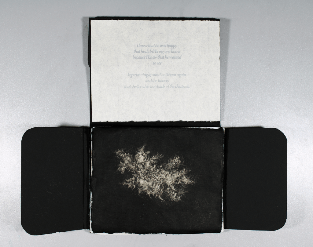
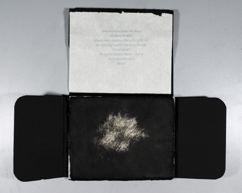

The following is the working version of my publication insert. Please bare in mind when scrolling through that the images and pieces of text inside are in no particular order and any can accompany each other in any order. This is to reflect the formless and mutable nature of clouds and memory, how they can form, reform, take on new meanings and evoke different emotions. The edges of the prints inside have been torn and then coloured black in order to create ephemeral and floaty ‘cloud-fragments’ that are soft and almost not there to the touch. Although I have experimented with different kinds of Japanese paper and tissues, and I do enjoy the feeling of this Kozo paper, and the strange quality of the text on it, I believe the colour is interrupting the flow of the piece. I think that I will try to monoprint the paper completely black, before screen-printing on it in a different colour. I also would like to monoprint the writing onto the paper by hand by scratching into the plates before using them to make the paper black, even though I didn’t enjoy the look of my handwriting on previous attempts to handwrite the words onto the paper.

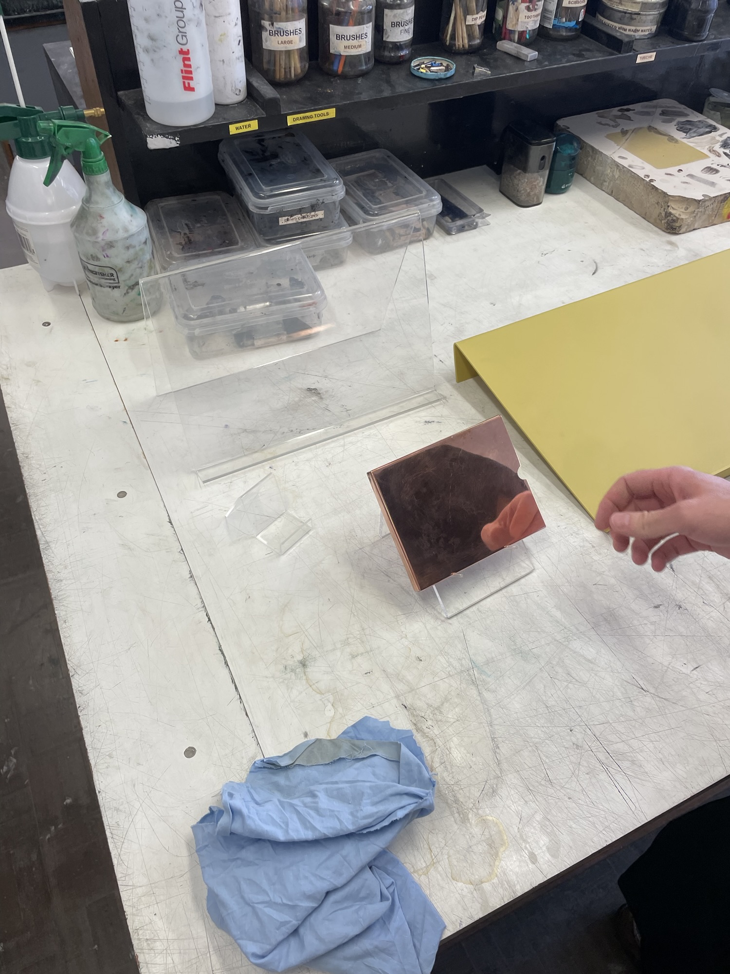
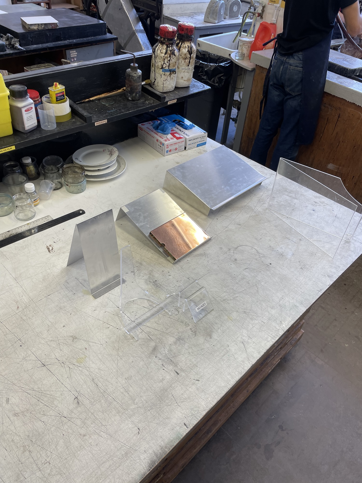
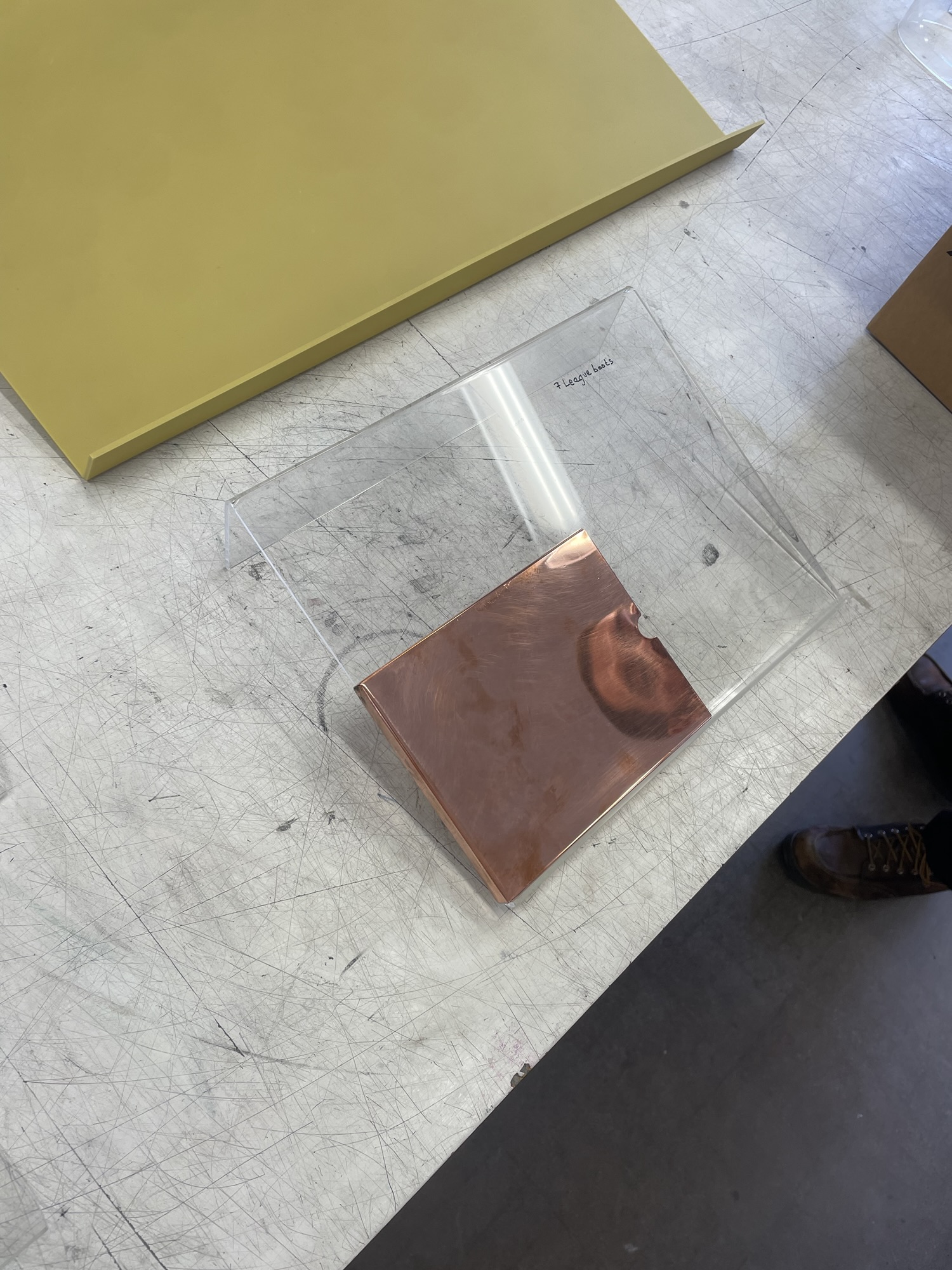
I have also begun thinking about possible ways of displaying the final publication at the degree show. I have wanted to make the piece inviting for the viewer to touch from the very genesis of the idea. I think that having the piece angled upwards towards the viewer makes it much more inviting to be picked up. I have thought about many different materials to construct this out of. The initial thought was obviously copper, but I very quickly realised that this was a bad idea, the box alone is more than enough, and any more copper would detract from it. The use of another metal feels like it clashes against the copper so I won’t be using aluminium or zinc to display it. I much prefer the idea of using a very simple piece of bent acrylic in order to display the piece slightly hovering above the table. I want this piece to be barely visible and as unobtrusive as possible. The visual language of the copper slightly floating also relates back to my previous floating shelves, and also the strange floaty nature of the cloud. Ultimately, I think that this work acts as a great representation of my research focus in this unit (bar a few edits to the words and the paper they are printed on). The formless nature of the publication relates to my ideas surrounding the mutable nature of both the cloud and grief.
