
Beginning Unit Three-
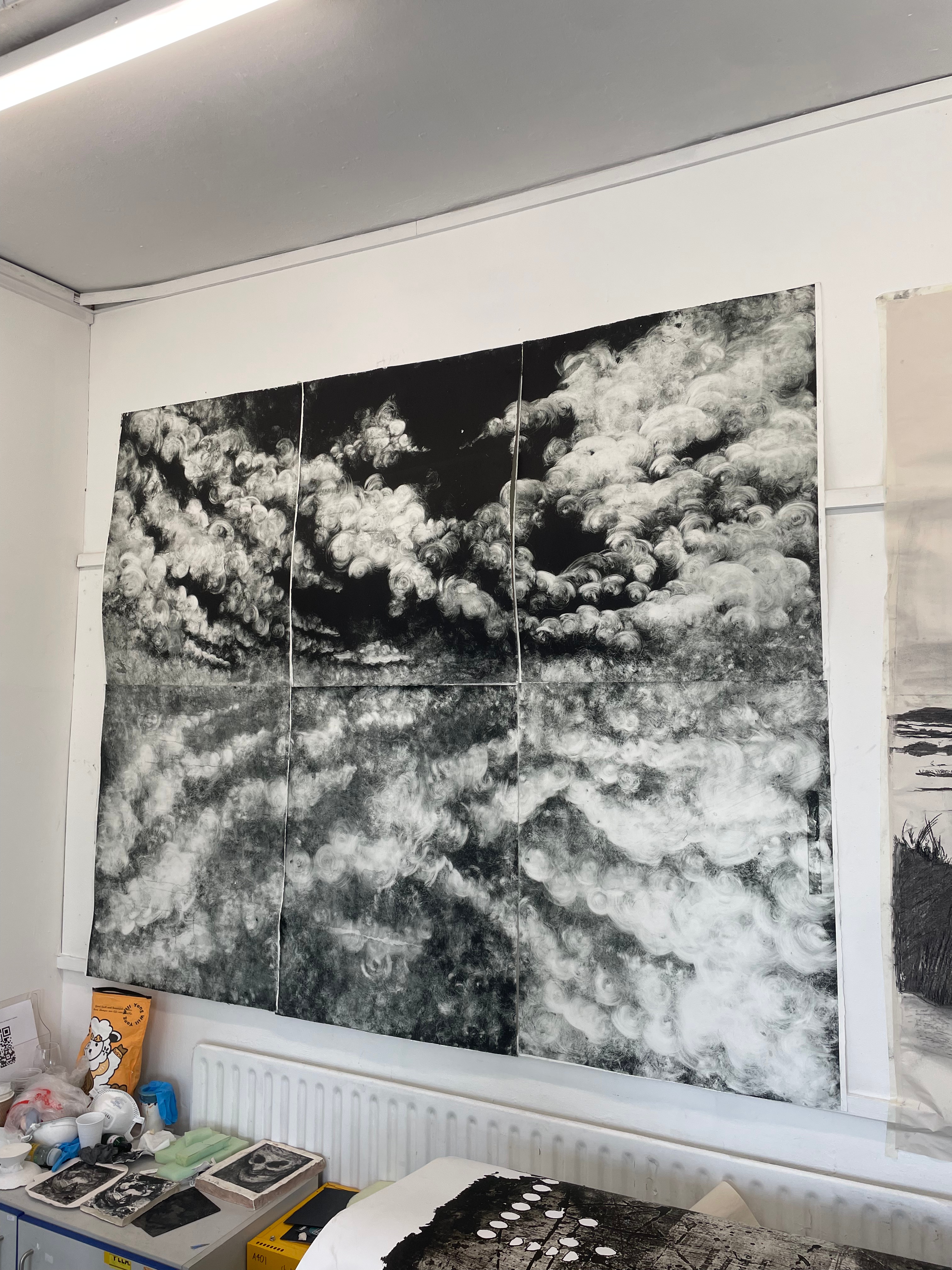
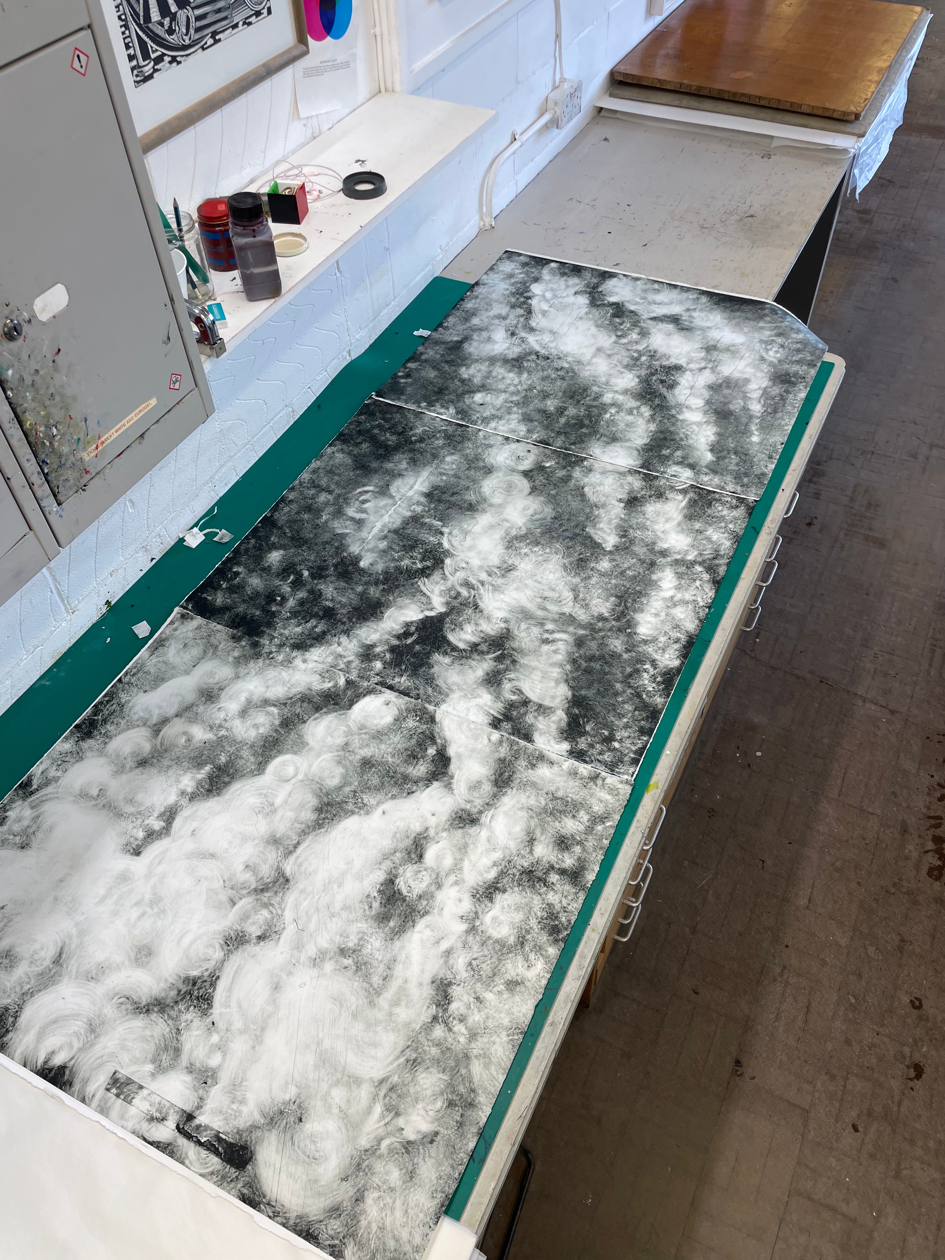
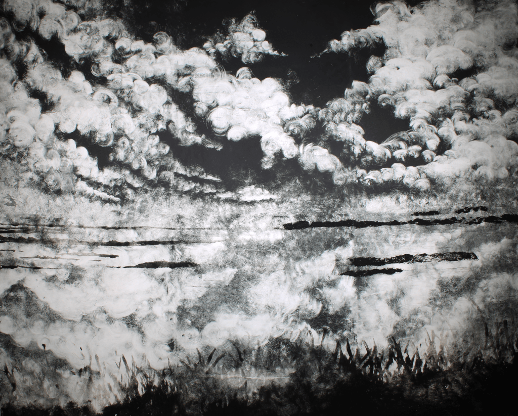
At the start of Unit Three, I had created this huge six part monoprint of a reflected cloudscape over the marshes, I had been playing with some carborundum prints and thought that these two mediums combined would yield a really nice result. I approached the monoprints first, before beginning with the carborundum on the lower three plates. Originally, this piece felt like a massive failure, but looking back with hindsight allows me to see many elements of the piece that seemed to work nicely. I especially like the hazy carborundum grasses and rushes at the bottom. I think the biggest failure in this piece was the image itself, the reflection shouldn’t have perfect one-plane symmetry, it should be skewed to the side as if looking from an angle. I think that the whole composition of this piece could’ve been much nicer. My monoprints that have a feeling of looking through something are much more successful in drawing the viewer through the image, as if they were at the foot of a snaking creek themselves.


Monoprints Continued-
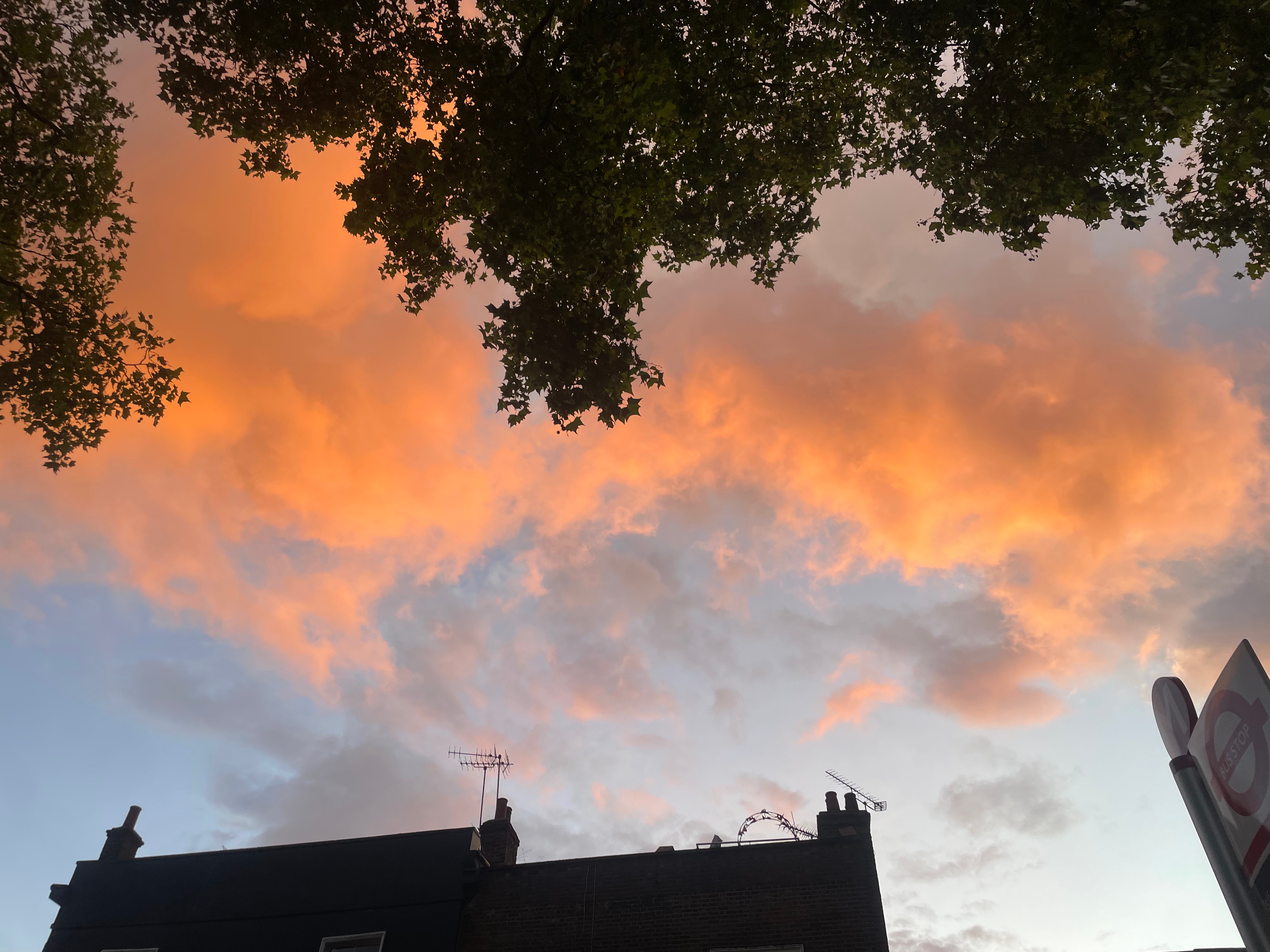
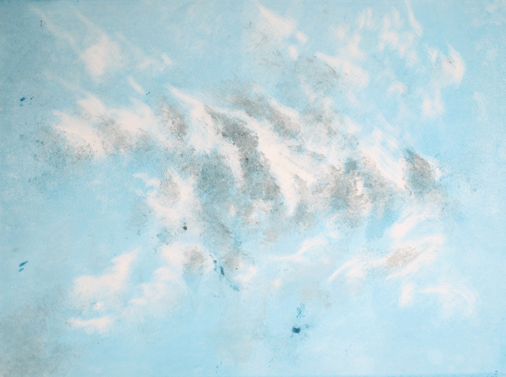
After discussions with tutors, I began to realise that the crux of my images resided in the skies. The clouds have always been a really important way in which I show the elements of emotion and grief in my work and I began to realise that my landscapes were becoming vessels for the clouds. Although location is very important within my work, and the places I choose to work from hold a lot of emotional weight for me, by just focusing on the clouds, these works become universal declarations of grief. The clouds are also still drawn from and inspired by the sunsets over the moors, or over the marshes, but to the viewer, these clouds could harken back to their own special relationships with nature and the environment. Everybody remembers those early winter evenings, where the skies put on a show, pink-oranges and blush red scarlets bleeding from the heavens, and this universal experience of awe is what I wanted to try and feature in my work. I had some issues working at this scale in print, as obviously every section would have to be printed on its own, but would also have to make up a well-registered and coherent image. Finding the space to create these prints was difficult, as I always wanted to assemble the image as a whole, often working on inked up plates on the floor of the studio. I think that these images may have been more succesful if they were on one plate, with at least a few days working on each one. However, due to the drying time of the ink, and limitations in the uni studio opening times, I would have to ink up six aluminium photolithography plates, draw them and print them all in the same day. Although this led to a ridiculous amount of work being made in a short amount of time, I believe that the quality of the compositions suffered. Each plate felt like it’s own image, that had a relationship to the image next to it, but didn’t have much consideration to the plate on the opposite side of the composition. This did, however lead to some pairs or threes of plates working fantastically together. The first monoprints that I made earlier in the year that I added carborundum to have very different tonal qualities to the ones shown above this text. I believe that this is due to the weather. I couldn’t quite work out at first why the ink was acting differently, and not providing these lovely tonal varieties in shade when wiped as they had in the past, I then realised that due to the excessive heat and humidity, the ink was much less viscous, and easily wiped from the metal plates.

‘Firmament I’-
For the Summer Show, I decided to show two sections of larger monoprints. This one, was an interesting portrait segment. As previously mentioned, the ink acted completely differently to how I was used to when coming back to this medium, meaning that these clouds were massively ‘over-wiped’. This led to them having a really interesting photographic, over-exposed look. I like these images that make you question what is coming out of the darkness. I believe that they overtly come across as clouds, but are abstracted enough for the audience to question what they are actually looking at. Like the cloud itself, I want people to see what they want to see in my images, as if they were Rorschach tests. The format of this piece also makes me think of ancient Japanese landscapes of the Muromachi period, that have a similar long-portrait form. The size of this piece also really excites me, as it almost acts like a sliver of sky that can be viewed through a crack.

‘Firmament II’-
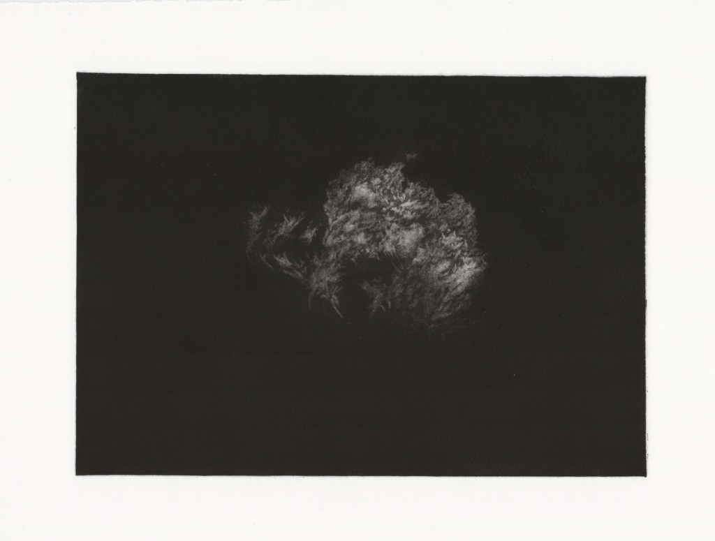
This piece was the more tonal section of the first set of monoprints I made. This selection has much more of an open, billowing mark than the later cloudscapes I produced that I really liked and just couldn’t manage to reproduce naturally due to the viscosity of the inks. The plates were also slightly dirty when making these clouds, leading to these really strange marks from splashes of gum from a previous life when these plates were being used for photolithography. These clouds really encompass that epic, Biblical power and awe that I always try and instil in my work.
Beginning the Mezzotints-
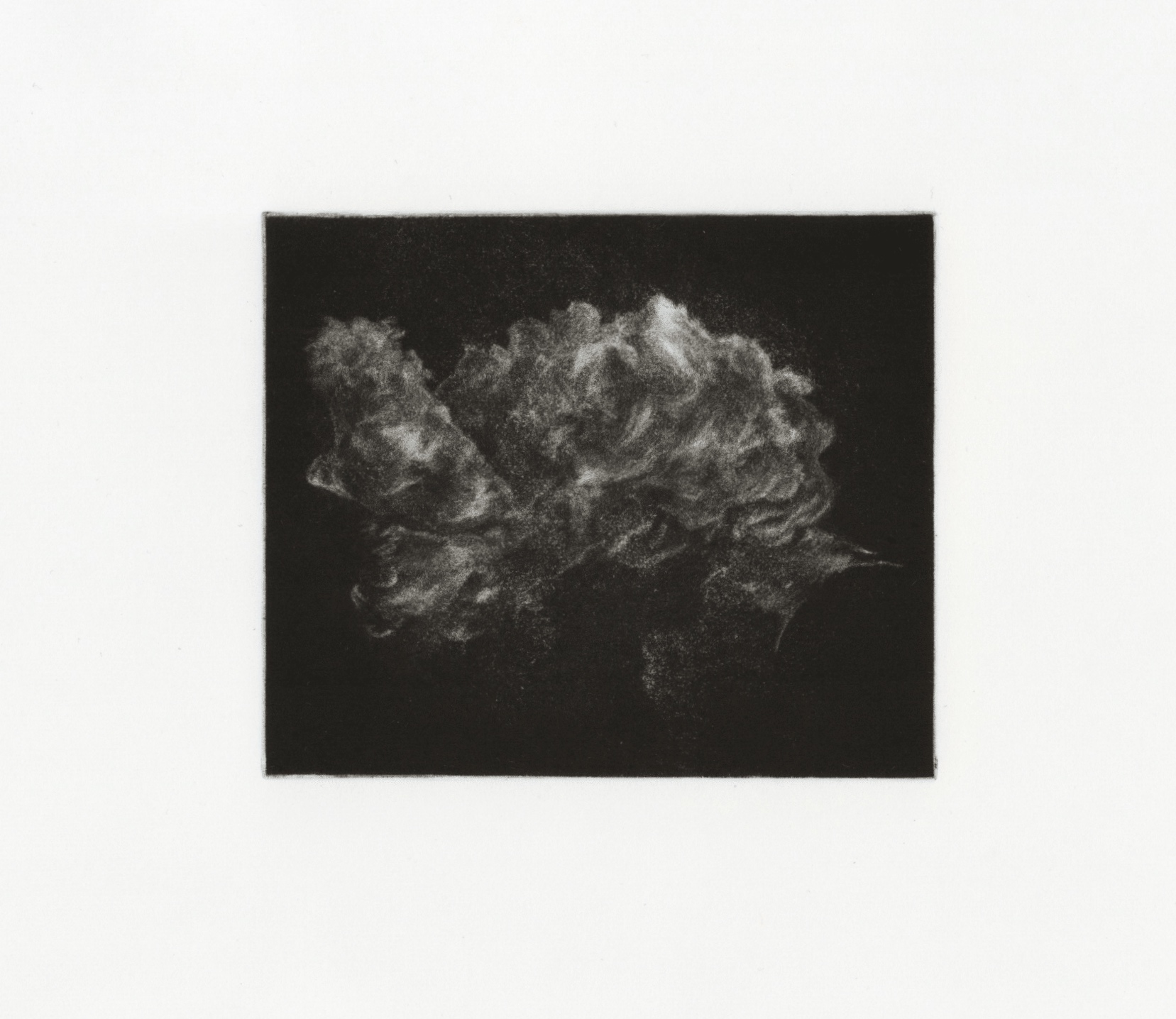
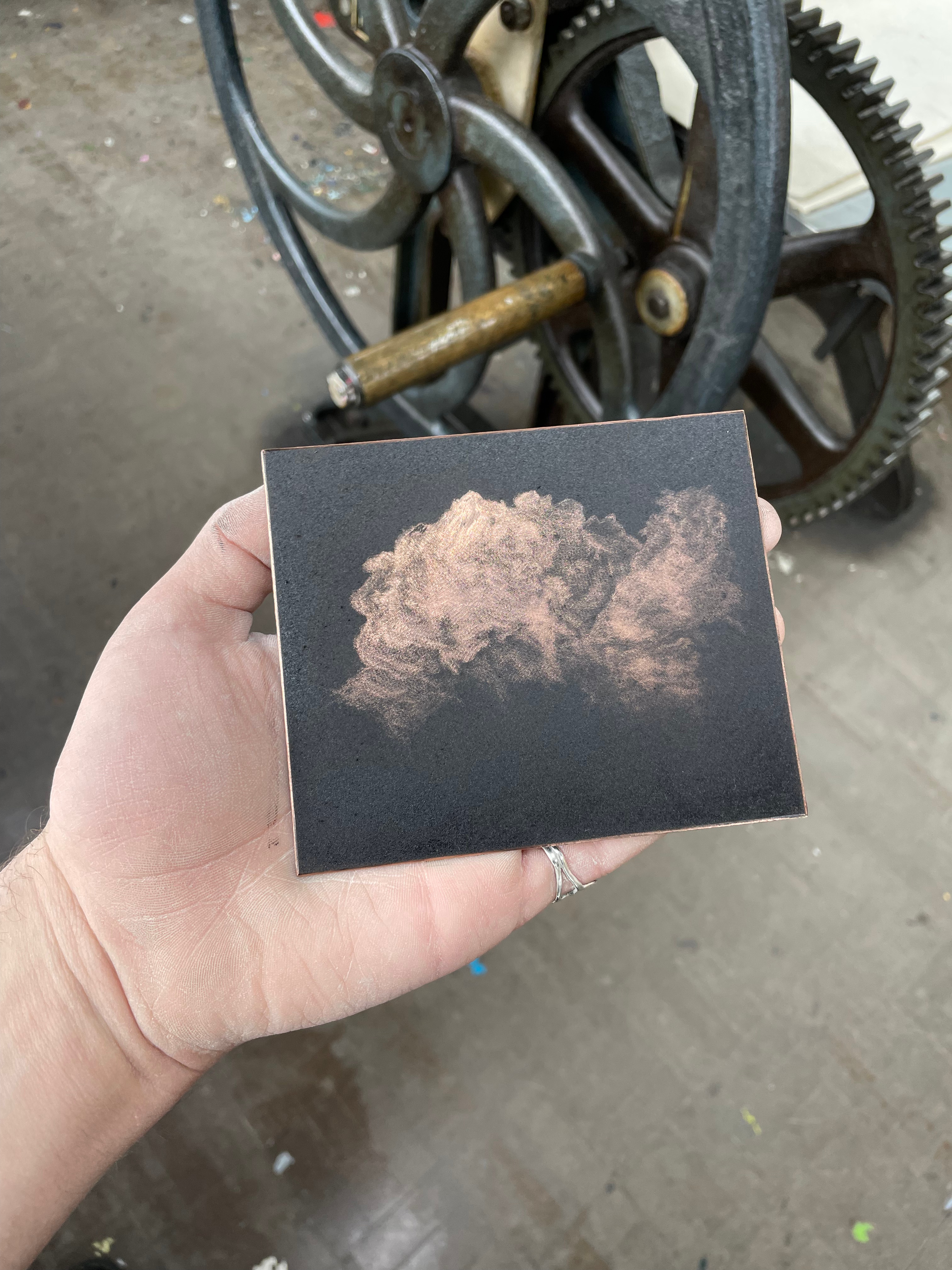
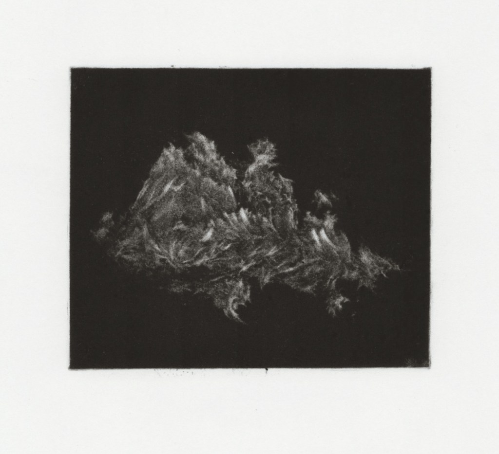
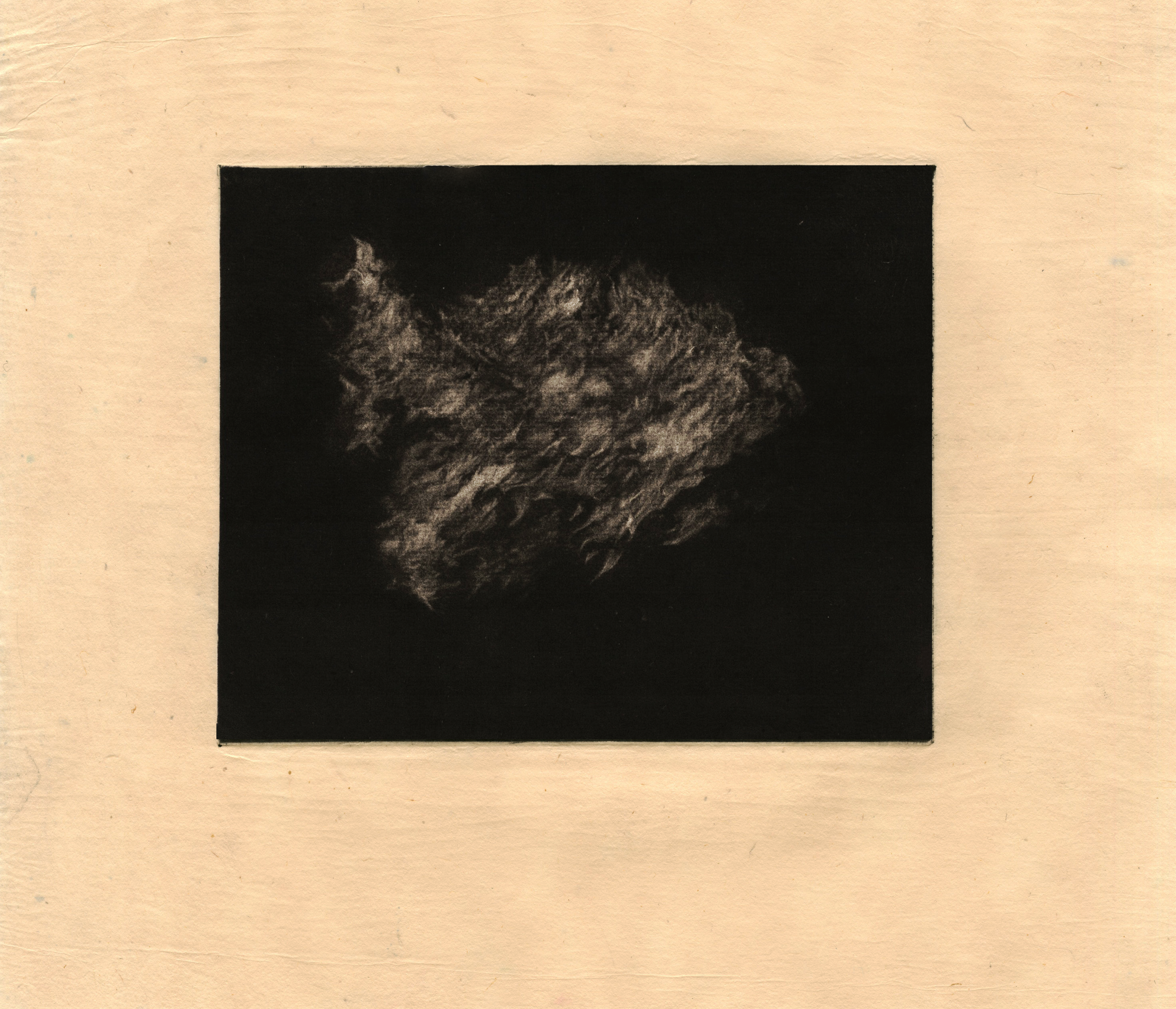
Mezzotint is a medium that I have always wanted the time to explore more. I had tried to create a couple of mezzotinted dogs on my BA to varying levels of success, but had the starting knowledge and tools to carry on experimenting and exploring. I chose mezzotint as it has a similar visual language to the monoprinted clouds, with softness emanating from an intense darkness, however had much more control in markmaking and tone, as well as naturally creating much smaller outcomes, which was something I had craved after working with the huge monoprints for so long. Working into copper mezzotint plates may be the most enjoyable surfaces I have ever worked with and I was reminded of this as soon as the first burnished mark went onto the plate. The copper is ablaze while working on it, and it made working from my reference images of dramatic clouds at sunset really natural. There is a meditative quality in working the copper, picking out natural shapes and forms in the material by following the guides of the reflections of light, oil and graphite on the plate. I was really happy with this first outcome after not attempting mezzotint for a year. Even after attempting many more mezzotints, this one is still one of my favourites, I was not scared of creating these larger, more billowing marks (probably as a response to coming straight away from making these similar marks on the larger monoprints. Like the monoprints, the actual subject matter of these plates are open to interpretation, and I would encourage the viewer to call them whatever it is that leaps out to them. I enjoyed my coursemates asking, “is it rocks in water?”, or “is there a dog in that bit?”. For me, these clouds become lonely vessels of grief and mourning, swollen with bitter rain and charged with violent static, eager to burst forth from it’s vaporous husk.


Mezzotints Cont.-
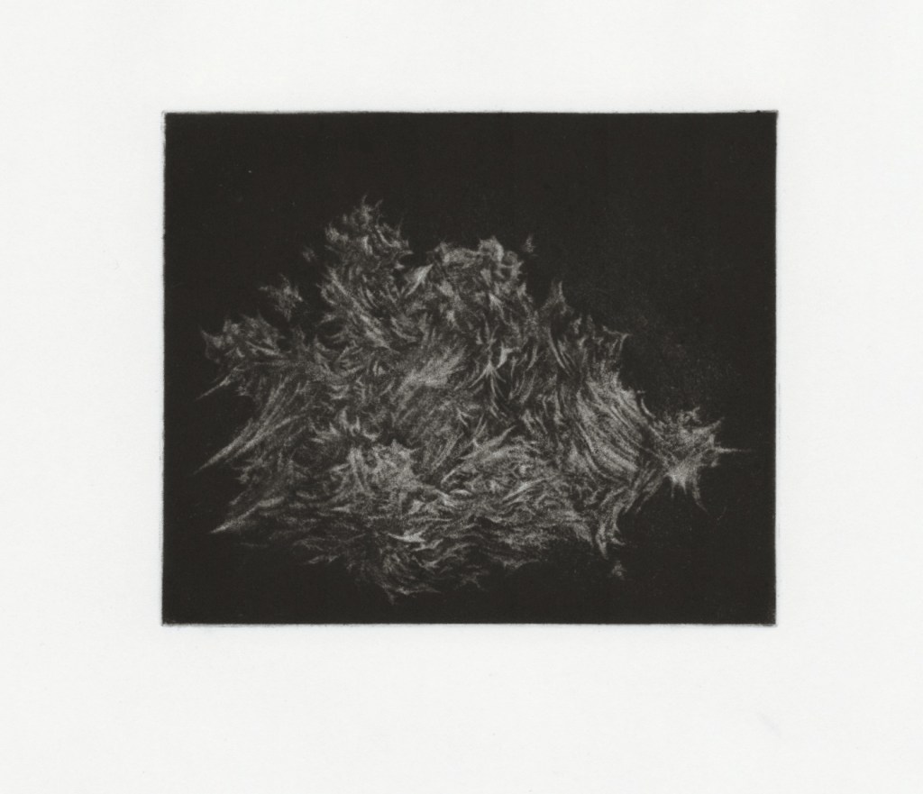
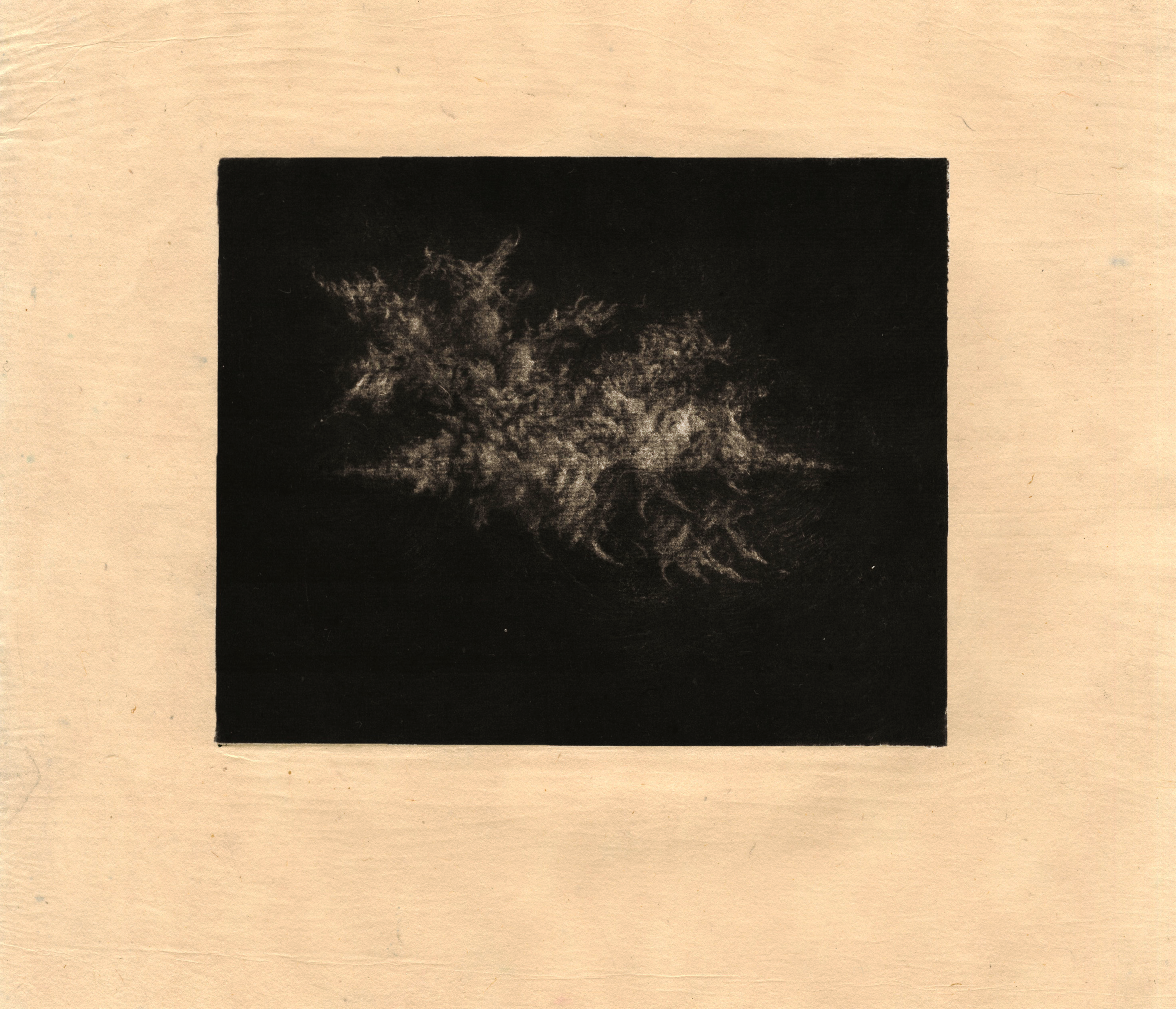
After the success of the first mezzotint, I decided to develop this idea into a series, I created two more mezzotinted clouds. Strangely, these clouds contained a very different kind of mark-making to my previous one, here I picked out much sharper shapes. These clouds began to feel more aggressive and barbed than the first iteration, in my head, they became more like these stellar warships, cruising through the aether. I was very proud of these clouds at the time of making them, but looking back with hindsight, after creating many more cloud iterations. They feel a little too sharp and angular, and have too much of a ‘mass’ to them. I’m also disappointed in the positioning of one of the clouds on the plate, I feel it would’ve been better in the middle of the plate like the others. The process of creating these clouds is very spontaneous, which has led to these slight issues with the final products. I would look at a reference image of a cloud before sketching this onto the plate. After this initial point of reference, the clouds were largely formed naturally by observing reflections in the oil used to lubricate the plate before scraping and burnishing, and picking out various forms that appealed to me. This use of light and reflections as a starting point for mark-making, allows these clouds to feel natural. I don’t want to try and force them look like a natural form by observing reference images, and instead, I allow the natural processes of light and reflection to form the image, like how we view the cloud itself.
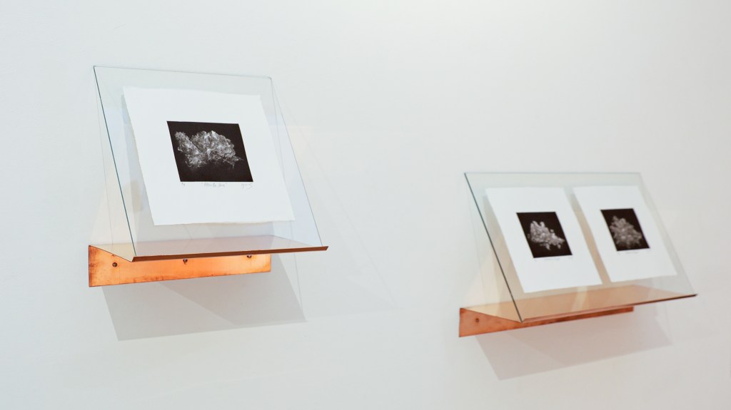
Mezzotint presentation-
For the degree show, originally, I wanted these prints framed very classically and simplistically. I personally don’t really enjoy very complicated means of displaying pieces of art, or incorporating artworks into big installations. I wanted to keep the display of these pieces more simple in order to echo the classical nature of their medium. However. I had gone to large efforts to print these pieces on varying kinds of Japanese paper that really accentuated their floaty, ethereal nature, and as such, I felt a frame would enclose and solidify the work, and realised that I had to break free from the frame. I decided that the pieces should be shown floating on a thin sheet of glass, rather than trapped behind it. This way, the space behind the work would allow for light to be caught behind the glass and thin paper, and give these prints a subtle backlit luminosity. The print and the beautiful paper itself would be viewed in an unobstructed manner, to allow the delicacy of the image, and the substrate it is printed on to be admired with nothing detracting from it. I discussed various ways we could suspend this glass from the wall with technicians. Many ideas came out of these conversations, including white wooden dowels drilled into the wall, with a 45 degree cut in them to allow the glass to lean against the wall at the appropriate angle, but I wasn’t a big fan of this, as I felt the dowels would look cheap and heavy and take away from the delicacy of the prints. I then decided, if we couldn’t hide the suspension, then the other way of tackling the issue would be to make the suspension beautiful. I then began to think about a small shelf-lip of beautiful dark-stained wood that the glass would sit on similarly to the last idea. This also troubled me, as wood is Earthly and connotes being firmly rooted in the ground, it doesn’t encourage turning your eyes to the vast heavens. Finally, I decided that the only option that would satisfy me would be to construct a shelf out of a single sheet of folded copper. Copper is a strange material as like wood, it is also of Earthly descent, however, copper has ancient deep-rooted symbolism that would suggest otherwise. Copper is a beautiful, orange-toned lustrous metal that feels luxurious, it relates back to the genesis of these works themselves, meticulously being carved from a small sheet of copper. Copper is also one of the seven alchemical metals, and is attributed to the planet Venus, representing love, beauty and protection. Copper was used alchemically as it was believed that it could be transmuted into gold. Copper reflects the clouds I create, depicting transformation and change, while also providing a physical and heavy contrast to the floaty printwork.

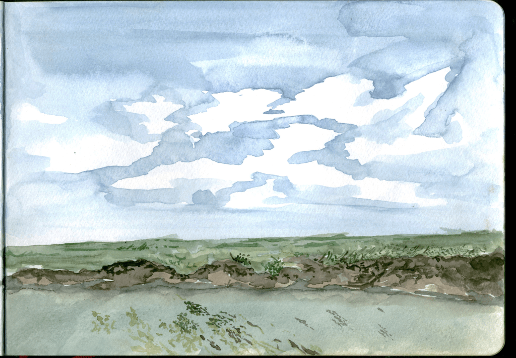

Marshland Watercolour Studies, En Plein Air-
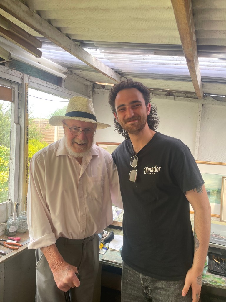
Over the Summer I went on another trip to Norfolk, this time armed with a pocket watercolour set and sketchbook. I wanted to take a step away from my usual moody works and try and capture some of the beautiful colours that the marshland has to offer at this time of year. I enjoyed creating these studies, and I found the joy in Constable’s ‘skying’, I think you can really see the weather and the time of day through these sketches. I do, however, really dislike the gaudy colours, mostly my fault in their mixing and selection, but partially due to a pretty sunny Summer. I think that the watercolours are not as penetrating as my oil based prints and I think that if I am to return to studying in paint, I would like to attempt to do some in-situ sketches with oils, which have a much thicker and more physical texture. I was also lucky to meet up with my Nana’s cousin, John Tuck, who I have spoken of before. John Tuck is an esteemed landscape painter, and had sadly stopped his painting a few days before my visit due to his failing eyesight (although he has done well to carry on as long as he has at the age of 99). John took a look at my sketches and gave me some nice feedback, mainly on my colours. It was inspiring as always to speak to John and I will always love having a look around his studio. Below is a picture of me and John on my last visit.
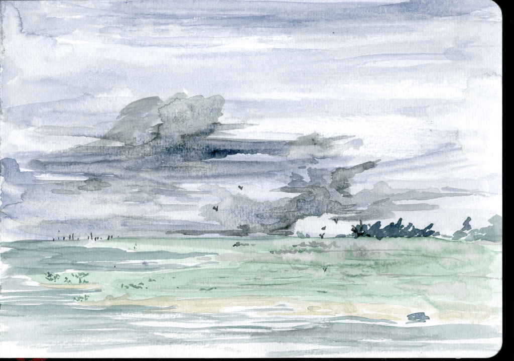
‘nascence’- Monotype
This piece was my first after returning to University after the Summer and it is a rare example of colour in my work. Clearly, spending weeks gazing into the vast blue of the East Anglian firmament had cemented these wispy shapes in my mind. I decided to create a colour monoprint also as it allowed me to get back into the multi-layered thinking process of print. I had spent the Summer making small watercolours and needed to get back into the print mindset. This piece was created by layering 8 ghost prints over the top of each other, all in subtle variations of blue. I did not clean the plate between prints, and after the first layer, used an additive approach to the plate, rather than subtractive, gently dabbing new hues of blue with a rag. Not cleaning the plate and not registering the plate every time, meant that the harsh lines would soften eventually, in these hazy overprinted areas, allowing for real variations of tone to appear between the blues and white especially. Initially I really didn’t like this piece and nearly threw it away after taking the last layer, but I’m really happy I kept it. I’d been reading a lot about John Constable over the Summer and I think I managed to capture something sufficiently Constable-esque here. This work contains a much more optimistic tone than my other clouds, yet the grey haze suggests that there is still something grim within it. As previously mentioned, I believe that we all have memories of those beautiful skies that fix us in moments of remembered emotion, and for me this cloud formation takes me to the saltmarshes catching shrimp and swimming with my dad. I named this one ‘Nascence’, meaning the beginning of something, the initial formation of something coming into being.

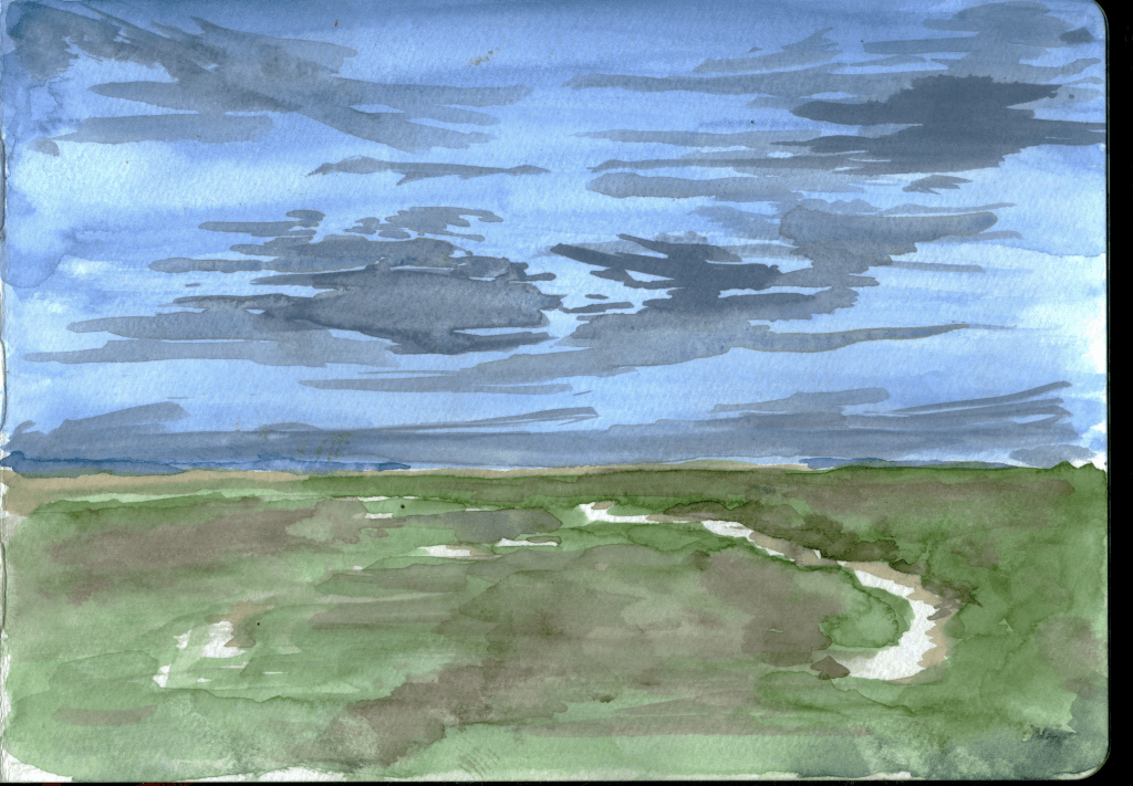
‘Receding (Further)’- Monotype
My experimentation with colour was short-lived, and my next monotype exercise was going back to the roots of the project and depicting a simple marshland scene again. Sometimes when moving away from ideas, here, moving away from the landscape and focusing on the clouds, I have to prove to myself that I’m still able to do the previous thing!I really like the Horizon in this one, it seems to really hazily bleed away. In these monoprints, I like to think that the only thing I’m actually depicting is light, I don’t want to physically illustrate anything concrete, the only thing I actively aim to show is slivers of light bouncing off things in the landscape, here, just the light dancing off the water, the light blocked by the tree line in the horizon, and just a touch reflecting off of the Sea Aster.

Carborundum Mezzotint-
I knew that I wanted to create a large series of cloud mezzotints but had a conundrum. I didn’t have time to rock eight copper plates by hand, and create the images, but the pre-rocked copper plates supplied by Intaglio printmaker that I had previously been using were one, too expensive, and two, restrictive in size and form. I knew I wanted to go slightly larger with my new clouds but still retain a similar dimension ratio to the previous plates I had created, such as the ones that were on display at the degree show. I had become aware of an artist called Dox Thrash, Thrash was a black artist working in Philadelphia in the early-mid 20th Century, who created pastoral scenes of life as a black person in America. Thrash had created a method of ‘mezzotinting’, wherein a copper plate would be ground down with carborundum, until the plate had a ‘tooth’. I decided to find out if this method would work on zinc, as this would save me a lot of money, and would allow me to work at pretty much any scale or format I wished. I took a 5Kg weight, along with some 80 grit carborundum and a relatively large zinc plate and got to work. After 20 minutes of grinding and working the plate, I took a proof. I was puzzled, as although the plate looked completely uniform, the prints I made were really inconsistent in their black. After much trial and error, I realised that the problem was not in the plate, but instead in the inking and printing process. After a few attempts, I got this down to a tee, the plate should be inked with Charbonnel 55985 black ink, mixed around 1:10 with medium plate oil, the plate should then be gently scrimmed and not tissue wiped. I also found that very high pressure and soft/new blankets on the press were ideal for this process. I was shocked to see how velvety and uniform the black prints, even comparing the prints to other real mezzotints and finding that the black was to the same calibre, or perhaps even better. This new method was really exciting to me and I was eager to see how scraping, burnishing and image-making would respond on the zinc carborundum plate, versus a traditional rocked copper plate.
‘Morpheus’- Mezzotint on Hosho Paper
This piece was created on the zinc mezzotint plate. I only created a small cloud image on this plate just to test out what it could and could not do. I am excited to try and create more of these clouds at a larger scale, but I actually quite enjoy this one and the amount of negative space around it, the cloud really feels suspended in this abyssal void of the night sky. The zinc is interesting to work into, I found that this medium is in ways much less forgiving than traditional mezzotint, it is easily scraped back to white with one harsh scraper mark, and therefore you must be very gentle with your mark-making. I also found that the zinc is so soft that a burnisher is almost not required, at least in the making of my clouds, a soft scratch from the long side of a scraper really flattens out tone nicely. For some reason that I do not understand, this process blunts your scraper like nothing else I have seen, you would think that because zinc is softer than copper this would be the opposite and your tools should stay sharp forever, but this is not the case. I have had to sharpen my scrapers probably 4 or 5 times in the making of every one of these zinc mezzotint clouds, but a small price to pay for the hours of rocking that is missed due to this. As previously mentioned, the wiping of prints made in this process is quite alien. The whole plate should be very gently and easily scrimmed and then the image must be picked out very selectively by tissue wiping. You must leave almost so much ink that you can only barely see the image on the plate before printing. After one or two prints of every plate, you begin to work out the intricacies of each cloud shape in the black and the printing becomes quite intuitive and much easier. Strangely, these plates also print fantastically on even the thinnest Japanese papers and tissues, whereas on traditional mezzotinted plates, I believe the deeper tooth in the metal caught onto the fibres in the paper, resulting in a patchy and furry print. Overall, this method is really handy in creating many mezzotints very quickly, and personally I don’t see any difference in the quality of the outcome and mark-making, this process also excites me a lot, as it makes printing and making mezzotints once the course has finished and access to the studios has stopped much more accessible.
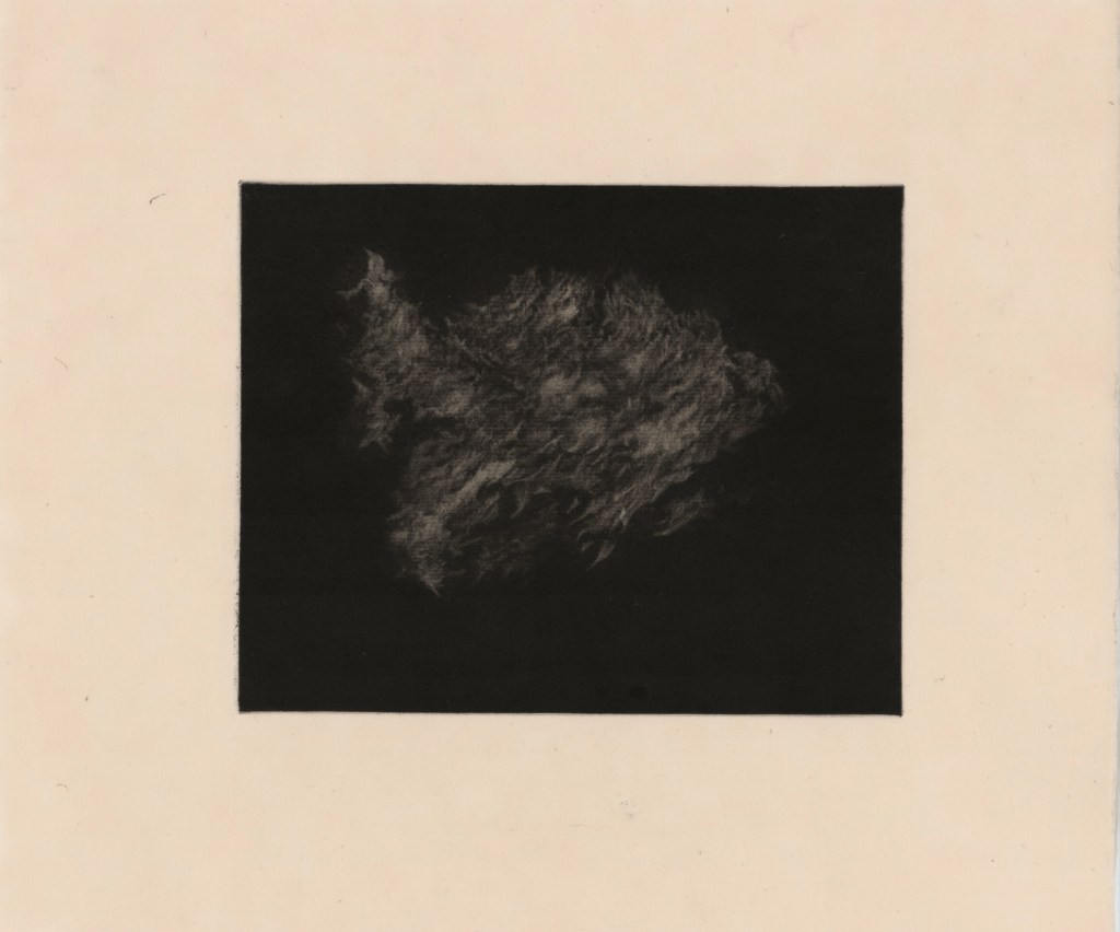
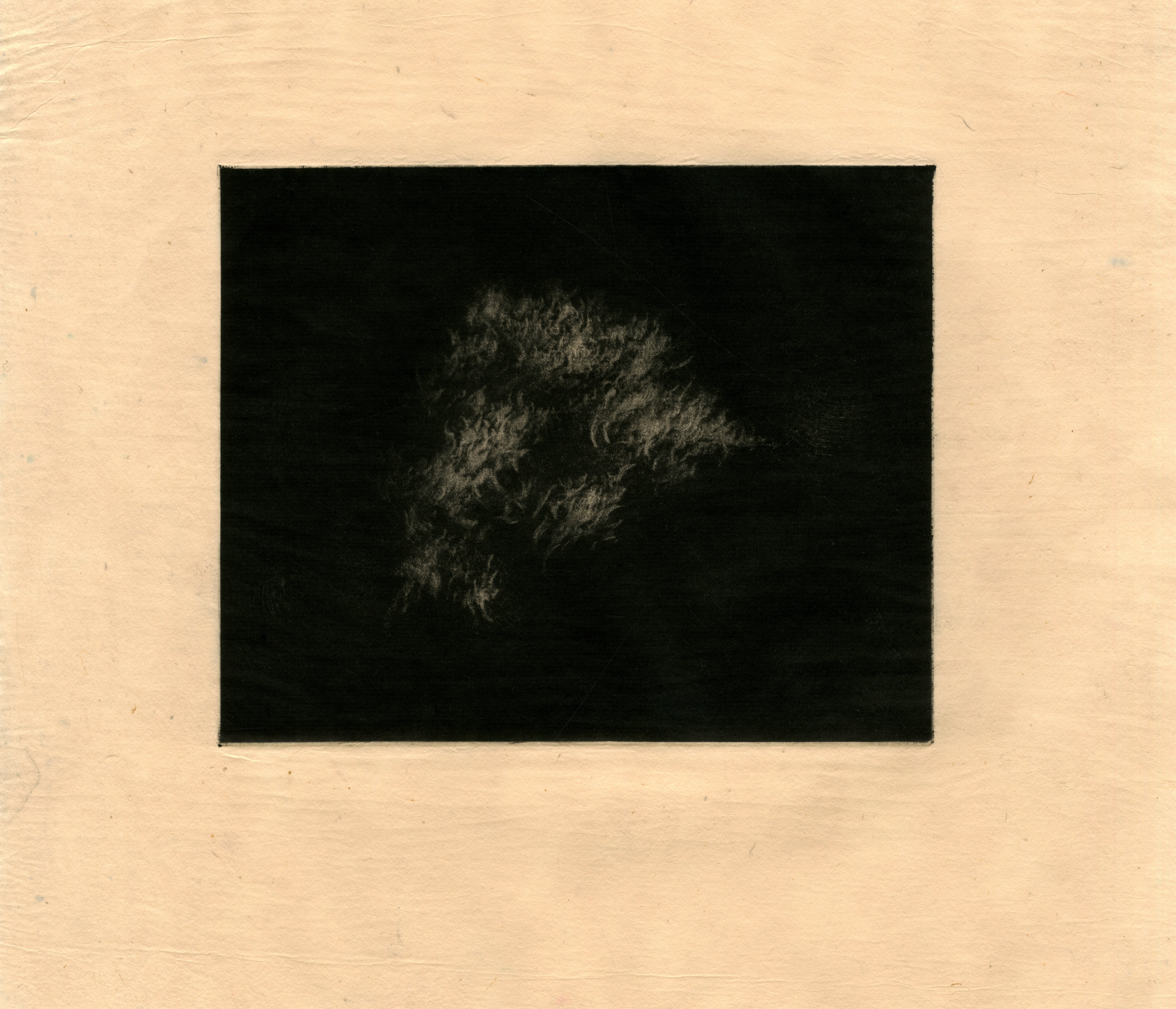
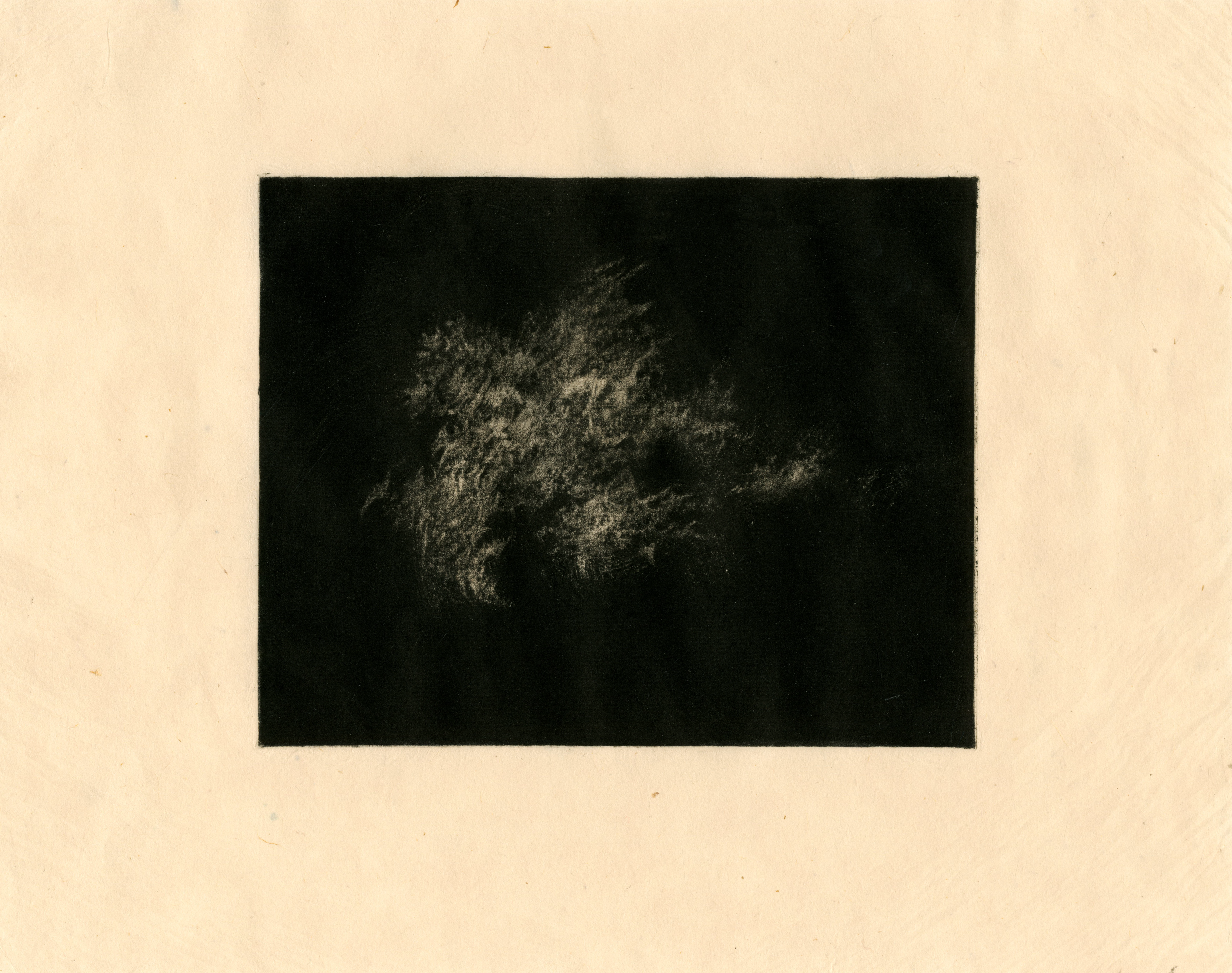
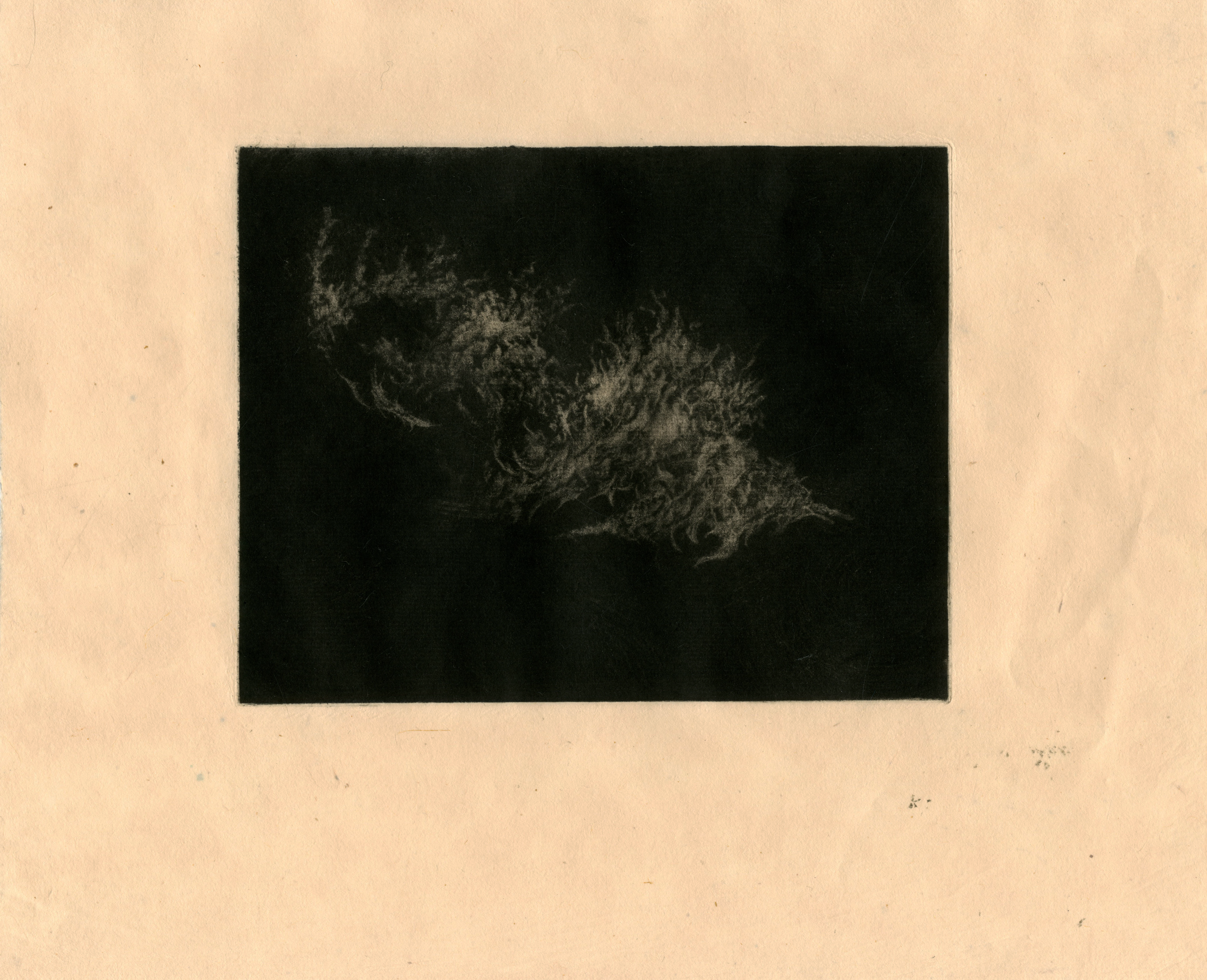
‘Untitled’- Mezzotint on Kitakata paper
This piece was the first in a series of eight mezzotints, printed on Awagami Kitakata Washi Paper. I find it funny that this one really echoes the first mezzotinted piece I did before Summer. I think going into this series, I have a much more established vision of what these clouds should look like. It annoyed me that the mezzotints I showed in the Degree show had a lot of promise, but just didn’t sit quite right together. I don’t mind that the clouds might not overtly look like clouds, however, I think the last mezzotints were just slightly too fantastical, and felt a bit heavy handed. For this series, I really spent a lot of time, noticing where the clouds were situated on the plates, and although many have quite different formations and marks, they still have something that draws them all together and makes them feel succinct. I experimented with lots of different papers to print these, I tried Kozo, Hosho, Mingeishi, Shirakaba, Tosa Washi, Kitakata green, natural and select, always trying to find the best feeling in the hand, the best quality of print and the beauty of the paper itself. I have never been a massive fan of starchy white paper, and never really loved the look of white Somerset, it always came across feeling quite clinical in these small clouds, making them look almost like laboratory slides of microscopic organisms or particles. I believe that, especially in mezzotint, the softness in the paper interacts beautifully with the tone of the black and so most of the bright white papers were cast aside rather quickly. A guilty pleasure of mine is Kitakata Green, I just love the subtle minty tone and the beautiful grain and weave of the paper, as much as I would’ve loved to edition all of the clouds on this magical paper, the green colouration doesn’t massively work with these clouds, they require something more neutral. This is why I, instead, opted to use Kitakata Natural, it had a balance of everything I liked from all the papers, it printed beautifully, almost without fail, it is heavy enough to handle, while also being delicate enough to give that lovely ethereal feel in the hand, it has a beautiful natural grain, with the fibres being a work of art themselves and it tears really nicely with a ruler and a bit of water.


Mezzotint Series-
After creating all 8 clouds, I’m really happy with how they’ve turned out. I think they all really communicate with each other and feel like a series, yet aren’t so similar that they become boring. As mentioned previously, these clouds are created quite spontaneously and therefore, I believe the subconscious plays a large part in their development. While creating one of them, I began to remember a lecture in Unit Two with Mark Fairnington, a hyper-realistic oil painter who created these fantastic Sottobosco paintings of tree stumps and roots, flourishing with ivy and snakes. Fairnington commented at the end of his lecture briefly on a point he had been discussing with his wife the night before his talk. Fairnington had been diagnosed with cancer and his wife asked him if subconsciously, these images were self-portraits, reflections of the uncontrollable growth and decay waging war on his own body. As these cloud formations started to become more scarred and strange in shape, I began considering what I too thought about while making these images, often I think of my dad and his own illness, and how these clouds are vessels for grief and mourning, but also vessels to symbolise my father. I am beginning to wonder, if subconsciously, these wispy, barbed and dagger-like shaped forms that I create are also representations of the illness inside my father. I carried on making these cloud forms, not thinking of their ethereal qualities, but instead of their more violent natures, the forms slowly start to become these more and more scarred, maybe even infested, insect-like shapes. I’m not quite sure what these clouds are becoming, or whether they are still clouds at all, or instead they are unbased and abstract manifestations of illness, rot, grief, and yet still of strange ethereal beauty.

Experiments on Somerset-
I managed to get my hands on some of the last Somerset Velvet Black available from John Purcell due to issues in manufacturing. I was really interested to see how my clouds would print on this black paper, after seeing a series of white line etchings of clouds on black paper created by Ian Malhotra at the Somerset House print fair. It’s interesting to note that on black paper these mezzotints become inverted, and I think this really adds to that weird insectoid, infected feeling they have. I’m not happy with this image as a resolved work, but I am excited to try to create some mezzotints with the intention of them being on black paper and inverted. Since seeing the first cloud inked on the copper plate, there’s really something exciting about getting that metallic almost fiery copper tone into the print on paper. After the handin, I intend on printing my cloud mezzotints on very thin Japanese tissue, before screen printing a square of gold size onto the black paper and applying copper leaf, and then chine-collé-ing these prints onto the copper-leafed paper. I’m hoping with some experimentation, this will make the clouds appear as if they are lit from within, with this thunderous quality about them.
